What inspired us
We’re all students living in New York City. The aptly named “city that never sleeps” has traffic everywhere, and at all times of day.
The City, despite having one of the best public transit systems in the nation, certainly has accessibility issues. We've grown accustomed to the transit in our area, but can definitely see its pitfalls.
Given the prompt of both Sustainable Cities and Communities and Peace, Justice, and Strong Institutions, we wanted to find a way to see detect in the longevity and survivability of communities; in our community, the biggest threat to longevity is accessibility. We hoped to use that information in order to improve on existing institutional infrastructure to more justly distribute freedom of movement across urban areas.
Not everyone can afford a car. Even between people who do drive here, an unspoken rule around where we live that nobody uses cars because of how god awful the traffic is. The existence of this much traffic is a direct indicator of failures of the public transportation system, and this surplus of private cars on the roads leads to accessibility issues, road accidents, and a massive, unnecessary excess of carbon emissions. We wanted to create a system that could determine where current public transit institutions falter, and give our input on how to fix them.
We chose to scope this project prototype to New York City because it's a common area we all know and can make real insights on, but we intentionally designed the project to be able to be used in any urban area worldwide by simply changing the bounds of the search algorithm.
How we built the project
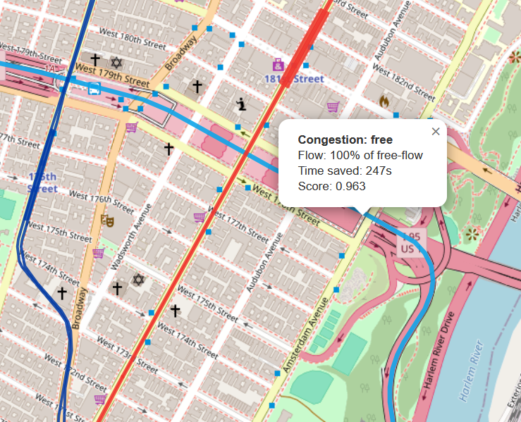
In order to see the most commonly traveled paths, we created a Python script to pick random pairs of coordinates within the bounds of NYC. We then used the TomTom Traffic API to find the shortest route between these two points, which returned a long list of "nodes," or portions of streets that made up this shortest path.
We then took a random sample of five nodes from each path and again used the TomTom API to see how much traffic was actively flowing through these areas. Based on how similar the amount of traffic was between each of the sampled nodes, we calculated a "flow correlation metric" based on how much the amount of congestion at each sample deviated from the mean traffic across the entire route.
Out of the 300 samples we tested across both rush hour (5:00PM) and late dinnertime (7:00PM), we picked the 10 routes with the highest congestion correlation. We then created a website to format the results and show our analysis of why these specific routes may be significant. Check out our website for the results!.
We used AI in order to speed up busywork (writing CSS to style the website and documenting/pretty printing our code).
What we learned
None of us had worked with website hosting in a long time, so we all learned a thing or two about website work.
We learned how to present our ideas in a cogent way, and got a lot of practice trying to analyze data and extrapolate ideas from it.
As a side product of our project, we also learned quite a lot about the city we live in while doing research for our analysis! Tom is our resident New Yorker, and he taught the two of us (Simian and Ian) a ton while we were working too.
Challenges we faced
Because we were using a free trial of the TomTom API, we only had a very, very limited amount of tokens available to us. Grabbing the flow at any point anywhere on the map used up an API call, and we couldn't batch order across an area. This meant that we had to be extremely frugal with our API usage. We spread out our API calls to two different distinct time periods to get more meaningful data without spending too many unnecessary calls, and took only 5 random samples of each path to analyze. We didn't expect much given these limitations, but we were very pleasantly surprised with the data that was able to come out of them.
Watch our video and check out the project overview!


Log in or sign up for Devpost to join the conversation.