-
-
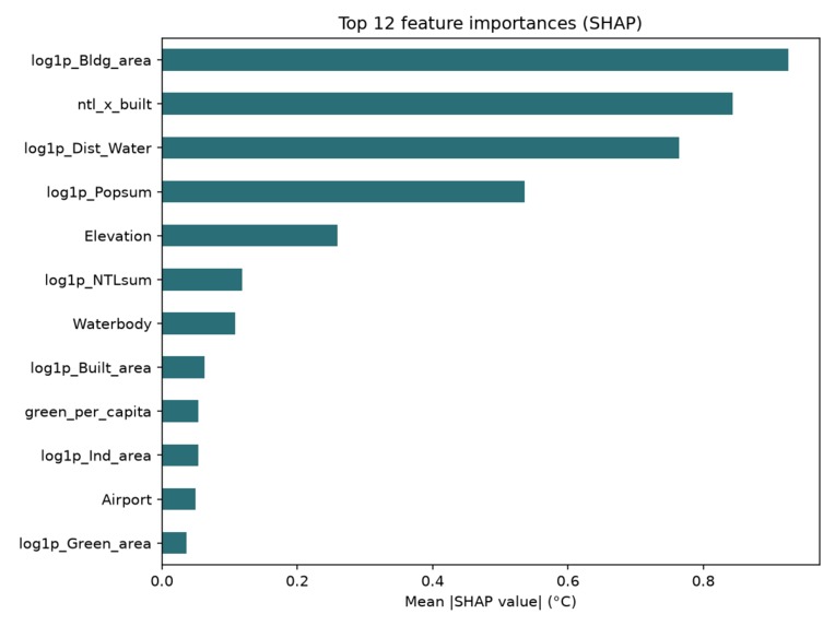
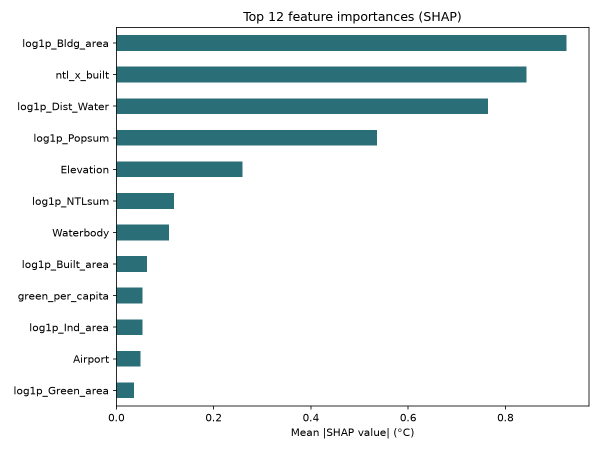
top feature ranking
-
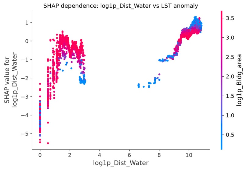
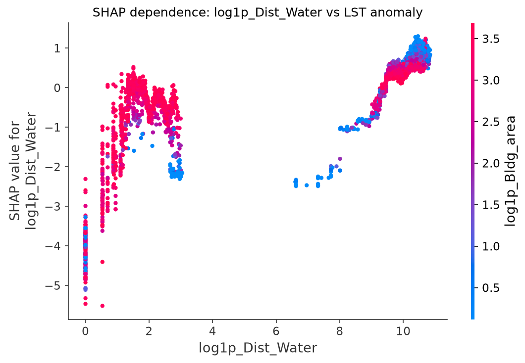
the water-proximity cooling effect
-
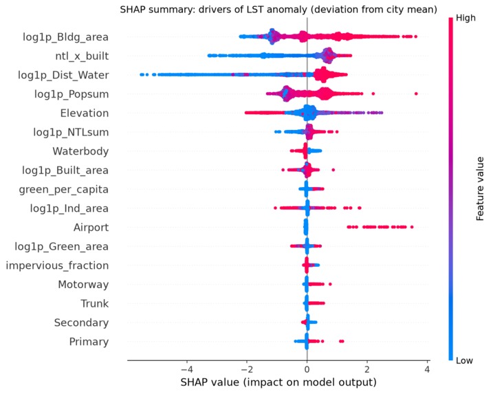
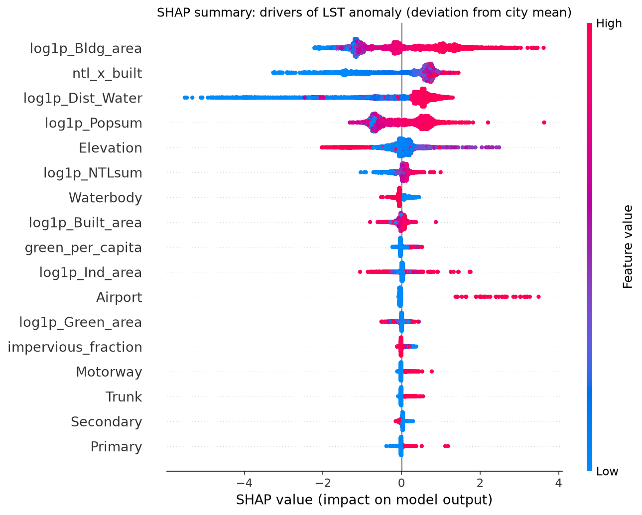
SHAP summary plot
-
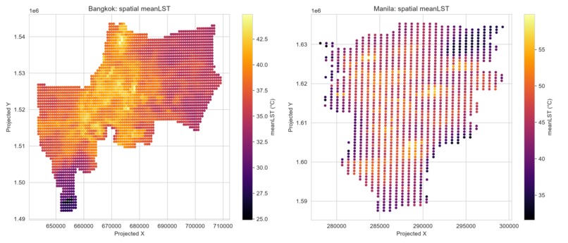
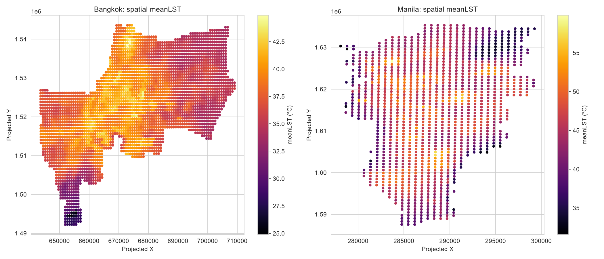
the two heat maps side by side, strongest visual hook
-
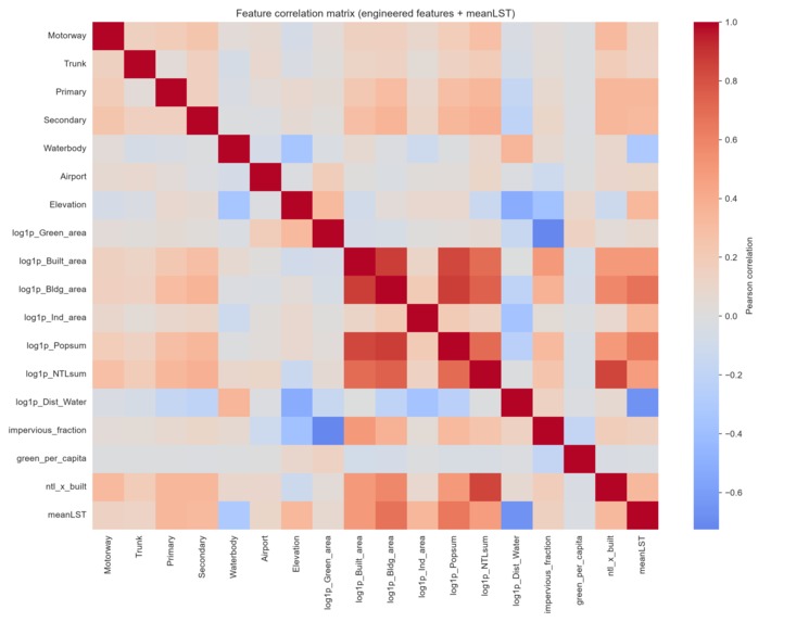
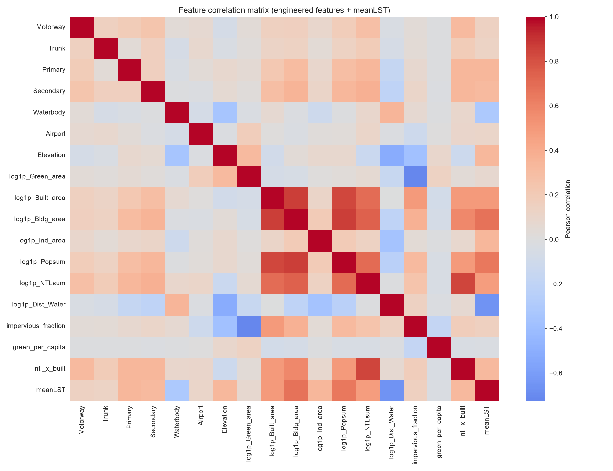
feature correlation matrix
-

dashboard ss(2)
-

dashboard ss


Inspiration
Urban heat islands aren't just an abstract climate statistic. They can mean the difference between experiencing a 36°C day and a 45°C day in the same city, depending on whether you're standing next to a park or surrounded by concrete and asphalt.
That difference matters, especially during heat waves, because extreme heat has real effects on people's health. It is also influenced by things that cities can actually change: how densely an area is built, how much green space it has, how close it is to water, and how the surrounding urban environment is designed.
I wanted to build something that went beyond simply predicting temperature. The goal was to understand why a particular location is hotter, identify the factors contributing to that heat, and then turn those findings into a practical tool a city planner could use.
That led me to build a system that combines machine learning, satellite data, explainable AI, and generative AI to turn urban heat predictions into actionable municipal policy recommendations automatically.
What it does
The project predicts real MODIS satellite-derived Land Surface Temperature across 4,310 grid cells covering the Metro Manila and Bangkok Metropolitan Area regions.
The model uses features such as building density, green space, proximity to water, population, elevation, and nighttime-light intensity. An XGBoost model reaches R² = 0.902, with a 25% reduction in RMSE compared with a linear baseline.
But getting a good prediction wasn't enough for me. I also wanted to understand what was actually driving those predictions.
That's where SHAP comes in. I use it to break down the model's predictions and show which features are contributing to higher or lower temperatures, both across the dataset and for individual locations.
Those explanations are then passed into a three-part sponsor-technology pipeline:
- Firecrawl retrieves relevant local heat-advisory and urban-planning news.
- Wolfram calculates solar-radiation and thermodynamic metrics.
- Featherless AI, running Qwen 2.5-72B, combines the model explanations and external information into a structured Urban Cooling Policy brief.
The final brief includes a risk summary, the main contributing factors, and recommended interventions. The idea is to take the process from prediction → explanation → external context → policy recommendation without requiring me to manually write each report.
How I built it
Feature engineering on the raw satellite and environmental data. I used log transforms for heavily skewed area-related variables and added interaction terms such as nighttime lights × built area. I also created an "LST anomaly" target, which measures how far a location's temperature is from its city's own mean. I used this specifically to test whether the underlying physical heat relationships could generalize between cities without simply learning each city's overall climate.
Baseline models came first. I tested a Dummy Regressor, OLS, Ridge, and Lasso to establish a reasonable baseline before moving to more powerful tree-based models. The baseline models reached around R² = 0.83, giving me something meaningful to compare against.
XGBoost and LightGBM were then evaluated using 5-fold cross-validation stratified by city. A standard GroupKFold setup wasn't practical here because there were only two city groups. The stronger boosting models pushed the performance to around R² = 0.90, with XGBoost ultimately reaching 0.902.
SHAP was used with TreeExplainer for global feature importance and dependence analysis. I ran the explanations against the anomaly target specifically because I wanted the explanations to focus on actual built-environment effects rather than simply telling me which city a grid cell came from.
Three sponsor API clients were built for Firecrawl, Wolfram, and Featherless AI. Each one has a documented fallback path in case an API key is missing or an API call fails. I also tested the complete pipeline with zero API keys configured and verified that it still runs to completion instead of crashing halfway through.
Two PDF reports are generated programmatically using ReportLab. One is a full technical evaluation covering everything from the problem statement and data analysis through model evaluation and policy recommendations. The second is a shorter municipal policy brief designed to be much easier for a non-technical audience to read.
Streamlit app, I also built a Streamlit web app (link above) so this isn't just a script — you can click any grid cell on an interactive map, see its local SHAP explanation instantly, and generate a live policy brief on demand
Challenges I ran into
My first dataset looked real, but the results told me otherwise. I initially worked with a Kaggle CSV containing 500 "cities." On the surface, the data looked plausible. But once I actually checked the relationships between the variables, things started looking wrong. Land cover had a relationship with temperature that went in the opposite direction I would expect; urban areas were showing some of the lowest average temperatures. On top of that, the linear model couldn't even beat a simple mean predictor. Instead of trying to force the dataset to work, I treated those results as evidence that something was wrong and replaced it with real MODIS satellite data.
I introduced a multicollinearity problem myself. At one point, my feature matrix contained both the raw and log-transformed versions of the same skewed variables. Since one is a deterministic transformation of the other, that creates exact collinearity by construction. It didn't cause an obvious problem with the in-sample fit, but it became a major issue when I tested cross-city extrapolation. The RMSE went into the thousands. The solution wasn't to throw more regularization at the problem. I removed the redundant representation.
Cross-city generalization doesn't magically work just because the overall model performs well. Manila and Bangkok have very different baseline climates, with their mean temperatures separated by roughly 8°C in this dataset. When I trained on one city and tested directly on the other using raw temperature, the model could fail badly, with R² dropping as low as −44. I could have ignored this because the overall cross-validation score looked good, but that wouldn't have been a useful scientific result. Instead, I went back to the anomaly target and asked the more appropriate question: can the model generalize the relative heat patterns within a city's own climate? The answer was mixed. I got R² = 0.42 in one direction and −0.04 in the other. I kept both results rather than selecting whichever one looked better.
Two PDF problems only became obvious when I actually looked at the rendered files. The
R²character silently disappeared with one of the fonts I was using. There wasn't even a visible error or a black box; the character was simply missing. I also found a dead-code line that meant Markdown formatting in the AI-generated policy brief wasn't actually being applied. Neither issue was obvious just from reading the code. I caught them by rendering the PDFs and inspecting the actual output. That has now become a proper part of my workflow rather than something I do only when something looks broken.I had to stop my own AI pipeline from making claims that the data couldn't support. At one point, the Featherless AI-generated policy text claimed that heat "particularly impacts low-income communities." That might sound reasonable in a general discussion about urban heat, but my dataset contains no income or demographic information at all. There was therefore no basis for making that claim in this project. I addressed this in two ways: first, by adding an explicit system-prompt constraint that lists exactly what information the model is allowed to use, and second, by adding a rules-based keyword scan that checks the generated output for unsupported claims. The second layer is there as a backstop rather than relying entirely on the prompt.
Accomplishments that I'm proud of
Getting a 25% RMSE improvement from gradient boosting over the linear baselines, while still being able to explain the model's predictions with SHAP. More importantly, the explanations make physical sense: higher building density and nighttime-light intensity are associated with more heat, while proximity to water has a cooling effect.
Catching a data-integrity problem in my first dataset before it became part of the final project. I think this is just as important as getting a high model score. Instead of quietly replacing the data and pretending the problem never happened, I kept track of what went wrong and included it in the final evaluation.
Building a sponsor-technology pipeline that is actually fault-tolerant. Firecrawl, Wolfram, and Featherless AI can all be used live when their API keys are available, but the project doesn't fall apart when those keys aren't configured. The complete pipeline can still run from start to finish.
Adding a generative AI step with an actual, tested guardrail against unsupported claims. The model isn't simply given the data and told to "write a policy." There are explicit constraints and a separate rules-based check to catch claims that go beyond what the dataset can justify.
What I learned
A dataset looking realistic doesn't mean it contains meaningful or trustworthy signal. Checking the actual direction and strength of correlations is much more useful than judging a dataset by how plausible the rows look.
Feature engineering can introduce problems that aren't obvious during normal model training. Collinearity between engineered features may not hurt the in-sample metric at all, but can become a serious problem once the model faces a different distribution. That's why testing only the metric you're optimising for isn't enough.
Generated documents can fail silently. A PDF or HTML file can technically be created successfully while still containing missing characters, broken formatting, or content that isn't being rendered the way you intended. Checking the final rendered output is therefore part of the development process, not an optional final polish.
LLM-generated text needs to be treated like a first draft from a human analyst. Even when the output sounds convincing, every important claim still needs to be checked against the evidence available in the actual dataset.
What's next
Extend the analysis to Jakarta, which is the third city in the source dataset, and use it to perform a more meaningful 3-city generalization test.
Investigate why Bangkok transfers better than Manila. Bangkok's larger training sample might be part of the explanation, but I want to check whether sample size is actually the main reason or whether feature diversity and differences in urban form are also playing a role.
Build a lightweight web front-end so that a city planner could select or query a grid cell and generate its policy brief on demand, instead of relying on a collection of static PDF reports.
Built With
- ai-ml
- climate
- data-science
- featherless-ai
- firecrawl
- geospatial-ml
- lightgbm
- matplotlib
- modelling
- modis-satellite-data
- numpy
- pandas
- pyshp
- python
- reportlab
- scikit-learn
- seaborn
- shap
- urban
- vscode
- wolfram|one
- xgboost

Log in or sign up for Devpost to join the conversation.