-
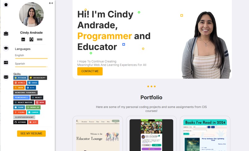
Screenshot of my website

Inspiration
During the "Building a unique portfolio part 1" event, I received very helpful feedback on how to improve my site. Ryan, the workshop's host, provided detailed suggestions with reasons behind those suggestions on how to improve the site including:
- bringing the two sidebar elements to the left side of my site
- adding a border to the project item elements to distinguish one project from another
- rounding out corners for softer designs
- adjusting the width of text to the optimal <80 characters line and more. I really appreciate the feedback that inspired this redesign, thank you!
What it does
My portfolio website showcases who I am, my experiences, projects, and technical skills.
Challenges we ran into
I built off my existing github.io website and went through the suggestions one by one. Going outside of the suggestions, I really wanted to add the functionality to filter out relevant work experiences in case there are people who are looking for specific items. My main challenge was refactoring a function I used in a past project to make it work for my current information. I wasn't sure how to organize my work data and ended up going through a couple of iterations of data organization before I landed on my desired one. For example, I decided to include relevant links at the end of the responsibilities instead of within the text.
Accomplishments that we're proud of
I'm proud of the way I rearranged the navbar to the left of the info bar because I took it a step further and added the functionality to hide my info bar with a css transition. It's my start to animating things on websites.
What we learned
I learned a lot about how to clean up websites and design rules to make them more aesthetically pleasing to our eyes.
What's next for Update Portfolio Website
I'm going to continue working on my portfolio website to add more functionality throughout it.

Log in or sign up for Devpost to join the conversation.