INSPIRATION
I've been doing search engine work for a fashion company called Frockhub. I've recently proposed (and pulled off after an 80 hour hell week) a massive overhaul on the scraping system as well as bettering the search system in terms of relevance.
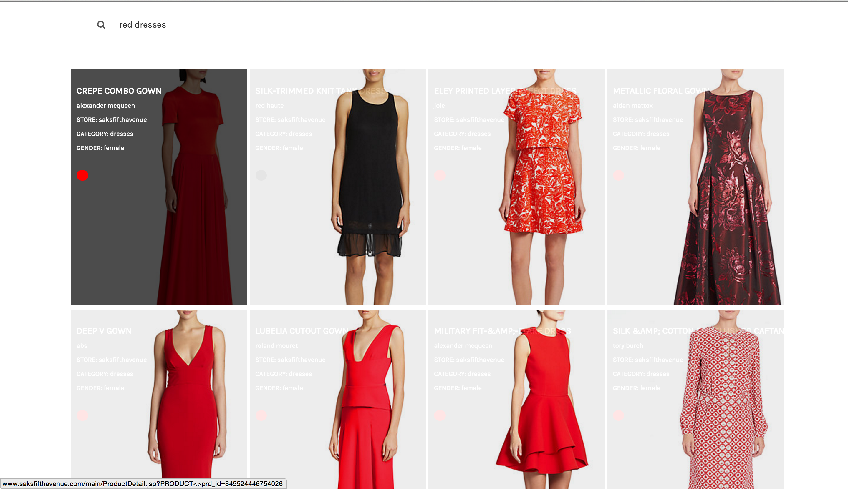
My team needed to show concretely the difference between the old and new data we have collected so my cofounder said "Cris, throw a flask app up on Digital Ocean so we can show them."
I approach learning things as "building a better cookie cutter" so I used this as an opportunity to try out my new UI Design axioms.
FEATURES
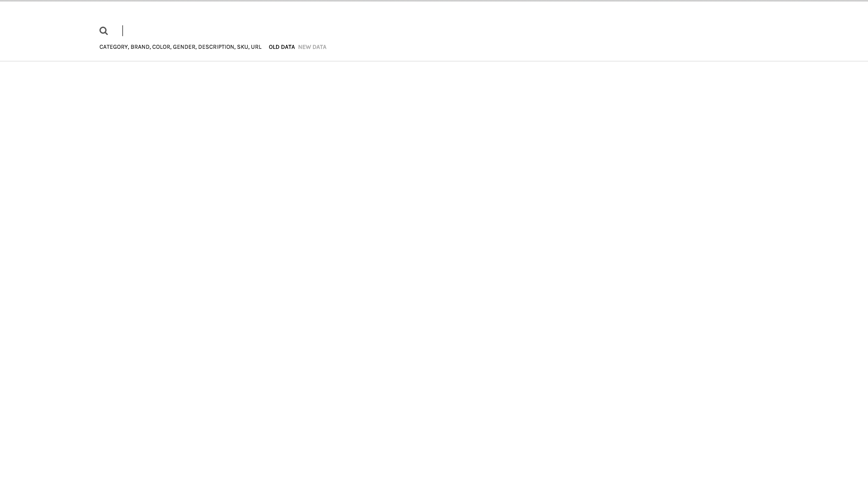
It's purposefully ultra-minimalistic. I didn't like the look of a textbox disrupting the nice minimal white background so I hid it. Then I said "Wait, this will effect usability..." so I wrote a few lines of Javascript which directed any click into the bigger div (it's a large area) containing the search bar to the text box. Then I said "Wait, why not have it so if I mouse over the div it focuses the textbox for you?" I ultimately did that, that's something I'm going to use in future projects for sure.
The "OLD DATA" and "NEW DATA" buttons are radio buttons that auto-hide with the search notes.


Log in or sign up for Devpost to join the conversation.