-
-
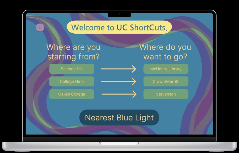
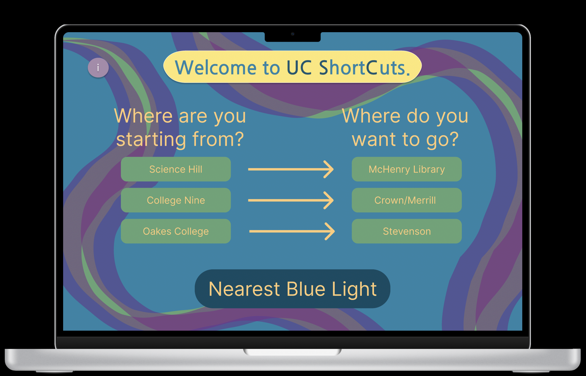
The home screen
-
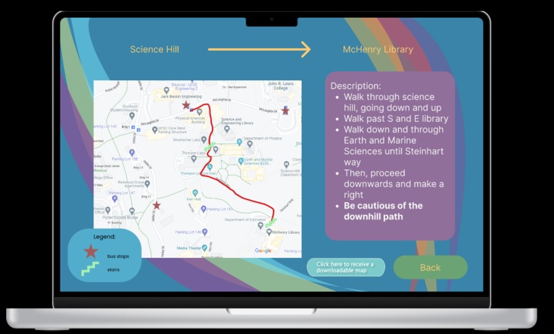
One of the recommended routes
-
The various locations for blue lights
-
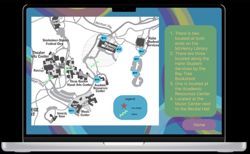
Map of the blue lights


Inspiration
Our inspiration for the project was based on our own experiences traversing the campus here at UCSC. When arriving a couple of months ago, we were aware that there were several paths and shortcuts but it took us a while to find them. Google Maps was not very helpful either: asking it for directions from RCC to College 9 directs the user to walk on Heller Drive, which isn’t very safe. Also, we were concerned about safety on campus, namely, the emergency blue lights scattered throughout the campus. Although they can be seen once in a while, it would be difficult to immediately find one in case of an emergency. We wanted to highlight the locations of the emergency blue light as a part of our project. Our ideas that we thought of but didn’t make the final project include a sunset warning, stair and steep hill warnings, and even some sort of reward system for walking.
What it does
The home page of our website starts out by asking the user two questions: 1) Where are you currently? 2) Where are you planning to go?
There are 3 different paths - each of which leads to a detailed path on another page.
The path includes:
- a picture of google maps along with a route we have chosen.
- the different bus stops and the buses that pass through that stop.
- a detailed description with landmarks so that our users don't get lost
- sometimes looking at a map is hard (as someone who is directionally challenged!).
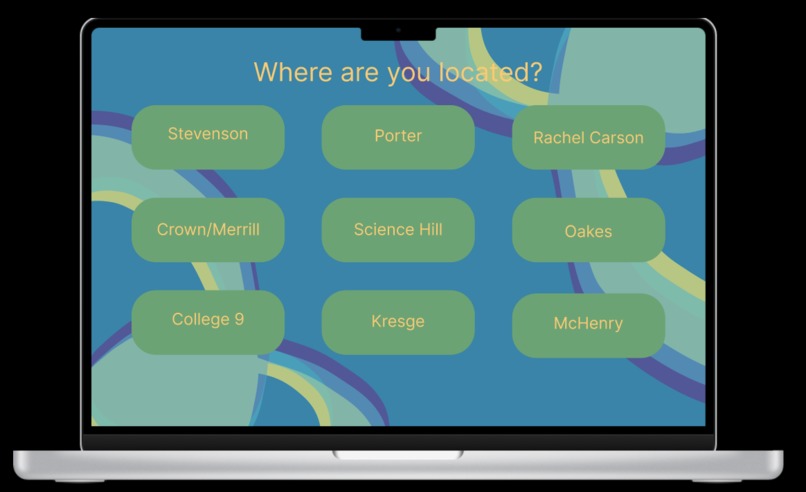
On the home page, there is also a button regarding the blue lights: Clicking that button leads the user to a page asking where the user is closest to (has all 10 colleges plus McHenry). When the user selects their location, it takes them to a page that has a picture of the nearest blue lights.
How we built it
We built the project mainly using Figma to create the design and pathways of our website. We then used siter.io to create the website itself. The process was pretty intuitive, and because of Figma, it was easy to create the pathways for each route. It was also easy to get user input to show them their closest blue light based on their location. We were able to create a design for each one of our pages as well.
Challenges we ran into
Our challenges include trying to get Twilio, a messaging API to work within our project. The goal was to get downloadable maps sent to them through text, and for people to be able to rate the maps. This would make our website much more interactive as well as gain credibility through the reviews. However, we had difficulties implementing it within our project as we had to pay for the full functionality. However, we did get to test Twilio a bit and we’ll include that screenshot in our GitHub repository. Our other challenges included using Domain.com to create a domain for our website. Again, it kept asking us to pay and wouldn’t process the payment. We also struggled at step 1 of the project, which was coming up with an idea. We all had multiple ideas for many different categories and it was difficult coming up with an idea that would both challenge us and also be possible within our skill sets (2 of us are freshmen taking our second-ever cs class at UCSC). The categories (sustainability, fintech, health, and social justice) were also quite broad and it was hard to decide which one to base our project around.
Accomplishments that we're proud of
We're proud of learning wireframing on Figma and developing an idea into a full-blown project.
What we learned
Learned wireframing on Figma and other platforms, such as Domains.com and Twilio.
What's next for UC Short Cuts
Add more shortcuts and functionality to be more useful to students.


Log in or sign up for Devpost to join the conversation.