Inspiration
We were inspired by the challenge of analyzing complex network administration data and making it accessible. We wanted to transform complicated, technical network metrics into something the general public could easily understand and benefit from.
What it does
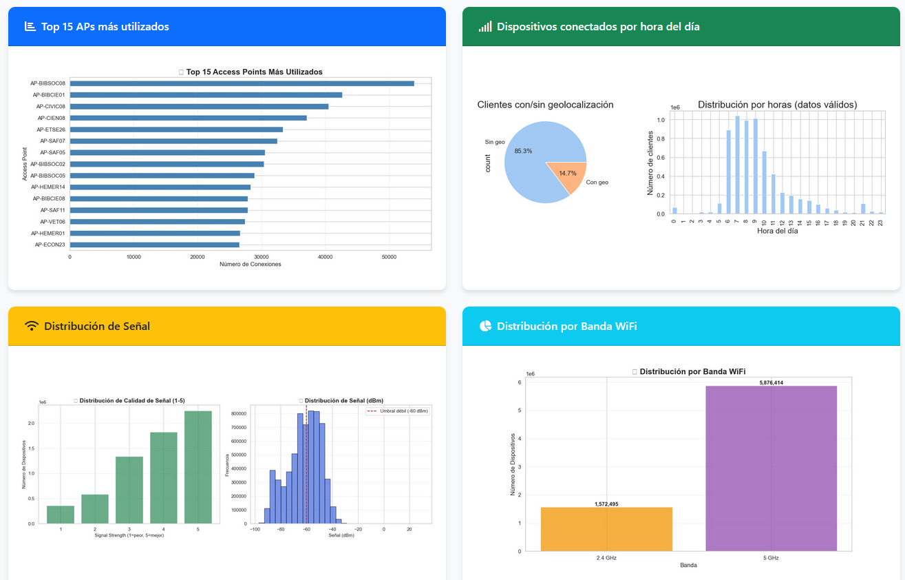
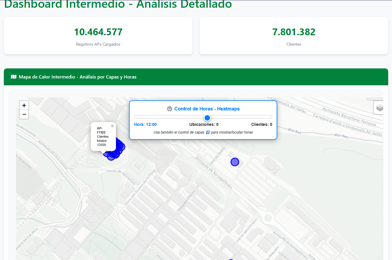
Our web application is an interactive dashboard that displays University network metrics through clear visualizations. It features heatmaps showing WiFi coverage and usage density across campus, along with detailed analysis of access points and client distribution patterns.
How we built it
We built the application using Visual Studio Code as our primary IDE, with Flask serving as the web framework backend. For data processing and analysis, we leveraged Pandas to handle the large WiFi datasets. The frontend combines HTML/CSS/JavaScript with Bootstrap for responsive design, and we integrated Folium for the interactive map visualizations.
Challenges we ran into
We faced significant challenges with map interactivity, particularly with the timed heatmap animations that required precise coordination between frontend and backend. HTML/CSS issues with div containers and buttons not displaying properly caused layout headaches. Our GitHub repository became chaotic with multiple merge conflicts, and we struggled with dependency management across different development environments.
Accomplishments that we're proud of
Despite the technical hurdles, we successfully implemented and deployed the timed heatmap visualization that dynamically shows network usage patterns throughout the day. Creating a functional, multi-page dashboard that actually processes real network data and presents it in an intuitive interface was a major achievement for our team.
What we learned
Through this project, we gained valuable experience in full-stack web development with Flask, data visualization techniques for large datasets, and team collaboration using version control. We learned how to transform raw technical data into user-friendly insights and improved our problem-solving skills when dealing with complex integration challenges between different technologies.
What's next for UAB WiFi Dataset Analysis
We plan to enhance the platform with predictive analytics to forecast network congestion, add real-time monitoring capabilities, and develop mobile-responsive views for on-the-go network management. We're also exploring machine learning integration to automatically detect and alert on network anomalies before they impact users.


Log in or sign up for Devpost to join the conversation.