-
-
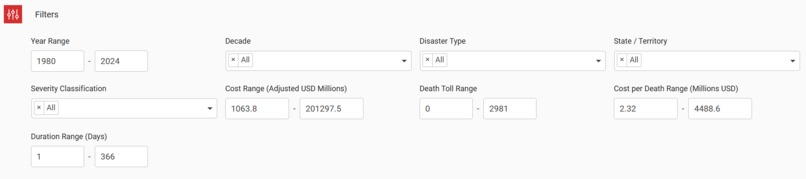
Filter Tab
-
Snippet 2
-
Snippet 1
Inspiration
I was scrolling through news about Hurricane Ian's devastation when I thought: how many billion-dollar disasters actually hit the U.S. each year? The coverage focuses on individual events, but what's the bigger picture?
NOAA has been tracking every major disaster since 1980, but the data sits in separate databases that are hard to navigate. I wanted to see patterns—which states get hit hardest, whether disaster frequency is increasing, how costs have changed over time. But there wasn't a simple way to explore this.
That's when I decided to build it myself. Using Plotly Studio, I could merge NOAA's datasets and create an interactive app where anyone—researchers, policymakers, students, or just curious people—could explore 40+ years of disaster data and understand what's really happening across America.
What it does
U.S. Billion-Dollar Disasters Dashboard lets you explore every disaster that caused over $1 billion in damages since 1980.
Key Features:
- Interactive filtering - Select specific states, years, or disaster types (hurricanes, droughts, floods, wildfires, etc.)
- Geographic visualization - See where disasters cluster across the U.S.
- Trend analysis - Track how disaster frequency and costs have changed over decades
- Instant search - Type any state-year combination (like "Florida 2017") and get immediate disaster summaries
- Comparative insights - Compare disaster impacts across states, time periods, and event types
- Real-time metrics - Total costs, event counts, duration patterns update as you filter
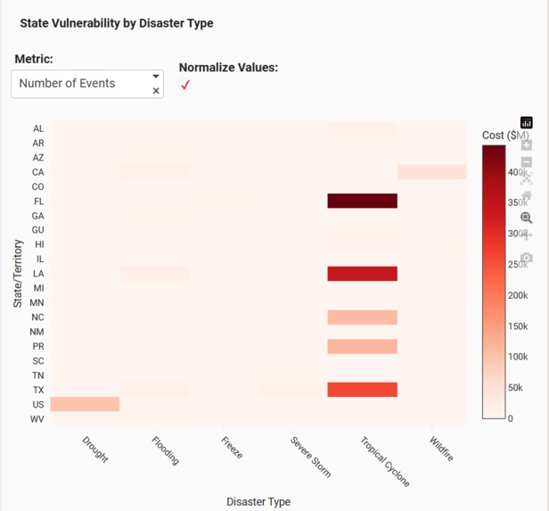
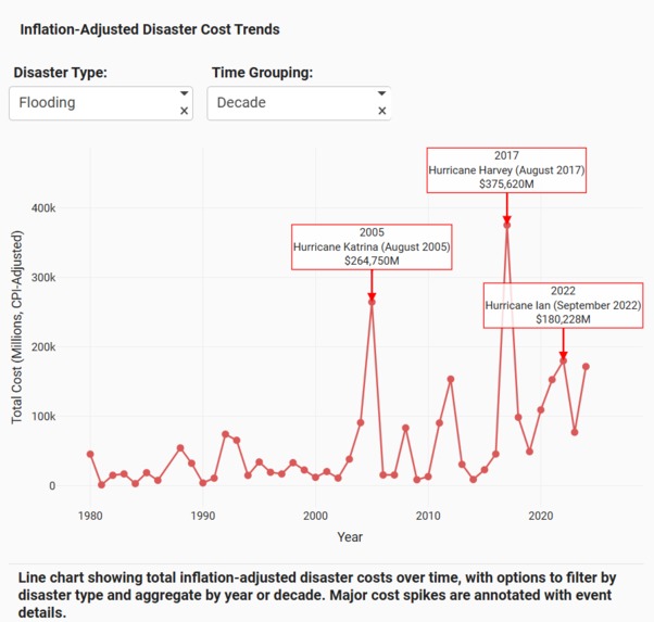
The app reveals patterns you can't see from raw data: the Southeast faces far more billion-dollar disasters than other regions, disaster frequency has nearly tripled since the 1980s, and total economic impact is accelerating.
How I built it with Plotly Studio
Data Sources:
- NOAA National Centers for Environmental Information: https://www.ncei.noaa.gov/
- NOAA Billion-Dollar Weather Events: https://www.ncei.noaa.gov/access/billions/events
The Build Process:
Started with two separate NOAA datasets covering different aspects of billion-dollar disasters. Merged them using Python, handling inconsistencies in state names, date formats, and damage reporting. This created a unified dataset with complete disaster information from 1980-2024.
Used Plotly Studio to build the interactive dashboard, leveraging these features:
- Multiple visualization types - Choropleth maps for geographic distribution, time series for trends, bar charts for comparisons
- Interactive controls - Dropdown filters for state/year/type selection
- Linked visualizations - All charts update together based on user filters
- Custom layouts - Organized cards to guide users through the data story
- Search functionality - Built instant summary feature for state-year queries
Deployed the finished app to Plotly Cloud: https://9053af2d-6108-4597-8ace-ac19407facdc.plotly.app
Challenges I ran into
Dataset Integration: NOAA's two databases had different structures—one used state abbreviations, the other full names. Damage costs were formatted differently. Had to write custom Python scripts to reconcile everything without losing data integrity.
Missing Values: Some disaster records had incomplete information (missing duration, unclear geographic boundaries). Decided to keep records but flag incomplete data rather than estimate values.
Visualization Choices: Tested different chart types before finding the right balance. Heat maps were too cluttered, simple bar charts missed geographic context. Settled on choropleth maps combined with filtered time series.
Performance Optimization: 40+ years of disaster data across all states is substantial. Made the app responsive by implementing smart data loading and efficient filtering logic.
Story Flow: Wanted users to naturally explore from broad patterns (national trends) to specific details (individual disasters). Organized the layout to encourage this exploration path.
Accomplishments I'm proud of
Merged Complex Datasets: Successfully combined two government databases into a single, reliable source. This foundation makes all the analysis possible.
Built with Plotly Studio: Fully leveraged Studio's capabilities—interactive charts, geographic visualizations, real-time filtering, and clean card layouts all working together seamlessly.
Created Exploration Tools: The search feature and filters let users investigate their own questions rather than just viewing static insights.
Revealed Clear Patterns:
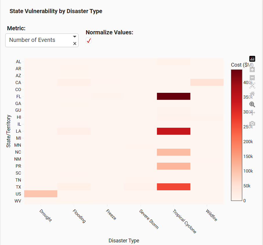
- The Southeast (especially Texas, Louisiana, Florida) faces disproportionate disaster impacts
- Disaster frequency has increased from ~3 per year (1980s) to ~18 per year (2020s)
- Total costs have jumped from billions to hundreds of billions annually
Made Government Data Accessible: Transformed dense NOAA databases into something anyone can understand and explore.
What I learned
Technical Skills:
Plotly Studio's AI-assisted development significantly sped up building complex layouts. The natural language interface let me focus on what I wanted to show rather than syntax details.
Data storytelling requires careful visualization choices—the same data can reveal or hide insights depending on how you present it.
Real-world datasets from government sources need extensive cleaning even when they're official records. Learned practical data validation and reconciliation techniques.
Domain Insights:
The billion-dollar disaster threshold (adjusted for inflation) helps track genuinely significant events, but even this high bar is being hit more frequently.
Climate patterns clearly affect disaster distribution—coastal states face hurricanes, Western states face droughts and wildfires, Midwest faces severe storms.
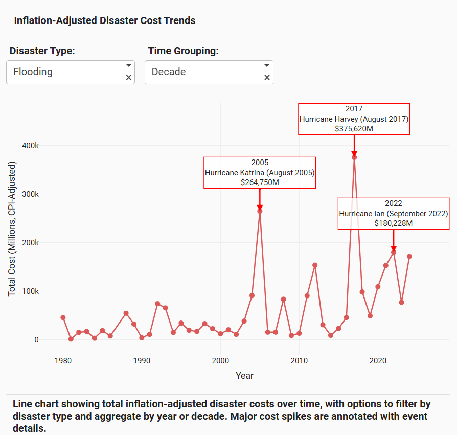
Economic impacts aren't just about event frequency—individual catastrophic events (like Hurricane Katrina or Hurricane Harvey) can skew entire years.
What's next
Phase 1: Real-Time Updates Connect to NOAA APIs for automatic data updates as new disasters are recorded. Keep the dashboard current without manual updates.
Phase 2: Predictive Analytics Use historical patterns to show disaster risk probabilities for different regions. Not forecasting specific events, but highlighting areas of elevated risk.
Phase 3: County-Level Detail Break down state data to county level for more precise geographic analysis. Show exactly which counties face highest disaster frequency.
Phase 4: Custom Reports Add downloadable report generation for specific queries. Let researchers, policymakers, or insurance analysts export customized data summaries.
Phase 5: Comparative Analysis Build side-by-side comparison tools for multiple states or time periods. Enable direct "what if" scenario exploration.
Long-term Vision: Make this the go-to resource for understanding U.S. disaster patterns. Whether you're a climate researcher, emergency management planner, policy analyst, or concerned citizen, this should be your first stop for billion-dollar disaster insights.
Why This Matters
Climate change is intensifying extreme weather. Understanding where disasters happen, how often, and their economic impact isn't just academic—it's crucial for:
- Emergency preparedness - Allocating resources where they're needed most
- Policy decisions - Targeting climate adaptation investments
- Insurance planning - Assessing risk and setting appropriate coverage
- Public awareness - Helping people understand their regional risks
This dashboard won't prevent disasters, but it makes 40+ years of critical data accessible to everyone who needs it.
Try It Out
Live Dashboard: https://9053af2d-6108-4597-8ace-ac19407facdc.plotly.app
How to explore:
- Use the filters to select specific states, years, or disaster types
- Watch all visualizations update in real-time
- Try the search feature - type "Texas 2021" or any state-year combo
- Explore the geographic map to see disaster hotspots
- Check the trend charts to see how patterns have changed over time


Log in or sign up for Devpost to join the conversation.