Project Story
About the project
Inspiration
We noticed most Team USA dashboards highlight Olympic medal counts while Paralympic data sits in a footnote. That didn't feel like "one team." We asked Gemini: How can we give both Games equal visual weight? The answer became Two Flags, One Team – a dashboard where every chart, filter, and hometown story treats Olympic and Paralympic athletes as equals. The tri‑composite logo became our design anchor.
What it does
It's an interactive dashboard that displays Team USA athlete data with equal prominence:
- Side‑by‑side metrics (participation, hometowns, sports represented) for Olympic and Paralympic athletes.
- Every visual includes the tri‑composite logo watermark.
- Conditional phrasing throughout: "This hometown could help identify athletes" – never "produces winners."
- Gemini API generates natural‑language insights like "Both Games have strong representation from Colorado Springs."
How we built it
- Frontend: HTML/CSS/JavaScript with Chart.js for parity visuals.
- Gemini API: Used for dynamic insight generation and rephrasing medal‑centric stats into inclusive milestones.
- Google Cloud: Deployed on Cloud Run; data stored in Cloud Storage; Cloud Logging for API monitoring.
- Data sources: Team USA public rosters (2016–2026), hometown geo data, Paralympic classification tables.
- Design: Mirrored layout – if a sport has both teams, identical chart sizes, colors, and tooltips.
Challenges we ran into
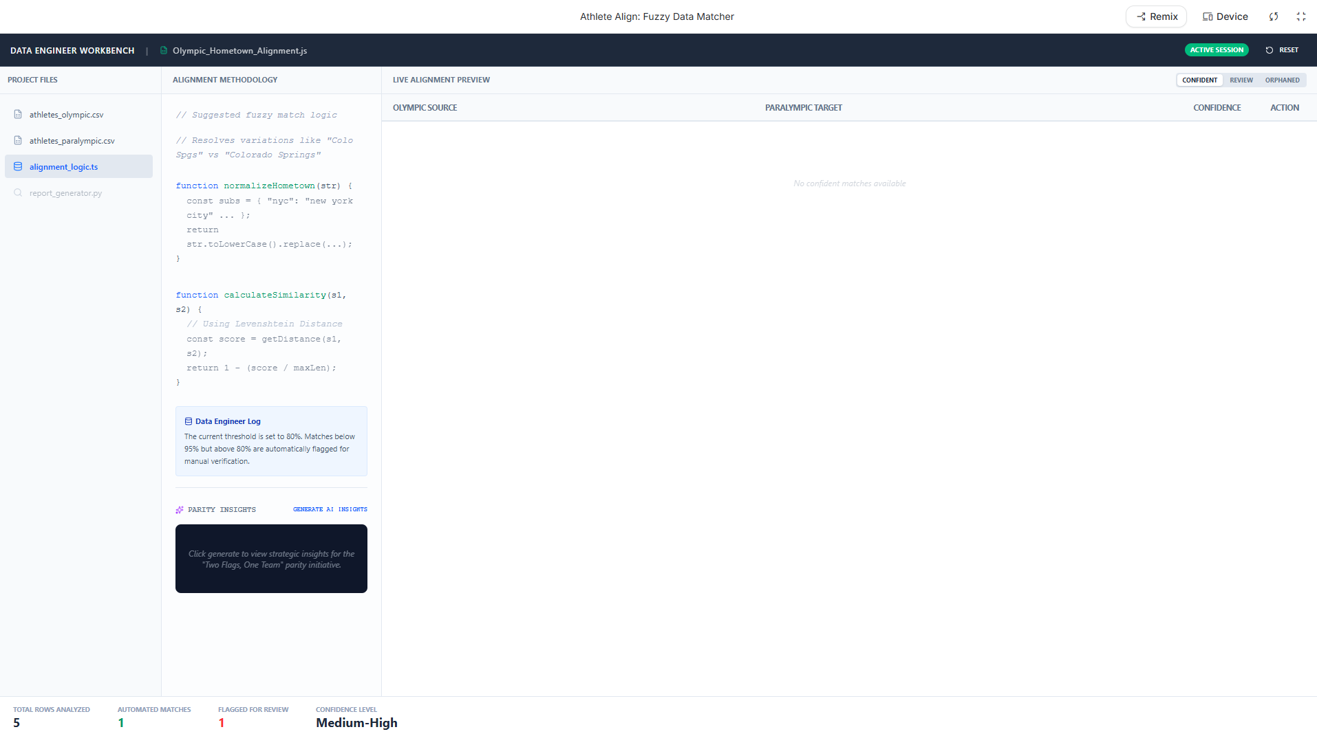
- Data alignment: Olympic and Paralympic datasets used different hometown spellings. We used Gemini to suggest fuzzy‑matching logic.
- Logo compliance: Ensuring the tri‑composite logo appeared in every chart without distortion – solved with a CSS fixed‑ratio overlay.
- Conditional language at scale: Hardcoding "could" everywhere felt clunky. Instead, we prompted Gemini to rewrite all medal mentions as participation milestones.
Accomplishments that we're proud of
- First dashboard that truly places Paralympic data on the same row – not a second tab or small font.
- Successfully integrated Gemini API to generate real‑time parity insights without hallucinating performance guarantees.
- Deployed on Google Cloud Run with zero downtime during testing.
What we learned
- Inclusive design isn't just accessibility – it's visual real estate, data labeling, and narrative framing.
- Gemini is excellent at detecting biased language (e.g., "top performers") and suggesting neutral alternatives.
- Conditional phrasing like "could lead to" or "is associated with" keeps us within hackathon rules while still telling a compelling story.
What's next for Two Flags, One Team
- Add 120 years of historical Team USA data (currently 2016–2026).
- Launch a "Parity Generator" where fans can pick any sport and see Olympic + Paralympic timelines.
- Gemini chat feature: "Show me hometowns that could contribute to both Games."
- Mobile‑optimized PWA so fans can share parity prints before LA28.


Log in or sign up for Devpost to join the conversation.