-
-

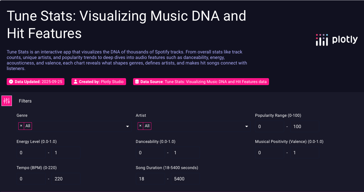
The Tune Stats dashboard: A powerful and intuitive interface for filtering and exploring the DNA of your favorite music.
Inspiration
I've always been fascinated by what makes a song a hit. Is there a hidden formula? Why do certain genres feel a certain way? This curiosity inspired me to create Tune Stats, a tool designed to explore the very "DNA" of music and find the data behind the feeling. I wanted to build an app that was not just a dashboard, but an interactive microscope for sound, allowing anyone to visualize the patterns that define their favorite artists and genres.
What it does
Tune Stats is an interactive data app that visualizes the DNA of thousands of Spotify tracks. It allows users to:
- Explore the relationships between audio features (like danceability, energy, and valence) and a song's popularity.
- Compare the "sonic fingerprints" of different genres with a dynamic heatmap.
- Analyze the unique signature style of any artist with a detailed radar chart.
- Discover trends and distributions with a collection of unique charts, including ridgeline plots and box plots.
- Filter the entire dataset by genre, artist, popularity, and a variety of audio features to answer their own musical questions.
How we built it
This entire application was built using the powerful new Plotly Studio. My process was iterative and focused on creating a professional, insightful user experience. I started by providing detailed, user-focused prompts to the AI to generate the app's structure and charts. I then curated the best and most unique visualizations, such as the Heatmap, Radar Chart, and Ridgeline Plot, to tell a multi-layered story. Finally, I continuously refined the app's design, from improving the color palette to ensuring every chart had a clear title and purpose.
Challenges we ran into
Working with a brand-new, powerful platform like Plotly Studio was an exciting and demanding experience. I encountered several real-world challenges that required deep debugging and creative problem-solving.
Initially, a series of stubborn bugs plagued the app. The "Unique Artists" KPI card repeatedly failed, and I discovered a UI bug where prompts from one chart would get copied to another during generation. The entire app layout also became "stuck" at one point, and I had to fix this by manually editing the layout section to force the platform to refresh.
Instead of getting stuck, I made a strategic decision to simplify and stabilize. I removed the buggy metrics and focused on perfecting the components that were working flawlessly. This taught me a valuable lesson: prioritizing a stable, polished user experience over a single, problematic feature is crucial.
Also when I made changes through a prompt after hitting "Remix" , other parts of that chart would change unexpectedly and disrupt the chart.
Accomplishments that we're proud of
- Building a Polished, Feature-Rich App: I'm proud of creating a fully functional, visually stunning, and analytically deep application entirely within the Plotly Studio environment in a short amount of time.
- Implementing Sophisticated Visualizations: I successfully implemented a wide range of advanced and unique visualizations, like the Ridgeline Plot and interactive Radar Chart, which go far beyond a standard dashboard.
- Overcoming Technical Hurdles: Most of all, I'm proud of my resilience. Facing significant platform bugs could have derailed the project, but I systematically debugged the issues, found creative workarounds, and made strategic decisions to deliver a stable and professional final product.
What we learned
This hackathon was an incredible learning experience that went far beyond just building charts. I learned how to guide a generative AI to build a complex application and how to debug the issues that arise. I learned the importance of creative workarounds, like manually editing the layout code to "force the state" when the UI wouldn't update. Most importantly, I learned that a great data app is more than just a collection of charts—it's a curated narrative, and the process of overcoming technical hurdles to deliver a stable, beautiful, and insightful final product was the most rewarding part.
What's next for TuneStats
The potential for TuneStats is huge. The next steps would be to:
- Integrate a Predictive Model: Build a machine learning feature that could predict a new song's potential popularity score based on its audio features.
- Personalize the Experience: Allow users to connect their own Spotify accounts to analyze their personal listening history and discover the "DNA" of their own favorite playlists.
- Expand the Dataset: Incorporate data from other sources, like Billboard charts or music review sites, to add dimensions for commercial success and critical acclaim.


Log in or sign up for Devpost to join the conversation.