-
-
-

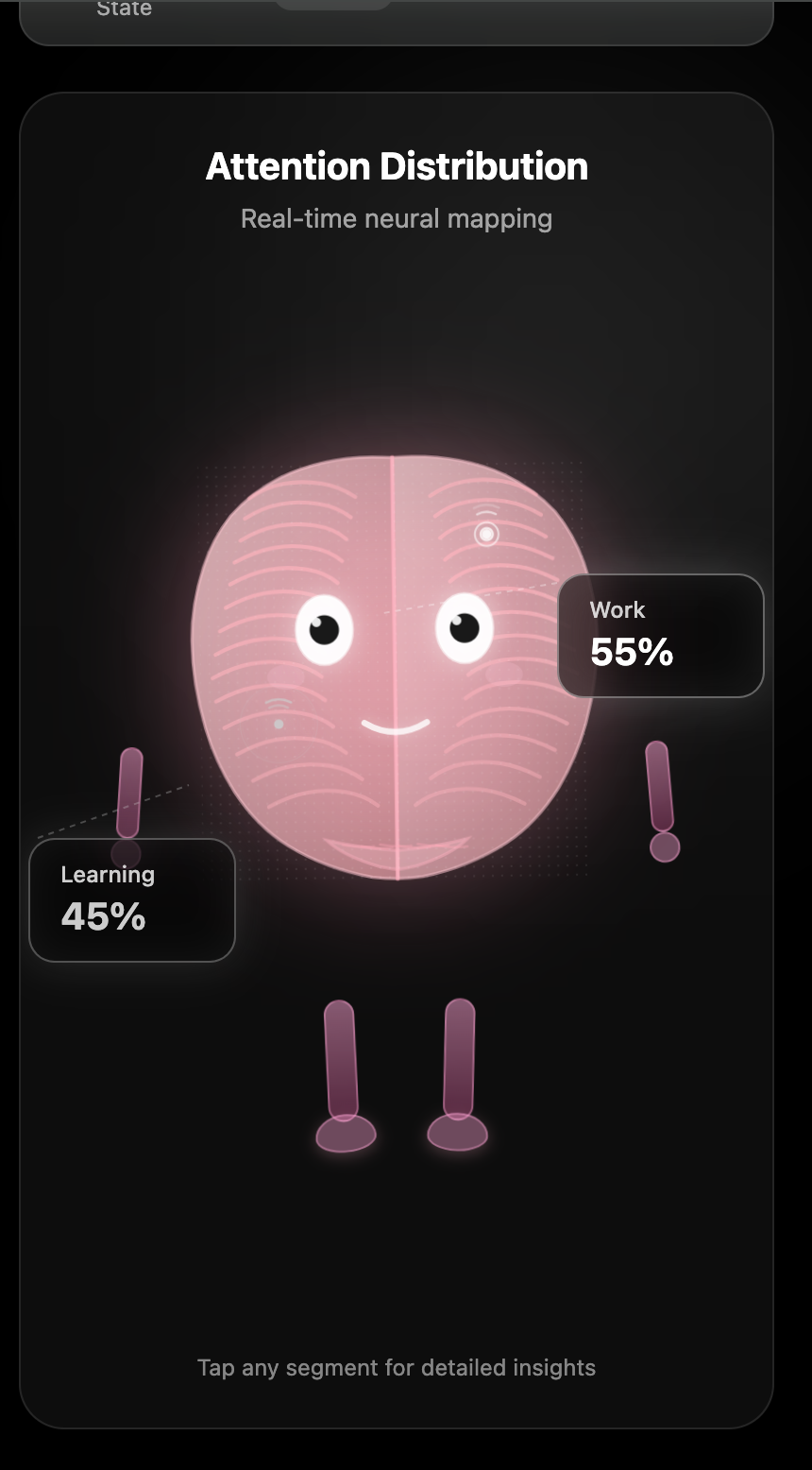
Healthy state of the brain
-
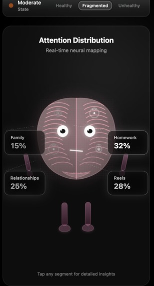
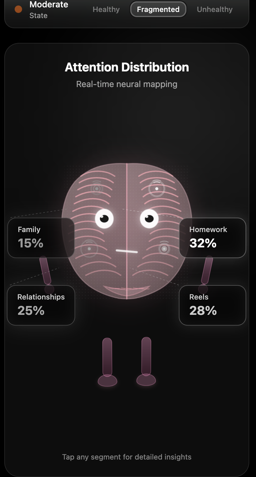
Fragmented state of the brain
-
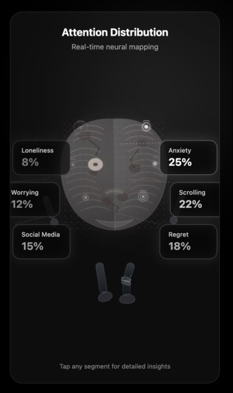
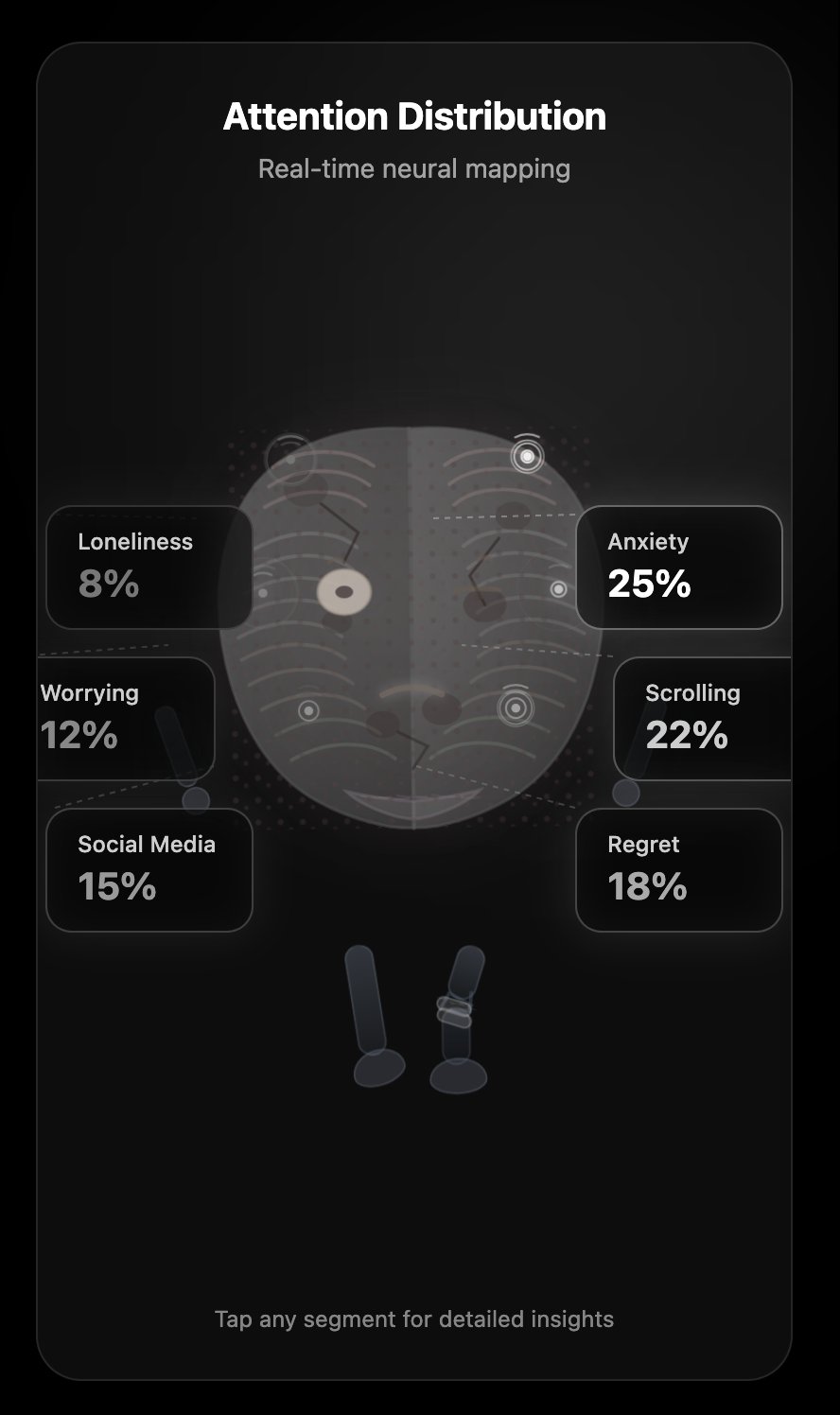
Unhealthy state of the brain
-

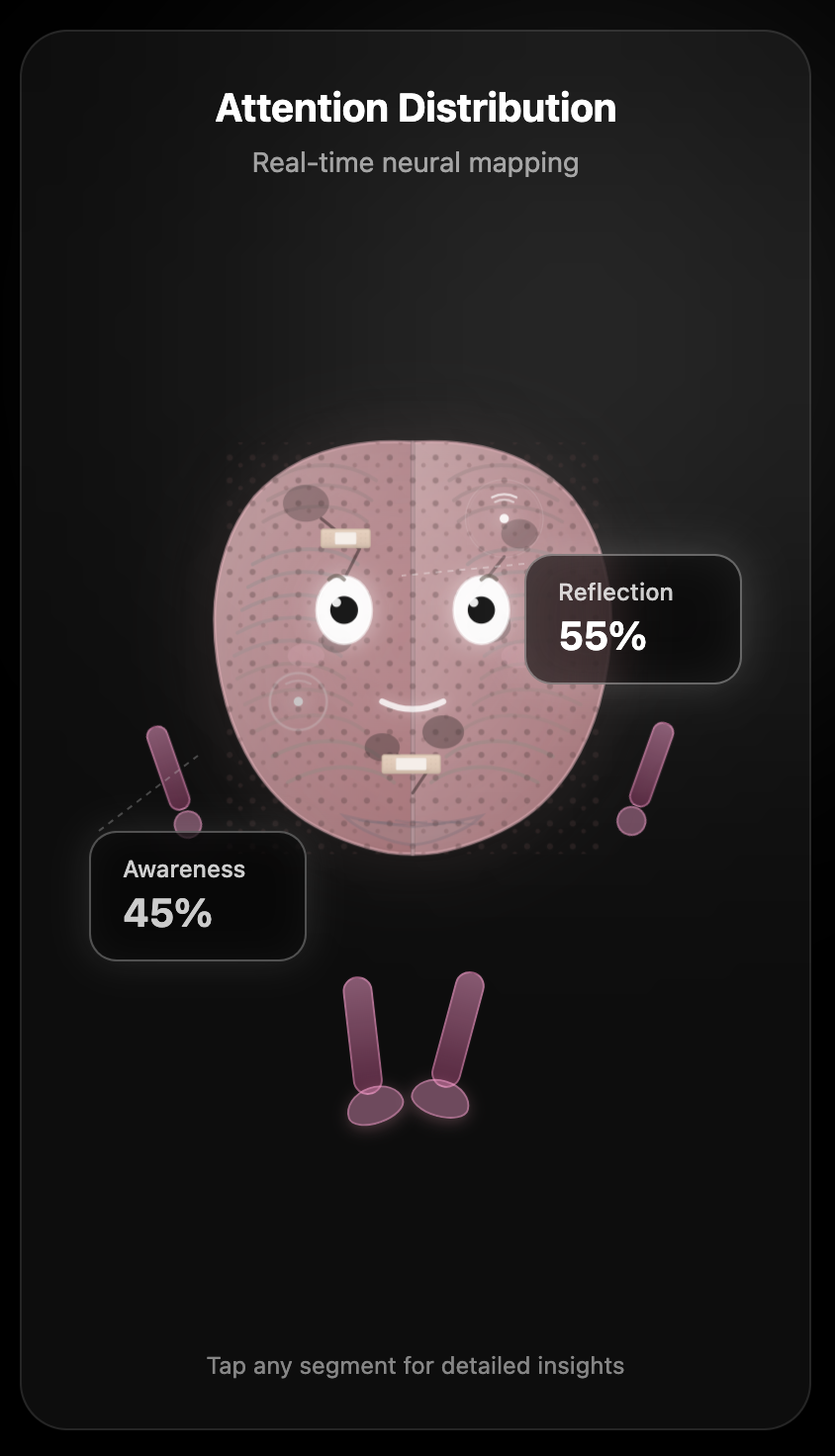
Repaired brain after Reflective Mode
-

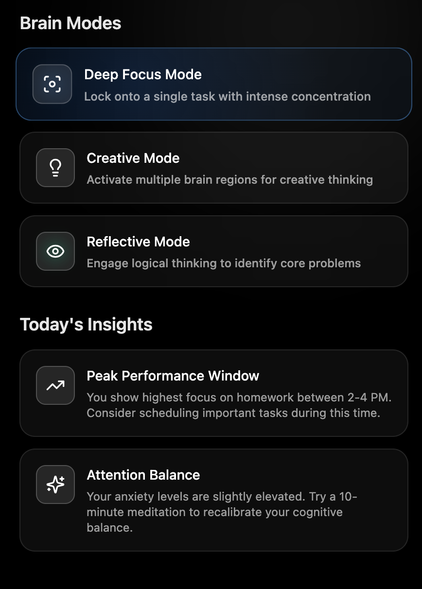
Brain modes and daily insights
Inspiration
Honestly, this project started from personal frustration - a problem that we struggled with and that we live in our everyday life.
I noticed I couldn't sit through a 10 minute video without picking up my phone. I'd open a book and re-read the same paragraph three times. I'd start working on some important project and somehow end up doom scrolling 45 minutes later with no memory of how I got there. And the worst part? I didn't even realize it was happening until it already had.
I'm not alone in this. The average human attention span has dropped from 12 seconds in 2000 to around 8 seconds today, which shorter than a goldfish. A Microsoft study found that 77% of people ages 18–35 report their attention deteriorates significantly when a device is nearby, even if it's face-down. TikTok's own internal research showed that the average session length for teenagers is now under 90 seconds per video, with users needing progressively more stimulation to feel engaged. For Gen Z specifically, studies show they switch between tasks or screens an average of 27 times per hour.
We're not lazy. We're not broken. We're just living in an environment that was engineered against us, and nobody gave us a dashboard to see the damage.
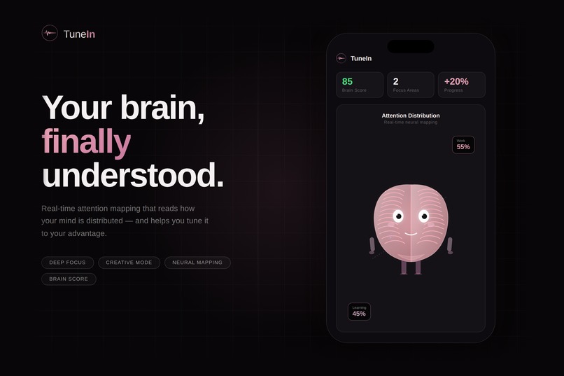
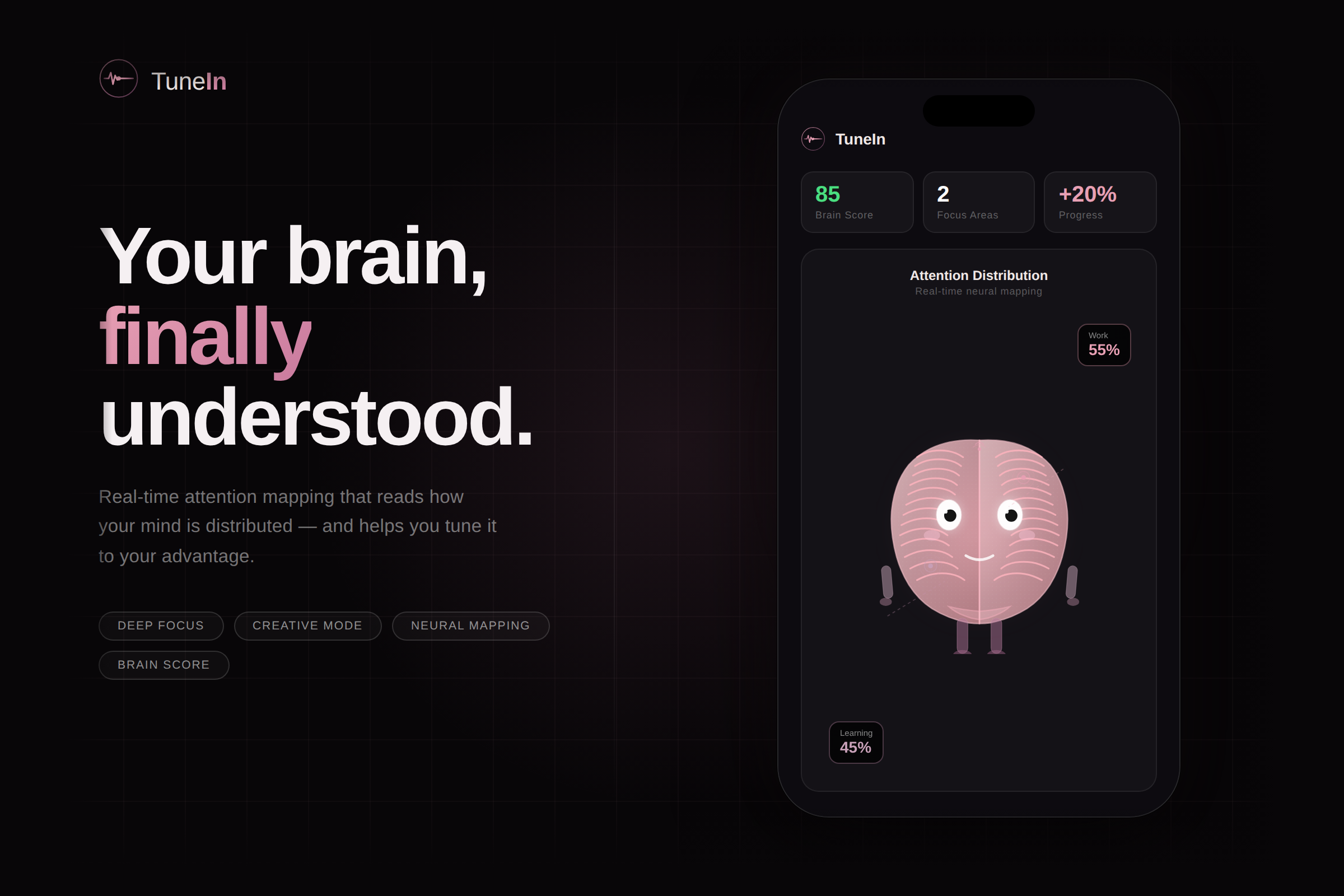
That's what TuneIn is. Not a productivity app. Not another screen time blocker you'll disable in two days. It's the first tool that actually shows you what's happening inside your head in real time, so you can make a choice to shape it, instead of just reacting.
What it does
What if your body could tell you what your brain is actually doing, and gently reshape it? That's the question TuneIn revolved around.
The concept works like this. Your smartwatch continuously reads biometric signals, specifically heart rate variability, galvanic skin response, and pulse patterns. These signals are already known to correlate with cognitive and emotional states. TuneIn takes that raw physiological data and runs it through a neural mapping model that translates it into something you can actually understand and act on.
The result is your Attention Distribution: a real-time picture of where your mental energy is going. Not where you think it's going, where it actually is. The app breaks this down into focus areas like Work, Learning, or Rest, each with a live percentage that updates as your state shifts. It also generates a Brain Score that gives you a single number to understand your overall cognitive health in that moment. But TuneIn isn't just a monitor. It gives you three modes to actively reshape your state:
- Deep Focus locks you into a protected session. You set a topic and a duration, and the app uses gentle biofeedback cues to help you stay anchored to that single thread of thought.
- Creative Mode shifts the experience to support open, divergent thinking rather than locked-in concentration. Different mental tasks need different brain environments, and this mode is designed for the moments when you need to explore rather than execute.
- Reflective Mode is the cool-down. When your brain is running hot or fragmented, this mode guides you into a lower-stimulation state. You can watch the brain character physically recover in real time, which sounds like a small thing but turns out to be genuinely motivating.
Everything runs locally. No cloud, no accounts, no data leaving your device. Sensitive readings are protected behind Face ID so even if someone picks up your phone, your brain data stays yours. And removing your smart watch is an instant kill switch as a safeguard.
How we built it
Before we started the design process, we had to know how it actually feels like to lose your focus? Not what it looks like from the outside. What it feels like from the inside. That led us away from dashboards and charts pretty quickly. Data visualizations are great for analysts. They're not great for someone who's already overwhelmed and scattered. We needed something that communicated your mental state at a glance, without making you do math.
That's where the brain character came from. We wanted a representation of your brain that felt alive and honest. Something that could smile when you're doing well and look genuinely tired when you're not. We went through a lot of iterations on the three health states, healthy, fragmented, and unhealthy, trying to find the right emotional register for each one. Too dramatic and it feels like the app is scolding you. Too subtle and nobody notices the difference. The unhealthy state specifically took the longest to get right because we had to make it feel real without making anyone feel hopeless about themselves.
The color language came early and stayed consistent throughout. The dark background is meant to feel minimalist and not overwhelming, the pink palette comes from the brain, which is supposed to feel soft and hopeful, and those two things together create a feeling that's somewhere between a wellness space and a sci-fi interface. We wanted it to feel like the future, but a warm one.
Typography was Syne for anything display-level and DM Sans for UI text. Syne has this slightly unusual weight distribution that makes headlines feel bold without feeling aggressive, which matched the tone we were going for.
The animation system ended up being one of the most time consuming parts of the design work. The brain character has a full walking cycle, independent arm and leg states, blinking, expressions, and a wake up sequence that plays when you first pair your device. The Reflective Mode transition, where the brain visibly heals over three seconds, was the last thing we designed and probably the thing we're most attached to. It's the moment where the whole idea of the app becomes emotional rather than just functional.
The rest of the interface followed from the character outward. The segment labels, the stat cards, the mode modals, the Face ID gate animation, all of it was designed to feel like it belongs in the same world as that brain.
We also put real thought into what we didn't show. There are no streaks, no leaderboards, no scores that make you feel bad for having a low number.
Challenges we ran into
The hardest design problem was figuring out how to show someone their brain state without making them feel judged by it.
Health data is personal in a way that step counts and sleep scores aren't. When you're telling someone their brain is fragmented or unhealthy, you're saying something about how they feel inside, not just how they performed. Early versions of the visual design were too harsh about this. The unhealthy state looked almost grotesque, and when we sat with it for a while it just felt mean. We had to find a way to make it honest without making it cruel, which took a lot of back and forth before we landed on something that felt right.
The brain character itself was deceptively difficult. It looks simple, a round pink brain with eyes and legs, but getting it to communicate three distinct emotional states through posture, color, expression, and movement took way more attempts than we expected. The fragmented state was the trickiest because it sits in the middle. It needed to feel noticeably different from healthy without sliding into the territory of the unhealthy state.
We also struggled with information density on the main screen. There's a lot happening: the character, the attention segments with their labels and connecting lines, the stat cards, the mode buttons. Getting all of that to feel calm and readable rather than overwhelming required a lot of restraint. The instinct when you're designing something with this much functionality is to show everything. The actual work was figuring out what to hide.
Accomplishments that we're proud of
The Reflective Mode transition is probably the thing we feel best about. It's a three second animation where the brain goes from its unhealthy state back to healthy. The color shifts from gray back to pink, the broken leg repairs itself, the frown becomes a smile, the cracks are repaired with bandages, and the whole character sort of wakes back up. It's quiet and it's small but it's the most emotionally loaded moment in the whole app. That one animation does more to communicate what TuneIn is actually about than any copy or feature list could.
We're also proud of how consistent the visual language stayed from the first sketch to the final screens. The dark background, the pink palette, the typography pairing, the way blur and transparency create depth without adding noise. It all holds together as a single coherent world. That kind of consistency is harder to achieve than it looks, especially when you're moving fast.
And honestly, we're proud of the brand itself. The logo, the images, the thumbnails, everything extends the same aesthetic in a way that feels intentional. TuneIn looked like a real product and not only a hackathon project, and that mattered to us.
What we learned
We learned that character design and UI design are actually the same problem approached from different angles. Both are asking: what does this thing need to communicate, and what's the simplest way to do that? The brain character taught us a lot about restraint in the interface, and the interface taught us a lot about clarity in the character. They ended up making each other better.
We also learned that the emotional tone of a design is set way before you choose a color or a font. It starts with the question you decide to answer. We asked "what does it feel like to lose your focus" instead of "how do we display biometric data" and that single framing decision shaped everything downstream. The warmth in the design, the character, the lack of punishing metrics, all of it traces back to that original question.
The last thing, and maybe the most obvious in hindsight, is that designing something about attention forces you to pay attention. To every pixel, every transition, every word. We caught ourselves going back to tiny details over and over, not because they were broken but because they weren't quite right yet. TuneIn is an app about caring about your brain, and somewhere along the way that started to show up in how carefully we made it.
What's next for TuneIn
The full version of what we're imagining doesn't quite exist yet because the hardware to support it is still catching up. But it's catching up fast, and that's what makes this exciting rather than discouraging.
Right now, consumer wearables give us heart rate variability, galvanic skin response, and pulse. That's already enough to paint a rough picture of your cognitive state. But the next generation of devices is going to go much further. Companies like Neurosity and Muse are actively researching non-invasive EEG integration into everyday wearables, and both Apple and Meta have filed patents for glasses that detect neurological signals passively as you go about your day. When that hardware exists, TuneIn becomes something categorically different. Instead of inferring your attention state from your pulse, we can read it directly.
A hundred years ago, strapping a device to your wrist to monitor your heart seemed absurd. Fifty years ago, carrying a computer in your pocket seemed absurd. The gap between absurd and obvious keeps shrinking. Knowing what your brain is doing in real time is going to feel completely normal to the generation after ours. We just want to be the ones who figured out what that should look like.
Built With
- davinciresolve
- figma
- figmamake
- figmaslides


Log in or sign up for Devpost to join the conversation.