-
-

First Screen
-

-

-

-
-




Inspiration
Every digital bank shows you the same fixed set of screens no matter what you actually asked. You want to know if you're overspending, and you get a static "Resumen" tab built for the average user, not for your question. We wanted to invert that: instead of forcing your situation into a dashboard someone designed in advance, the agent designs the dashboard around your situation — every time, from scratch, with your real numbers.
The hackathon's constraints (LLM at the center, MCP for data/actions, A2UI for a generative interface) matched that idea almost exactly, so we scoped it to something a bank actually owns responsibility for: credit cards, credit lines, and loan restructuring.
What it does
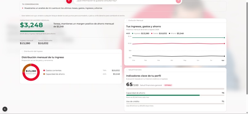
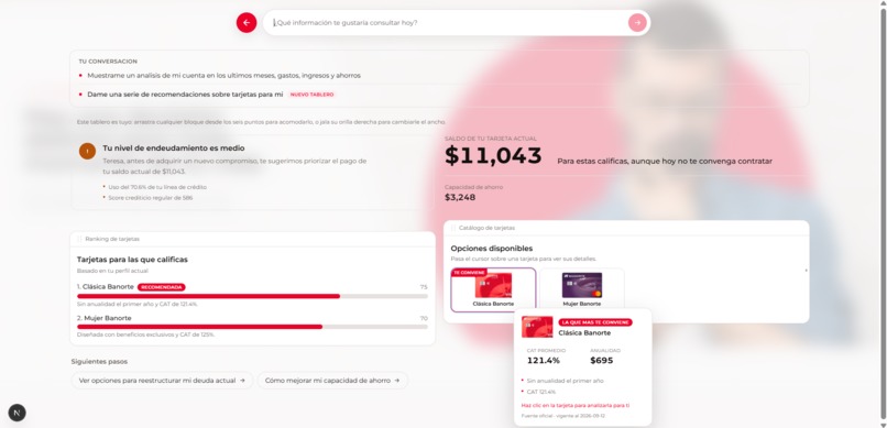
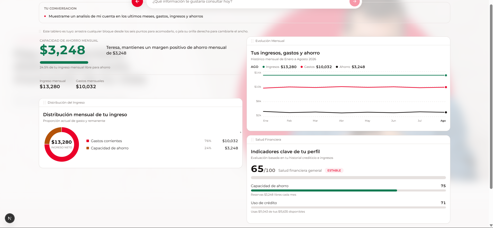
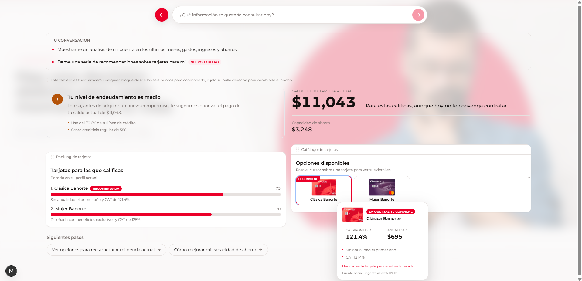
You describe your situation in plain language — "no sé si me conviene reestructurar mi tarjeta" — and Tu rumbo Banorte builds a screen that answers exactly that: a verdict, the real numbers behind it, and the next steps. Click anything on that screen and it becomes a new question that regenerates the board.
How we built it
Each turn runs through a pipeline of two LLM calls instead of one:
- Scope filter (regex, no model call) — greetings and out-of-domain questions get an
OutOfScopeCardfor free. - Context preload — profile, eligible products, and 8-month financial history are fetched from our MCP server in parallel before the model is asked anything.
- Reasoner (Gemini + function calling over MCP tools) decides what is true about the user's situation.
- Planner (a second, separate Gemini call) converts that into an A2UI v0.9.1 message stream — it never sees the tools, it only copies numbers into UI components from an 18-component catalog.
- Validation —
validateA2UI(schema + catalog + required props) andrevisarReglas(visual hierarchy, at least one chart, no walls of text) check the plan; failures bounce back to the model for up to two repairs. - Render — NDJSON, one message per line, applied by a reducer into a live grid of widgets.
Critically, no number the model shows is invented by the model. All domain math lives in the MCP server:
Card ranking starts every product at a base of 55 points and adjusts additively for CAT, annual fee, income headroom, and segment affinity, clipped to $[0, 100]$ — a transparent, debuggable score instead of a black-box recommendation.
Challenges we ran into
- No response schema. Gemini's structured-output schema can't express A2UI's open unions and free-form props, so we could never force valid JSON. The fix was accepting that and building a repair loop instead: validate, tell the model exactly which rule it broke, retry up to twice, and fall back to a safe plan if it still fails.
- Latency. Letting the model request each MCP tool one at a time in series pushed reasoning to ~19s per turn. Preloading profile, simulation, products, and history in parallel before the first model call cut that to ~1.6s.
- Free-tier quota. A single turn burns two-plus Gemini calls. We built a model fallback chain that advances on 429/404 and retries on 503, so a quota hiccup on one model doesn't kill the demo.
- Messy real data. The card catalog's age-requirement column came in thirteen different free-text shapes —
"18 a 69 años 11 meses","18+","Mayor de edad; sujeto a evaluación"— so eligibility needed a small parser instead of a clean field, and it defaults to an open range rather than silently hiding a product the user actually qualified for. - Fairness by construction. A "Mujer Banorte" card should rank higher for women without ever becoming a rejection rule for anyone else. We kept segment affinity strictly additive — it can only help a score, never gate eligibility.
- A last-minute chart bug. Hours before the deadline, the income/savings/expense trend charts looked like flat straight lines. The y-axis was hard-coded to start at zero; since monthly income and expenses are large numbers with small month-to-month swings, that real variation was being compressed into a couple of pixels. The fix was letting money-denominated charts auto-scale to their own data range instead of anchoring at 0, while keeping the zero baseline only where it's semantically meaningful (percentages like credit-line usage).
What we learned
- Splitting "what's true" from "how it looks" into two separate model calls made failures easy to diagnose — when a chart was wrong, we always knew immediately whether it was a bad number or a bad layout, instead of one tangled prompt doing both badly.
- A generative-UI protocol is only trustworthy if the server, not the model, has the last word on both the numbers and the shape of the screen. Catalog validation plus hard business rules turned "usually correct" model output into "always correct" screens.
- Not every visual bug is a data bug. Our flat-line charts had perfectly good, varying data underneath — the defect was purely in how the axis scaled it. It was a good reminder to actually look at the rendered chart, not just print the numbers behind it.
Built With
- apis
- databases
- languages
- localhost

Log in or sign up for Devpost to join the conversation.