-
-
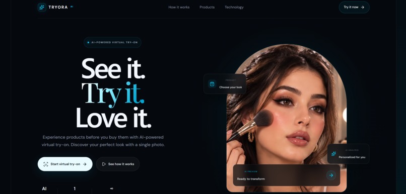
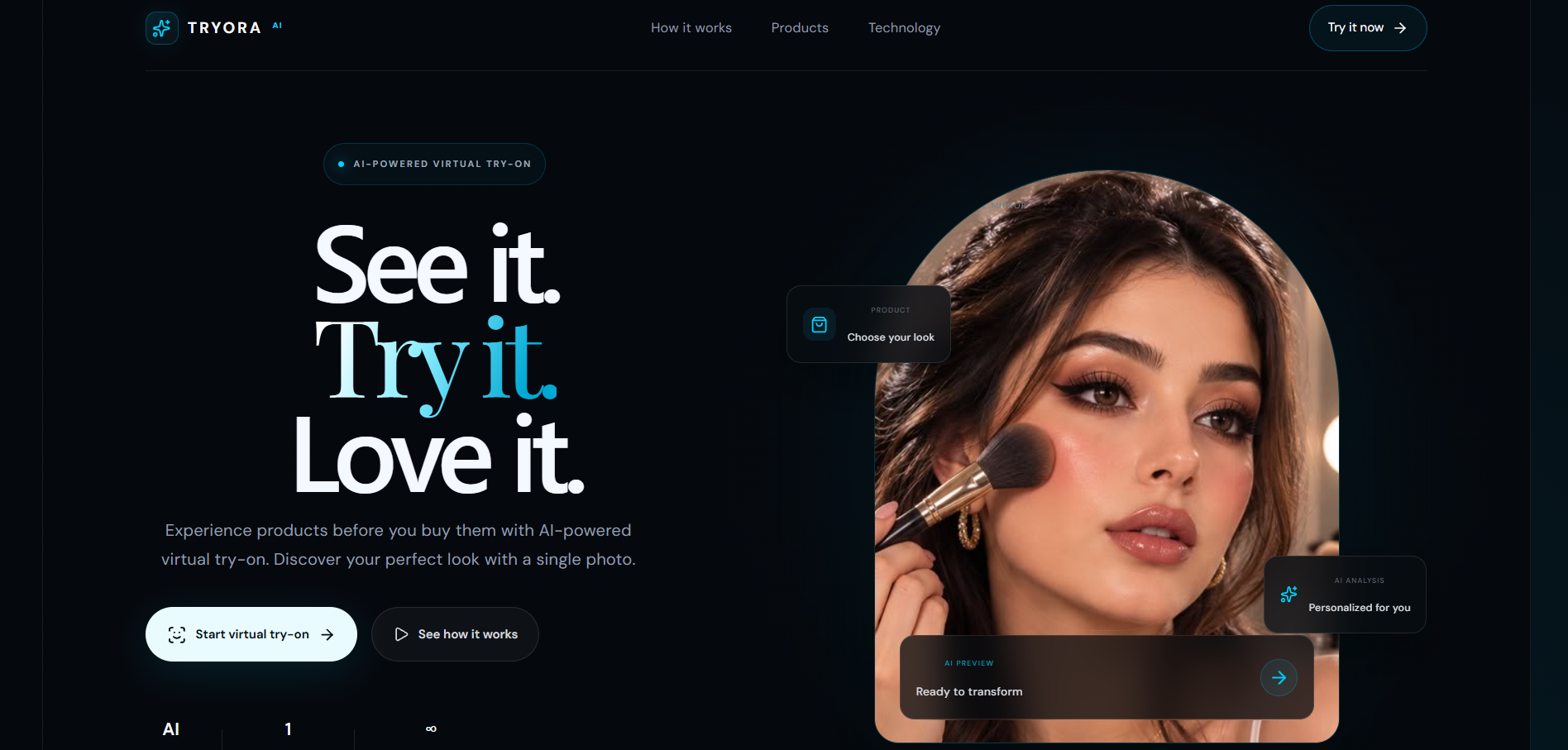
1. Desktop — Dashboard TRYORA AI dashboard showing the virtual makeup try-on experience and product categories in a clean desktop interface.
-
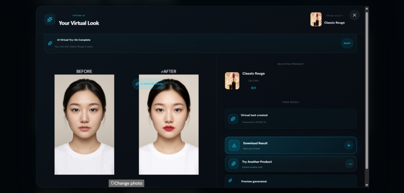
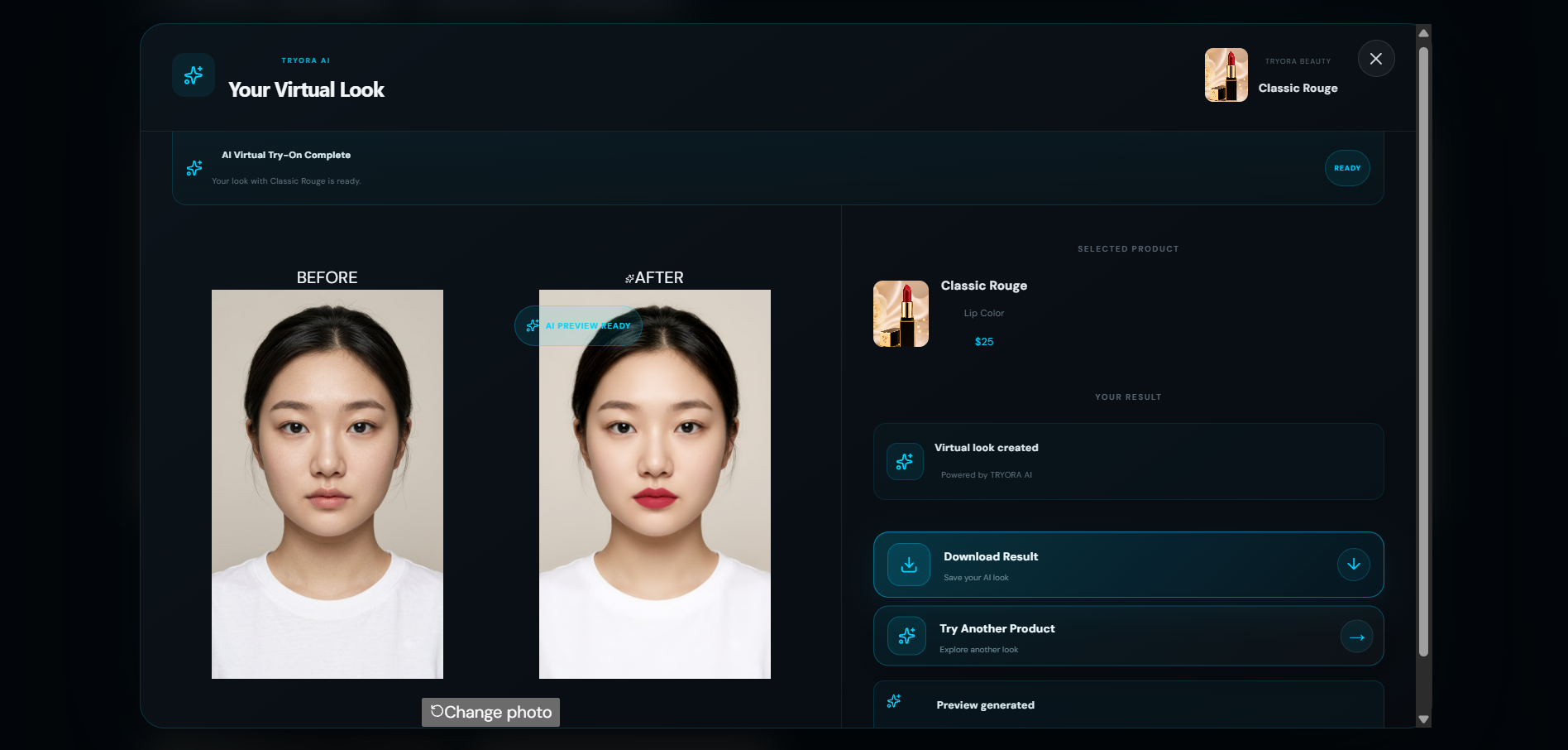
2. Desktop — Before & After Side-by-side before and after comparison showing the result of AI-powered virtual makeup application.
-
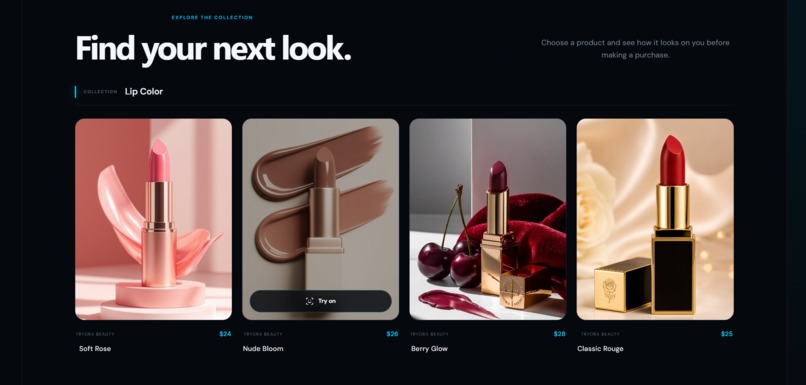
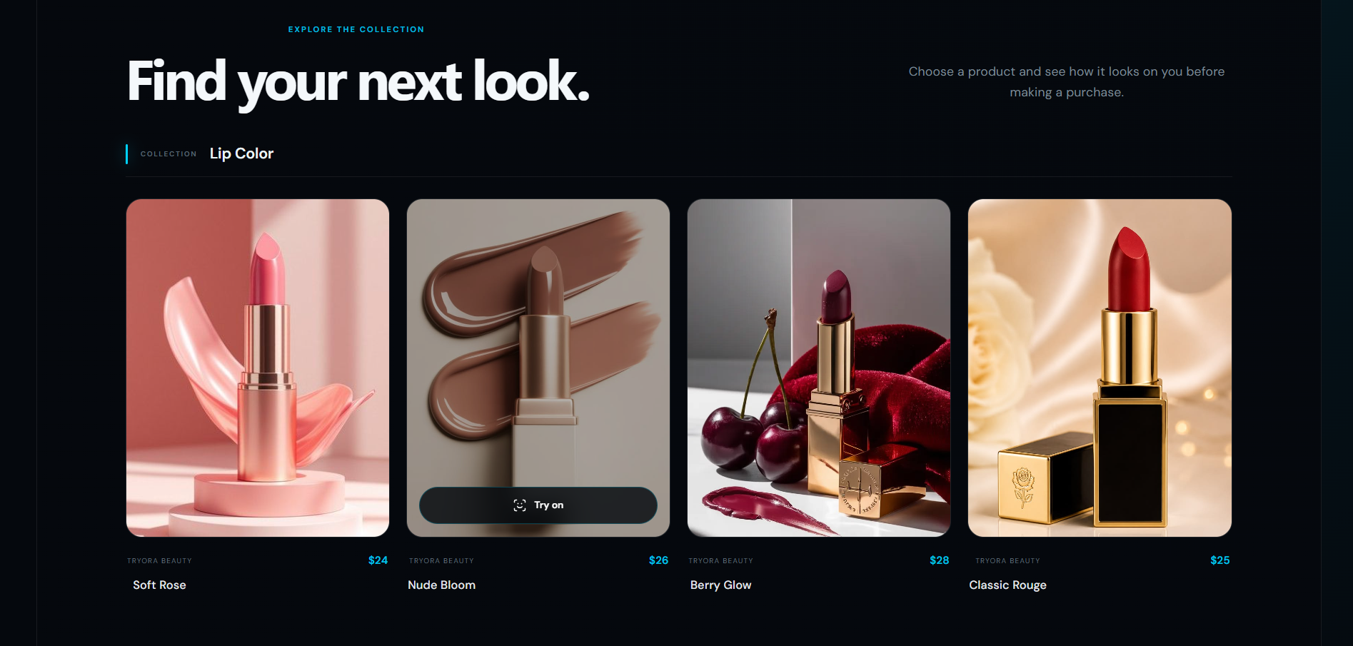
3. Desktop — Product List Makeup product selection interface featuring lip color, blush, and eyeshadow products available for virtual try-on
-
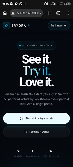
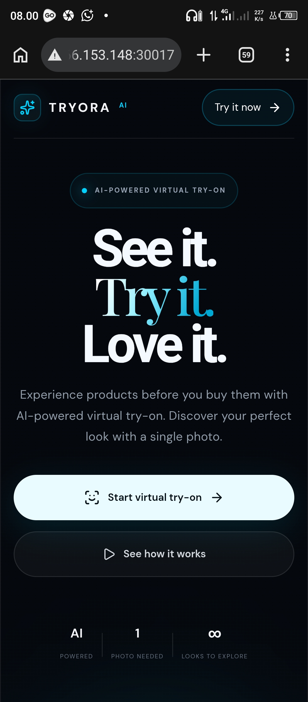
4. Mobile — Dashboard TRYORA AI dashboard optimized for mobile, providing an accessible virtual makeup try-on experience on smartphones.
-
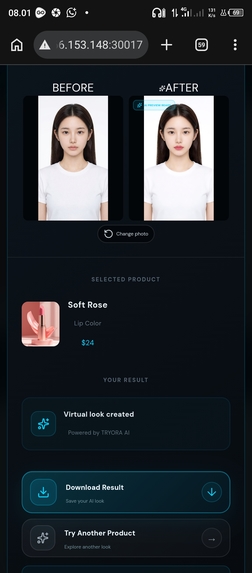
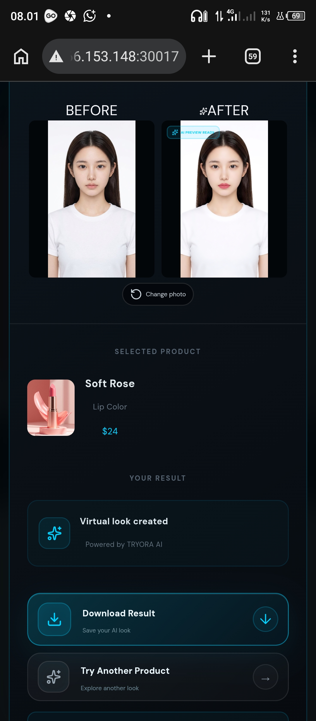
5. Mobile — Before & After Mobile before-and-after view showing the virtual makeup result directly on a smartphone screen.
-
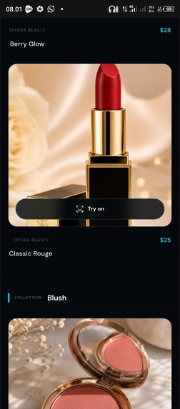
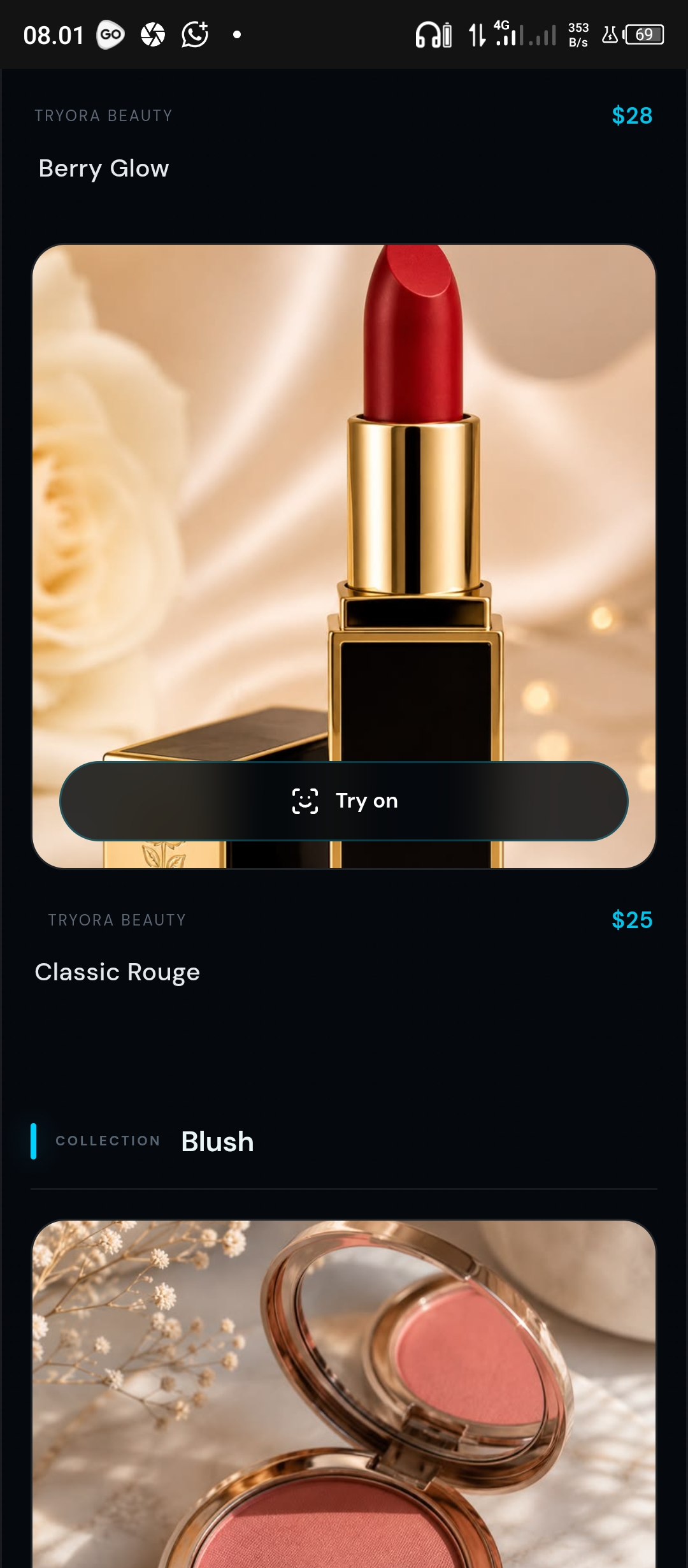
6. Mobile — Product List Mobile product selection interface allowing users to browse makeup products and try different looks.
Inspiration
Tryora was inspired by the idea of making virtual makeup exploration more interactive, visual, and accessible.
Choosing makeup products online can be difficult because users cannot easily see how different products, colors, and effects may look together. We wanted to create an experience where users could explore makeup styles visually before deciding what they like.
The goal was to build more than a simple product showcase. Tryora combines a modern shopping experience with visual makeup exploration, allowing users to discover products and compare results in a more engaging way.
What We Built
Tryora is a modern virtual makeup experience designed around product discovery and visual transformation.
The project includes:
- Virtual makeup exploration
- Makeup product browsing
- Multiple makeup products and effects
- Before-and-after comparison
- Interactive product experience
- Responsive modern interface
- Visual product presentation
- Smooth animations and transitions
The before-and-after experience was designed as a side-by-side comparison so users can immediately see the difference between the original and transformed appearance.
How We Built It
We built Tryora as a modern web application with a focus on visual interaction, responsive design, and a smooth user experience.
The interface was developed using a component-based architecture, with separate sections for the hero experience, products, makeup effects, and before-and-after comparison.
We also integrated external makeup assets and effects to create a realistic virtual makeup experience.
The project went through several iterations focused on improving the visual hierarchy, animations, product presentation, and comparison layout.
Challenges We Faced
One of the biggest challenges was making the virtual makeup experience feel natural while keeping the interface simple and responsive.
Another challenge was designing the before-and-after comparison. We initially experimented with a vertical layout, but it made the comparison feel too small and difficult to evaluate. We redesigned it into a larger side-by-side layout so users could compare both states more naturally.
We also spent time refining the hero section, animations, product cards, spacing, and overall visual hierarchy to create a polished experience rather than a basic prototype.
What We Learned
Building Tryora taught us how important visual interaction and UX details are in an application focused on appearance.
We learned how small design decisions—such as image proportions, spacing, animation timing, and comparison layouts—can significantly change how users experience a product.
We also learned how to integrate external visual assets and effects into a web experience while maintaining a consistent interface.
What's Next
Future improvements could include:
- More makeup styles and products
- More advanced face tracking
- Personalized makeup recommendations
- Additional customization options
- Improved mobile experience
- Saving and sharing makeup looks
- More realistic virtual try-on effects
Tryora is a starting point for creating a more interactive way to explore beauty products digitally.
Built With
- animation
- backend
- computervision
- css
- express.js
- frontend
- html
- javascript
- react
- responsivedesign
- restapi
- typescript
- ui/ux
- virtualmakeup
- vite
- webapplication
- youcamapi


Log in or sign up for Devpost to join the conversation.