-
-

True Colors: Title page
-
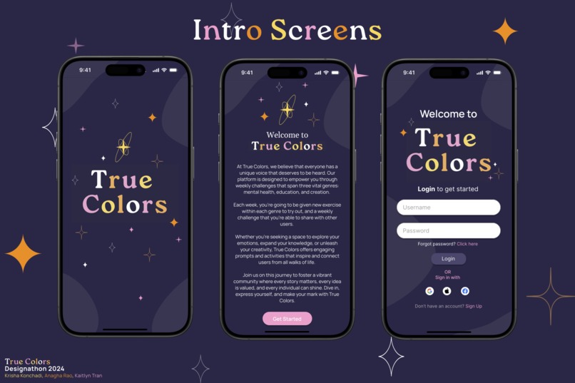
True Colors: Intro Screens with opening, info, and log-in page
-
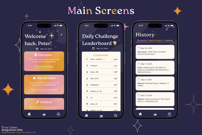
True Colors: Main Screens with home, score board, and history page
-
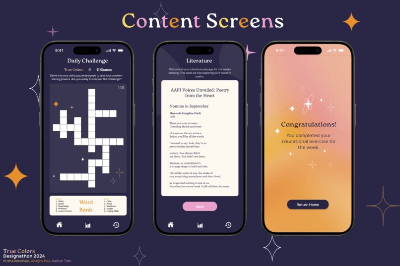
True Colors: Various Content Screens with daily challenge, literature activity, and completion page


Design-A-Thon 2024: True Colors
By: Kaitlyn V. Tran, Krisha Konchadi, Anagha Rao
Brief description of True Colors
True Colors is a mobile app offering activities in education, mental wellness, and creative expression. Users navigate to the “Mental Health,” “Education,” or “Creation” tabs, each providing specific weekly prompts. Selecting the “Mental Health” tab presents a wellness activity, while the “Creation” tab offers a creative task. The “Education” tab educates users on a weekly topic. After completion, users can mark their activity complete, and submit ratings and comments about their experience with the activity. These completed activities are logged into a “History” tab, where users can track their progress throughout the weeks. Every week each prompt or topic, for each of the three tabs, is changed, to allow users to learn and participate in a multitude of different activities. Additionally, True Colors features daily word puzzles based on daily readings, with users ranked on a leaderboard based on their completion speed.
Main Decision Decisions
One of the main design decisions was integrating a gamification aspect into our user interface. We implemented a daily challenge to promote daily user participation, as well as a continuous flow of educational content every day. This also gives users a competitive edge over other users, potentially driving user engagement. Additionally, our design decisions were heavily informed by our user research. We found that 100% of survey respondents were interested in daily learning and exploring topics about equity and inclusivity. To accommodate this, we balanced daily challenges with weekly learning activities, allowing for both quick, engaging experiences, and longer, more reflective tasks. This decision reaches a wider audience for our application, as some people may enjoy quick, engaging learning experiences, and some may enjoy longer more reflective tasks. Another key decision was creating a positive feedback loop of user input to continuously improve our user experience and content. This prioritizes the customer-facing aspect of our app, fostering a closer sense of community between the app and its users. In an age where technology often feels impersonal, True Colors aims to uplift personal narratives and cultivate genuine skill and artistry. To make our app accessible, we incorporated high-contrast color schemes to enhance visibility and readability, especially for users with visual impairments. Readable fonts were selected to reduce strain for users with reading difficulties. By designing an app that prioritizes user engagement, continuous learning, and inclusivity, we empower users to seek their own identity and authenticity, highlighting the human essence in technology.
Ux Research: https://docs.google.com/forms/d/e/1FAIpQLSeJTxBDOILxVvflkh5yF--lhSJ-shx_u4vHNxpoVn9odyNYsw/viewform?usp=sf_link
Figma link (version history): https://www.figma.com/design/pKwY1zo6YdDrjQa8b551Ln/T2U?node-id=66%3A370&t=iG9mEEMt1knXcvyT-1
Built With
- figma

Log in or sign up for Devpost to join the conversation.