-
-

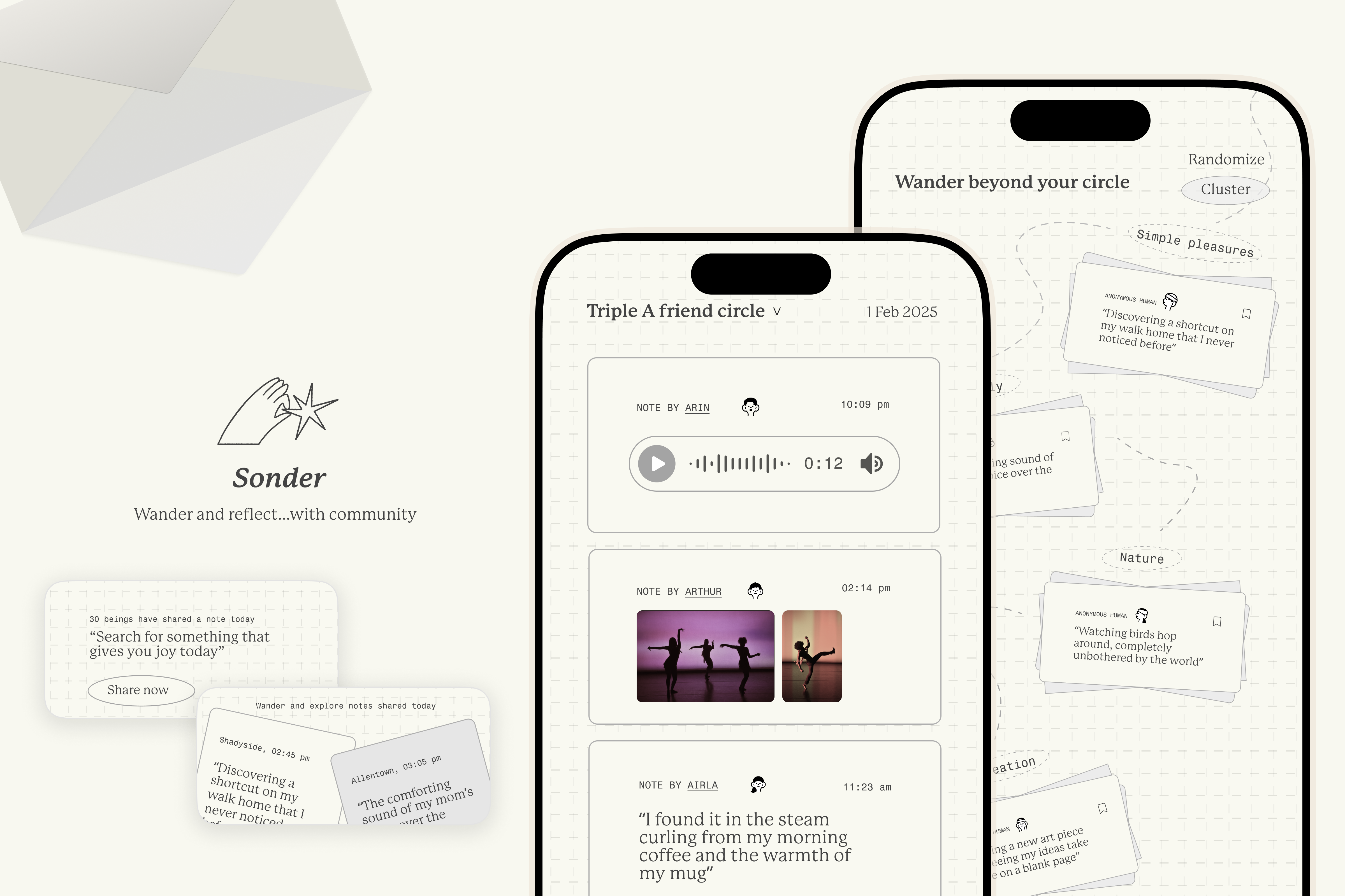
Sonder app
Prototype link (Please submit a link to a playable prototype, not a link to your design file) Link
Describe your project (max 150 words)
In a world where AI curates our choices and shapes our digital experiences, Sonder reclaims the innately human element in discovery and connection. Each day, users receive a community-sourced prompt that invites them to pause, reflect, and share — through a voice note, image, doodle, or writing. They can first explore responses from their close friend circle, then expand into the broader, loose community for fresh perspectives.
The act of sharing becomes an act of acknowledgment, a way to appreciate small, often-overlooked moments and engage beyond the algorithm. Unlike AI-driven feeds designed for passive consumption, Sonder fosters intentionality and reflection, creating a space where discovery is not just about consuming content, but about engaging with unpredictable human experiences. Whether it’s a fleeting observation, a captured moment, or a voice note filled with raw thoughts, Sonder brings back the joy of unfiltered human expression — where curiosity, not AI, is guiding the experience.
- Describe your research process and findings. If you conducted any surveys or interviews, please include the survey form and/or interview questions here. If you conducted secondary research by pulling from online sources, please include a link to your sources. (Max 500 words)
Primary research and user interviews: To better understand how young people navigate decision-making and connection in an AI-driven world, we conducted 1:1 user interviews with CMU students, leveraging our Gen Z peers as the closest demographic to our target audience. Through these interviews, we explored how AI influences their choices, interests, and relationships. One participant noted, "I don’t even realize how much AI shapes what I like until I try to remember the last time I found something without an algorithm showing it to me." Another reflected on decision fatigue, saying, "I used to spend hours curating playlists, but now I just let Spotify’s AI pick for me—it’s easier, but I miss making choices for myself." Conversations also revealed concerns about social interactions, with one student sharing, "I feel like we talk less now. My group chat just reacts to AI-generated memes instead of actually chatting." These insights pointed to a growing reliance on AI not just for information but for shaping identity, interests, and even friendships.
Secondary research and studies: To contextualize these findings, we turned to secondary research. A Pew Research study found that a high majority of young adults say AI-driven recommendations heavily influence their entertainment, shopping, and news consumption. Similarly, an MIT study on AI-assisted decision-making found that users trust AI-generated suggestions over their own instincts, even when the AI is incorrect. This aligns with our interviewees’ experiences of passive content consumption and reliance on algorithm-driven choices. Additionally, a Harvard sociology study on digital intimacy revealed that young people increasingly lean on chatbots and pre-set AI responses in messaging apps to avoid interactions that make them feel vulnerable and uncomfortable, reinforcing very real concerns that AI has made human interactions highly passive and predictable.
Consolidating our research: Bringing our research together, we consolidated all findings into our FigJam board, mapping out patterns and recurring themes. We identified a critical gap: young people desire more agency in their decision-making and deeper, non-AI-mediated connections but struggle with the convenience AI provides. This realization became the foundation for our ideation process. How might we design an experience that encourages real-world discovery, reflection, and human connection—without falling into the same algorithmic traps? With this challenge in mind, we began developing a platform that prioritizes authenticity over optimization and presence over passive consumption. (Link to out Figjam: link)
- Describe your most important design decisions. What research findings and/or user testing results led you to make these decisions? (Max 500 words)
The core experience of multimedia notes: Originally, we wanted to focus on the act of sharing and discovering photos, but users we talked to felt constrained and limited in what they could share, and just having photos would feel similar to platforms such as Pinterest. Based on the feedback, we decided to allow multimedia inputs such as text and voice recording notes, which in turn also allowed prompts on the platform to be more expressive and diverse. Users felt this was more liberating, and the diversity of notes that could be on the platform was exciting to users – after all, inspiration and reflections can come in many different forms beyond something visual.
Visual design and Motion design direction: The visual design helped establish the tone of the platform – playful, calm, and reminiscent of analog tools used to share, send, and archive messages across physical and temporal distances, much like letters/notes themselves. A limited and minimal range of colors was used to keep the emphasis on the content people on the platform shared, which quick user feedback also validated. Additionally, Motion design reinforced the platform’s sense of curiosity and gentleness, shaping core interactions such as sharing notes, opening notes within groups, and wandering through messages shared that day. These moments were designed to evoke a feeling of discovery, making emotional connection central to the experience.
Feature: Crowdsourced prompts: Originally, prompts were curated in a static database and presented to users as a way to share a slice of their life. Users mentioned how prescriptive and less community driven it actually felt, which made us take a step back into our problem space and solution of what this community should also feel like. A core principle of the platform is to give agency back to users, allowing them to share from the ground up. Instead of being passive recipients, we decided that users should also be the curators themselves, shaping the experience collectively – hence, prompts can also be crowdsourced. A second round of concept testing and feedback revealed that users appreciated the ecology of sharing notes and providing prompts, sustained and grown by users themselves.
Feature: Cluster vs No clustering of shared notes: By default, an important design decision was making the discovery of notes feel organic and spontaneous, something more exciting than simply 'receiving recommendations'. This was made as a default option of the experience, but we still gave the flexibility and option to cluster notes by groups/higher level themes if users wanted a more structured exploration.
Widget design: The platform is about presence, reflection, and shared moments within communities. The widget extends this, acting as another entry point and quiet nudge to engage – a gentle reminder to share or discovering up to 2 notes shared on the platform. The visual design extends into the minimal and unobtrusive widget design, where users can still see notes gathered over the course of the day without entering the platform.
Built With
- figma


Log in or sign up for Devpost to join the conversation.