Inspiration
Travel is supposed to feel exciting, but planning it often feels like the opposite. People spend hours jumping between maps, reviews, hotel listings, attraction blogs, and group chats, only to end up with a plan that can still fall apart because of traffic, weather, or changing preferences. We wanted to build something that makes travel planning feel less like scattered research and more like clarity. Trigo was inspired by the idea that a trip should not begin with stress. It should begin with momentum.
What it does
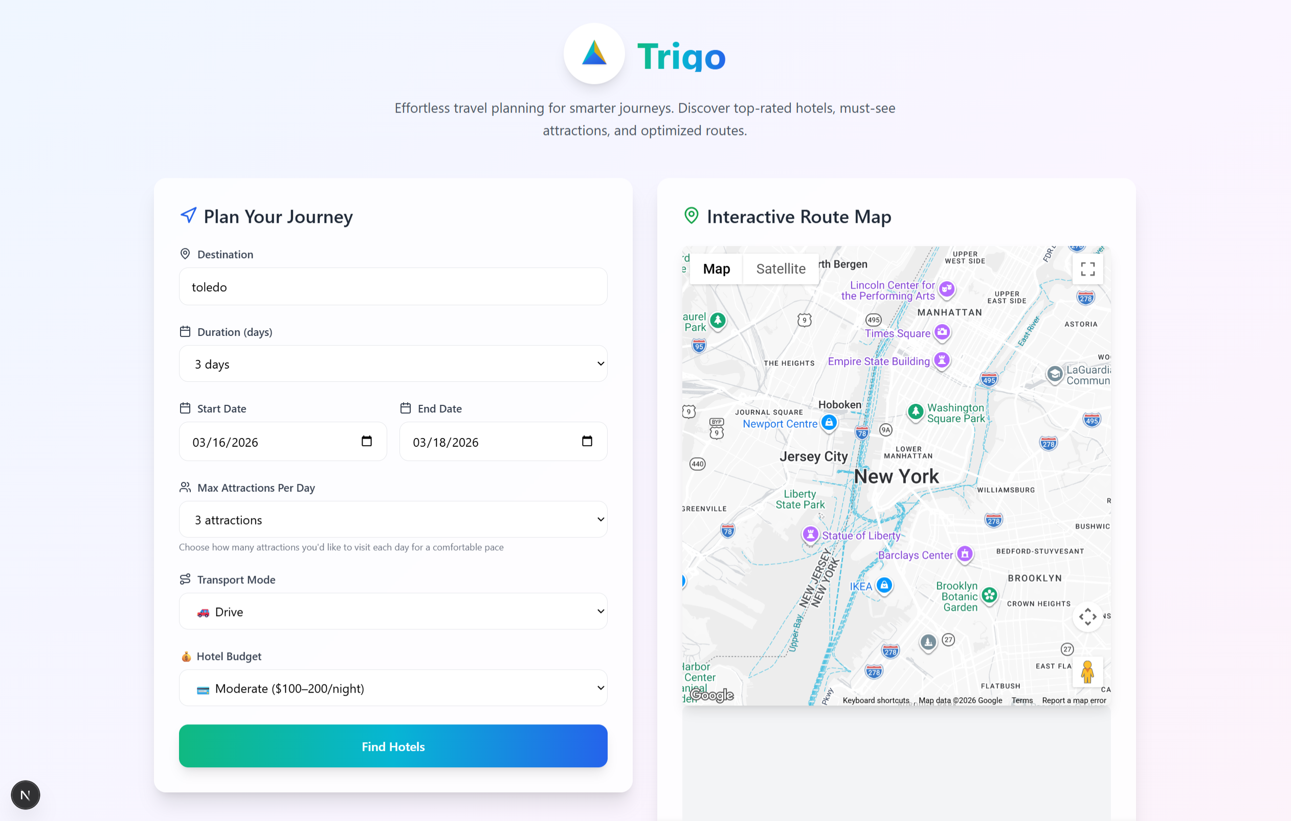
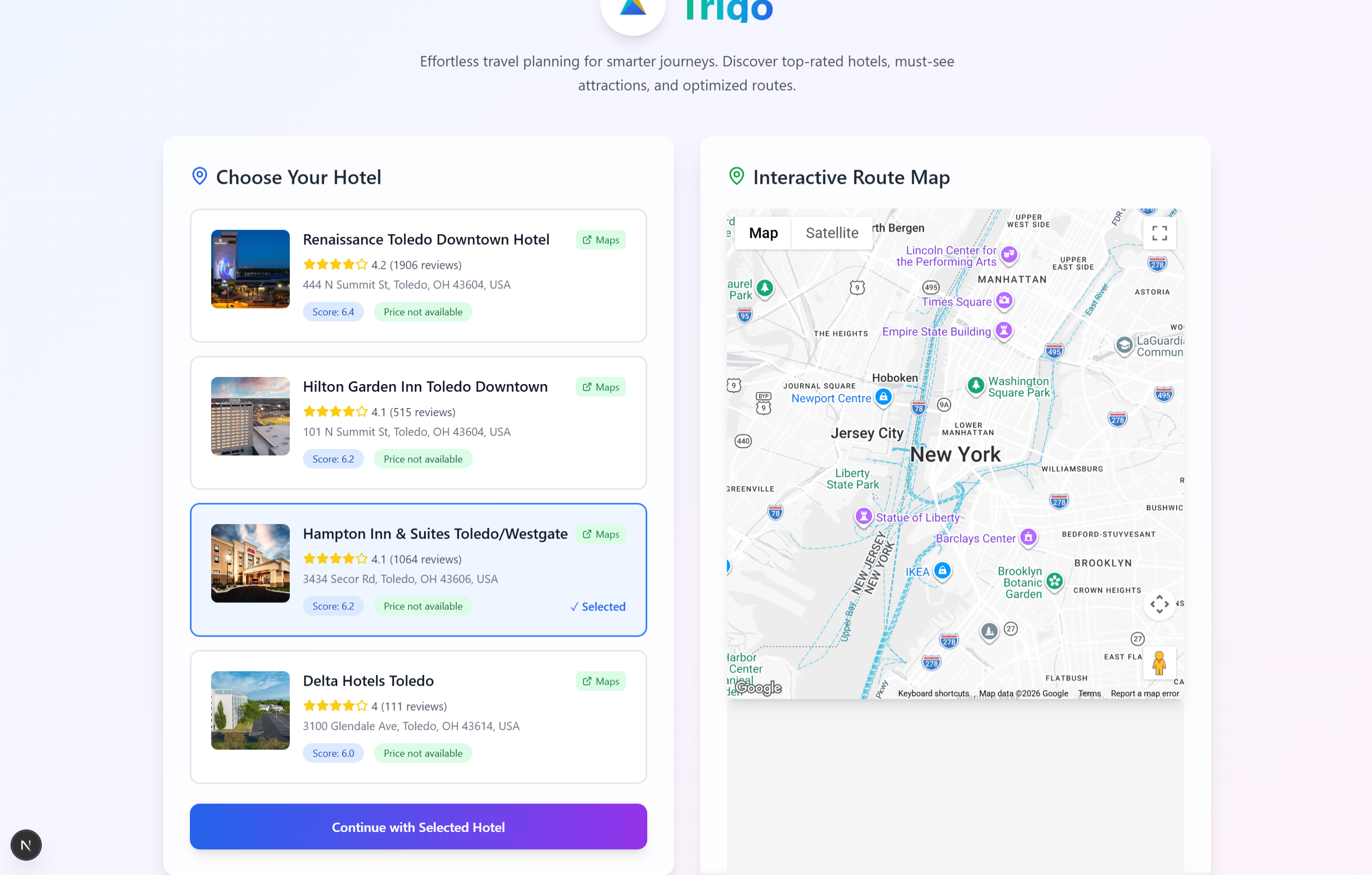
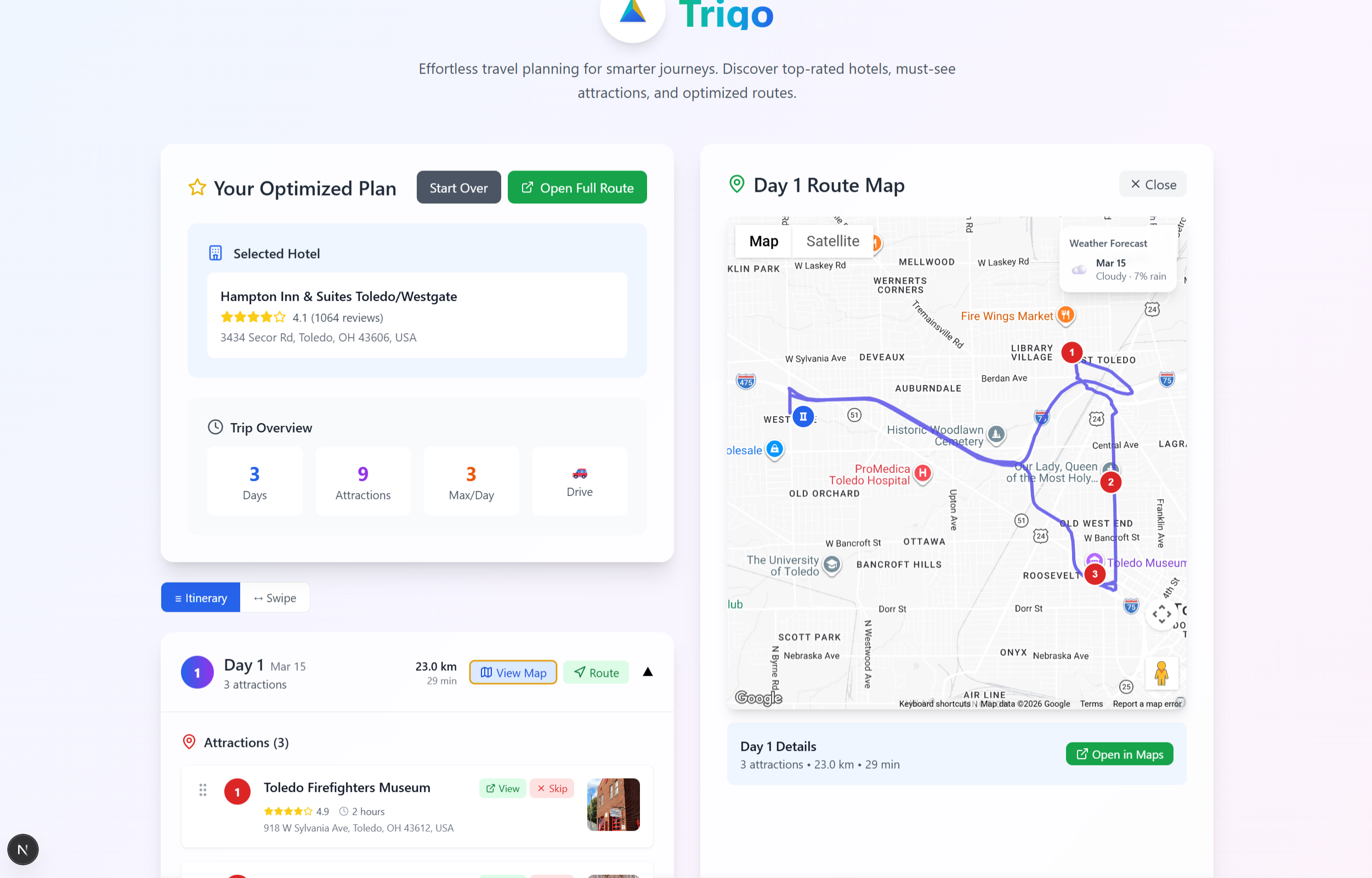
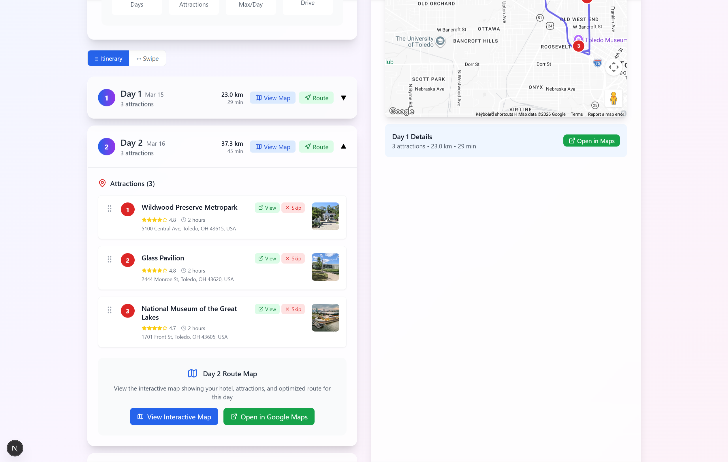
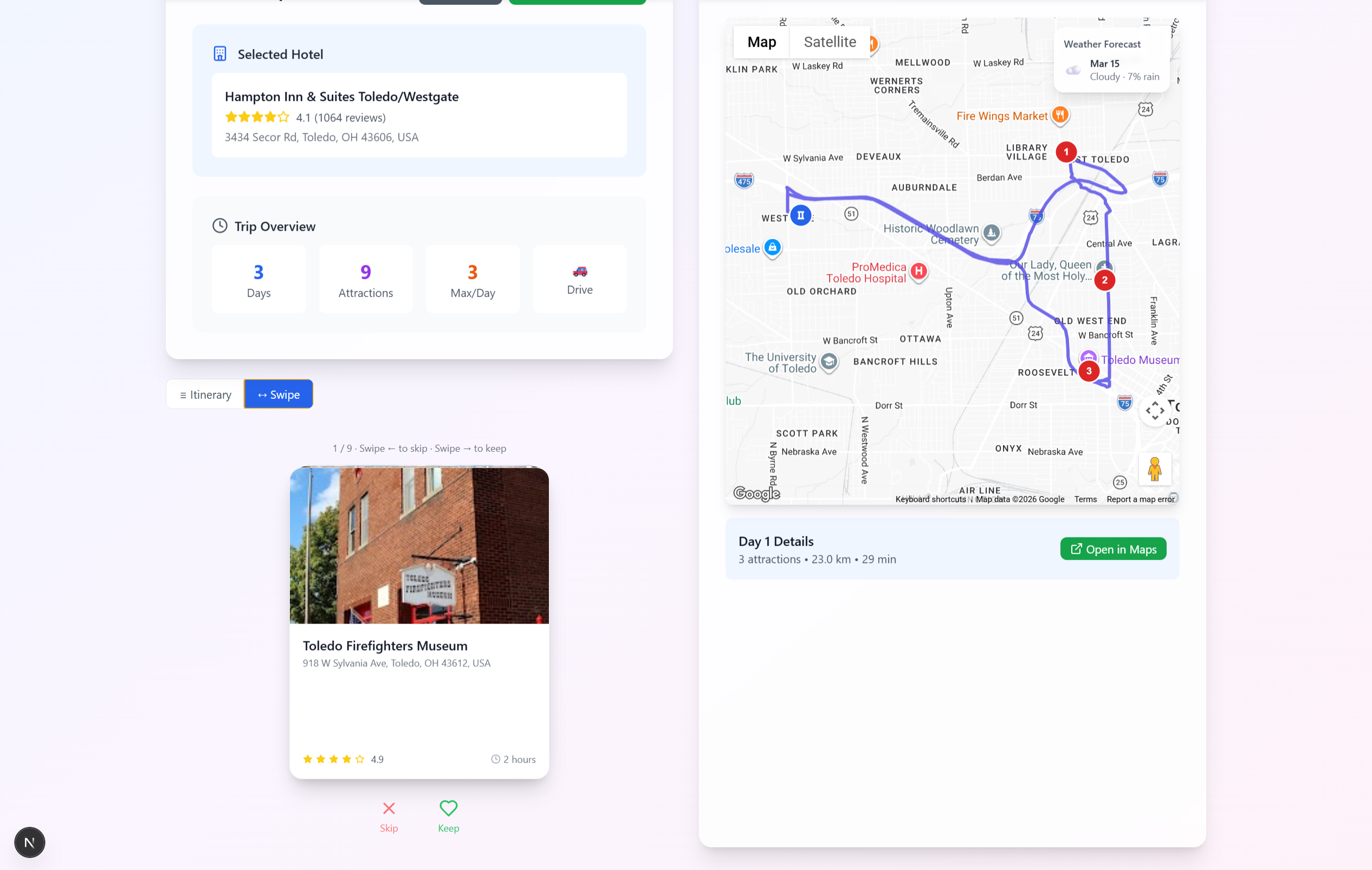
Trigo is an automagic vacation planner that transforms fragmented travel research into a personalized, swipe-based planning experience. Users enter their destination, budget, and trip details, then explore hotels and attractions through a simple interface that brings descriptions, images, and reviews together in one place. Instead of opening endless tabs and comparing options manually, users can swipe left to pass and swipe right to keep what they like, making planning much faster and more intuitive. As conditions change during the trip, whether because of traffic, weather, or timing, Trigo can adapt and suggest better alternatives. We also envisioned a shared link-based planning system where groups can shape one itinerary together without creating accounts, giving every traveler a voice instead of letting the loudest person decide the trip.
How we built it
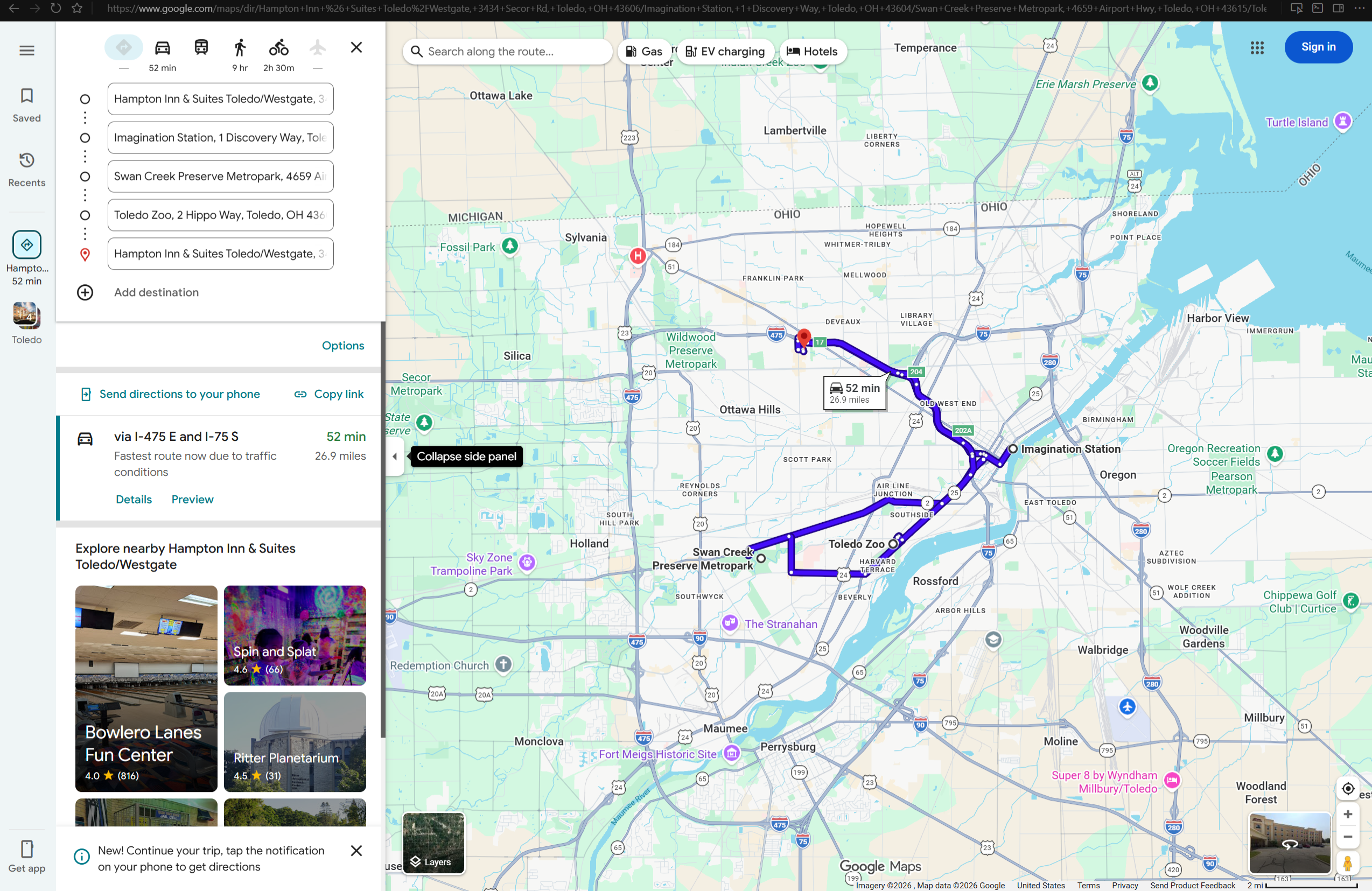
We built Trigo using Python with Flask for the backend and Next.js for the frontend. To power the travel experience, we integrated Google Maps Platform APIs for location data, reviews, and route information. This allowed us to turn real-world place data into something more meaningful: not just a list of options, but a travel flow that helps users move from indecision to a realistic plan.
Challenges we ran into
One of the biggest challenges was designing an experience that felt effortless while doing something inherently complex. Travel planning involves many moving parts, but the interface could not feel heavy or confusing. We had to balance useful information with speed, making sure the swipe-based interaction stayed clean, modern, and intuitive without hiding the details users actually care about.
Accomplishments that we're proud of
We are proud that Trigo feels like more than a basic travel search tool. One of our most novel decisions was applying the swipe-left, swipe-right interaction model to travel planning. We thought about how successful that interaction pattern has been in helping users make quick decisions in other apps, and realized it could solve a real problem here too. By combining descriptions, images, and reviews into one swipeable experience, we made it easier for users to sort through travel options without feeling overwhelmed. Along with that, we built a working product around a real problem and shaped it into something practical, interactive, and forward-looking.
What we learned
We learned how to connect a modern frontend with a backend system that handles real travel data in useful ways. We learned how to work with Google Maps Platform APIs, how to think carefully about user flow, and how much design matters when the goal is to make something complex feel simple. More importantly, we learned that the best products do not just provide information. They reduce hesitation and help people move forward.
What's next for Trigo - Automagic Vacation Planner
The next step for Trigo is turning it from a solo planner into a living travel companion. We want to expand the shared link-based planning system so groups can contribute preferences, swipe on options, and shape a trip together without needing accounts or long group chat debates. We also want to introduce GPS-aware recommendations for nearby places during the trip, smarter real-time itinerary adjustments when plans shift, and support for Apple Maps or Organic Maps alongside Google Maps. The long-term vision is for Trigo to feel less like a static planner and more like a system that moves with the traveler.
Built With
- elevenlabs
- flask
- git
- google-maps
- nextjs
- python
- typescript

Log in or sign up for Devpost to join the conversation.