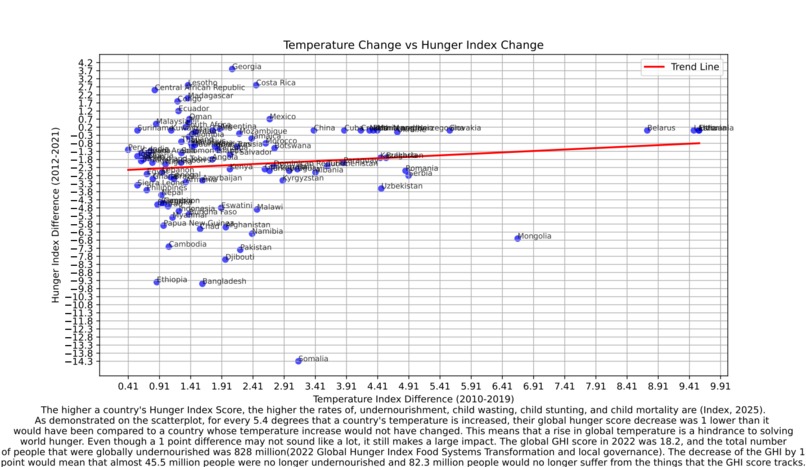
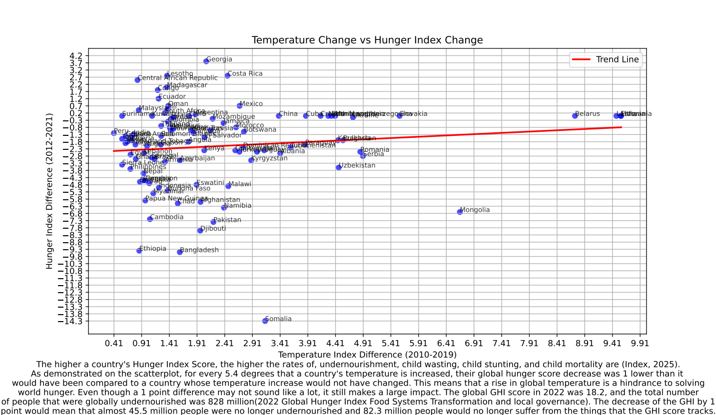
Inspiration: To connect global warming's negative effects to something easily understood to a mass audience.
What it does: Opens a graph and a short report on the findings and insights from the data.
How we built it: We used python to clean and merge two csv files and then export it into a graph.
Challenges we ran into: We ran into the challenges of finding data that fits the same time frame and encompassed the majority of countries.
Accomplishments that we're proud of: Cleaning the data and formatting it properly so it can be used in a chart.
What we learned: We learned how to do data cleaning. merging and create graphs in python.
What's next for Trend between temperatures and hunger index scores: What's next is to further isolate countries that would be most disadvantaged by global warming, such as countries closer to the equator.


Log in or sign up for Devpost to join the conversation.