Inspiration
When you move countries as a student, public transport isn't a lifestyle choice — it's the only option. You learn every bus route, every transfer, every gap in the network. You budget carefully because a missed connection isn't just inconvenient — it's money you don't have, a shift you're late to, a healthcare appointment you couldn't reach.
We've lived this. Moving between countries, navigating cities where transit is excellent (Mumbai, Melbourne) and cities where it isn't, we saw firsthand how a well-connected city gives people real alternatives. In India and Australia, commuters choose public transport for work — not because they have no car, but because the system is reliable enough to trust. Mumbai's suburban rail alone carries over 7 million people daily, most of them working-class commuters for whom it is not a backup plan but the backbone of daily life. In cities where that investment never came, low-income residents don't have a choice at all.
That experience brought us to this question: what does it actually cost the people who depend on transit most when investment is delayed - not forever, just five years? What compounds in that time, and who pays for it?
What it does
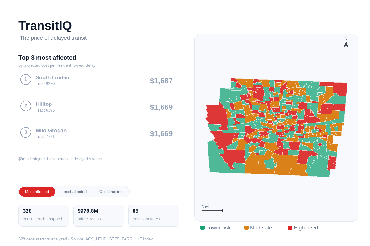
TransitIQ is a decision-support dashboard for city planners that quantifies the cost of inaction — the compounding economic harm to low-income, transit-dependent workers when transit investment is postponed.
It answers one question, precisely:
"If this investment is delayed 5 years, here is the compounding cost to low-income workers — in measurable, specific terms."
Across 328 Franklin County (Columbus, OH) census tracts, TransitIQ surfaces:
- Annual cost of inaction — lost wages, missed healthcare, environmental cost, education access, and forgone affordability, summed per tract
- Compounding delay scenarios — what that cost becomes at 1, 3, and 5 years of delay, with differentiated growth rates per component
- Per-resident and per-worker figures — $10.2K per transit-dependent worker over a 5-year delay
- Priority triage — which tracts to fund first, ranked by combined hardship index and per-capita delay cost
- Equity breakdown — which vulnerability segment absorbs disproportionate burden (High-need transit burden: $1,575/resident vs. $124/resident for the lowest-risk segment)
- Responsible AI guardrails — named failure modes with who gets harmed and what design choices mitigate each
How we built it
Data Pipeline
We assembled six public datasets joined at the census tract level:
| Dataset | Source | Use |
|---|---|---|
| ACS 5-Year Estimates (2019–2023) | US Census Bureau | Income, vehicle access, transit dependency |
| BLS OEWS 2024 | Bureau of Labor Statistics | Columbus MSA wage rates |
| COTA GTFS 2025 | Central Ohio Transit Authority | Bus stop coverage, route density |
| NHTSA FARS 2023 | Federal Highway Administration | Safety warning overlay |
| LEHD LODES 2021 | US Census / HUD | Jobs accessibility by tract |
| H+T Affordability Index | Center for Neighborhood Technology | Housing + transport cost burden |
Cost Engine
The annual cost of inaction compounds five components forward at differentiated rates:
$$\text{Cumulative Delay Cost} = \sum_{y=1}^{N} \left( \sum_{c} \text{Component}_c \times (1 + r_c)^y \right)$$
Where wages compound at 3.5%, healthcare at 4.5%, and education at 1.2%. All assumptions are adjustable live via sidebar sliders.
Vulnerability Segmentation
K-means clustering (k=3) on the Transit Hardship Index segments tracts into High-need, Moderate hardship, and Lower-risk groups — used to drive the equity tab and priority triage.
Tech Stack
Python · Streamlit · Plotly · Pandas · GeoPandas · Scikit-learn · Nominatim (OpenStreetMap)
Challenges we ran into
The hardest part wasn't the code — it was the framing.
Our first version was a transit analytics dashboard. It had maps, charts, and hardship scores. But our mentor pointed out it was answering the wrong question. "Cost of inaction needs to be the core output — not just analytics." That reframe meant rebuilding the cost engine, restructuring every tab, and rethinking what a judge or planner should see first.
Other challenges:
- Census tracts have no names — they're numbered administrative units. We reverse-geocoded 328 tract centroids via Nominatim to recover neighbourhood names for 166 tracts (Linden, Near East Side, Roseland, etc.)
- Responsible AI beyond disclaimers — writing generic warnings was easy. Identifying the specific displacement paradox failure mode (investment → rising rents → residents priced out of the neighbourhood the tool recommended) and designing a concrete guardrail was not.
- Live sensitivity — wiring sidebar sliders to recompute all five cost components and three delay scenarios in real time, without breaking the map, equity charts, or priority scores.
Accomplishments that we're proud of
- The $10.2K number — reducing $978.8M in aggregate cost to a per-worker figure that makes the harm legible to a human being, not just a spreadsheet.
- Honest Responsible AI — not a compliance checkbox, but three named failure modes (displacement paradox, suppressed data, borderline tract instability), each with a specific person harmed and a specific design response built into the tool.
- Neighbourhood names from scratch — we had no name data. We geocoded every tract centroid and recovered real neighbourhood identifiers so planners see "Near East Side · Tract 54.10" instead of "39049005410."
- End-to-end from raw Census data — ACS pulls, GTFS joins, cost engine, clustering, and a fully interactive dashboard, all built in the hackathon window.
What we learned
The most powerful number in this dashboard isn't the aggregate. It's the per-person number. $10,200 per transit-dependent worker is the figure that makes the cost of delay legible to a human being — and that's what changes the conversation in a city council meeting.
We also learned that data tools for public policy carry a different kind of responsibility than consumer products. When a dashboard influences where a city invests $25 million, the design choices — what you show first, what you call "high priority," whether you surface uncertainty — are not neutral.
Cities like Mumbai and Melbourne didn't become transit success stories because they had more money. They invested consistently, early, and with a clear view of who loses when they don't. TransitIQ is our attempt to give Columbus — and cities like it — the same clarity.
What's next for TransitIQ
- Per-tract data quality flagging — surface which tracts have suppressed or imputed Census values so planners can weight those recommendations accordingly
- Soft clustering — replace hard K-means boundaries with fuzzy c-means to show borderline tract confidence
- Expand beyond Columbus — extend the cost engine to additional Ohio MSAs and eventually other US metros
- Community review integration — flag tracts for direct resident input before funding decisions reach council
Built With
- bls
- cota-gtfs
- geopandas
- k-means
- nominatim
- python
- streamlit
- us-census-acs

Log in or sign up for Devpost to join the conversation.