Inspiration
TransitFair started when I noticed how uneven public transit access can be. In some neighborhoods, buses and trains are only a short walk away. In others, especially low-income or historically underserved areas, stops are sparse, walking distances are long, and travel times are much higher. This gap limits access to jobs, schools, and essential services.
I wanted to create a tool that could use real data and optimization algorithms to identify underserved areas and recommend new transit stops where they would make the greatest difference.
What it does
TransitFair analyzes census and public transit data to find neighborhoods with poor access to transit. It assigns each area an equity score based on demographics and distance to the nearest stop. Then, it runs optimization algorithms to identify where new stops would most improve access.
The web app displays before-and-after interactive maps showing how equity scores change when the proposed stops are added. It also provides metrics like:
Average equity score improvement
Percentage of population within 0.5 km of a stop
Reduction in “transit deserts”
Population served by each new stop
How we built it
Data: Collected census demographic data from the US Census Bureau and transit stop data from GTFS feeds.
Equity Score: Created a formula that weights low-income and minority population percentages more heavily, while penalizing high walking distances to transit.
Optimization: Applied k-medoids clustering to select new stop locations in underserved areas.
Visualization: Built choropleth maps using GeoPandas, Folium, and Streamlit. Current stops appear in blue, and proposed stops in red.
Before/After Metrics: Computed key statistics and displayed them alongside maps for easy comparison.
Frontend: Designed a responsive, multi-page Streamlit interface with smooth animations and intuitive navigation.
Challenges we ran into
Balancing equity and efficiency: Early results placed stops where the algorithm found easy wins, not where they were needed most. I had to tune weights and thresholds to prioritize underserved areas.
Handling large geospatial datasets: I implemented precomputations and caching to speed up processing.
Merging incomplete transit data: Some regions lacked GTFS coverage, so I combined multiple sources.
Performance in rendering maps: Interactive mapping slowed the app until I optimized layout and loading.
Accomplishments that we're proud of
Built a fully working optimization tool that produces actionable recommendations.
Created clear, intuitive visuals that make the before/after improvements obvious at a glance.
Developed a custom equity score formula grounded in both data science and social equity principles.
What we learned
What's next for TransitFair
Expand coverage to multiple cities and countries with dropdown select.
Additional
Data
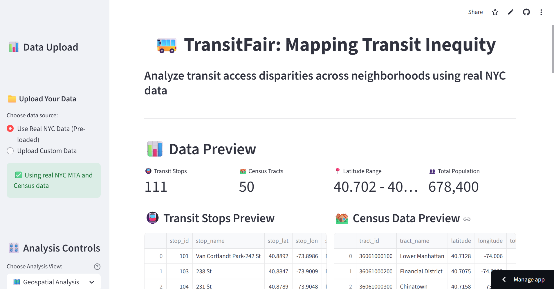
Use the preloaded NYC data or upload your own CSVs GTFS stops need stop_id, stop_lat, stop_lon Census tracts need tract_id, latitude, longitude, total_population, median_income (optional: population_density, car_ownership_rate, area_sq_km, poverty_rate)
Built with
Python, Streamlit, Folium, Plotly Pandas, NumPy, GeoPandas, Shapely scikit learn ReportLab


Log in or sign up for Devpost to join the conversation.