-
-
-
-
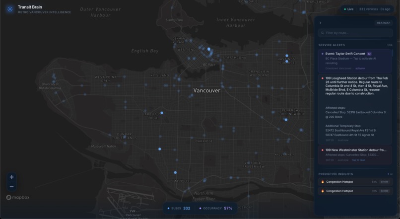
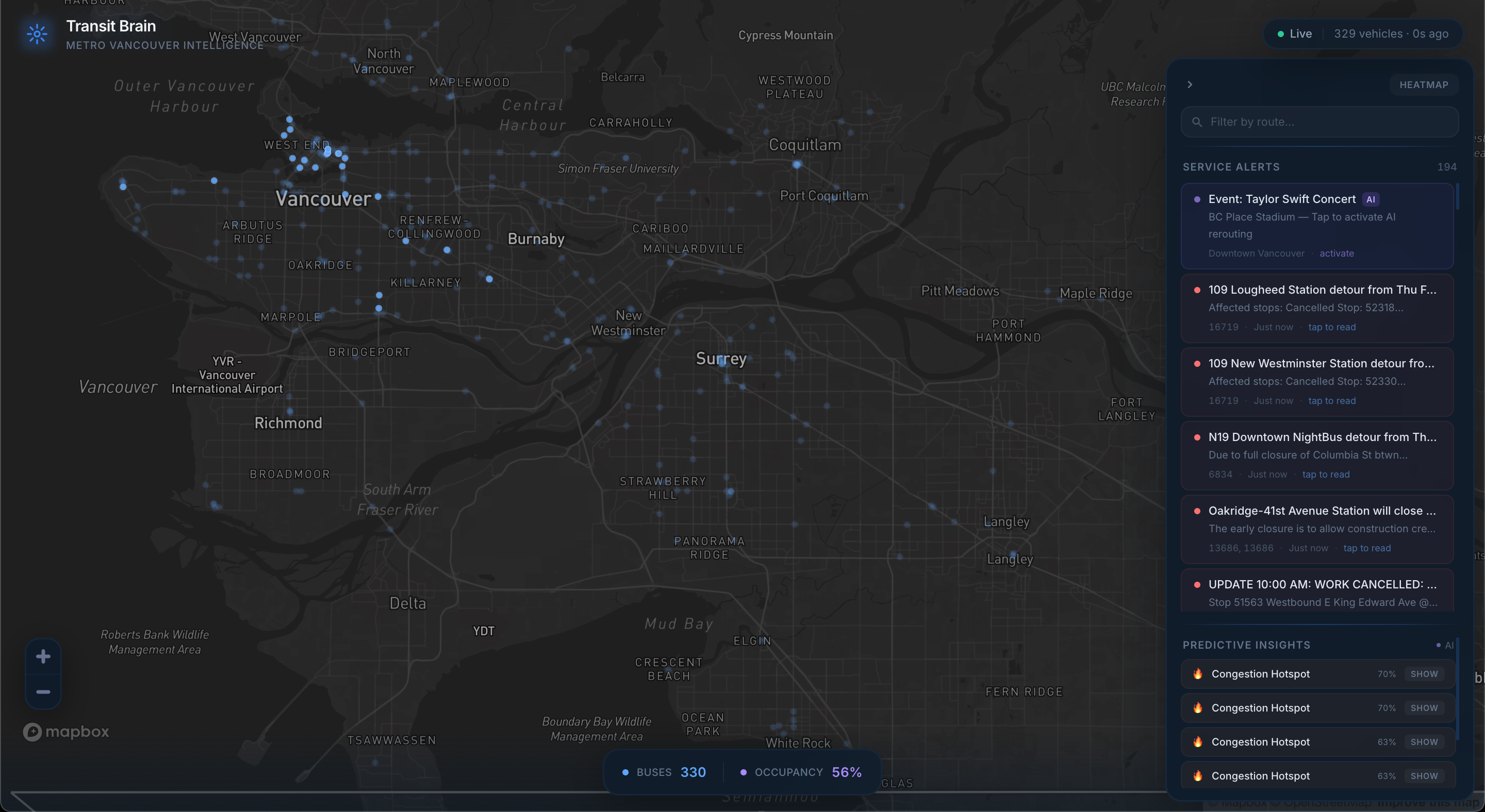
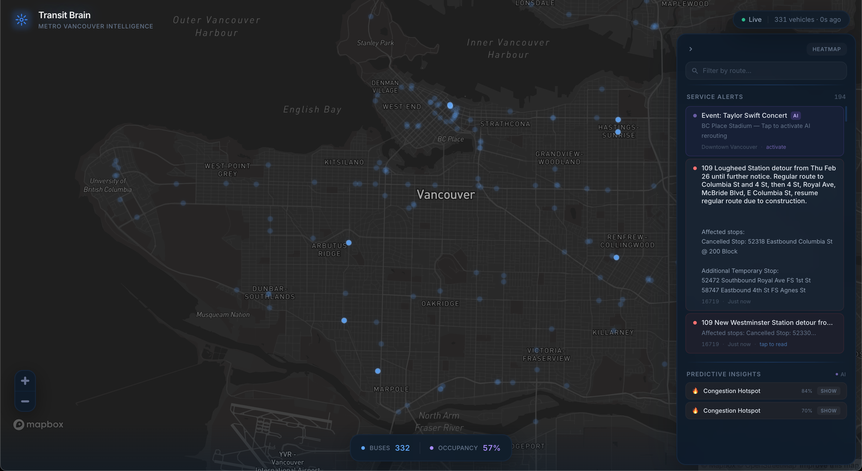
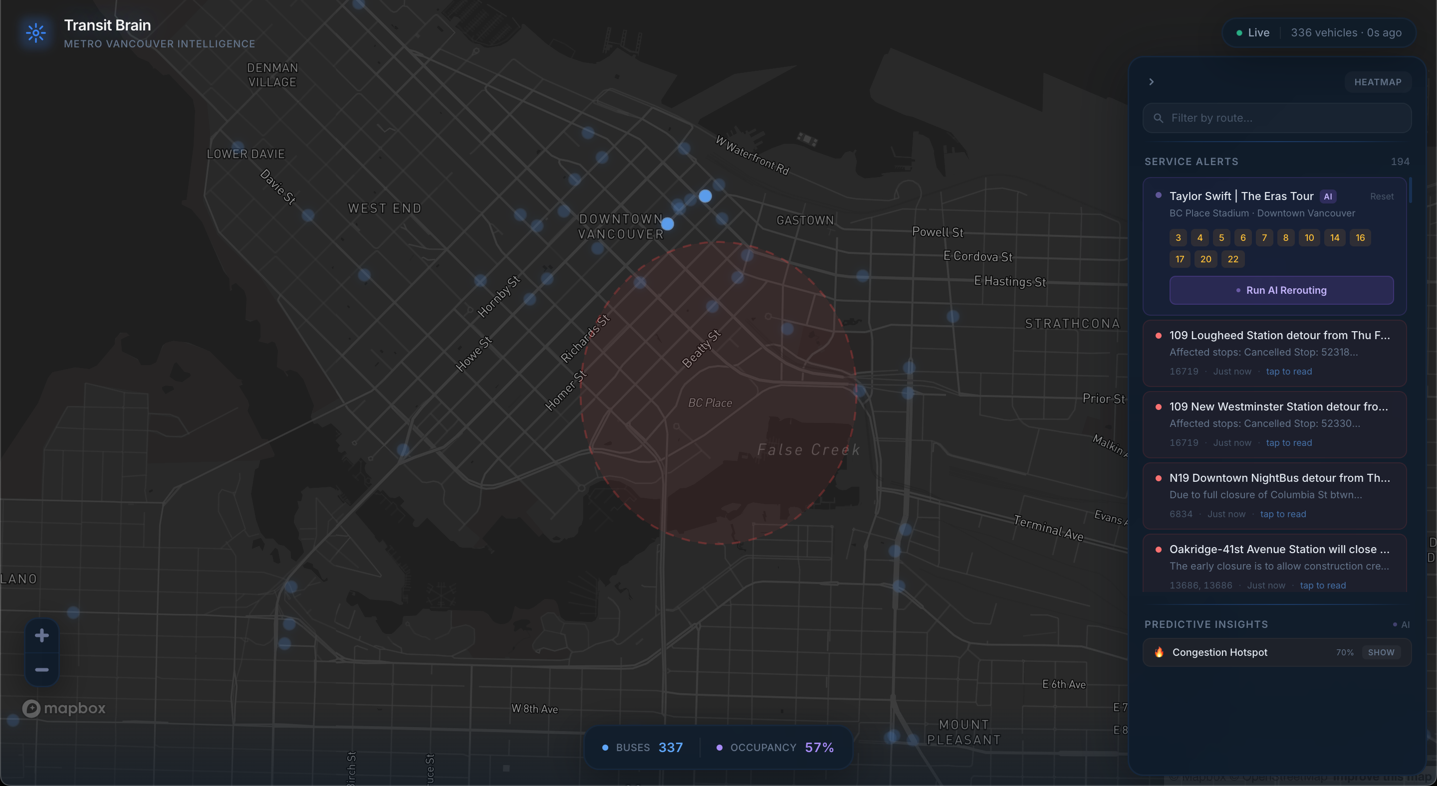
Service alerts can be expanded for more detail
-
-
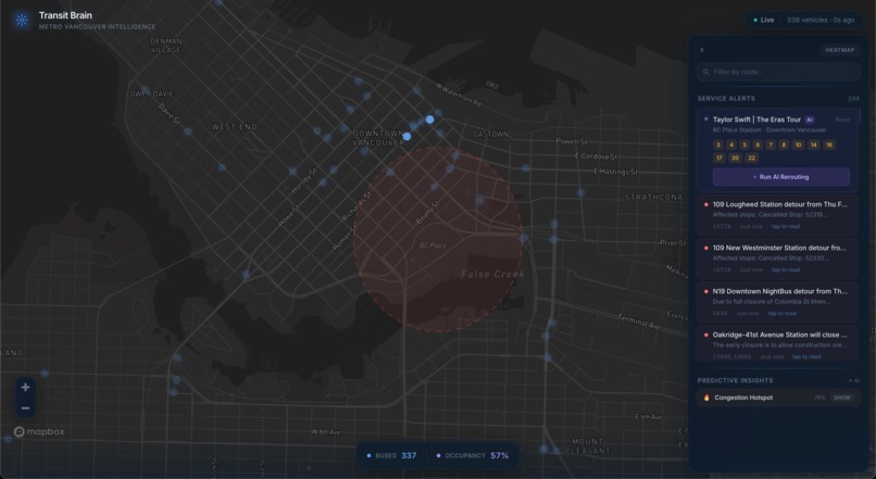
Event shows bus routes that are affected
-
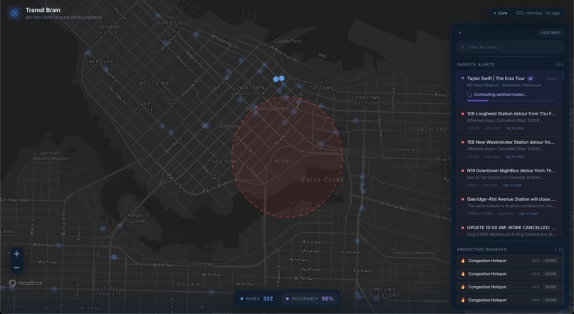
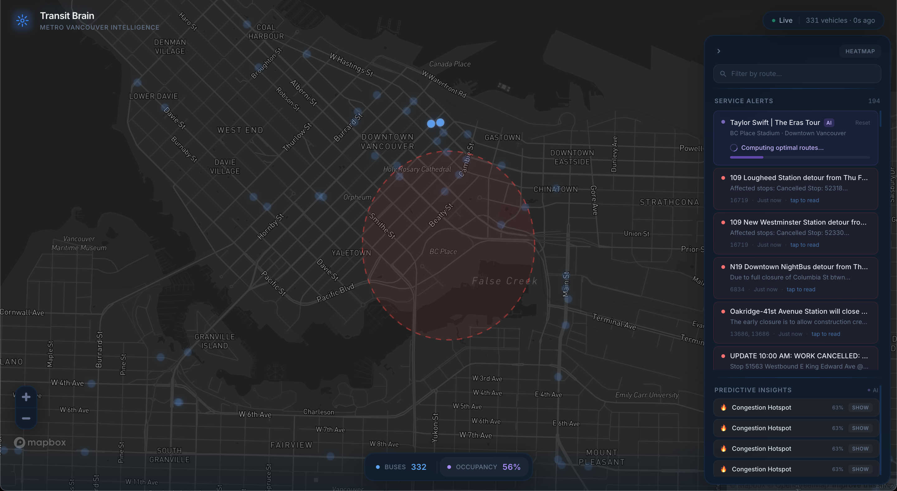
AI routing computes optimal reroutes
-
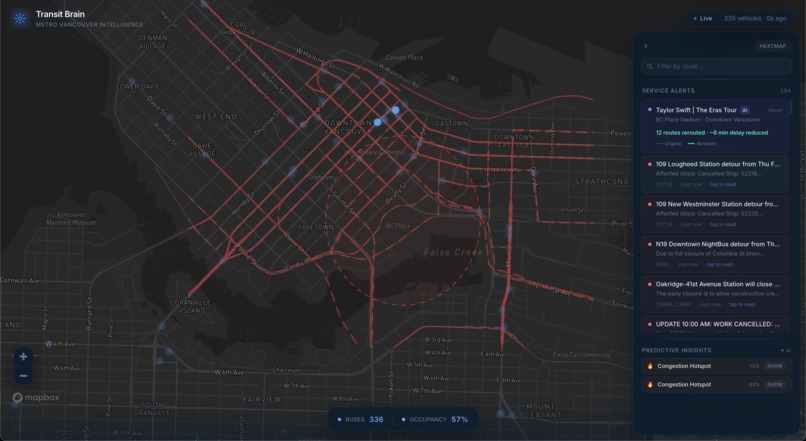
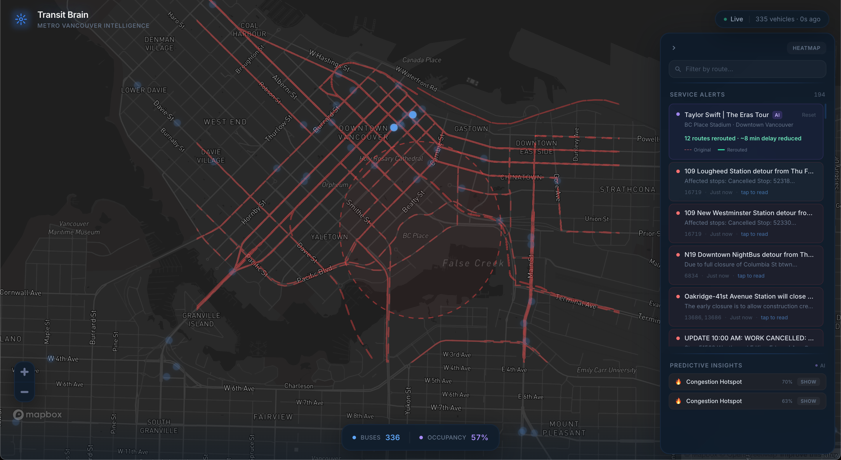
Analyzing routes
-
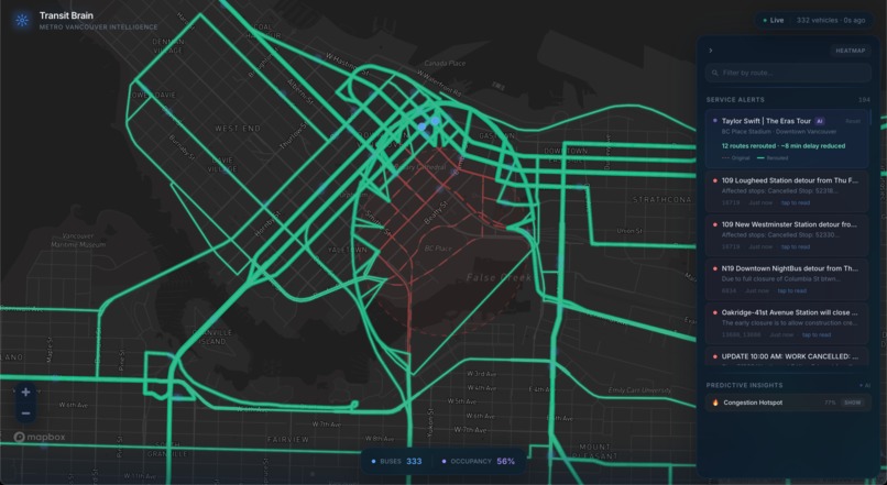
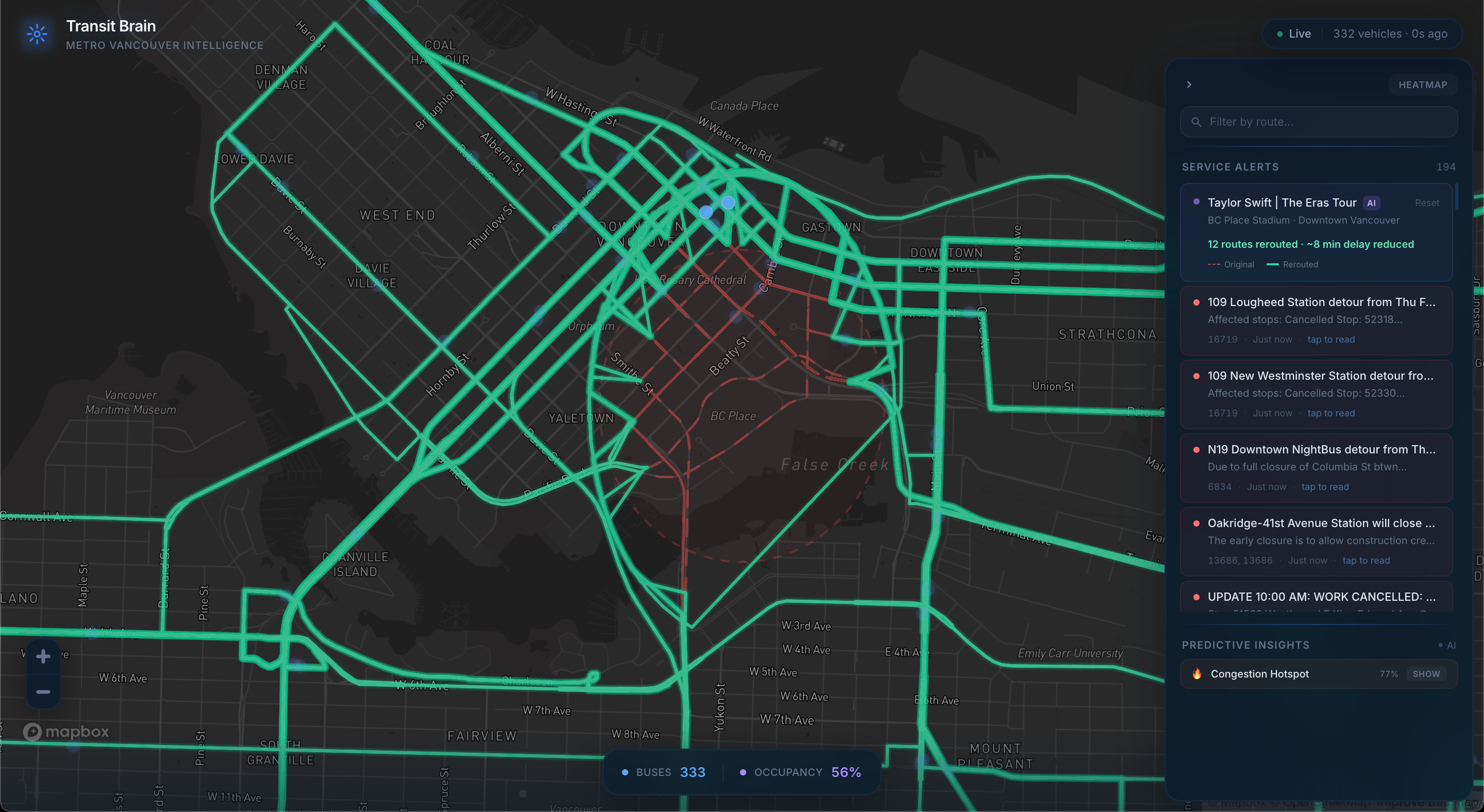
Rerouting complete!
TransLink has committed to a fully zero-emission bus fleet by 2040, with battery-electric buses (BEBs) already entering service across Metro Vancouver. This is one of the largest sustainable infrastructure transitions happening in Canadian transit, but operating an electric fleet is fundamentally different from a diesel one. Range depends on passenger load, elevation, weather, and HVAC demand. Batteries degrade over time. Charge scheduling has to balance energy availability against service requirements. Today, there is no unified tool that gives transit operations teams real-time visibility into both fleet operations and fleet energy, in the same view, on the same map.
Meanwhile, TransLink publishes rich GTFS Realtime data (vehicle positions, trip delays, service alerts) that is open but difficult to consume: encoded in protobuf, split across three endpoints, and updating every few seconds. Most existing tools are static schedule viewers or bare-bones tracking maps with no energy or sustainability layer.
We built Transit Brain to bridge that gap: a real-time operations dashboard that treats electrification as a first-class concern. Every bus on the map carries not just its route and delay data, but a full energy profile — state of charge, projected range, consumption rate, charge curve, and the specific factors (load, grade, regen braking) eating into or extending that range. The goal is to show what fleet management looks like when sustainable infrastructure gets the same operational visibility as schedules and delays.
What Does Our Solution Do?
Transit Brain is a real-time transit intelligence dashboard built around TransLink's live GTFS data, designed to support the operational demands of an electrifying bus fleet.
1. Electric Bus Energy Dashboard
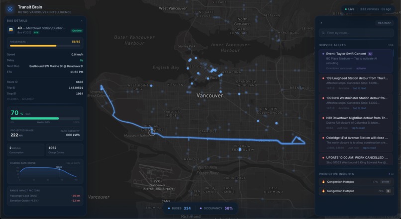
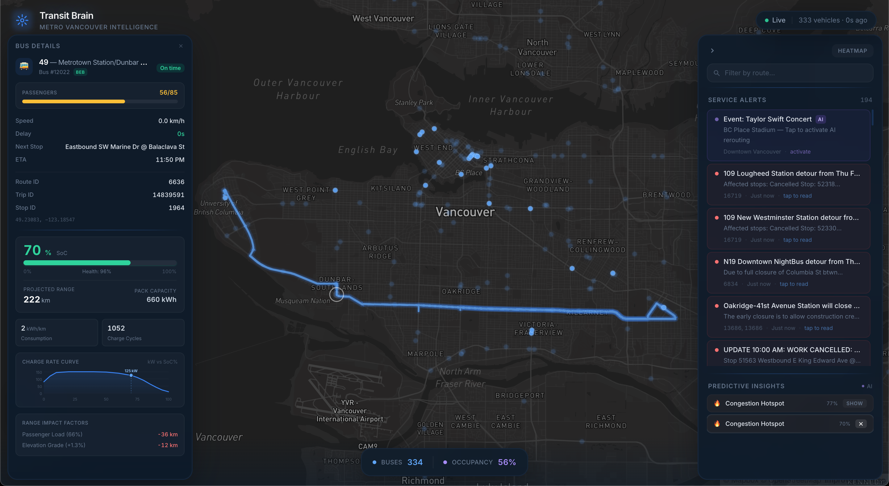
This is the core sustainability layer. For every vehicle in the fleet, Transit Brain models and displays:
- State of Charge (SoC) — A dynamic gauge with time-of-day decay curves reflecting real usage patterns (high overnight after depot charging, declining through morning rush, lowest by evening peak)
- State of Health (SoH) and charge cycles — Tracks battery degradation over the life of the bus, directly affecting usable capacity
- Energy consumption rate (kWh/km) — Computed in real time from four factors: base consumption, passenger load factor, elevation grade, and HVAC thermal load. A bus climbing a hill in winter with a full passenger load burns energy significantly faster than a lightly loaded bus on flat ground in mild weather
- Projected range — Derived from usable energy (capacity × SoC × SoH) divided by the current consumption rate, giving operators a real-time estimate that accounts for actual conditions, not just a static manufacturer spec
- Charge rate curve (kW vs. SoC%) — Modeled after real CCS depot charger profiles: peak power (~150 kW) between 20–40% SoC, tapering above 80%. Operators can see at a glance where a bus sits on the curve and how long a charge stop would take
- Range impact factors — A breakdown showing exactly how many km of range are being gained or lost to passenger load, elevation grade, and regenerative braking
This gives fleet managers the information they need to make energy-aware decisions: which buses can complete their remaining blocks, which need to be swapped or charged, and how real-world conditions are affecting range network-wide.
2. Live Fleet Tracking
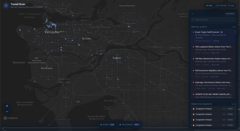
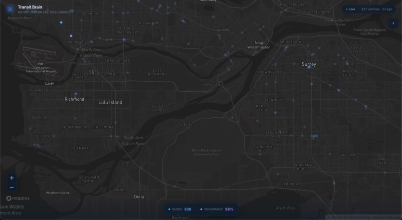
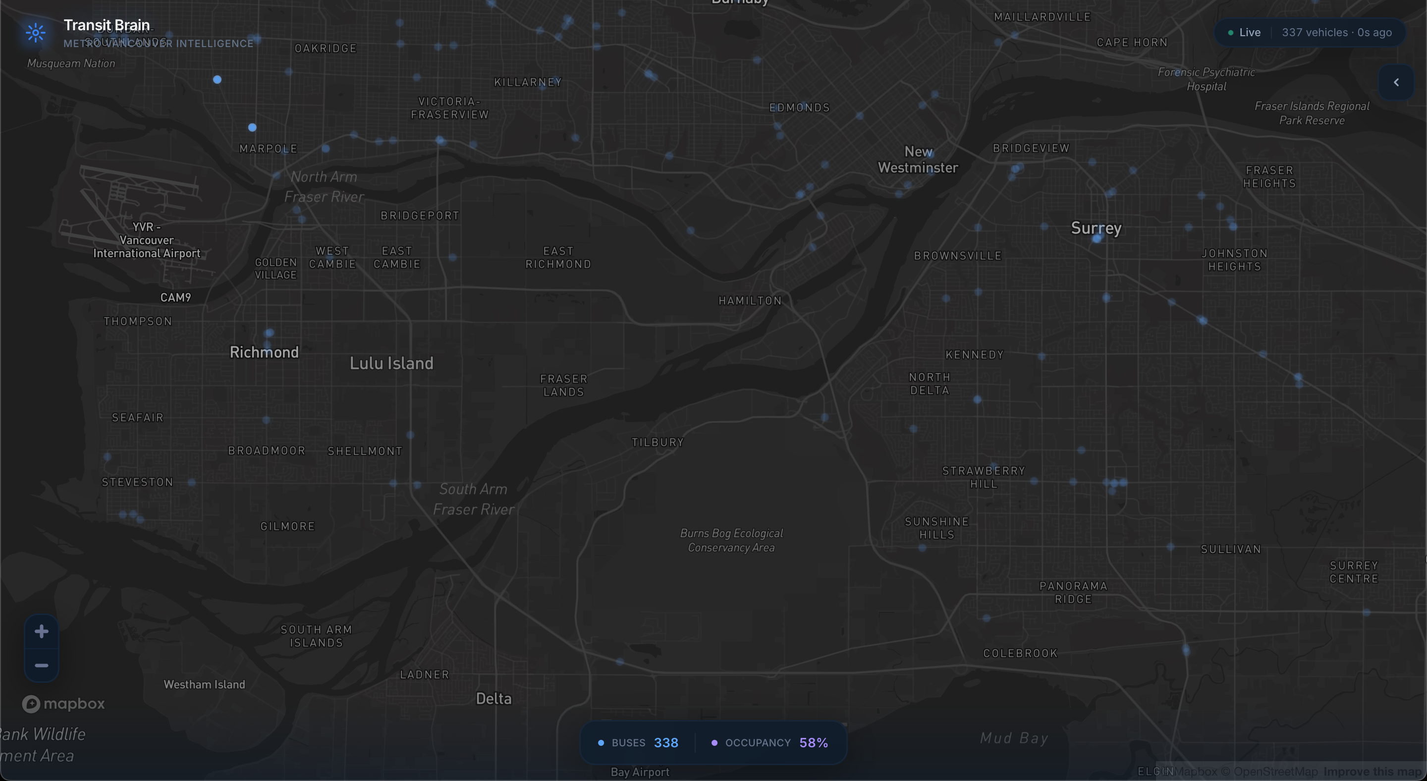
The full-screen Mapbox map displays every active bus in the TransLink network. Positions are polled every 7 seconds from the GTFS vehicle positions feed, decoded from protobuf on the server, and rendered as animated markers. Between polls, a requestAnimationFrame loop applies smoothstep interpolation so vehicles glide continuously — the same technique used in game engines for network entity interpolation.
Clicking any bus opens a detailed panel with route info, speed, delay, next stop, ETA, passenger occupancy, and the full BEB energy dashboard described above.
3. Predictive Analytics Engine
On every data refresh, a heuristic analytics engine runs three detection algorithms:
- Systemic Delay Detection — Aggregates delay across all vehicles on each route. When a route's average delay exceeds 3 minutes across 2+ buses, it flags a systemic issue with a confidence score.
- Congestion Hotspot Detection — Divides the map into a spatial grid (~500 m cells). Cells with 4+ buses traveling under 8 km/h or averaging >2 min delay are flagged. A depot filter (keyword + stopped-vehicle heuristic) prevents false positives at bus exchanges.
- High-Demand Corridor Detection — Routes with 10+ active buses are flagged as peak-demand corridors with average occupancy reported.
These insights surface as cards in the side panel, each with a "Show" button that highlights affected routes on the map. A toggleable congestion heatmap provides a spatial overview of delay concentration across the network.
For an electrifying fleet, these insights have a direct sustainability implication: congestion and delay mean more time spent idling or crawling, which drains batteries faster. Identifying problem areas helps operators anticipate which BEBs will need earlier charging.
4. AI Event Rerouting Demo
Large events create localized transit disruption — extra dwell time, road closures, and detours that disproportionately affect BEB range. Transit Brain includes a demo centered on BC Place Stadium:
- The system identifies all bus routes within ~800 m of the venue using GTFS static shape data
- An exclusion zone is established around the event
- A geometric rerouting algorithm displaces affected route segments outside the zone
- The map renders original and rerouted paths side by side
For electric buses, proactive rerouting around congestion zones isn't just about schedule adherence — it directly preserves battery range by avoiding stop-and-go conditions that maximize energy consumption.
How We Built It
Data Pipeline
We started with the data layer. TransLink's GTFS Realtime API exposes three protobuf-encoded feeds: vehicle positions, trip updates, and service alerts. We built a Next.js API route (/api/gtfs) that fetches all three in parallel using Promise.allSettled, decodes them with the gtfs-realtime-bindings library, joins vehicle positions with trip delay data via trip ID, resolves stop names from GTFS static stops.txt, and filters out rail vehicles using route_type.
On top of the decoded position data, the API route generates per-vehicle BEB telemetry: battery capacity (sized by bus type), SoC with time-of-day curves, SoH and cycle counts, and a multi-factor consumption model (base rate × load factor × elevation factor × HVAC factor). The model uses seeded random functions keyed to vehicle ID so each bus has stable, deterministic characteristics across refreshes while still varying realistically across the fleet.
For route geometry, a second API route (/api/gtfs/shapes) parses ~220,000 shape points and ~62,000 trip-shape mappings at startup, serving GeoJSON LineStrings by route ID or by geographic proximity.
Polling and State
A custom React hook (useGTFSPolling) polls the API every 7 seconds with error backoff (drops to 3 s during failures, shows "Reconnecting" after 3 consecutive errors). Data flows into a Zustand store that merges incoming vehicle positions with interpolation metadata.
Map Rendering and Animation
The Mapbox GL map runs a persistent requestAnimationFrame loop. Each frame, it reads vehicle state via refs (bypassing React re-renders), computes interpolated positions using smoothstep easing (t² × (3 − 2t)), and batch-updates the GeoJSON source. This produces 60 fps vehicle motion from 7-second data samples.
Analytics
The insight engine (analytics.ts) runs synchronously on each vehicle update. Delay detection iterates per-route vehicle groups. Congestion detection uses a grid-based spatial index with a depot filter to suppress false positives. All insights are scored with confidence values and capped at 6 results.
Electric Bus Simulation Model
The BEB telemetry model is designed to be realistic enough to demonstrate operational value:
- Battery capacity is assigned by bus size (40-seat: 450 kWh, 55-seat: 550 kWh, 85-seat: 660 kWh), reflecting real BEB specs
- SoC follows time-of-day curves (92% at 5 AM after overnight depot charge, declining to ~35% by evening rush)
- Consumption rate is a product of base rate (1.4 kWh/km) scaled by load, elevation, and HVAC — the same factors that dominate real BEB energy budgets
- Charge rate curve is a piecewise linear function matching CCS charger behavior (peak 150 kW at 20–40% SoC, tapering sharply above 80%)
- Regenerative braking activates when speed >5 km/h and grade < -0.5%, contributing positive range impact
Tools and Frameworks
- Next.js 14 (App Router) — Server routes for protobuf decoding and BEB model, client components for the dashboard
- Mapbox GL JS v3 — WebGL map rendering with custom GeoJSON sources and layers
- Zustand — Lightweight global state with selector-based subscriptions
- Framer Motion — Panel transitions, gauge animations, number counters
- Tailwind CSS — Utility-first styling
- gtfs-realtime-bindings — Official Google protobuf decoder for GTFS Realtime
- TypeScript — End-to-end type safety
Challenges We Faced
Protobuf decoding in a serverless environment. The gtfs-realtime-bindings library uses dynamic require() internally, which conflicts with Next.js edge bundling. We resolved this by keeping the API route as a standard Node.js serverless function and using dynamic imports.
Vehicle marker jitter. Early iterations caused buses to teleport every 7 seconds. We solved this with smoothstep interpolation — storing previous and current positions and computing intermediate frames. Tuning the interpolation window to 7.5 s (slightly longer than the poll interval) eliminated visible snapping.
False-positive congestion at depots. The spatial clustering algorithm initially flagged every bus exchange as a congestion hotspot. We added a two-part depot filter: checks whether >70% of vehicles in a cell are stopped and whether nearby stop names contain depot keywords. This eliminated false positives without affecting real congestion detection.
Making the BEB model feel realistic without real telematics data. We don't have access to actual CANbus data from TransLink's electric buses. The challenge was making the simulation grounded enough to demonstrate operational value. We used seeded random functions for fleet-wide variation, time-of-day SoC curves to reflect real charge/discharge patterns, and a multi-factor consumption model based on published BEB energy studies. The result is data that behaves plausibly even though it's synthetic.
GTFS static file size. shapes.txt contains ~220,000 coordinate points. Parsing on every request was too slow, so we moved parsing to module-level initialization — runs once at server cold start, lookup maps held in memory.
Accomplishments We're Proud Of
A sustainability layer that's operationally useful, not decorative. The BEB dashboard isn't a "green" badge on an existing tool — it models the actual factors (load, grade, HVAC, battery degradation) that determine whether an electric bus can complete its service block. This is the kind of visibility fleet managers will need as electrification scales.
Realistic energy modeling from first principles. The consumption model accounts for the same variables that dominate real BEB energy budgets. The charge rate curve matches CCS charger behavior. Even simulated, it demonstrates the right analytical framework.
Smooth 60 fps animation from 7-second data. The interpolation system makes the dashboard feel like a live video feed rather than a polling-based map — critical for an operations tool where situational awareness depends on fluid visual feedback.
Predictive insights with a sustainability connection. Congestion hotspots and delay patterns aren't just operational headaches — for an electric fleet, they're energy drains. Surfacing them lets operators anticipate which BEBs will need earlier charging.
End-to-end pipeline with no external infrastructure. From raw protobuf to decoded, enriched, energy-modeled, and rendered data in a single Next.js app. No database, no message queue — keeps it deployable and hackathon-appropriate.
What we learned:
- Fleet electrification changes the operational calculus fundamentally — range is no longer unlimited, and factors like weather and elevation that diesel fleets ignore become critical variables.
- GTFS Realtime is powerful but under-documented; practical knowledge came from reading raw feed output rather than the spec.
- Spatial indexing (even a simple grid) is essential when running analytics on hundreds of vehicles every few seconds.
What's Next?
Short-Term Improvements (1–2 weeks)
- Real telematics integration. Replace the simulated BEB model with actual vehicle telemetry via CANbus data from fleet management platforms. This would provide real SoC/SoH readings, making the energy dashboard operationally actionable rather than demonstrative.
- Charge scheduling optimization. Use projected range + remaining service block length to flag buses that need mid-route charging, and suggest optimal charge windows based on the charge rate curve (charge when SoC is low enough to hit peak kW, avoid topping above 80% where charging slows dramatically).
- Historical energy analytics. Persist BEB telemetry over time to identify routes and conditions that are hardest on batteries — informing both scheduling decisions and infrastructure planning (e.g., where to place on-route opportunity chargers).
- Real routing engine for event rerouting. Replace the geometric demo with OSRM or Valhalla for turn-by-turn reroutes that follow actual road networks.
Long-Term Scalability and Adoption
- Multi-agency support. GTFS Realtime is an industry standard. Abstracting TransLink-specific logic into a configuration layer would let Transit Brain work with any GTFS-compliant agency pursuing fleet electrification — many of which face the same visibility gap.
- Charger infrastructure planning. Aggregate energy consumption data by geography and time to identify where on-route opportunity chargers would have the highest utilization, helping agencies plan charging infrastructure investment alongside fleet procurement.
- Grid integration. As BEB fleets scale, depot charging becomes a significant grid load. A future version could model depot energy demand by hour and coordinate with utility rate schedules to minimize charging costs — or participate in demand response programs by shifting charge timing.
- Carbon impact reporting. Track cumulative diesel-equivalent emissions avoided based on actual BEB km traveled, giving agencies and the public a concrete measure of the fleet electrification's environmental impact.
Built With
- css
- framer
- javascript
- mapbox
- next.js
- translink
- typescript


Log in or sign up for Devpost to join the conversation.