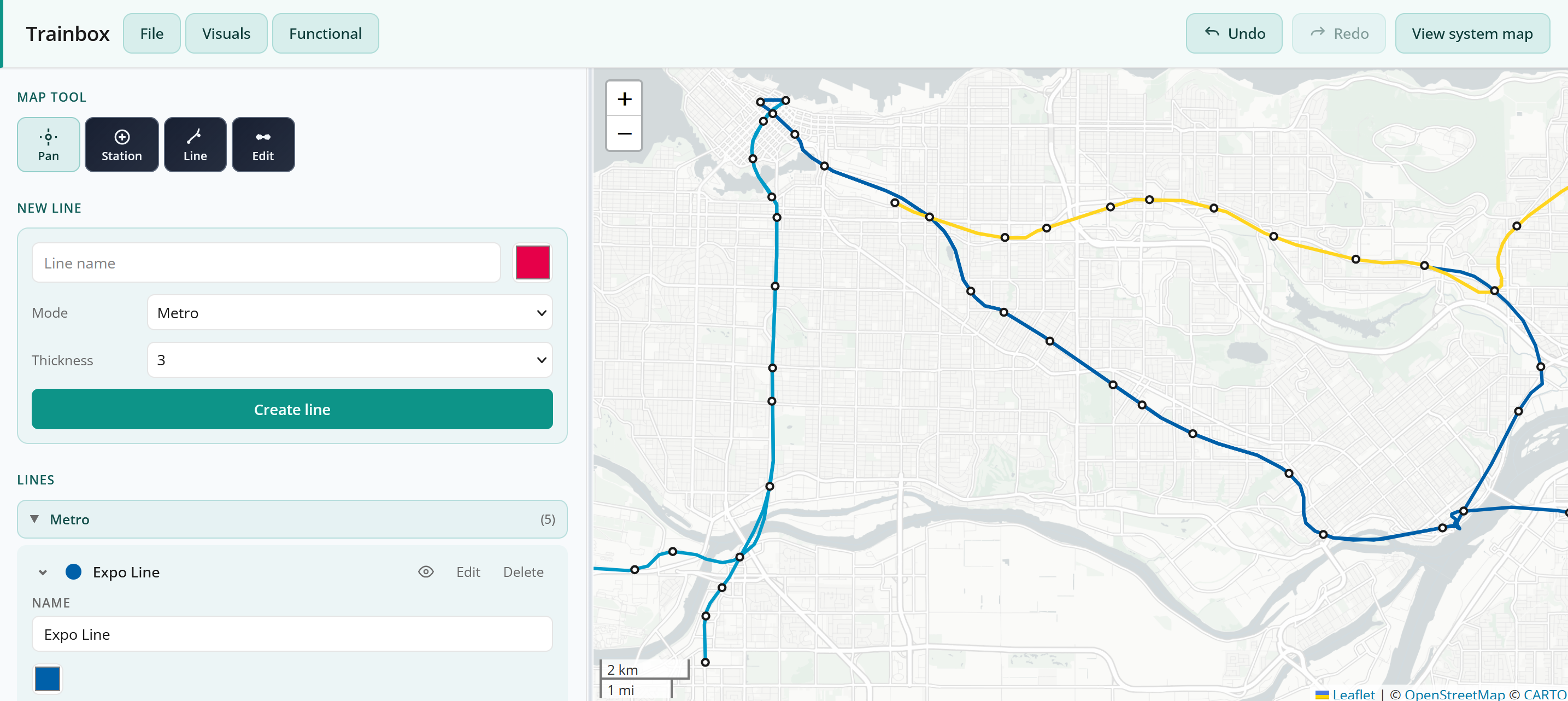
Try It Out LINK (Designed for desktop, not mobile. Also, I'm hosting this for free, so it might be a bit buggy/crash)
Inspiration
Growing up I was obsessed with transit maps. Even as a kid, I would draw them on paper. As I grew older, I tried every digital tool I could find: Metro Map Maker, Google Maps, Canva, the list goes on and on. None of them felt right. Too rigid, or too freeform, or just missing the thing that made it feel like a real map. I wanted something that let me build transit maps the way I actually imagined them: on a real city, with real control over how things look. None of the existing tools let me do that. Hence, Trainbox.
What It Does
- Draw transit lines on a real geographic basemap - Leaflet with CartoDB tiles, with a lighter simplified tile option if you want less visual noise
- Import any city's existing network from OpenStreetMap via the Overpass API: metro, light rail, bus, regional and national rail all supported
- Edit, extend, or build entirely new lines on top of whatever you imported (or from scratch)
- Auto station naming via Nominatim reverse geocoding: drop a stop, it queries nearby roads and neighbourhoods and fills in a name
- Full visual control per mode: line color, stroke weight, solid vs dashed, label font, marker fill and scale
- Five distinct transit modes (metro, light rail, bus, regional, national) each with their own visual settings
- Express service designation, planned/under construction flags, show/hide by mode
- System map view: read-only diagram mode with night theme and fullscreen
- JSON save/load, draft autosave to localStorage, recent files
Challenges
- Getting the curves right - Harsh polylines looked terrible. Getting lines to arc naturally between stations meant implementing Bezier smoothing from scratch. Midpoint handles let you manually bend a segment without touching the stations on either end, which sounds simple but took a while to get feeling right.
- Cleaning up OSM data - Real transit data from OpenStreetMap is a mess. Generic stop names like "Stop", duplicate routes for inbound and outbound directions, stops that are technically two separate nodes but should be one. The import pipeline does a lot of quiet cleanup work to make imports actually usable.
- Making it work worldwide - Every city has a different bounding box, different data density, different API load. A lot of edge cases to handle to make sure an import in Tokyo works the same way as one in Toronto.
- Rendering at every zoom level - Station dots, line weights, and label sizes all scale with zoom. And when there are too many labels on screen at once, the app hides them rather than letting everything overlap into an unreadable mess.
- Station name labels (still in progress) - Honestly the hardest part of the whole project. Getting labels to sit in an intuitive position relative to their station - instead of overlapping the line or covering adjacent stops, and being readable at every zoom, is way harder than it sounds. There's a full collision detection and placement system under the hood, and it's still not perfect. Active work in progress.
(I'm not a super technical person, so big shoutout to Cursor for doing a lot of the technical heavy lifting on this one.)
Built With
- cartodb
- javascript
- json
- leaflet.js
- nominatim
- openstreetmap-overpass-api
- react
- typescript
- vite

Log in or sign up for Devpost to join the conversation.