
Inspiration
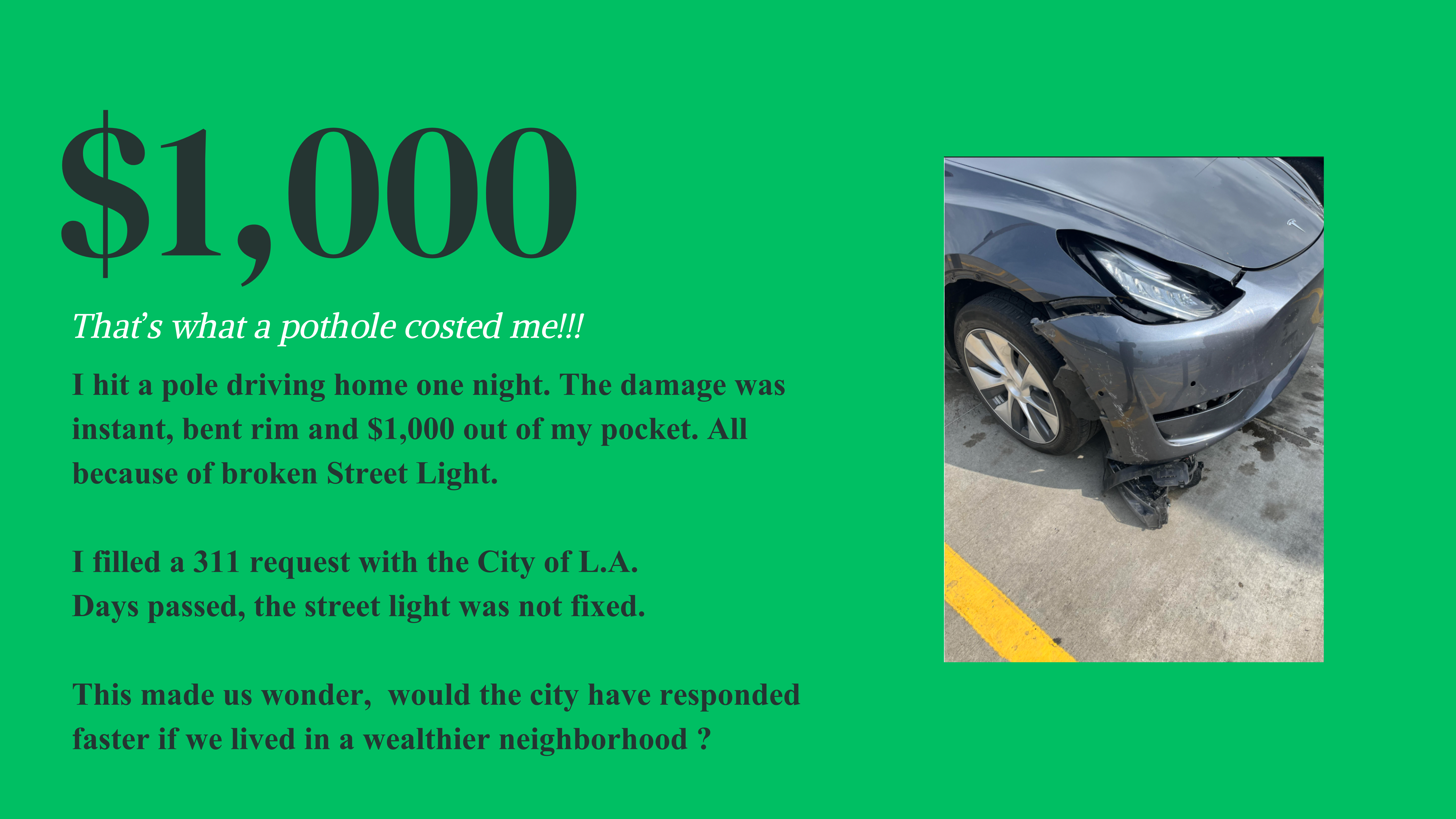
We wanted to know whether the police respond to areas of high wealth faster with service requests.
What it does
We gathered 3 different datasets, preprocessed, cleaned, feature extracted, and joined them together. We analyzed these datasets and how they interact with each other through a variety of figures. Then, we created an interactive map that overlays how response time and racial, educational, and financial demographics vary between tracts within LA county.
How we built it
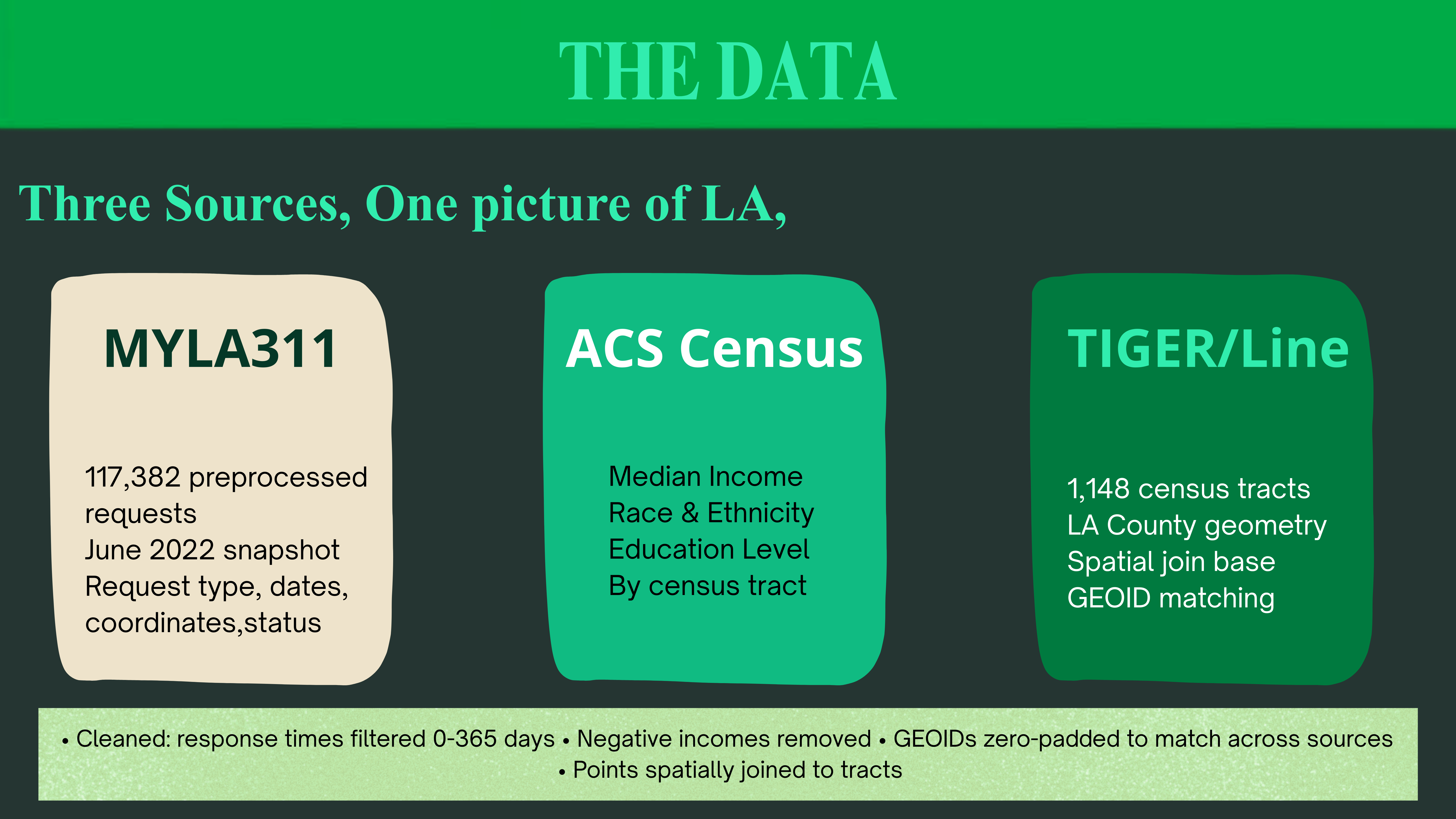
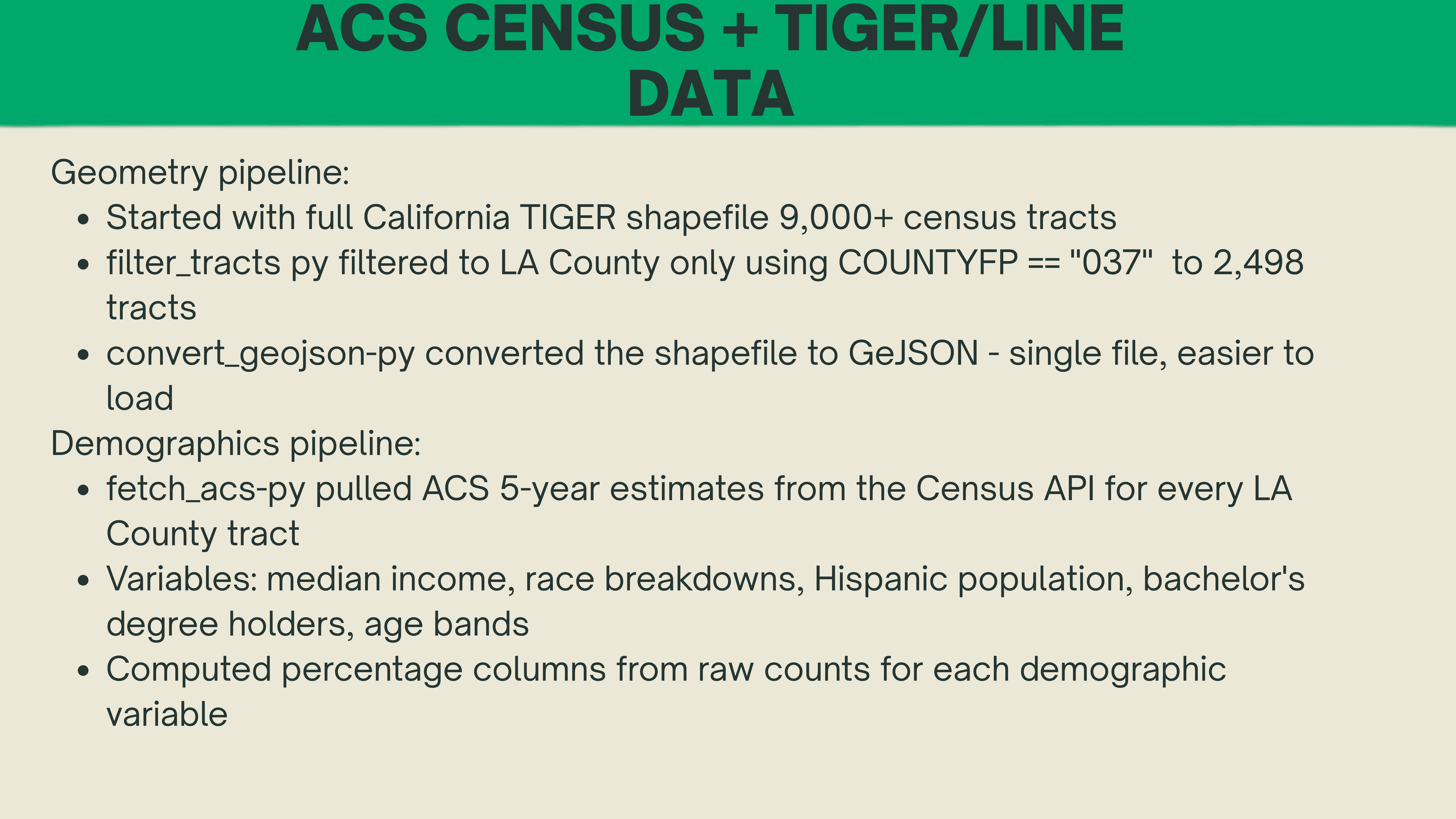
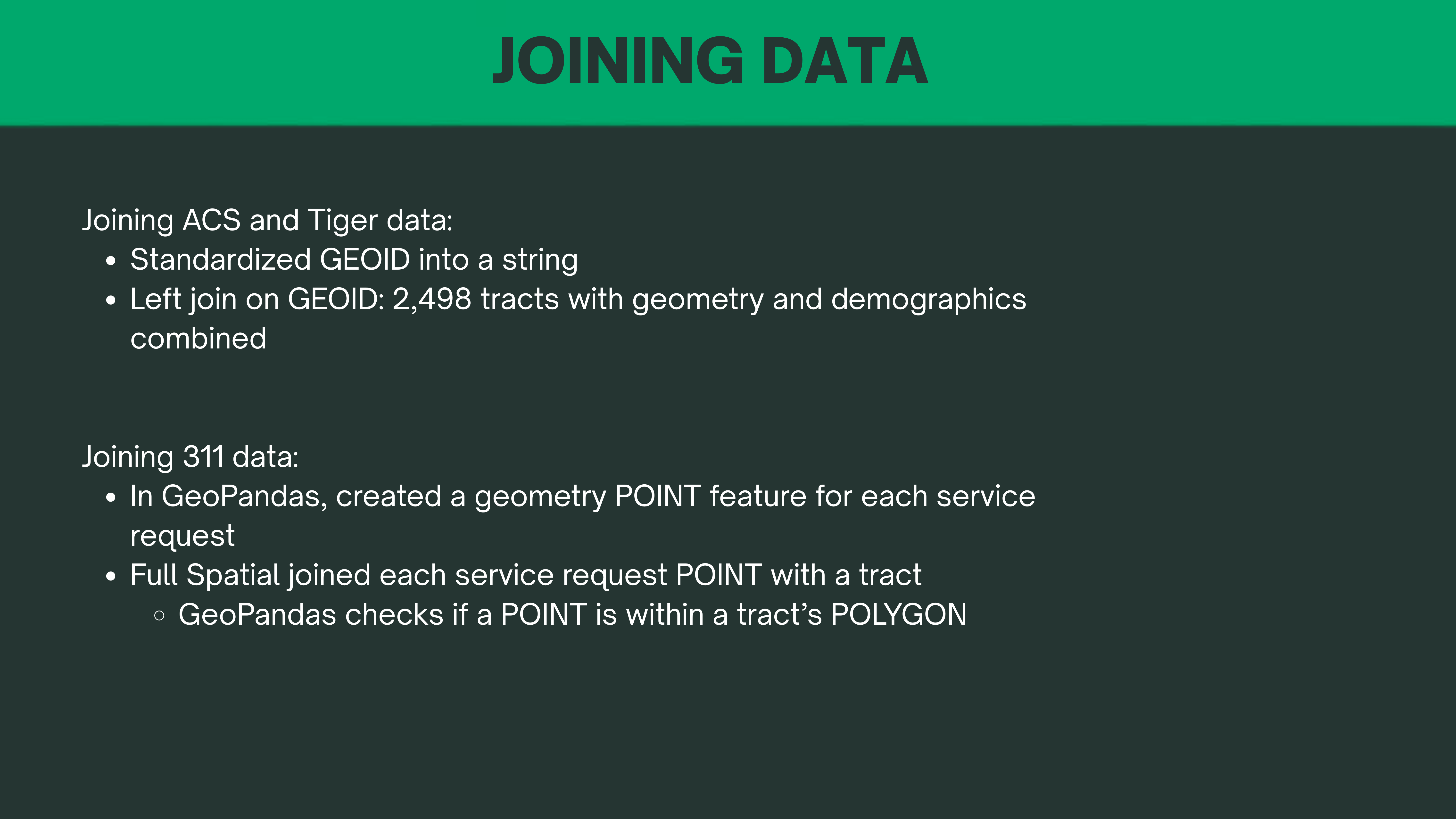
We used notebooks and Python scripts to gather, preprocess, and generate visualizations of the data. Then, we pulled three datasets: MyLA311 June 2022 requests, ACS Census demographics via API, and TIGER/Line shapefiles, then cleaned and filtered each before joining them. The geometry pipeline filtered California's 9,000 census tracts down to LA County, converted to GeoJSON, and merged with ACS demographics on GEOID after zero-padding to fix a format mismatch. Each 311 request was then spatially joined to its census tract using GeoPandas point-in-polygon, giving us a 116,651 row dataset with both complaint data and neighborhood demographics attached to every record.
Challenges we ran into
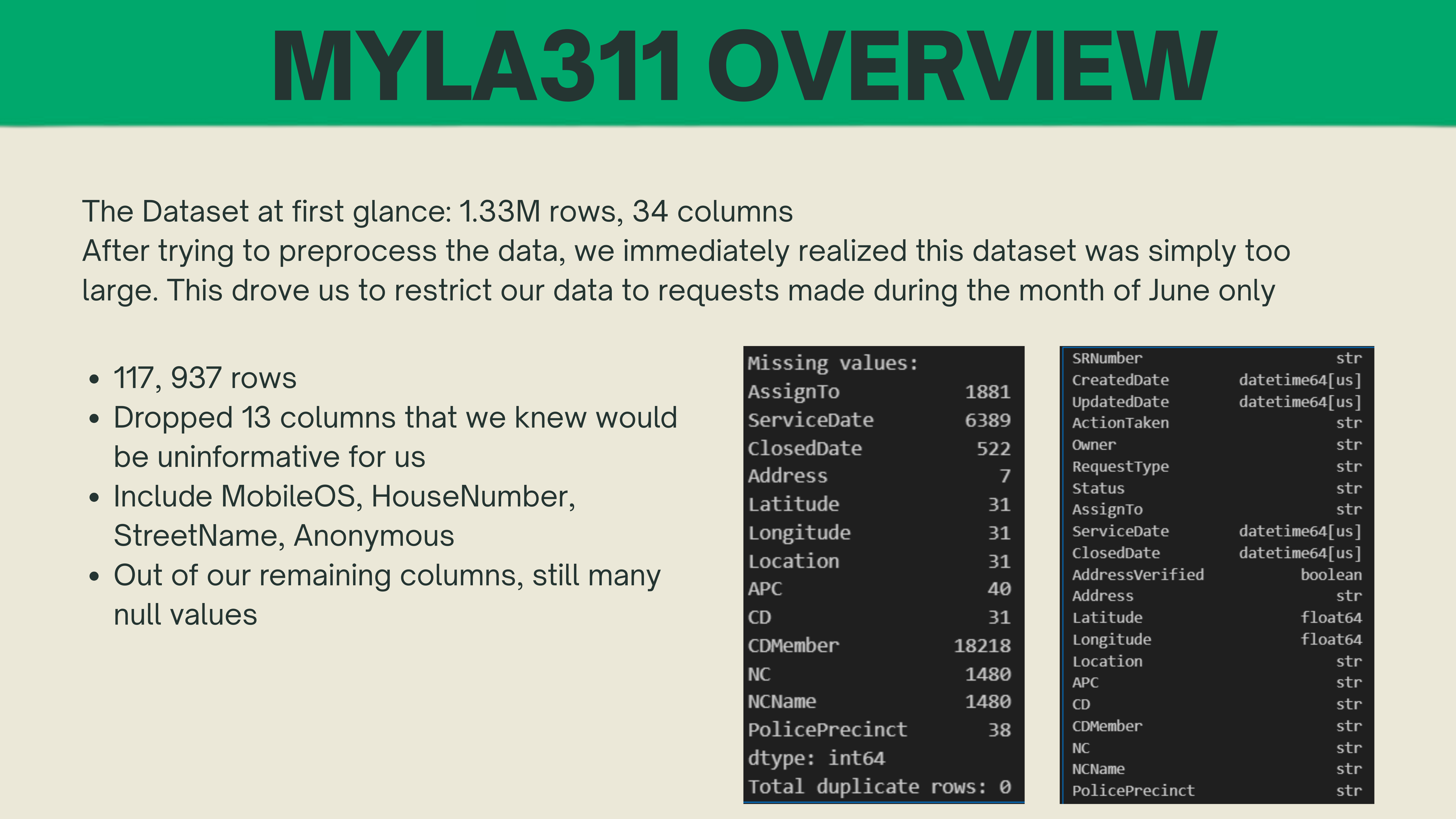
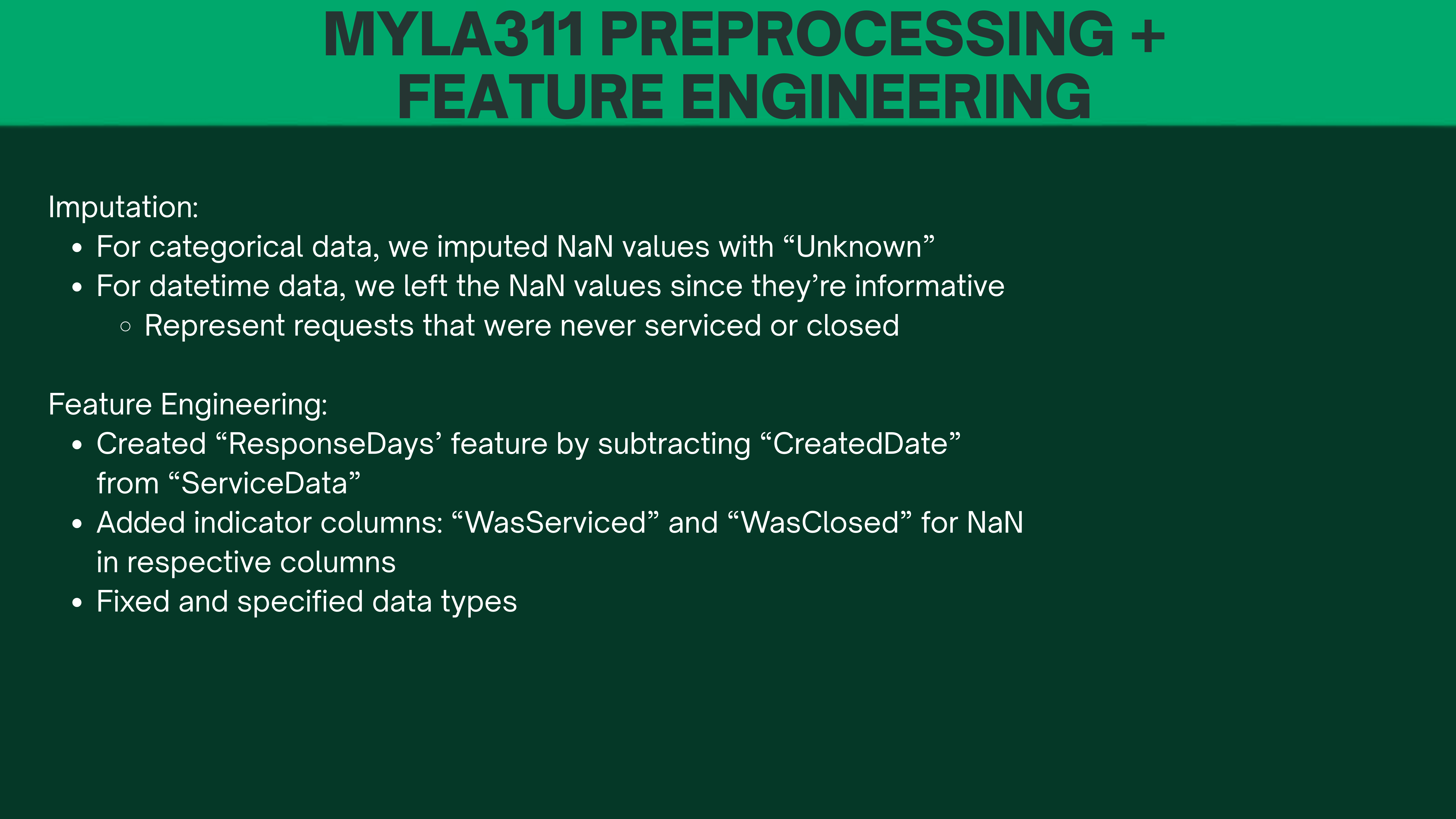
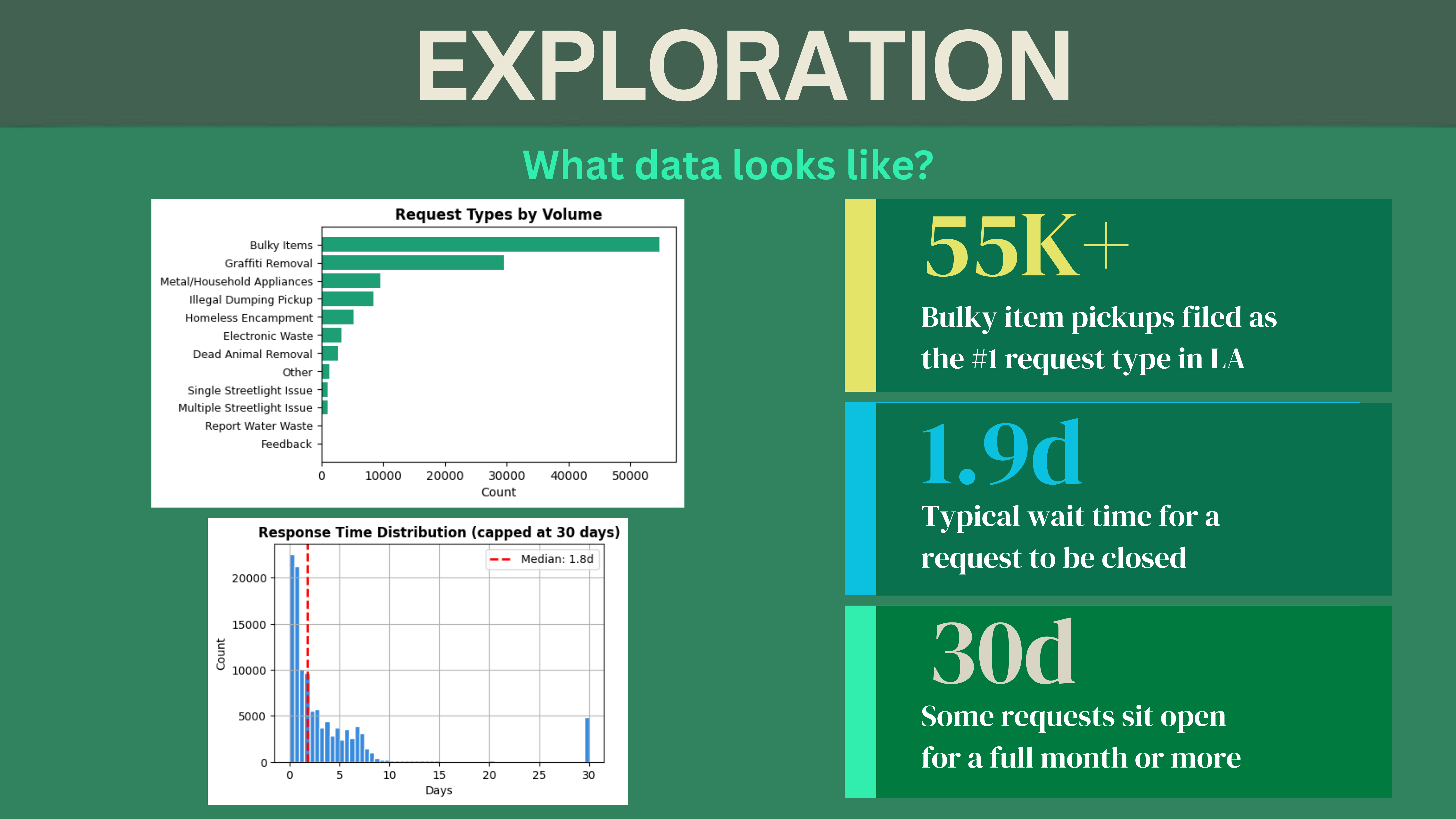
- The dataset was initially too large and preprocessing and analysis was taking too long. We narrowed our scope to June of 2022 through random sampling
- Lots of NULL values to deal with in our 311 dataset. Handled that with imputation *Early on, different parts of the UI were answering different questions: population-weighted tract medians in one place, unweighted tract percentiles in another. Aligning cohorts, weights, and definitions so Snapshot, map, and copy all pointed at the same interpretation took a lot of careful coding *LA County at tract resolution means large GeoJSON, lots of client-side joins (311 + ACS + overlays), and a bus UI. Making that feel usable on mobile was a separate challenge from “it works on a laptop with Chrome DevTools.”
Accomplishments that we're proud of
- Built an end-to-end tract-level view of 311 and place. We joined MyLA311 (June 2022 closed requests) with ACS demographics and census tract geometry so people can see where long closes cluster—not just citywide averages.
- Made the statistics honest and consistent. Snapshot metrics use the same cohort and weighting (e.g. population-weighted tract medians, income–response gap aligned with tract-level definitions), so the headline numbers don’t fight the map.
- Shipped a real public demo. Tract Record is live on Netlify, with a mobile-first simplified view on small screens so the core story - map + key counts + income–response gap - is still readable without the full analyst UI.
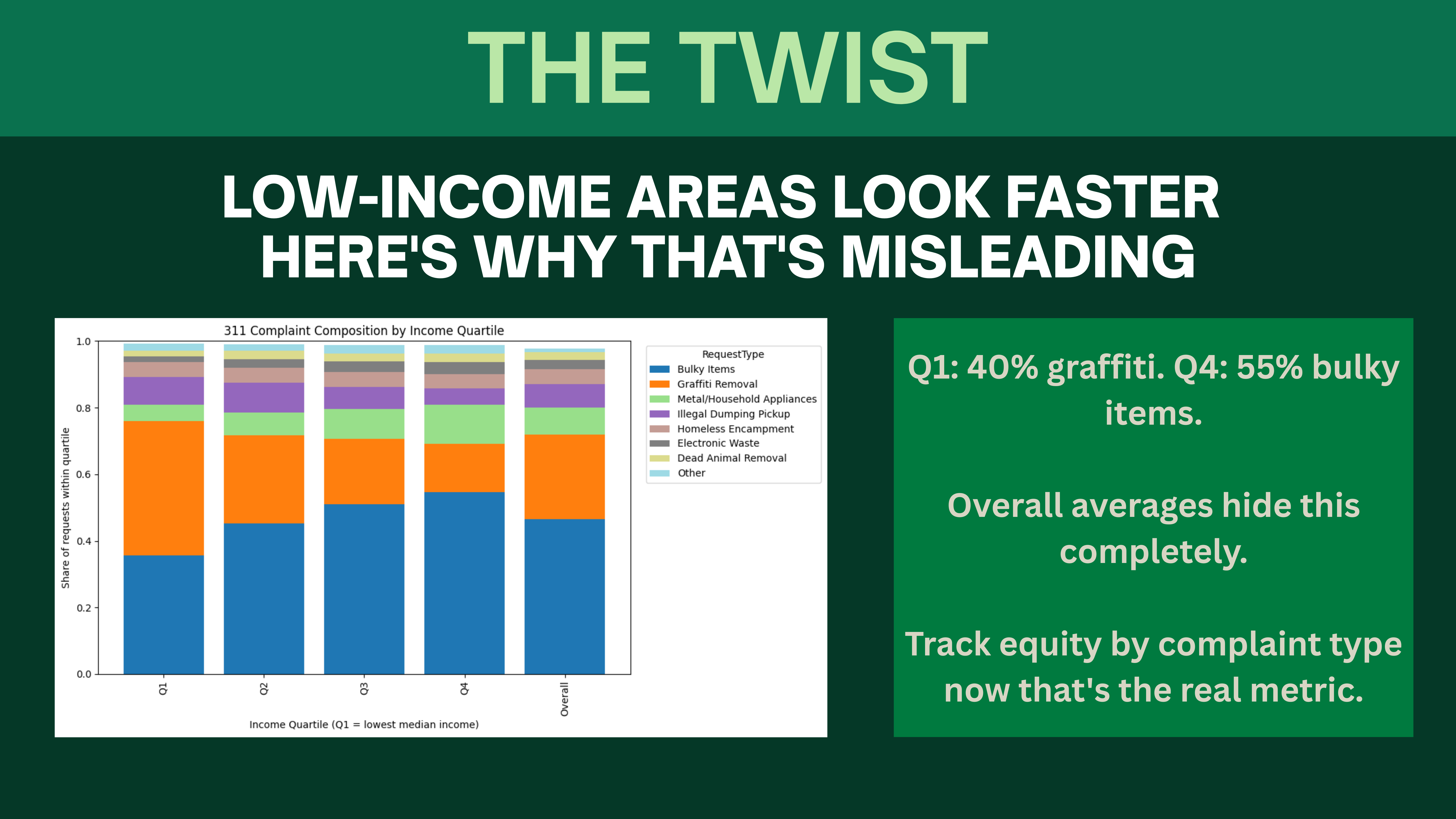
- Surfaced nuance, not a single misleading line. The work encodes a key insight from the analysis: raw “faster in poor tracts” can be a composition story (e.g. mix of request types like graffiti vs. bulky items), not a simple “equity solved” narrative - so the tool invites curiosity instead of false certainty.
What we learned
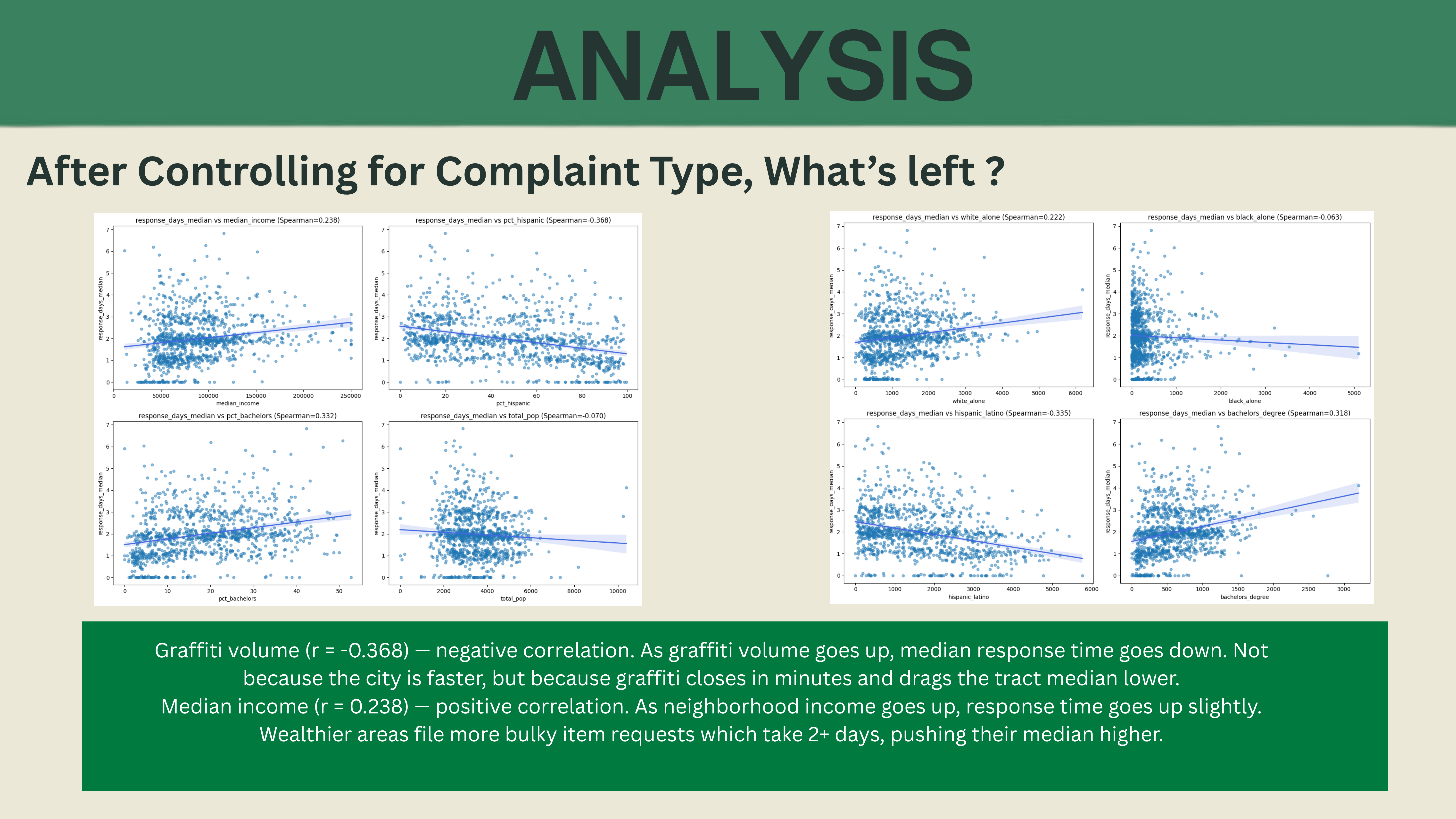
1) Neighborhood stories need tract + request type, not zip codes alone. Linking 311 to tracts and layering wait surface, income, and related ACS fields makes inequality and service mix visible in one place. 2) One number rarely tells the truth. Median close, distribution tails (e.g. 90th percentile), and Q4−Q1 income gaps answer different questions; we learned to label and compute them so they don’t get mixed up (tract vs. request level, weighted vs. unweighted). 3) Design and engineering are part of accountability. Clear legends, filters, mobile simplification, and provenance (what June 2022 means, what “tract median” means) matter as much as the regression notebook—otherwise the public can’t use the evidence.
What's next for Tract Record
Our project is live, and we want to help hold public offices accountable to the people they serve. Pattern and alert literacy: Make it easier for users to notice patterns - for example, tracts or areas where waits stay severe (long medians, bad tails, or persistent gaps vs. peer tracts)-without needing a statistics background. From insight to action: Add clear paths to speak up - e.g. one-click links or templates to contact the right local office (council district, 311, or other accountable channels) when someone sees something that looks wrong or unfair, so friction doesn’t silence feedback. Democracy by design: Tract Record’s role is to empower residents with understandable, tract-grounded evidence and low-effort ways to participate. The goal isn’t just a map - it’s to lower the cost of caring so communities can drive real change together.
Built With
- css
- html
- javascript
- jupyter-notebook
- netlify
- python


Log in or sign up for Devpost to join the conversation.