

Inspiration
Even though there are many sources of coronavirus data, it can be difficult for individuals to calculate and understand their risk level for contracting the coronavirus. We wanted to design a tool that uses reliable data to help individuals understand and visualize how at-risk they are.
What it does
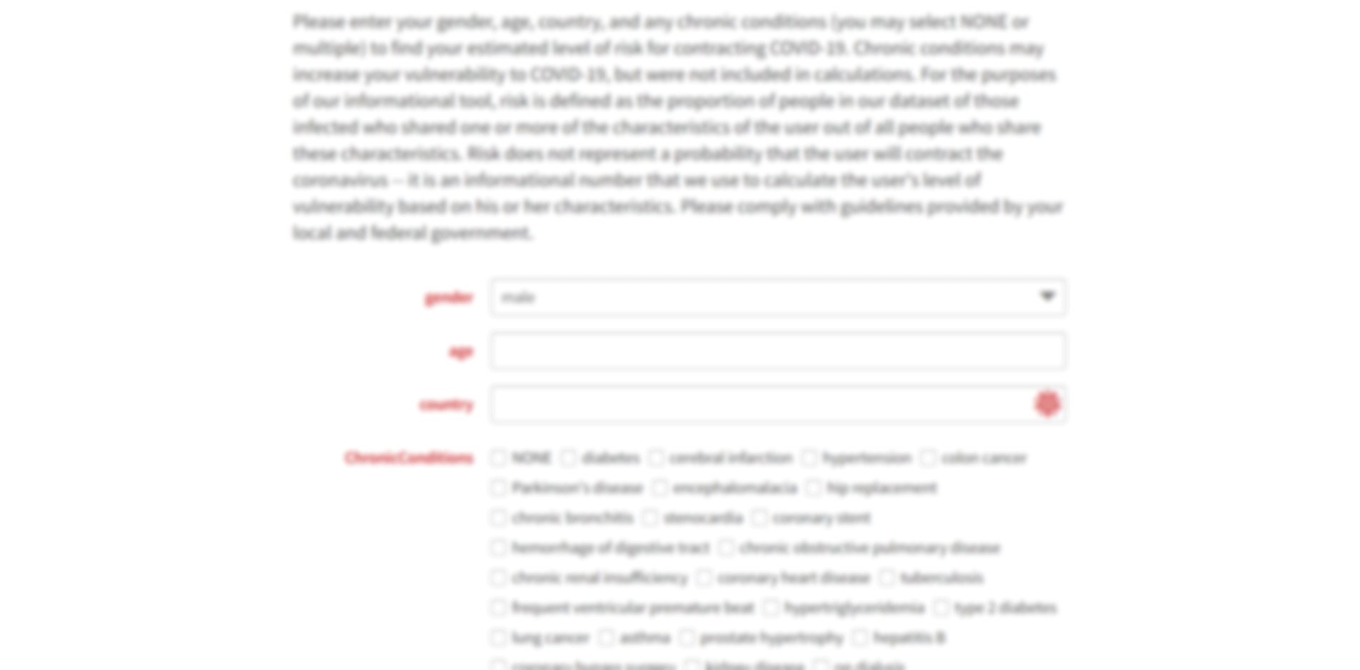
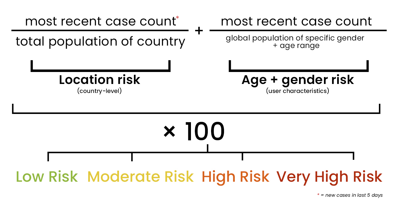
The web tool takes an input of the user’s age, country, and gender, as well as any pre-existing chronic conditions. It uses data from Wolfram and the United Nations to calculate the proportion of new cases in the last five days to the country's population and the proportion of people of the user’s age and gender with the coronavirus to the global population in that demographic group. These proportions are added together to form an overall measurement of risk, and this measurement is categorized as “Low,” “Moderate,” “High,” or “Very High.” Users can also view a map of worldwide cases of their age and gender and a graph of confirmed cases in their country, as well as the death rate for cases of their age and gender and the number of cases from patients with their pre-existing conditions.
How we built it
We used the Wolfram coronavirus datasets to collect data on cases by country and on the characteristics of individual patients. We also used data from the United Nations to obtain world population counts by age and gender. We used Wolfram to code the tool to take our desired inputs, calculate the risk levels using our datasets, and output the appropriate numbers, rankings, and graphics.
Challenges we ran into
The biggest challenge with this project was deciding which data to show to users. We wanted to create an intuitive tool that outputs useful information. Ultimately, we decided that individualized risk levels were the best way to combine the available data and help users understand how the coronavirus could impact them.
Accomplishments that we're proud of
We are most proud of designing, coding, and presenting a brand-new concept in 24 hours.
What we learned
This project taught us how to think about data. In order to connect people to enormous sets of data, we had to think carefully about how to design a tool that took user input and was able to output useful and understandable pieces of information for laypeople.
What's next for TraCOV
In the future, we hope to use a larger dataset, such as the Johns Hopkins coronavirus data, to make more precise and accurate risk level assessments.
Built With
- domain.com
- wix
- wolfram-technologies


Log in or sign up for Devpost to join the conversation.