-
-
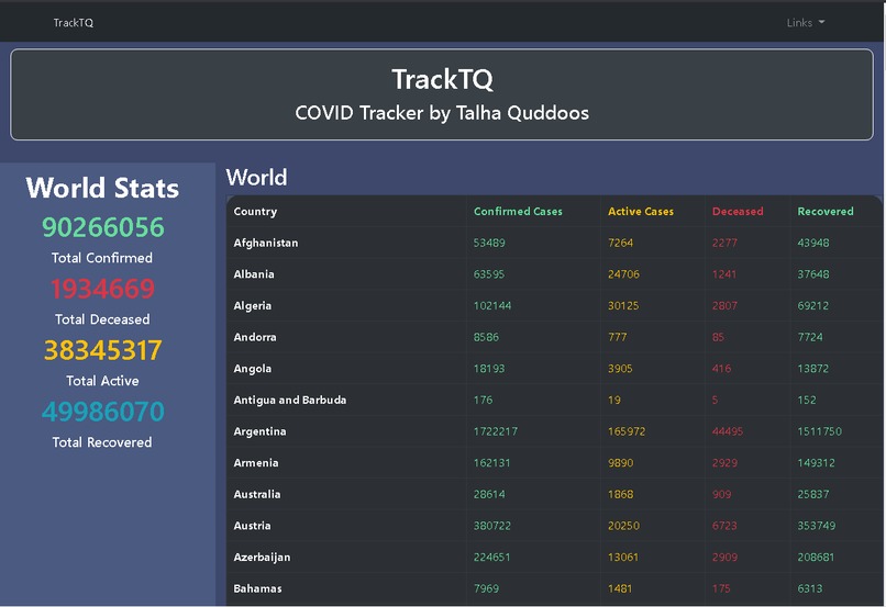
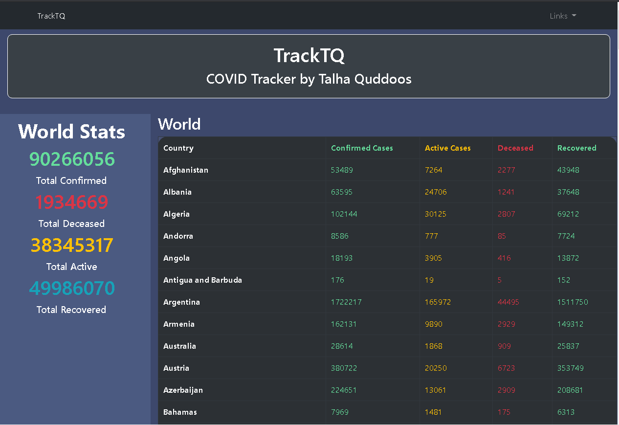
Home Page
-
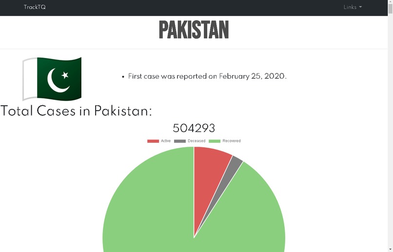
/country/country_name

Inspiration We all had bad times during the pandemic, however it also gave us an oppurtunity to learn new things and upskill ourselves. COVID-19 trackers were the focus of most people, but most of them did't had any visualizations. So, I decided to make a COVID-19 tracker, which will also include interactive visualizations.
What it does This app is basically a COVID-19 tracker, which tracks the confirmed and active cases, deceased and recovered people, but the plus point about TrackTQ is that it also offers interactive visualizations as well as also shows the complete history of the COVID cases from start. It also tells when was the first case reported in a particular country.
How I built it I built it using HTML for markup, CSS for styling, JavaScript for logic, Node.js for backend processing, and Bootstrap for responsiveness. I used Chart.js for making visualizations and charts, such as pie chart, doughnut chart and line charts.
Challenges I ran into The first and foremost challenge for me was to learn about COVID trackers and what they actually are. The next challenge I faced was to learn Chart.js library. The third challenge was to make visualizations through Chart.js library. And there is one more challenge ahead: Make a video about this project!!!!
Accomplishments I am proud of I am proud of adding those visualizations to my app, so my app became more interactive for people. Also, I used external API for the first time, and some higher order JS functions such as map and filter.
What I learned While I was making this app, I came to learn about a lot of things, including CSS position property (for adding the loader animation to my app), building pie charts, doughnut charts, line charts and bar charts using Chart.js, and a lot of other things like pushing to github, etc.

Log in or sign up for Devpost to join the conversation.