Inspiration
Airlines contribute around 2.5% of global carbon emissions. While this impact remains significant, many countries are taking notable steps to improve their airborne carbon footprint. In 2021, the 300-or-so global airlines belonging to the International Air Transport Association resolved to reach net-zero emissions by 2050. I wanted to check up on how they’re doing. My code is meant to be a jumping-off point. Ideally, after visualizing a trend in the data, one could draw conclusions regarding why or why not a given country’s approach to reducing CO2 emissions has been successful compared to others’. Personally, I’m hoping to study abroad over the summer, and I’d like to book airline tickets within the next week to visit my friend in Boston. From the perspective of someone who loves to travel, I wanted to build a tool which is interactive and easily accessible to anybody interested. I wanted the user to have fun inputting different countries and seeing which trends pop up.
What it does
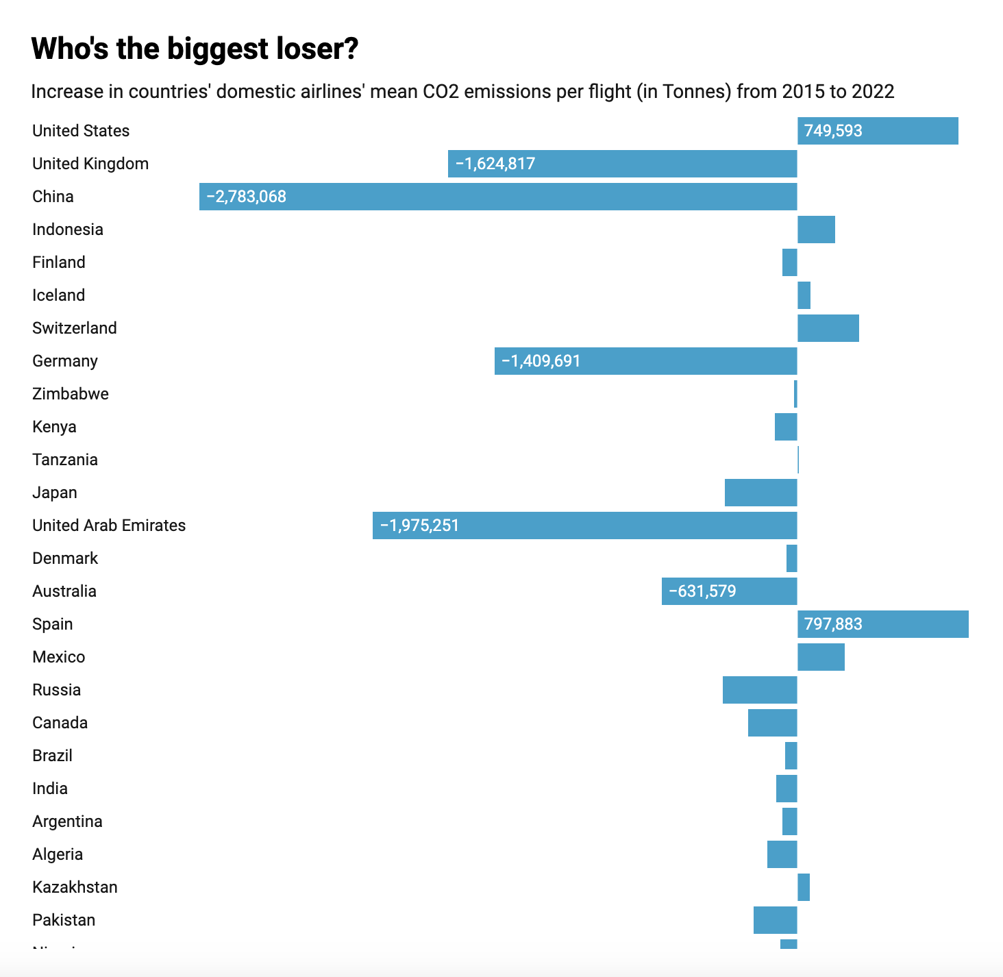
I wrote a function that accepts the input of a name of a given country, then generates a graph of that country’s yearly average per-flight CO2 emission from 2015 to 2022. I also wrote a function that takes the difference between the 2022 average and the 2015 average, then compares it to that of other countries–so that you can find out which country's the biggest loser, haha.
Separate versions of both functions are available to look at only domestic flights by resident airlines, or to look at all flights by resident airlines.
How I built it
I wrote the code in JupyterNotebook. I used Datawrapper API to create the visualizations.
Challenges I ran into
Midway through, a lost puppy wandered into the building and I had to abandon my project to return it to its owner… just kidding! That didn’t happen! I did keep getting error messages, though.
At first, I incorrectly initialized Datawrapper, which made it so that none of the visualizations were showing up. My main challenge was manipulating the dataset so that I could make the charts I had in mind–even after I initialized Datawrapper, it was a while before I could see any of those bad boys.
Accomplishments that I’m proud of
I can make graphs! That’s cool! With this program, I could make an inconceivably large number of different graphs! I could sit around for the rest of my life making graphs and still not exhaust its graph-making possibilities! I will not sit around for the rest of my life making graphs but I’m proud that I’ve given myself the option to do so, should the occasion arise!
I’m proud that I built a program that runs mostly-ish without error, and that I find it genuinely interesting to look at the visualizations it returns.
What I learned
I learned more about cleaning data in JupyterNotebook and Pandas. I also learned some new function calls to make working with datasets easier, and some common mistakes that may get in the way. I also familiarized myself further with the Datawrapper API and the different types of graphs available.
What's next for Biggest Loser
I’d love to be able to set up a web page which accepts inputs from the user, so that they can create visualizations themselves. I’d also like to find a way to assess the overall yearly airline CO2 emissions by country, as I recognize that the mean-per-flight is not the best measure of success. For instance, if an airline begins offering fewer short-distance flights to preserve fossil fuels, my visualizations would paint them as having become less eco-friendly rather than more.

Log in or sign up for Devpost to join the conversation.