-
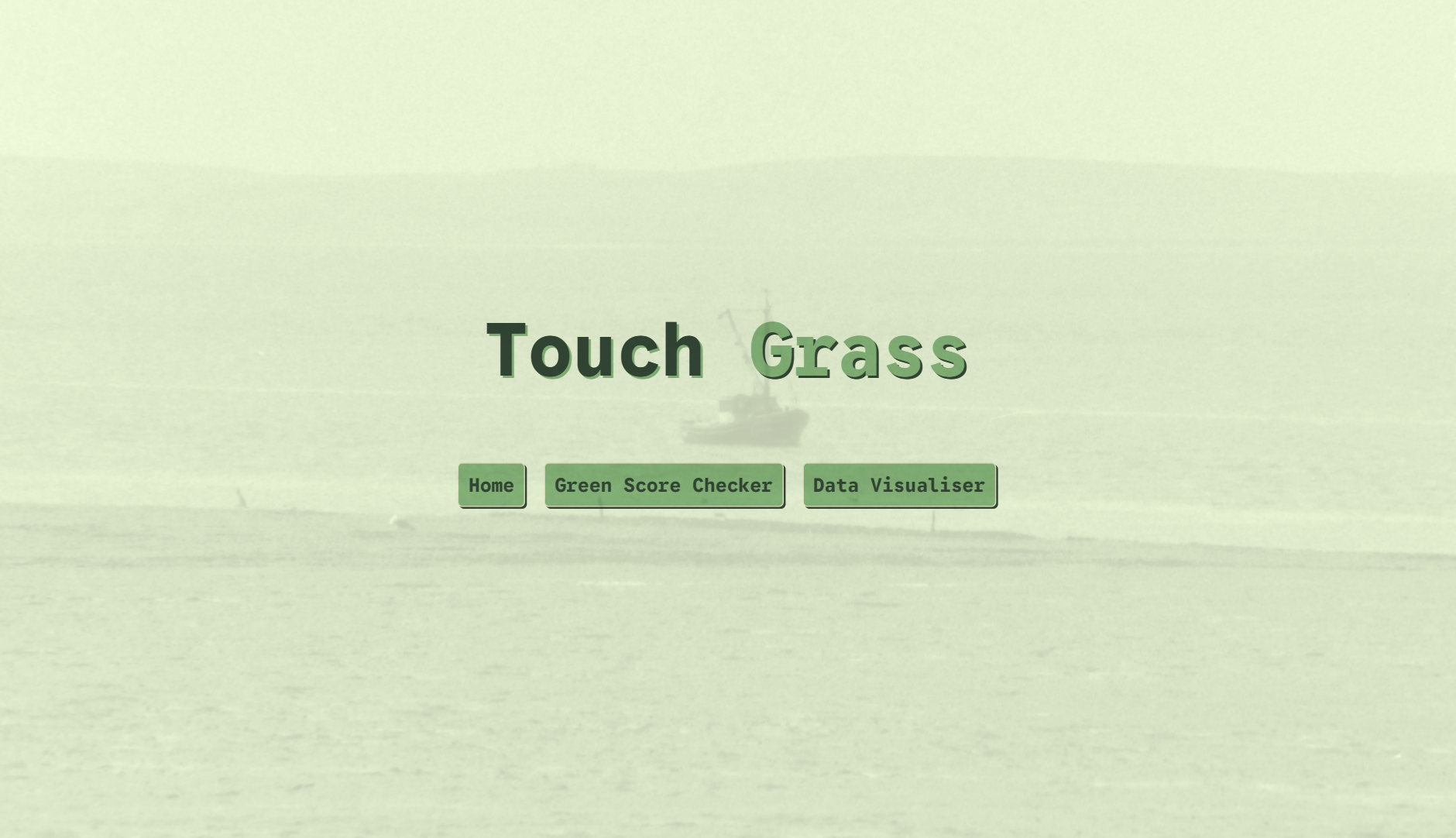
Home Screen
-
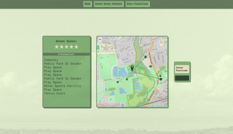
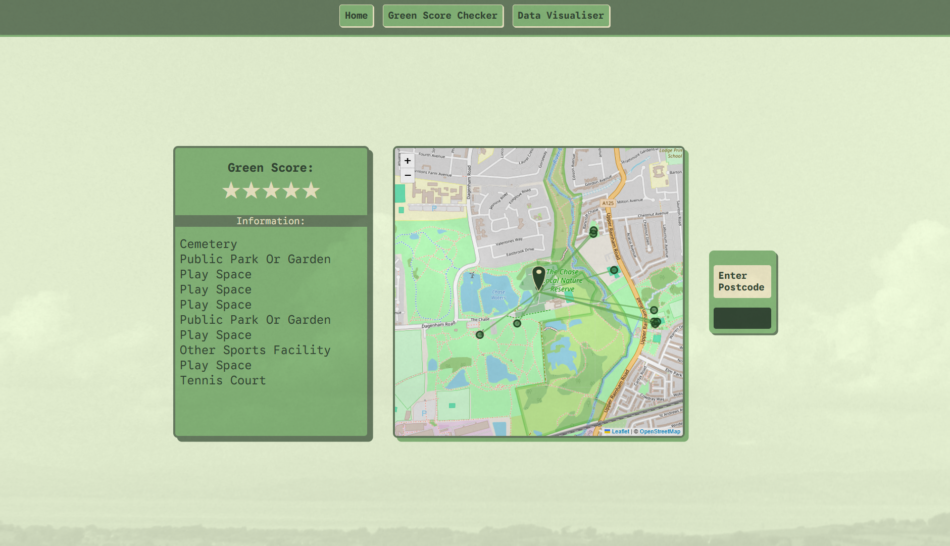
Green Score Checker (1)
-
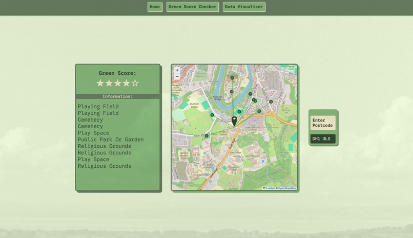
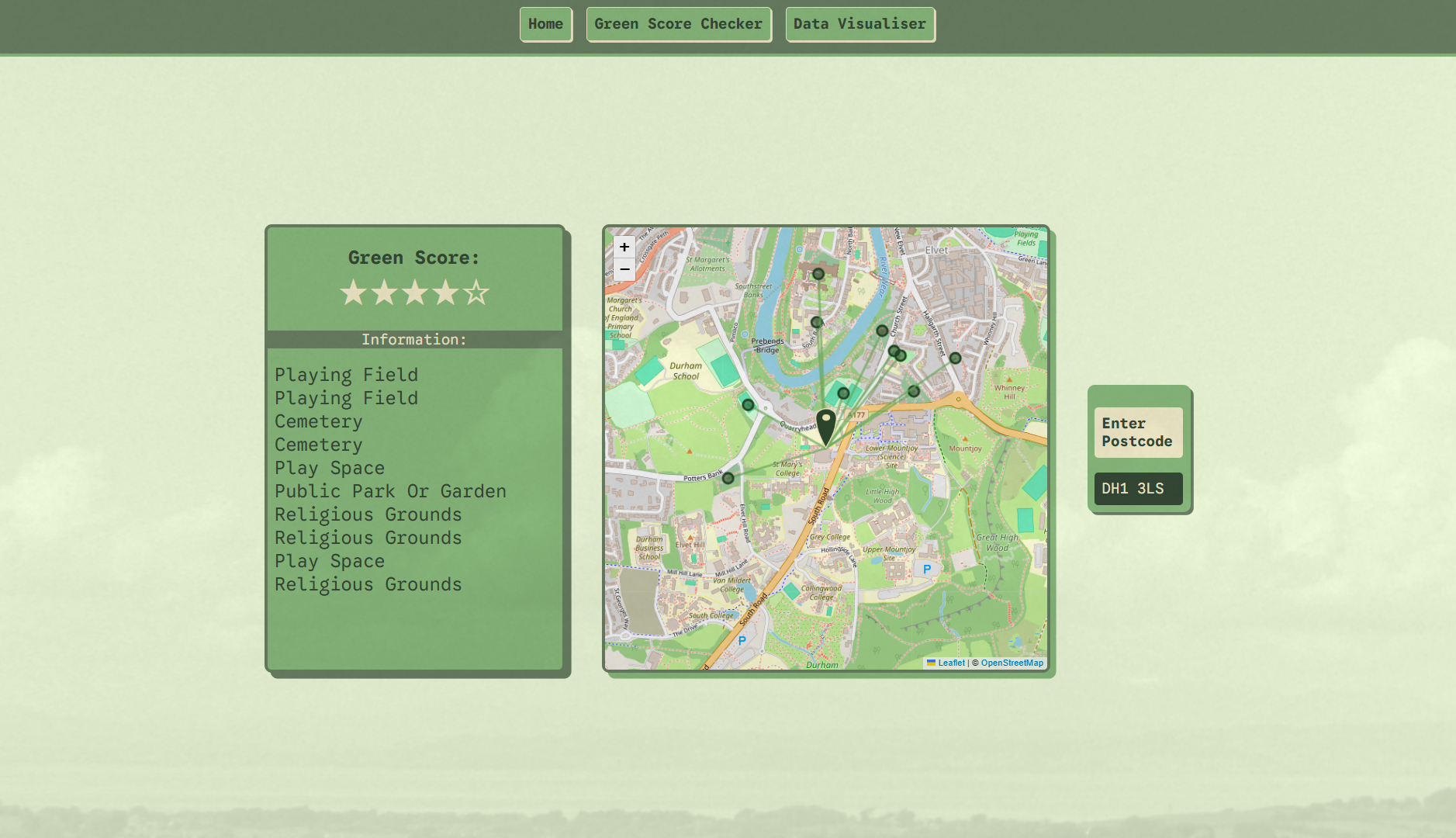
Green Score Checker (2)
-
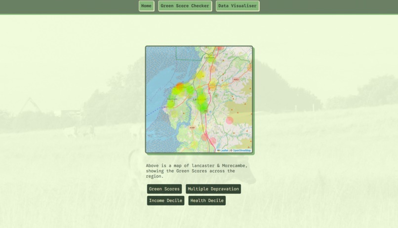
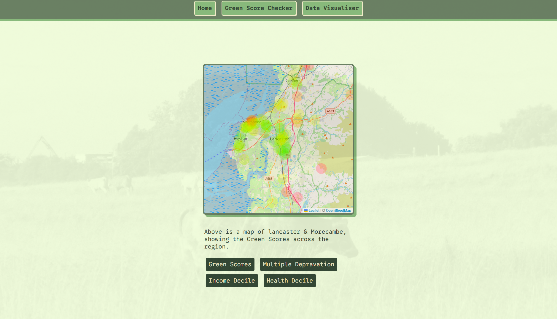
Data Visualiser
Inspiration
In 2018, 55% if the world population lived in urban environments, with this number being expected to rise to 66% by 2050 (Vojnovic et al. 2019). Access to greenspaces has significant benefits to physical and mental health; Hartig et al. (2014) found that it encourages higher levels of physical actvity, helps maintain positives social relationships within communities and reduces the risk of chronic stress. While 40% of upper class people visited parks in Bristol, only 27% of those in the lower class did (Jones et al. 2009), potentially signalling links between nature exposure and income bracket. Despite these benefits, access to parks and other greenspaces are still incredibly limited for those in urban areas (Angelia et al. 2023). With Touch Grass, we aimed to create a tool to draw users' attention toward the nature around them.
What it does
Touch Grass is a website that shows users different nature-based stats calculated from the area around them. The Green Score Checker takes in a postcode and shows users all the greenspaces that are accessible from that area. It also associates the postcode with a Green Score based on the number of nearby greenspaces and their relative sizes and distances from the postcode. The Data Visualiser aims to highlight the potential impacts of lack of exposure to nature. It maps the Green Scores of Lancaster, Durham and London as a heat map to allow users to better understand the distributions of greenspaces in these areas. It also creates heat maps of the Index of Multiple Deprivation decile, Income decile and health decile for these areas to allow for side-by-side comparison with the Green Space data and highlight any potential correlations between access to nature and other socio-economic factors.
How we built it
When the user inputs a postcode into the Green Score Checker, the website queries the caching system for a corresponding Green Score and the locations of nearby greenspaces. If it has them, it returns them, significantly speeding up the lookup process. We found this incredibly benificial as the databases we used are incredibly large, so lookups can take a long time. If the data isn't in the cache, a dataframe of nearby greenspaces is generated using the OS Open Greenspace dataset and this data is used to calculate a Green Score for the postcode. To calculate the Green Score, we wanted to consider the number of greenspaces, the sizes of them and the relative distances. More, larger and closer greenspaces should produce a larger score and fewer, further and smaller greenspaces should produce a lower score. We first calculate the size factor using \(sf = \frac{s}{s + 6}\), where 6 is a parameter that we tweaked to finetune the model. The distance factor is then calculated using \(df = e^{-\ln(2) \cdot \frac{d}{\max(d)}}\). We multiply these together to produce a individual green score for each location and aggregate all the scores using \(g = \bigl(1 - \prod (1 - p)\bigr) \times 6\) The greenspace data and Green Score are then returned to the website to be displayed and cached for future use.
The Data Visualiser takes a json file containing the longitute, latitude and a metric for that area. For the Green Score heatmap, this metric is a Green Score for each location and for the other heatmaps, the metric comes from the English Indices of deprivation dataset. For every entry, it takes the metric and maps it from green to red based on the metric and draws it on the map at its location
The OS Open Greenspace dataset provided us with the types, sizes and locations of different green spaces across the UK. Although approximately 14% of green spaces are not included in this dataset, a lot of them are private land, meaning it is still a good indicator of the green spaces the public have access to. link
We used the English Indices of Deprivation dataset to provide us with data on the income deprivation decile (ID), health deprivation and disability decile (HDD) and index of multiple deprivation decile (IMD) for different Lower-layer Super Output Area (LSOA) levels. The IMD is a combination of the following factors with the gollowing weights:
- Income Deprivation (22.5%)
- Employment Deprivation (22.5%)
- Education, Skills and Training Deprivation (13.5%)
- Health Deprivation and Disability (13.5%)
- Crime (9.3%)
- Barriers to Housing and Services (9.3%)
- Living Environment Depravation (9.3%) We also chose to map the HDD and ID as our research suggested that these specific factors may have a correlation with access to green spaces link
Because the English Indices of Deprivation dataset used LSOA to map location, we used the Postcode to OA (2011) to LSOA to MSOA to LAD (November 2021) dataset to convert LSOA levels to postcodes which correlated to the postcodes present in the databases we created. link
Challenges we ran into
We were working with very large datasets which took a long time to download and process. This halted our progress often as there were parts of the project that couldn't be completed until these had been run. In the future, we would design the order of our development process so other independent parts could take place while we waited for the data to be processed.
The Green Score Checker returns an objective score out of five, but while designing the equation for it, we realised that what makes a good greenspace is incredibly subjective. Some thought a large number of greenspaces was important to provide the user with variety, while others thought that having one greenspace nearby was vital to a good score. In the end, we cycled through multiple algorithms and chose the one that produced a Green Score that was close to the median of all our perceived scores for our testing data. Had we had more time, we would've liked to find a way to make it more objective, using tested metrics, or given the user a way to influence how much each factor contributed to the overall green score.
What's next for Touch Grass
It would also be interesting to see if the data we produced could be used to predict the impact that adding new greenspaces in certain places would have on the Green Scores of the surrounding areas. We found some interensting correlations between Green Score and certain deprivation factors within Lancaster, so it would be interesting to expand the dataset and see if this carries across the UK. If a significant correlation is found, the data could potentially be used to predict the impact that adding greenspaces around the UK would have on the deprivation factors of the surrounding areas. This would be incredibly interesting as it we could see how improving the greenery of an area would increase the quality of life for its inhabitants.
References
Angelia, S.I.A., Tan, P.Y., Kim, Y.J. and Er, K.B.H., 2023. Use and non-use of parks are dictated by nature orientation, perceived accessibility and social norm which manifest in a continuum. Landscape and Urban Planning, 235, p.104758.
Hartig, T., Mitchell, R., De Vries, S. and Frumkin, H., 2014. Nature and health. Annual review of public health, 35(1), pp.207-228.
Jones, A., Hillsdon, M. and Coombes, E., 2009. Greenspace access, use, and physical activity: Understanding the effects of area deprivation. Preventive medicine, 49(6), pp.500-505.
Vojnovic, I., Pearson, A.L., Asiki, G., DeVerteuil, G. and Allen, A. eds., 2019. Handbook of global urban health. New York and London: Routledge.


Log in or sign up for Devpost to join the conversation.