


I love numbers and totals - we gain a unique perspective when we see the big picture. I believe knowing and understanding our usage of products helps us use them better.
People love budgeting/finance apps because they can keep track of their spending, easily identify money being consistently wasted and then fix it by, well, not spending that money.
The same goes for fitness apps. It's addictive to keep track of your miles run, laps swam, bike rides completed. Knowing those totals - seeing them all on a graph or easily summarised - it's inspiring and addictive.
I wanted to apply the same concept to Uber. I was already playing with the API before I found about the hackathon - trying to analyse my past rides and trends, but never thought about making an 'app' of it. The hackathon definitely inspired me and I was motivated to create a tangible user experience that I had wanted for myself.
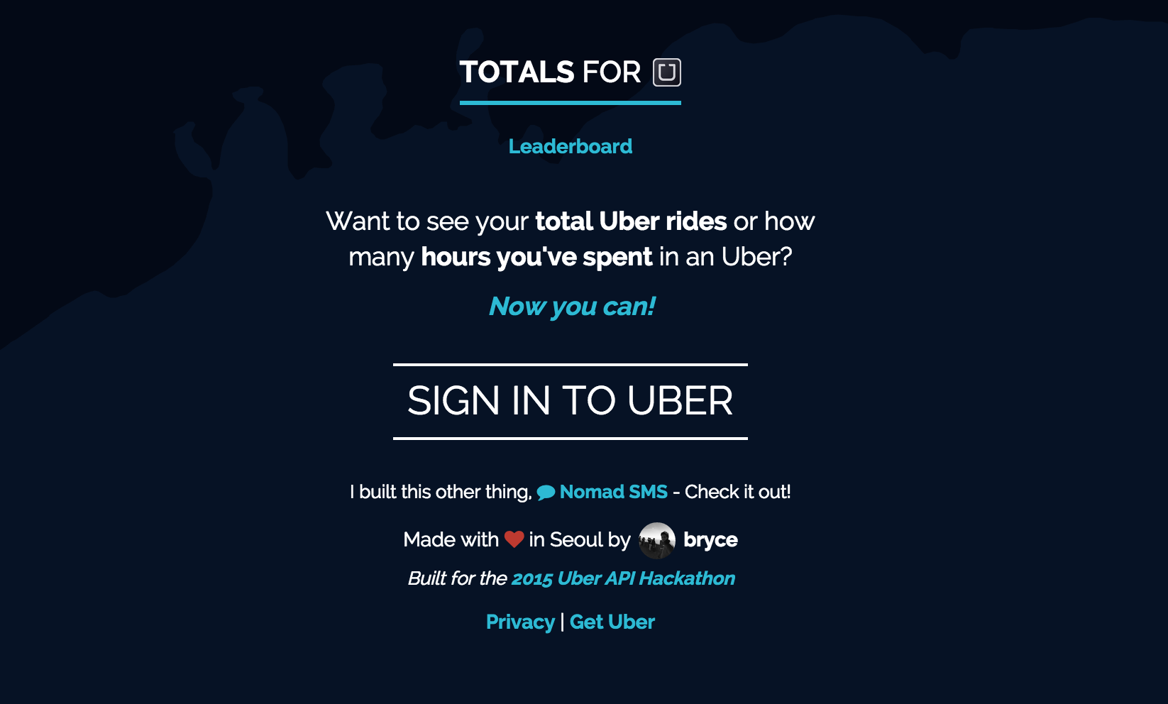
The idea was simple. All your Uber stats, presented in interesting ways, in one place. I kept the flow simple:

They'd then sign in and be sent to their own page. My personal sad results (I've lived in strange places around South East Asia for the past few years, where Uber wasn't easily available):

Sharing was also hugely important if I wanted it to go viral and make user acquisition easier:

I added twitter/facebook share buttons with the sharing message automatically set to their numbers so they could easily share their results:

That was okay but it was only going to be shared by actual Uber users and those proud of their results, so I quickly put together a leaderboard too:

I tried my best to keep the Uber design and feel to it. I think I succeeded as many people thought the app was built by Uber - sorry about that! :) I'm not much of a designer but the Uber brand and style is very recognisable, so just by using dark backgrounds and the light blue/aqua for text, people picked up that it was for Uber. Inspired by the map used on the API website and Uber website itself, I'm actually using live Google Maps as the background. I don't think many people noticed it funnily enough but you're able to drag it and explore at the same time.
A little bit about the project. It took about a day to build. I work full time so I had to get as much done as possible on a Sunday afternoon :) I used Laravel as the framework but there's really not too much else going on. After a user is authenticated, I create a record of them and create their page, which is pretty much just https://uber.totals.io/?utid={last 8 characters of their Uber ID (uuid)} - I also save some important stats like their total rides, hours driven, etc. for building the leaderboard.
Performance was tough. Obviously the max amount of rides I can return at a time from the API's history endpoint is 50, so for users with 1000+ rides, that's a lot of API calls. In hindsight I would have loaded the data in realtime after the DOM has loaded and then add the rides to the total count as I get them, rather than doing it server-side. I also initially popped it on a $5 digital ocean droplet, which was okay for the first few hours but when I had several hundred concurrent users, it started to struggle and I upgraded it.
The response was really cool. Within a day there were several thousand users and over the first 3-4 days over 10,000. That's the actual number of users who authenticated and used the app. There were around 50,000 views in that time too, so I believe it brought a lot of people who weren't actual Uber users but were interested in what was being shared. Also interesting was that 50% of users were on desktop. As Uber's typically a mobile experience, I think it's awesome to see users shift to different platforms to interact with the product.
I'm really happy with how it turned out, especially considering the small amount of time put into it. The Uber API was a lot of fun to work with, and the idea of a hackathon itself was brilliant and something that inspired me to write about Hacking User Culture.
Thanks for the opportunity! :)


Log in or sign up for Devpost to join the conversation.