-
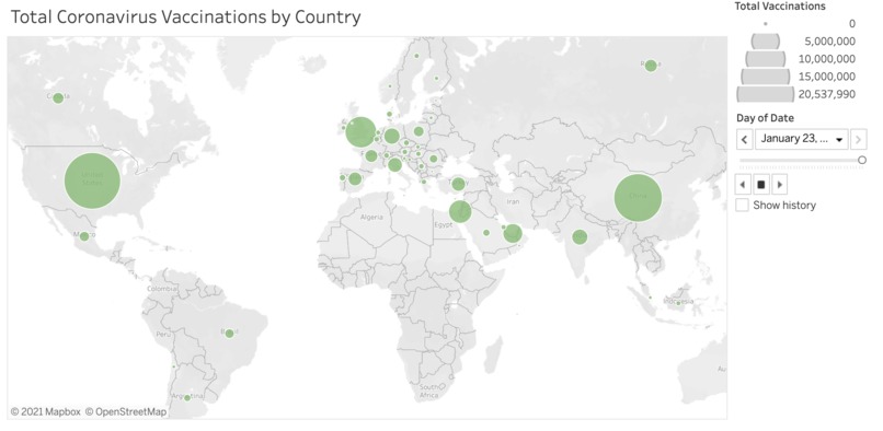
A screenshot of our vaccinations map
-
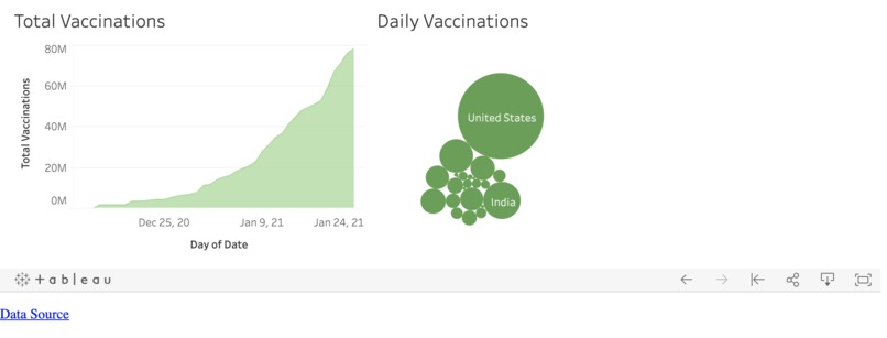
A screenshot of our vaccinations graph
-
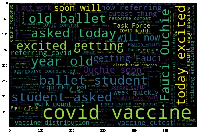
A word cloud from tweets about the Covid Vaccine with positive sentiment


Inspiration
After almost a year of Covid, the news of the vaccine was a 'light at the end of the tunnel' to most people. We wanted to make that light brighter.
What it does
Our tool summarises the progress in vaccinating people around the world, and conveys what others are thinking about the vaccine(s) in terms of sentiment (are various countries positive or negative about the vaccine, according the openly available data on Twitter?). This is a simple way for the public and/or organisations to obtain information quickly. Furthermore, our tool gets updated in real-time as new data comes in, staying up-to-date and relevant.
- One thing that differentiates our tool from others is our focus on positivity - we present data without any changes, but we use subtle features to make the visitor to the site a little happier: by using the calm shade of green (rather than red, as in many covid dashboards), keeping the display light (with not too much information) and visualising the positive Tweets.
How we built it
- We first found a dataset on Kaggle - https://www.kaggle.com/gpreda/covid-world-vaccination-progress.
- Next, we re-formatted the data to fit with Tableau's system and with our visualisation (fill null values with 0 or empty strings, add new rows for dates missing and forward-fill with the last available number).
- We then imported this data into tableau to visualise the number of vaccines, and embedded this Tableau dashboard within a GitHub website using html code.
- Another part of the dashboard illustrates what other people are thinking about the vaccine, based on Twitter sentiment in a random sample of Tweets mentioning the Covid vaccine. For this, we downloaded a dataset using the TAGS app of a random sample of tweets mentioning 'Covid vaccine OR Pfizer vaccine OR Oxford vaccine OR Moderna OR Coronavirus vaccine OR Sputnik vaccine', cleaned these and applied the sentiment analyser TextBlob. We also extracted location of these tweets from the user object in the tweet - for many users this data was missing.
- The tweets data was added to the dashboard, alongside a word cloud and an example tweet.
Challenges we ran into
- Pairing up the tool with a continuously updating source of data.
- Allowing viewers to see a time-series simulation of the data.
- Getting 3 data scientists to learn enough about front-end and back-end to host our analysis on a website...
Accomplishments that we're proud of
Managed to recover from a complete U-turn half-way into the hackathon.
What we learned
- Tableau!
- html!
- how to recover from a U-turn and re-start as a team half-way through a hackathon :)
What's next for Covid Vaccination Dashboard
Spread the word, make our tool useful, and add more features! For example, we plan to put in a whole dataset from which the Kaggle data was created - https://ourworldindata.org/covid-vaccinations. This will contain more detail about more countries.


Log in or sign up for Devpost to join the conversation.