Inspiration
TM 26 is inspired by classic, tactile industrial equipment from designers like Dieter Rams and playful instruments from Teenage Engineering. Most mobile design apps feel like generic software websites, but we wanted to build a smartphone tool that feels like a precise, physical instrument—a synthesizer, but for real-world textures. The goal was to let digital artists, 3D creators, and designers capture inspiration directly from the physical world and turn it into immediately usable assets.
What it does
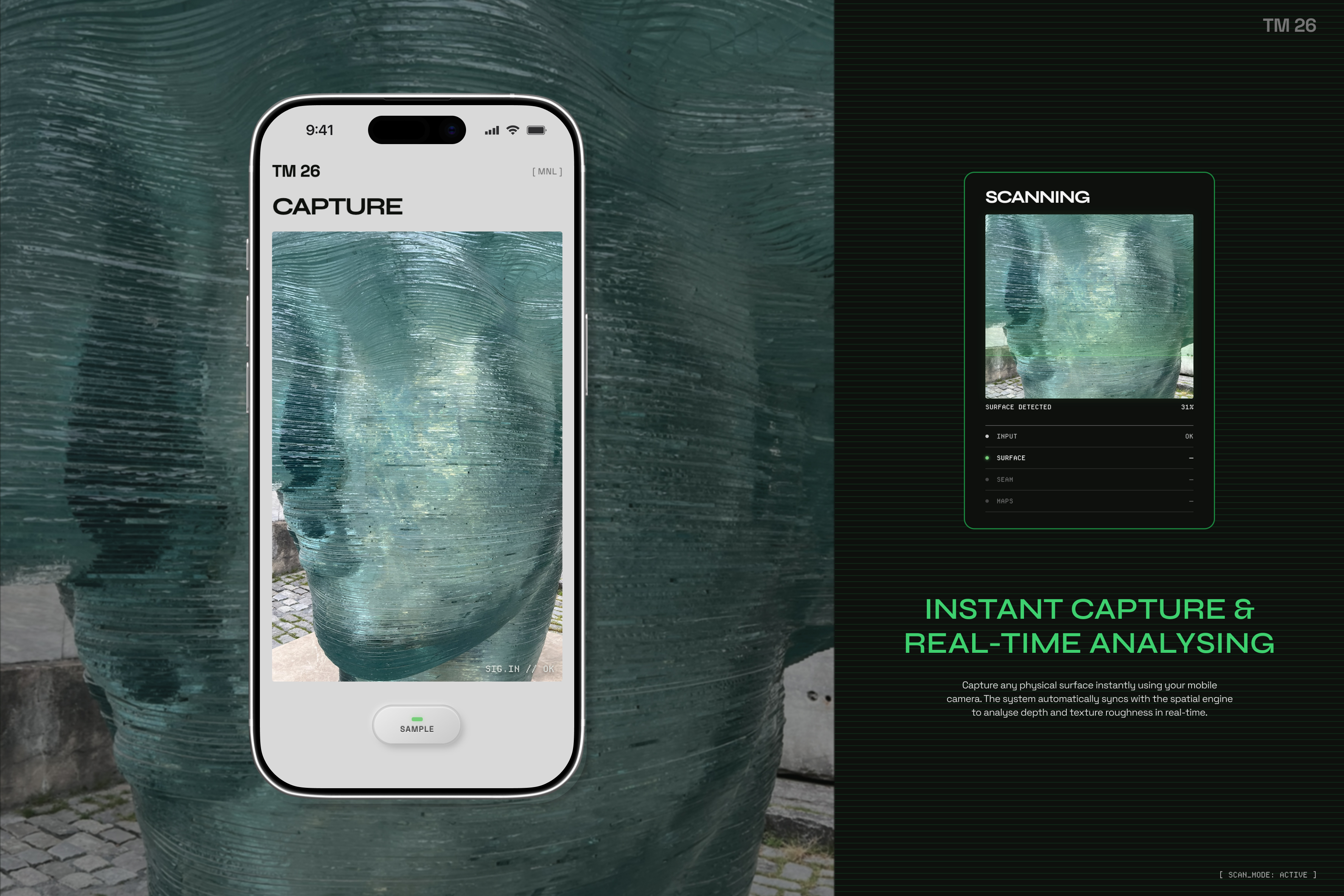
TM 26 is a mobile-first material digitization app. Users point their smartphone camera at any surface to take a sample. The app processes the image locally and instantly generates a multi-format creative toolkit:
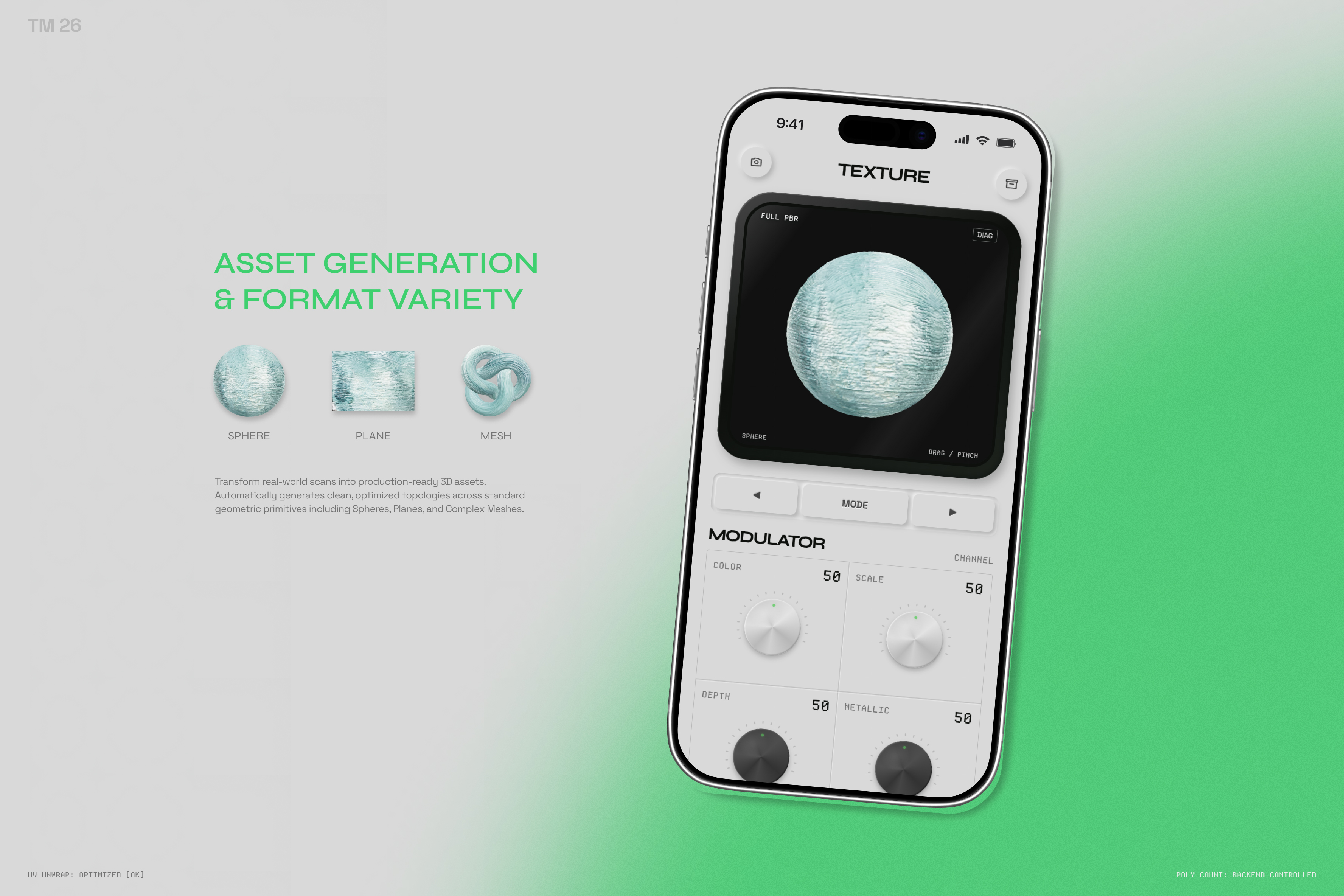
- 3D Assets: Full PBR maps including Albedo, Depth, and Gloss channels, viewable on an interactive 3D preview sphere.
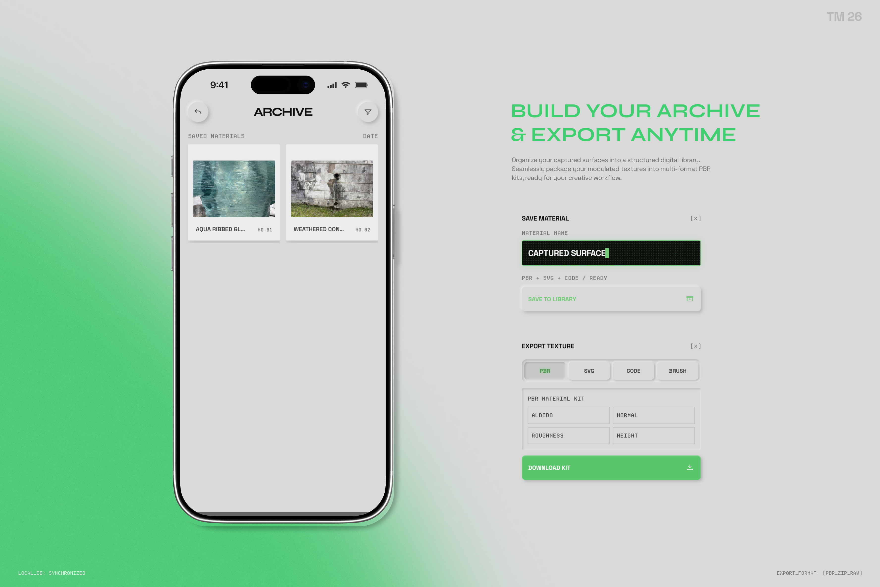
- 2D Assets: Seamless vector patterns (SVG) for graphic design.
- Code & Brushes: Raw material configuration code and digital brush kits for software like Procreate and Photoshop.
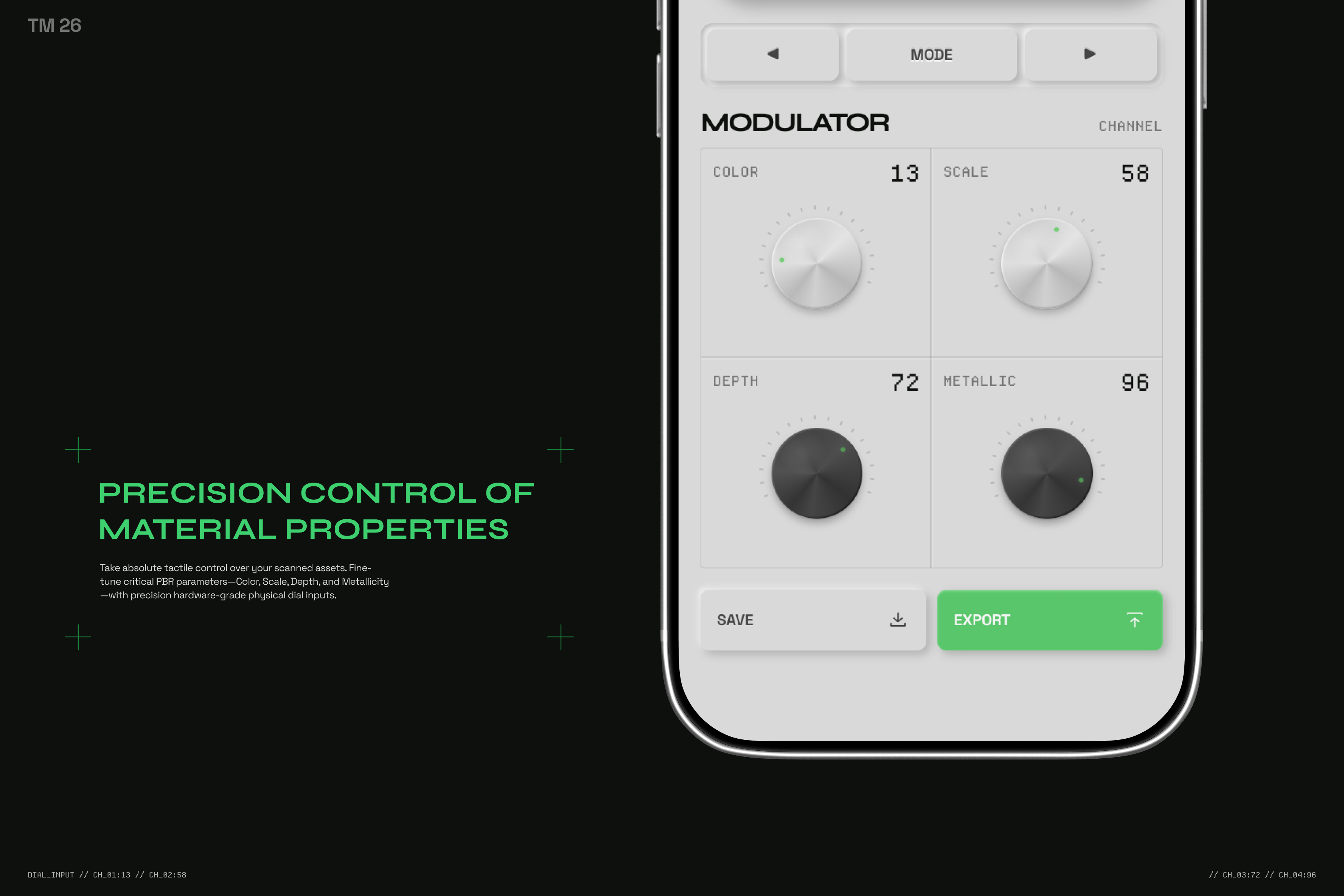
Users can toggle diagnostic views to inspect channels, fine-tune properties using tactile dial controls, and save their creations to a local device archive.
How we built it
We built the entire project as a lightweight, framework-free frontend application using vanilla HTML5, CSS3, and JavaScript.
- 3D Engine: We integrated Three.js via a CDN to handle the interactive 3D canvas container, allowing smooth touch-based rotation and pinch-to-zoom gestures.
- Camera Capture: The app uses the native browser WebRTC MediaDevices API to access the device's rear camera directly in mobile Safari or Chrome.
- Local Analysis: Texture mapping and depth field generation happen entirely on the client-side using custom HTML5 Canvas image luminance filtering.
- AI Collaboration: GPT-5.6 acted as our lead product architect, mapping out the multi-screen journey and calculating responsive mobile ergonomics. Codex and Cursor served as our implementation pilots, transforming design ideas into functional code, writing complex touch event handlers for the 3D viewport, and building the layout for the slide-out export panels.
Challenges we ran into
- 3D Sphere Clipping and Texture Seams: Resolving depth conflicts where the interactive 3D sphere physically clipped into the surrounding UI container was a major technical hurdle. Additionally, ensuring that different captured images wrapped around the geometry smoothly without visible seam artifacts under intense displacement mapping required precise renderer tuning.
- Cross-Material Evaluation: Calibrating how the local canvas filter translated completely different real-world surface profiles—ranging from soft human skin to rough industrial fixtures—into consistent, responsive height fields that react naturally to light.
- High-Density Mobile Layout: Packing a complex instrument workspace (complete with live viewports, four independent dial modulators, multi-format export cards, and system schematics) into a compact smartphone viewport while keeping all touch targets ergonomic and readable.
- Tight Style Iteration Deadlines: The limited hackathon timeline forced us to execute extreme visual and structural overhauls at a rapid pace—such as stripping out layout-breaking screen-shake elements, embedding the operational manuals directly into the hardware logo, and tuning the CRT sub-pixel background grid.
- AI Model Regressions ("Two Steps Forward, One Step Back"): Working with LLMs and Codex meant dealing with occasional codebase instability. Sometimes a model would generate an excellent feature but inadvertently introduce a regression or break existing touch event logic, requiring us to carefully revert code, manually debug syntax, and guide the AI step-by-step to lock down a stable state.
Accomplishments that we're proud of
We built a highly responsive, deeply tactile user experience that feels like a premium pocket gadget rather than a flat webpage. Achieving low-latency local image conversion without a heavy backend or third-party framework was a major win. We are especially proud of the rock-solid Three.js rendering performance on actual mobile devices after fixing the texture clipping bugs.
What we learned
Building the actual prototype taught us that desktop monitors lie. Many interface elements, line weights, and font proportions that looked perfectly balanced on a large development monitor felt completely wrong once loaded onto a physical smartphone screen.
We learned that true calibration cannot happen in isolation on a screen—it must happen in context. You cannot accurately judge the usability, density, or ergonomic comfort of a mobile interface until you hold the device in your hand, interact with it using your thumb, and test it under real ambient lighting conditions. This real-world environment testing is what ultimately dictated our final decisions on element scaling, layout tightening, and interface polish.
What's next for TM 26
The immediate priority is preparing TM 26 for a public launch. Our next steps are:
- Public Beta Release: Finalize the core stability and launch an open beta to gather real-world feedback from visual creators and 3D artists.
- Production-Ready Exports: Upgrade the current prototype asset downloads (SVG, PBR kits, and brushes) into fully validated formats that creators can import seamlessly into Blender, Procreate, and Photoshop.


Log in or sign up for Devpost to join the conversation.