-
-
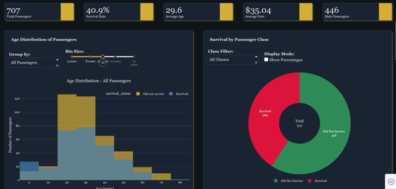
Titanic Survival Analytics Dashboard

Inspiration
I wanted to explore the Titanic disaster using data.
The goal was to find patterns in who survived and build a dashboard that shows insights clearly.
What it does
- Shows four main sections:
- Historical Review (what happened)
- Root Cause Analysis (why it happened)
- Scenario Forecasting (what might happen)
- Historical Review (what happened)
- Includes interactive charts: histograms, donut charts, violin plots, and heatmaps
Gives easy-to-understand insights from the data
How we built it
Everything was built using Plotly Vibe Code. I provided a single comprehensive AI prompt, and Vibe Code handled:
Loading and cleaning the Titanic dataset
Splitting data into training and test sets
Training three ML models: Random Forest, Decision Tree, Linear SVC
Evaluating models with Accuracy, Precision, and Recall
Building a four-tab interactive dashboard with CYBORG dark theme, KPIs, charts, and prediction inputs
Challenges we ran into
- Some charts overlapped, requiring edit to fix in Vibe Code
- Missing Strategic Recommendations tab: even though it was in the instructions, Vibe Code did not generate it automatically, so it would need to be added manually
## Accomplishments that we're proud of
Fully functional interactive dashboard built entirely in Vibe Code
- High-quality visuals with CYBORG dark theme and clear KPIs
- Turned messy Titanic data into actionable insights without writing manual code
What we learned
- How to trust AI to automate end-to-end workflows
- Importance of clean data and proper feature engineering
- How to compare multiple ML models and evaluate them effectively
- How to present data insights clearly in an interactive dashboard ## What's next for Titanic Survival Analytics
- Add the Strategic Recommendations tab manually, with four actionable insights
- Include additional ML models and hyperparameter tuning
- Add better visualizations for survival probabilities


Log in or sign up for Devpost to join the conversation.