-
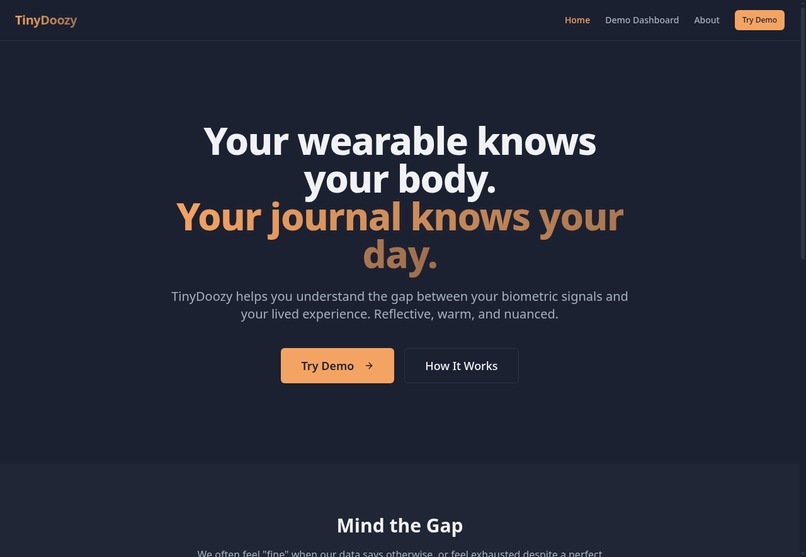
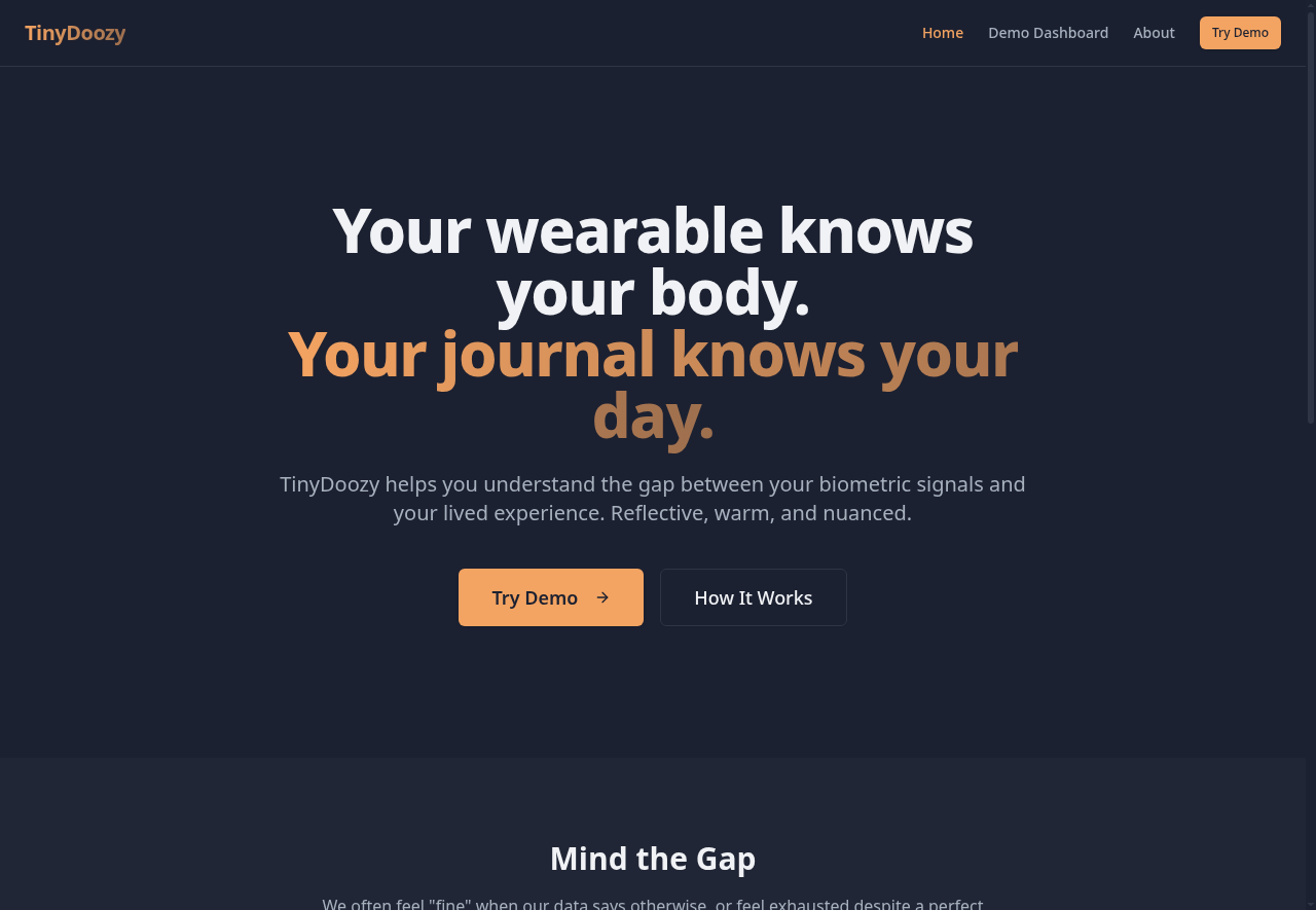
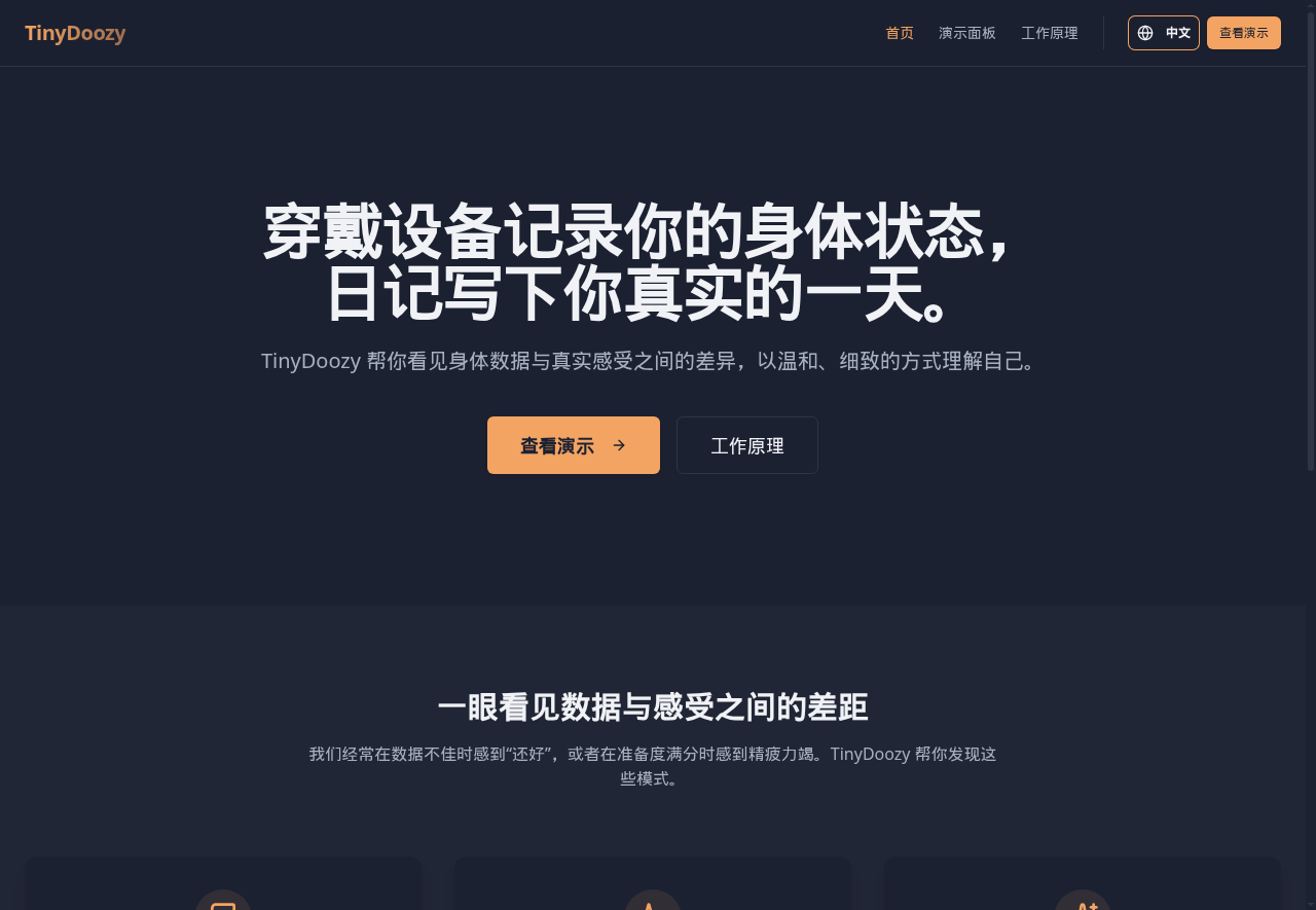
Landing Page EN
-

Landing Page CN
-
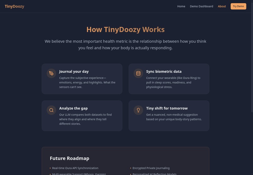
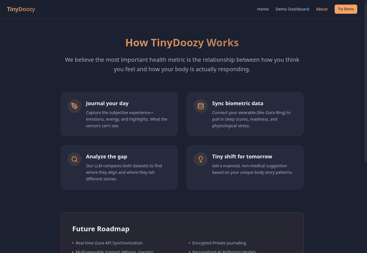
How it Works EN
-
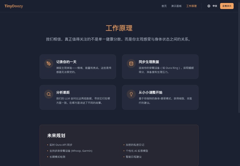
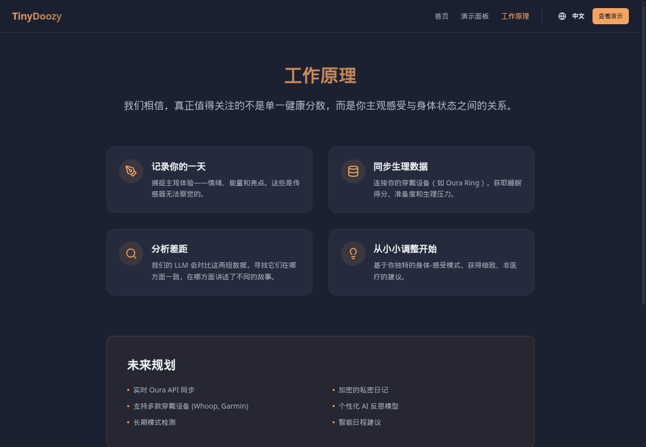
How it Works CN
-
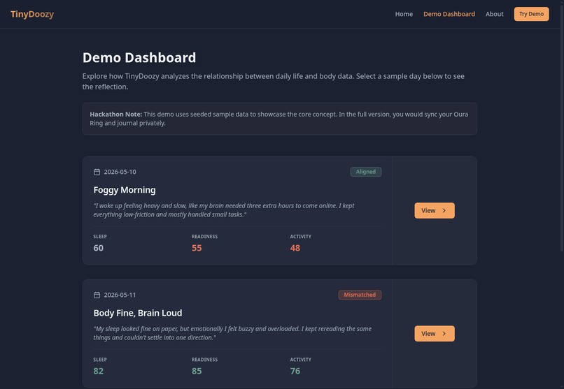
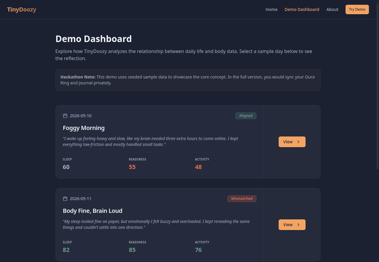
Demo Dashboard EN
-
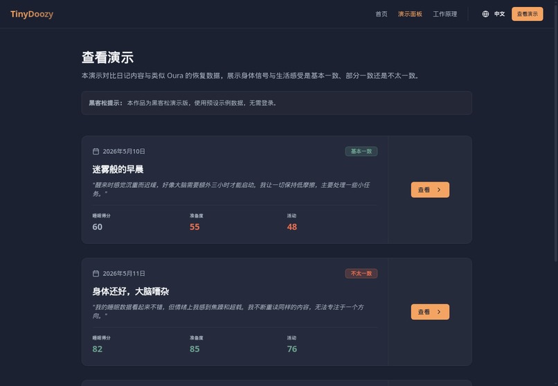
Demo Dashboard CN
-
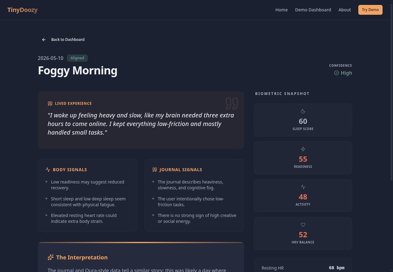
Journal Excerpt EN
-
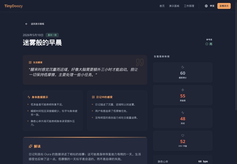
Journal Except CN
Inspiration
TinyDoozy started from a simple observation: health data and lived experience do not always tell the same story.
A wearable can show sleep, recovery, and activity scores. A journal can capture how the day actually felt: tired, clear, scattered, creative, overloaded, calm, or energized. We wanted to explore what happens when those two perspectives are placed side by side.
The core question behind this demo is:
Did the body data match the lived experience?
What it does
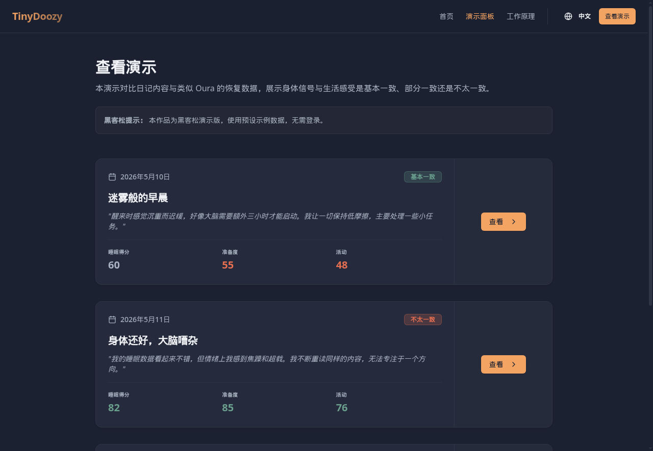
TinyDoozy: Signal & Story is a public demo that compares sample journal entries with Oura-style wearable data.
The demo includes three example days:
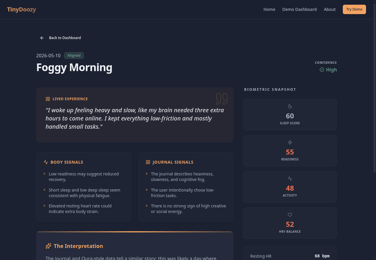
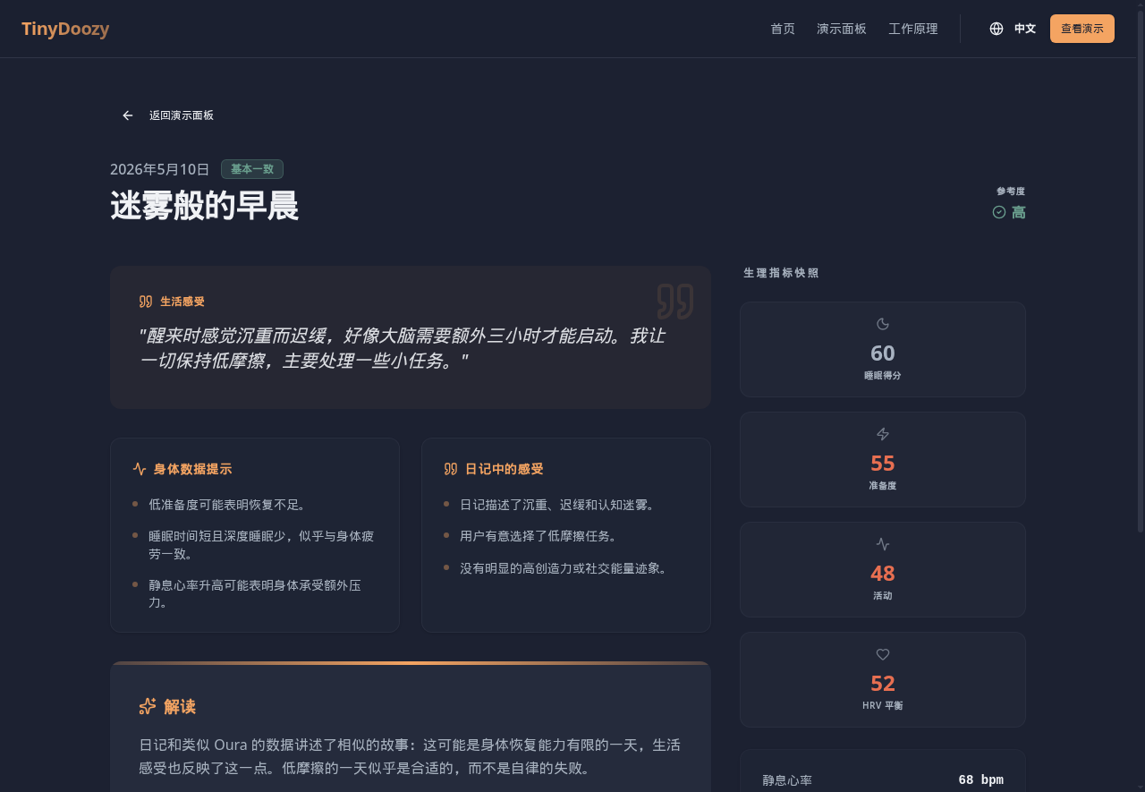
- Aligned: body data and journal both suggest low recovery.
- Mismatched: body data looks strong, but the journal describes emotional or cognitive overload.
- Mixed: the body data is moderate, while the journal shows creative momentum.
For each day, the app displays:
- a journal excerpt
- wearable-style scores
- a match badge
- body data notes
- journal notes
- a short interpretation
- one small suggestion for the next day
The demo uses seeded sample data and does not require login.
How we built it
We built the demo with MeDo using a deliberately narrow scope.
Instead of building a full journaling app, authentication system, or real wearable integration, we focused on making the central interaction easy to understand: choose a sample day, compare the journal with body data, and view a reflection.
The app includes:
- a landing page
- a demo dashboard
- three sample reflection pages
- English and Simplified Chinese UI support
- a short explanation of how the concept works
This helped us keep the demo public, fast to test, and easy for judges to understand.
Challenges we ran into
The biggest challenge was deciding what not to build.
The larger idea could expand in many directions: real wearable sync, private journals, trends, user accounts, and deeper personalization. For this submission, adding too much would have made the project harder to evaluate and easier to break.
We chose a read-only demo using sample data so anyone could open the app and understand the concept immediately.
Another challenge was wording. We wanted the app to feel reflective and useful, but not medical or diagnostic. We also adjusted the Chinese copy so it felt natural rather than like a literal translation.
Accomplishments that we're proud of
We are proud that the demo communicates the idea quickly.
The three sample days show that “good data” does not always mean “good day,” and “tired” does not always mean “unproductive.” That nuance is the heart of the demo.
We are also proud of keeping the scope small. The app does not try to be a complete wellness platform. It demonstrates one clear interaction and does it in a polished, accessible way.
What we learned
We learned that the most interesting question is not simply whether a metric is high or low.
A better question is:
Did the data match how the day felt?
That framing made the demo clearer and more human. It also helped us avoid treating wearable data as an absolute answer. The journal and the data each tell part of the story.
We also learned that a public demo works better when it removes friction. No login, no real personal data, and no setup means users can focus on the concept instead of the tooling.
What's next for TinyDoozy
This demo focuses on one simple interaction: comparing a journal entry with wearable-style data for a single day.
Future directions could include:
- real wearable data import
- private journaling
- user-controlled data storage
- improved daily reflections
- optional trend views
- better ways for users to save what felt useful
The goal is to keep TinyDoozy simple and user-controlled: a tool that helps people notice useful patterns without overwhelming them with tracking or turning personal data into pressure.
Built With
- medo

Log in or sign up for Devpost to join the conversation.