-
prelogin
-

login
-

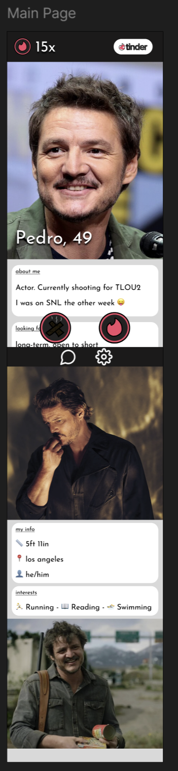
main
-
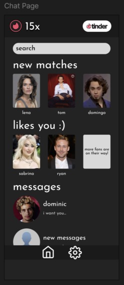
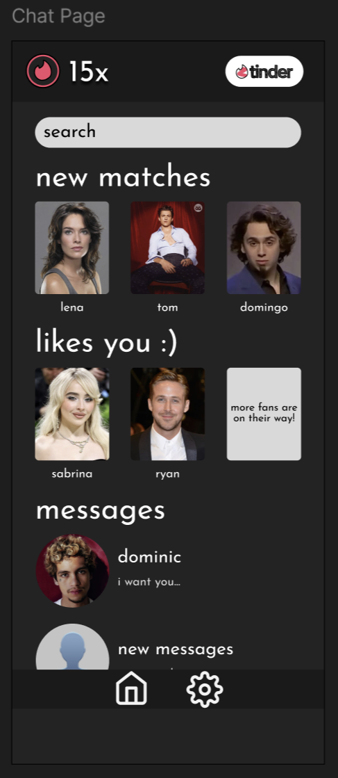
chat
-
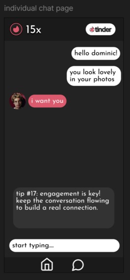
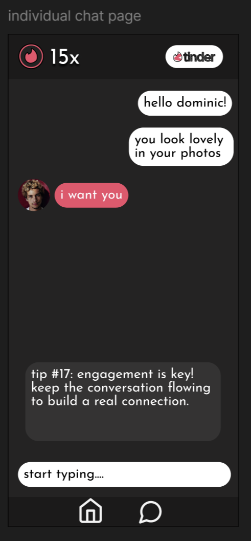
individual
Original Tech Product:
Tinder
Tinder is an online dating app where users are prompted to "swipe right" to match with other users and "swipe left" to dislike profiles. Each user creates a profile with information including a bio, hometown, interests, and more information that they are willing to share. After two users have matched, they can begin messaging each other. To see all of the users who have liked your profile or to have unlimited likes, you must pay for a premium subscription.
Inspirations
A More Meaningful Tinder
Tinder has given users many challenges and frustrations while using the app. The superficial nature of Tinder has made many users opt to leave the app or switch to competitor dating apps. Aaron and I disliked the superficial nature of Tinder, having to have premium features for a more tolerable experience, and ultimately a lack of depth. After a while, Tinder can begin to feel more like a game than an app used to foster meaningful connections that could potentially last a lifetime.
Issues With Tinder:
Shallow Dating
One of the major issues we found with Tinder was that users can swipe left or right off the bat without giving the other user's profile a chance. This means that some users base their interactions solely on looks, and one's perceptions and judgments are based on their images, a shallow outlook on dating. How do you know who that person is or what their interests are without reading any of their profile information?
Premium Services
Unfortunately, Tinder offers a variety of features, including unlimited likes and profile boosts behind tiered paywalls. This makes the app harder to use for users who can't afford or who do not want to pay for the premium subscriptions. Without offering core features like those mentioned above, how can a company expect to keep users on the app and recommend it to their peers?
Clutered UI
Tinder's user interface feels daunting. The app can be scary for first-time users, and even when you have been using it for a while, it still feels congested and game-like. We wanted to reimagine Tinder's UI to be more welcoming and encouraging for users to continue their attempts at connecting with others.
Key Improvements
Less Superficial Matching
To combat shallow dating, we opted to require our users to wait before swiping left or right on a profile. We made it so that a user should scroll through a profile before making a decision. This would give users a chance to be thorough with their decisions and find more in common with each other.
A Welcoming UI
We made the design of Tinder much warmer and more inviting so that users don't feel like the app is too cluttered and to make the app more approachable.
Accessible Features
Instead of locking key features behind a paywall, we decided to have these options available for all users. This would give all users accessibility to engage meaningfully with each other without having to pay for another subscription service just to meet more people.
How we built it
We used Figma to build our mobile app design and structure app functionalities. We used Gimp to edit icons for our app.
Built With
- figma
- gimp

Log in or sign up for Devpost to join the conversation.