⏳ Timekeeper – Your Life in Weeks
🌟 Tagline
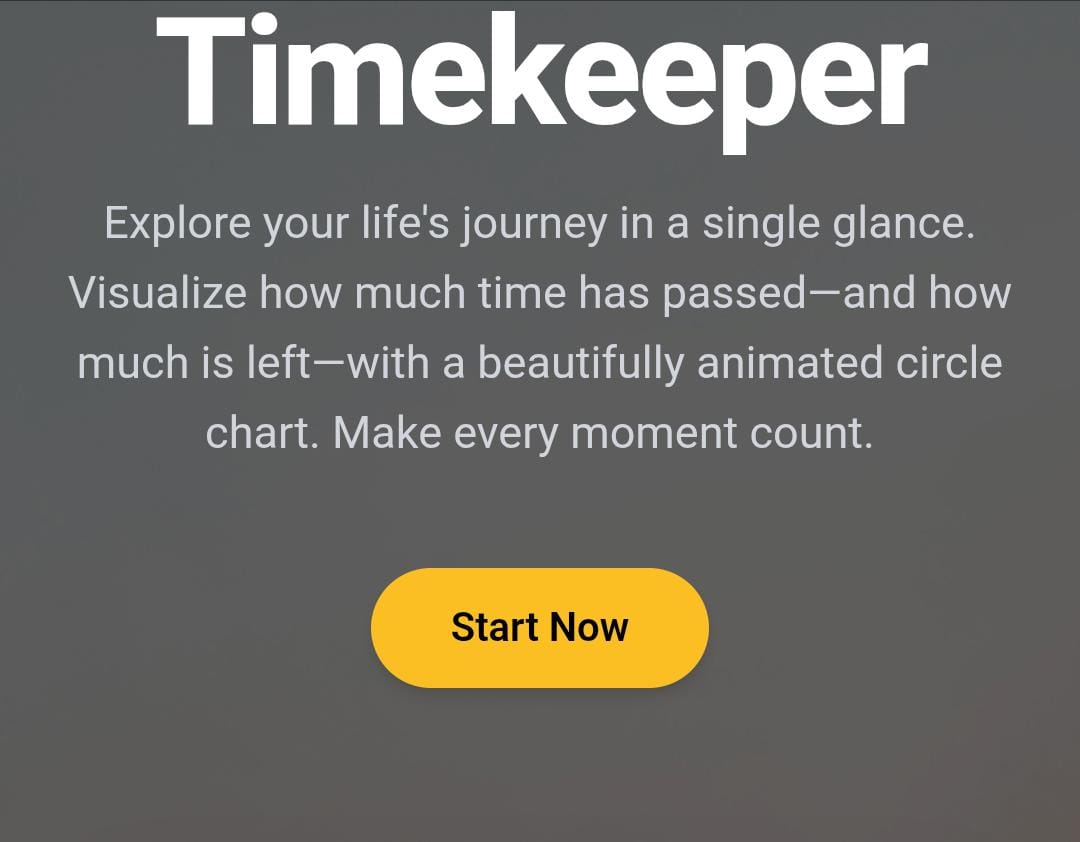
Visualize your life, one week at a time.
💡 Inspiration
The inspiration for Timekeeper came from Tim Urban’s viral blog post “The Tail End” on Wait But Why, where he showed a human life as a finite number of dots — each representing a week. It was a simple yet powerful way to realize how fleeting and precious our time is.
I wanted to bring that concept to life in an interactive and beautifully animated format, so anyone can visualize their life in a single glance — not as a to-do list, but as a timeline of intention.
🛠 What it does
Timekeeper is a life visualization tool that maps your entire life — from birth to 90 years — as a circular timeline of 4,680 dots (weeks).
You can:
- 🗓️ Enter your birth year and instantly see how many weeks you've lived and how many remain.
- 🎯 View milestones like years and decades.
- 📈 Hover over each week to see age, year, and remaining time.
- 🖨️ Download or print your timeline chart as a keepsake or journal cover.
- 💻 Use it across all devices with responsive layout.
- 🌐 Experience time not as a calendar — but as a story.
🔨 How we built it
We used:
- HTML5 Canvas to create the circular radial timeline of 4,680 dots.
- JavaScript to:
- Calculate weeks lived based on the user's birth year.
- Animate counters for total weeks, lived weeks, and remaining weeks.
- Dynamically label years, decades, and highlight milestones.
- CSS3 for layout styling and responsiveness.
- GSAP (planned) for future interactive animations.
The math involved trigonometry to position dots using polar coordinates around a central point:
x = centerX + radius * Math.cos(angle);
y = centerY + radius * Math.sin(angle);
We also structured the page as a single-page application (SPA) with print-ready layouts and download capability.
🚧 Challenges we ran into
- 🔁 Correctly mapping thousands of tiny week dots in a circular fashion without performance lag.
- 📐 Getting the math right for radial spacing and labeling years on the curve.
- 💬 Making the user interface intuitive and meaningful without being overwhelming.
- 📱 Ensuring full responsiveness across desktops, tablets, and phones.
- 🖼️ Placing optional images and milestone overlays without crowding the circle.
🏆 Accomplishments that we're proud of
- Created a powerful, emotional tool from a minimal interface.
- Achieved smooth rendering of over 4,000 DOM elements using canvas.
- Successfully added interactivity, download feature, and hover insights.
- Designed it in a way that’s flexible enough for both personal use and educational/historical storytelling.
- Received great feedback on its thought-provoking and self-reflective nature.
📚 What we learned
- Working with canvas-based visuals at scale (rendering thousands of elements).
- Using time not as a utility, but as an emotional anchor.
- How UI/UX choices can evoke introspection.
- Precision in JavaScript calculations for dates, years, and positions.
- How a simple concept (dots in a circle) can trigger deep user reflection.
🔮 What's next for Timekeeper
Timekeeper has massive potential beyond life visualization:
- ✍️ Add journaling per week (click to write memories)
- 🔁 Compare multiple people's timelines (e.g., couple or family)
- 🌌 View milestone overlays (first job, marriage, children, etc.)
- 🧠 Add AI insights: “You’ve spent X years on ___, would you like to balance it?”
- 📤 Sync with calendars, health apps, or legacy planners
- 📖 Export as a timeline storybook for your life or startup
- 🎨 Timeline Builder for historical figures, companies, and movements
This is not just a calendar or an app. It’s a movement — to see your time, respect it, and make it meaningful.
Because every dot is a week. And every week is a chance to live with intention. 💙


Log in or sign up for Devpost to join the conversation.