-
-
Tiles goes beyond static transit specifications and uses open source data to make transit accessibility data more transparent
-
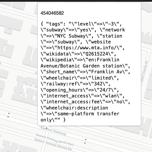
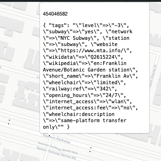
Tiles offers detailed information about transit station's accessibility features (e.g. elevators, ramps, etc.)
-
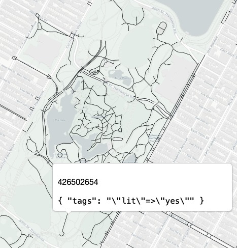
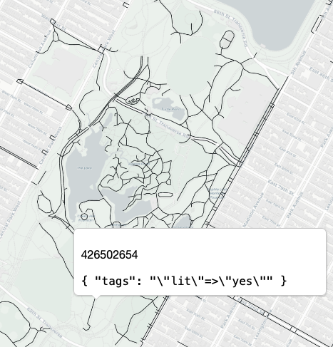
Tiles can show users data about pedestrian safety (e.g. protected sidewalks, sidewalk material, lighting conditions, or bike lanes)
-
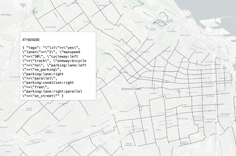
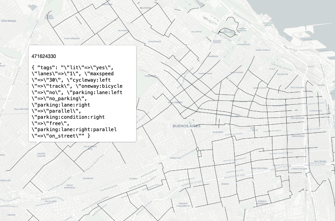
Tiles covers North and South America, but can be expanded to the entire world. Consider this view of Buenos Aires, AR.
-
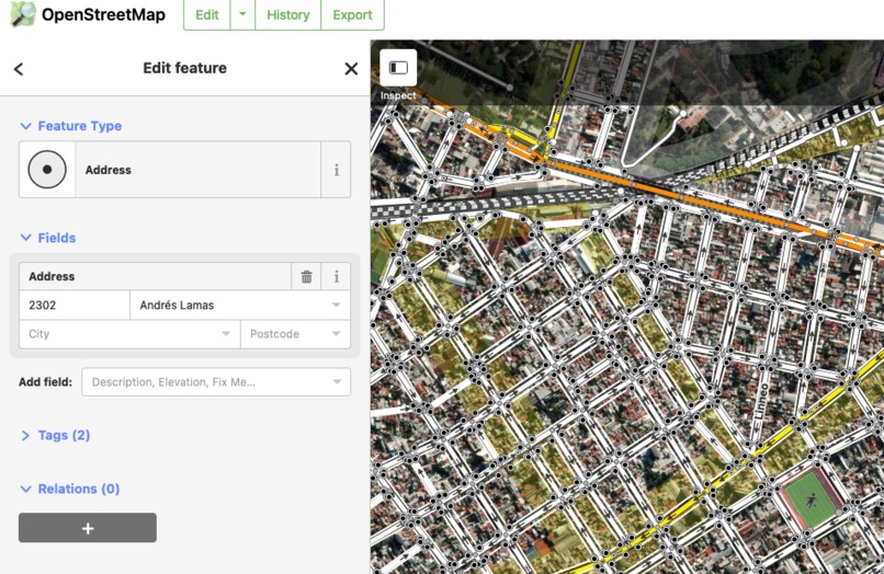
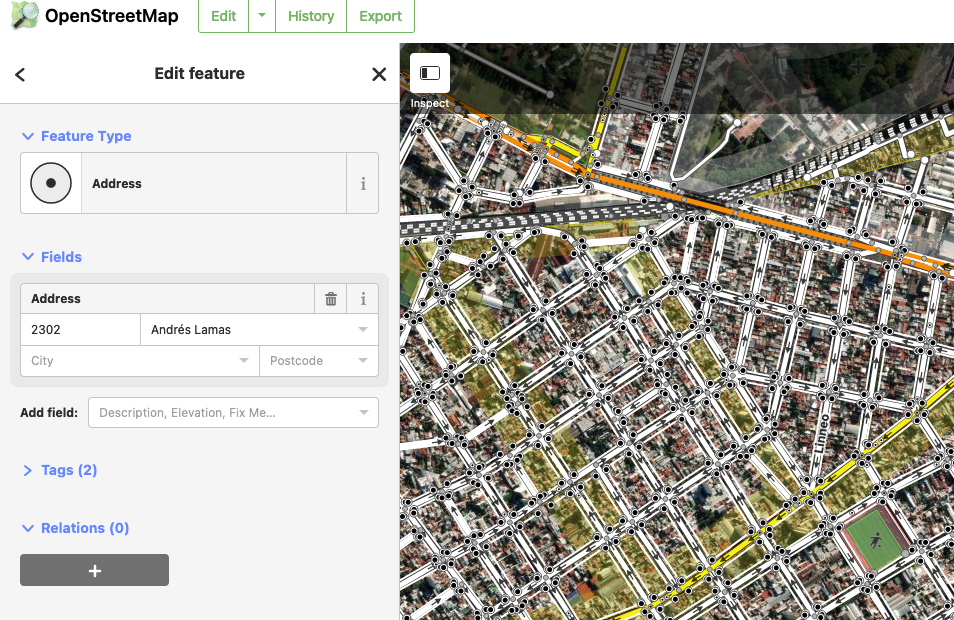
Tiles offers a convient way to edit the global OSM dataset and expand the collective corpus of accesibility data
-
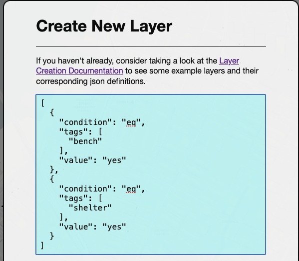
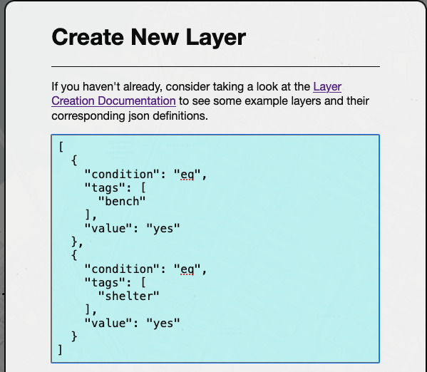
Tiles offers a simple query language that allows users to highlight station features that are important for them
-
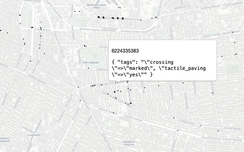
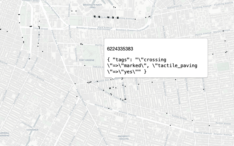
But...we can't accurately describe the physical world without good data! In this case "crossings with tactile pavement" are underreported!
Inspiration
As you may know, in the US right now (Oct 2021) there is ongoing debate about investment in public infrastructure. It's important to acknowledge that the state of the nation's infrastructure does not effect everyone uniformly. Individuals who are dependent on public transit shoulder the brunt of this burden, and the shortcomings in public transit are particularly devastating to individuals who have mobility, visual, or auditory disabilities. In short, planning trips can become a nightmare if one cannot get access to information about the public services that they need to get from point A to point B.
As a data engineer I often find myself working with a wide variety of geospatial sources from the very simple (e.g. points, polygons, roads) to the complex (e.g. LIDAR, raster, GTFS). Few of them unify different use-cases in the way that Open Street Map (OSM) does. Earlier this month I found myself looking through OSM and noticed a particular subway station that had an amazing amount of information associated with it (internet access, seating descriptions, notes on elevator repair status, flights of stairs, etc.).
When I cross referenced this particular station with Google, Apple, and the local transit authority's data, I found that not only was OSM in agreement with these major sources on basic information, it surpassed them on station metadata.
Because OSM is crowdsourced, it offers data from thousands of individuals who've elected to contribute data to help others understand physical spaces without being present there themselves.
For the Estee Lauder Hack4llY Hackathon, I undertook this project as an opportunity to build a service on top of OSM data that could allow individuals to derive insights into the accessibility of their public spaces and transit systems.
For disability and transit advocates, urban planners, policymakers, etc., this is a tool that can be used as a starting point to develop targeted advocacy plans on infrastructure. Map layers are shareable via link, example - NYC MTA B68 - Shelter Status of Stops for easier communication between parties.
For all users, this can be a tool that helps with understanding the state of their local transit system and planning trips. Once users get the hang of how to make custom queries (which I admit, can take some time!) they can craft targeted requests that can help with their own trip planning or targeted advocacy efforts. Finally, Tiles has international coverage that goes beyond just transit, it considers all elements of the built world, this can include the physical state of roads and sidewalks, businesses, and (more generally) any building's accessibility characteristics
What it does
The project's backend services allow users to query through ~500GB of OpenStreetMap (OSM) data and request custom vector layers from this data (e.g. "All stations with an elevator AND underground"). For this event, I am only able to host North and South America, but the architectural principles will hold on a larger database (the OSM world extract is ~1.3-1.4TB at time of writing)
The webpage offers a convenient graphic interface to explore and visualize custom layers. A user guide is available here as well.
How I built it
The means by which the application does all this is called a dynamic tileserver. As the user pans an area, the area in view is requested from a backend service. This service fetches nodes from our OSM replica DB that are in view, packages them into a tile, and then returns them to be rendered in the browser.
I launched an ECS cluster with my API, a cache for recently seen tiles, as well as some monitoring sidecar containers (xray, cw-log-agent). A tileserver works just like any other API, but instead of a (more standard) json response, we return a binary payload. The webpage's client library understands this payload as a map tile and can render at the correct portion of the screen.
Because the DB does a lot of the service's heavy lifting, the most important infrastructure and provisioning decisions were DB related, right now I am running the PostGIS DB on a m6.large EC2 instance, but for stability's sake, may migrate to RDS when I'm able to polish the application.
The full architecture of the project is available here
Challenges I ran into
For this event I wanted to challenge myself to develop a webpage that (at least) met Mozilla's accessibility guidelines. This meant solving problems that I've never had to solve as a developer before re: accessibility on the web such as:
- Descriptive alt text values assigned to all images
- Making all text zoomable up to 200%
- Making the default color palette functional for individuals with red, green, blue, color, or contrast loss
- Ensuring the website is navigable by keyboard
Rendering in browser. Depending on the browser used, request ordering/rendering behaves variably. Requests to the baselayer (a 3rd party static tileserver, Carto Free Basemaps) take precedence over my requests which leads to a less than ideal user experience.
Accomplishments that I'm proud of
See
Challengespoint 1I wanted to make a webpage that respected users' data constraints (e.g. a webpage that automatically loads 30MB of content can be quite annoying). Map tiles can be large, but the addition of Nginx allowed me to compress the data that gets sent over to the user by a factor of 2-3x.
What I learned
- Quite a bit about frontend development, webpage accessibility standards, and UX
- A good bit about networking tasks on ECS
What's next for Tiles@Maphub
There are a lot of gaps that need to be plugged to make this an MVP.
There are infrastructure and system design considerations (DB tuning, request sharding, caching to disk via Nginx vs Redis to save cluster memory, tidying the core application to use a proper config!), but the most significant will be in UX and user testing.
Even as the developer of this app, It's clear to me the JSON query syntax is quite confusing, a much cleaner user interface for layer creation is possible. Before releasing this as a product I'd want to turn that into a drag and drop interface.
The application has been tested on Mozilla Firefox >=v92.0, Chrome v94, and Safari >13.1.x, other browsers may not display w/ live map interaction properly, for an MVP, I would want compatibility with all common browsers
Built With
- amazon-web-services
- golang
- postgresql
- terraform

Log in or sign up for Devpost to join the conversation.