The Problem
We've all been there. Something is wrong, but you can't name it. You open your notes app and stare at a blank page. You start a to-do list but don't know what to write. You think about journaling but don't know where to begin. So you close everything and push through.
Every existing tool asks too much. Notes apps give you a blank page with no guidance. To-do lists demand clarity you don't have yet. Journaling demands commitment. Therapy demands vulnerability with a stranger. So people do nothing. They bottle it up, or brush past it entirely.
But the deeper, unsolved problem is what happens after. Even when people get through hard moments, there's no record of that strength. Each new wave of stress feels like the first one. People forget they've already proven they can handle hard things.
We identified three layers to this problem:
Identification — I can't even name what's wrong, I just feel bad
Isolation — every existing outlet feels like the wrong fit, so I hold it alone
Amnesia — I forget that past-me was strong, so present-me feels helpless
This led us to ask the following question:
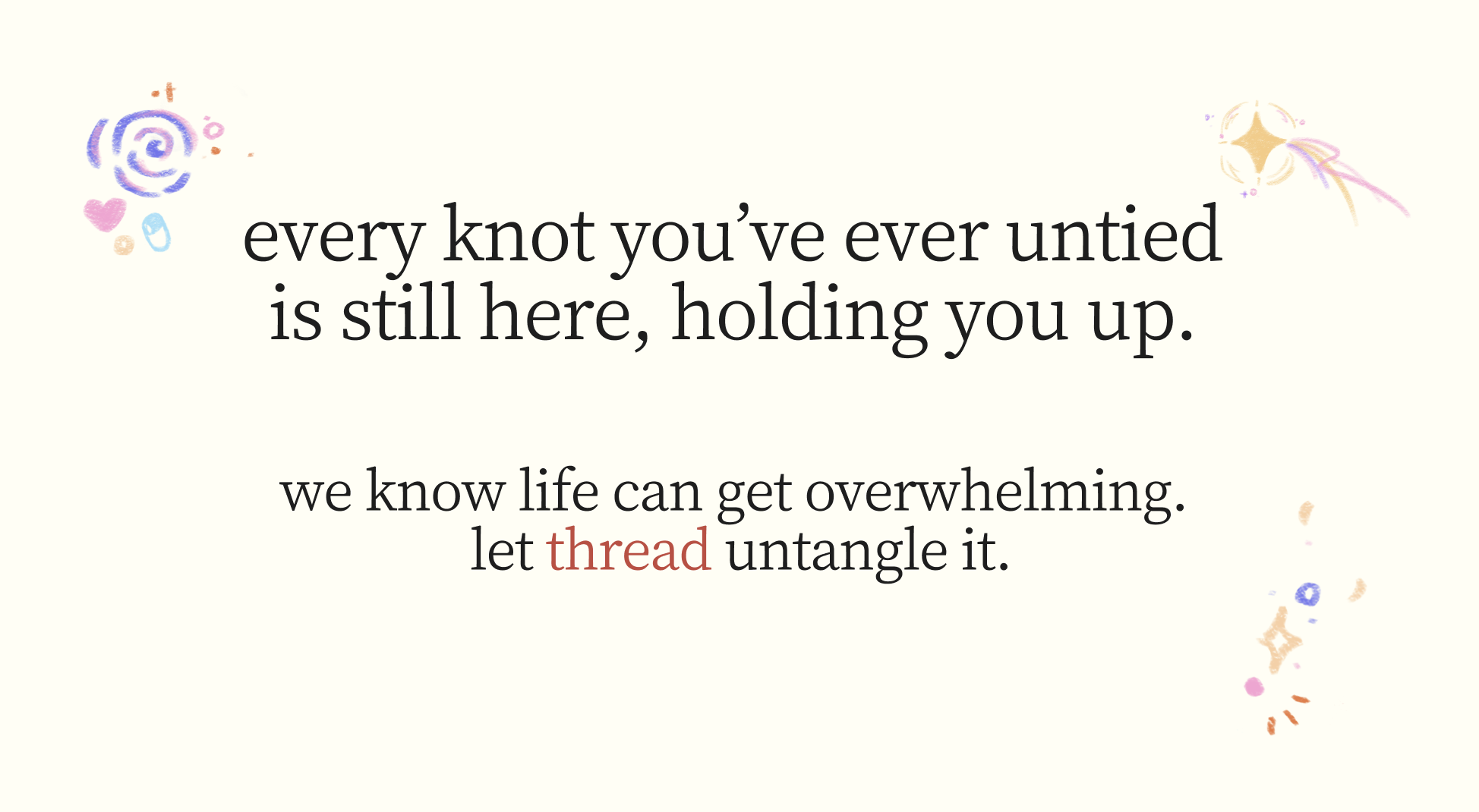
How might we create a low-commitment space that helps people visualize their problems and untangle their current knots, while empowering them through their own history of resilience?
Why thread is Different
Existing tools in this space such as AI journaling apps like Reflectly, mental health chatbots like Woebot, and mood trackers like Daylio all require high commitment or outsource the emotional work to AI. They solve your problem for you, or they ask you to show up consistently before you see value.
thread's position is the opposite. No AI solves anything for you. The guided reflection prompts create space for you to find your own words. The retrospective is built from your own past wins, not generated insight.
thread is the only tool in this space that treats your own history as the most powerful resource you have.
What We Built
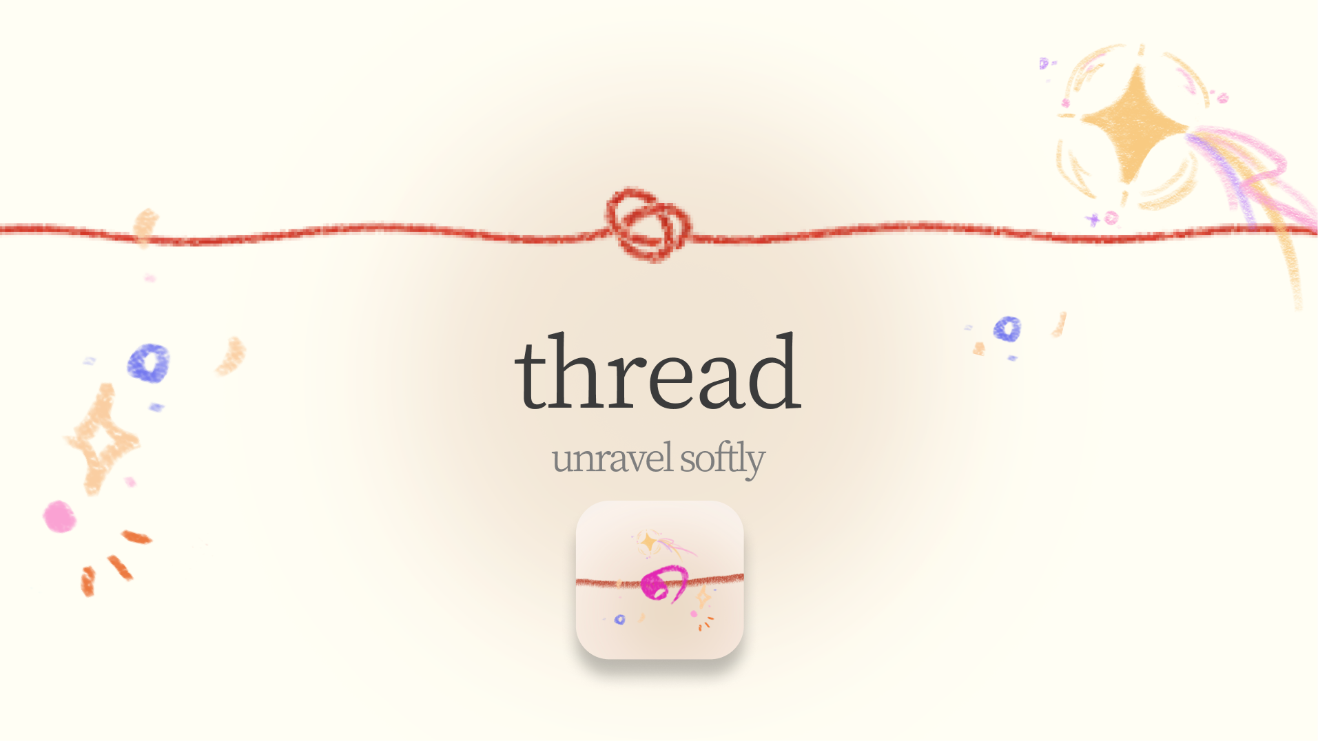
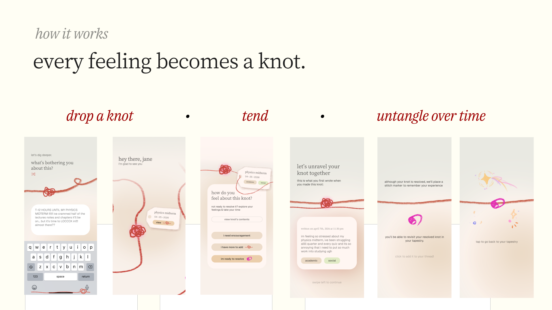
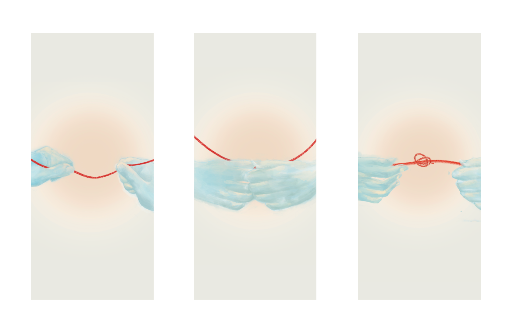
thread is a low-commitment emotional clarity app built around the metaphor of yarn. When you're overwhelmed, you tie a knot: a visual, tactile representation of something weighing on you. The yarn ball on your home screen grows and shifts with the weight of what you're carrying.
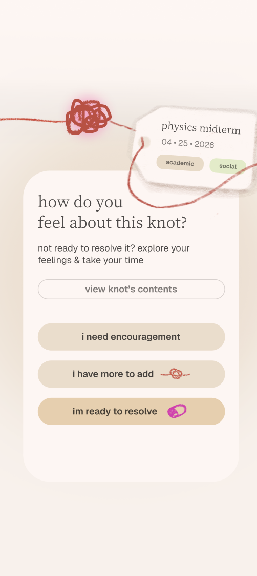
Guided reflection prompts let you shuffle through at your own pace, helping you find the words for what's wrong. There are no right answers. You are not being solved, rather you are being given space to explore, reflect and breathe.
When you've worked through something and you're ready to let it go, you resolve the knot yourself. It detangles, and a stitch marker takes its place on your thread. Permanent proof that you overcame a struggle.
Over time, your thread becomes a living record of everything you've gotten through. When a new knot feels impossible, your thread shows you the ones you've already conquered.
The UI centers around a continuous thread. Knots appear as tight clusters of fiber. Resolved knots become colorful stitch markers along the thread. The app's color palette uses a vibrant red against soft beige tones. Colorful pastels represent celebrations, such as a confetti doodle for resolving a knot.
Our Design Process
We started with four ideas and stress-tested each one against the prompt. Through structured critique we landed on thread, anchored by one question: what if your past resilience could show up for you when you needed it most?
Notability was our primary ideation tool throughout. We used it to sketch the yarn metaphor and map out how knots, strands, and stitch markers would behave visually. We wireframed low-fi user flows by hand, keeping the process tactile and fast.
Gemini helped us synthesize our survey responses, identify patterns across user answers, and pressure-test our problem statement. When our early framing had logical gaps, like overclaiming that "no tools exist," Gemini helped us find the more defensible, precise version of the problem. It also helped us research the competitive landscape.
We made a deliberate choice to skip mid-fidelity wireframes and prototype directly in high fidelity. For a nontraditional UI built around animation and motion, static frames were misleading. We needed to see the strings of yarn move to test if the experience worked.
User Research
We built our survey around one principle: no leading questions. We needed people to reveal their authentic behaviors and habits unprompted. In total, we collected 105 responses.
The data validated our three-layer problem directly.
On identification: 73.5% of respondents feel overwhelmed often or always, but when asked how long they sit with something before doing anything about it, 40% said multiple days and 10% said they usually don't. People are carrying things around for a long time before they even try to address them.
On isolation: When asked who or what they turn to first, the most common answers were friends, family, and distraction: (scrolling, food, sleep, gaming). Only a handful mentioned any kind of structured tool. The ones who did mentioned their notes app or a physical journal almost apologetically. Nobody had a system they felt confident in — only 36% said "yes" they have a consistent way of dealing with stress, and another 36% said "maybe."
On amnesia: 73.5% of respondents said that after a stressful period passes, it only comes up from time to time or they move on immediately. They're not reflecting, they're just surviving and moving on. And yet 66% said they have gone back and read old notes or journal entries from hard times, meaning when the material exists, people do find value in it. The retrospective isn't something people resist. It's something they never have the material for.
Perhaps most tellingly: 73.7% said they've felt better just from writing something down or saying it out loud. The act of externalizing works. People just don't have somewhere to do it that meets them where they are.
These findings set three hard constraints on our design: zero structure required at entry, no more than a few minutes of commitment, and a retrospective that builds passively, without the user having to go looking for it.
Challenges
The hardest part wasn't designing the app, but it was designing the language. thread deals with something deeply personal, and every word has to earn its place. Finding the balance between warm and patronizing, between guiding and hand-holding, required more iterations than any screen we built. We rewrote every little detail from the affirmations, onboarding, prompt copy in order to make sure the app never took credit for the user's own growth.
We also struggled with the gap between what we understood after two days of deep work versus what a first-time user would trust walking in cold. Building credibility through design alone, without explanation, is a genuinely hard problem.
Feature prioritization was a constant tension. We wanted to build everything but learning to define the demo flow first, and designing only the screens that flow required was uncomfortable but necessary.
What We Learned
Start with solidifying the demo flow. Designing without a clear picture of exactly what the demo needed meant we spent time on screens that didn't make the final cut. Next time: map every screen first, design only those.
For nontraditional UI, prototype as you go. Trying to add animation to static frames after the fact doesn't work well, and motion has to be built in from the start.
We pushed our Figma skills further than expected. Our teams created custom assets and learned that design complexity has to match project scope. Not every edge case needs solving in a designathon demo.
Working across three distinct design styles taught us that different strengths only become a liability without clear expectations. Frequent check-ins and open communication kept us aligned even when our instincts pulled differently.
What's Next for thread
The core of thread is intentionally simple, and we want to keep it that way. But there's room to deepen the experience without adding noise.
The most natural next step is expanding ways people can tie a knot. Right now it's just text, but a voice memo, a photo, a quick sketch might be exactly what someone needs when words aren't coming.
We also want to introduce the yearly yarn ball: a new color of yarn for each year of your life in the app. Over time your thread becomes a visual autobiography: different colors layered together, each year's knots and stitch markers woven into the one before it. A more in-depth tagging and category system would live underneath without ever surfacing in a way that makes thread feel like a database. The simplicity stays while the depth grows quietly behind it.
Built With
- figma
- gemini
- notability
- procreate
- sketchbook


Log in or sign up for Devpost to join the conversation.