Inspiration
As someone who’s seen friends struggle to find accessible, personalized mental health care—navigating insurance, specialty gaps, and overwhelming booking processes—I knew there had to be a better way. Living in the US, I saw how fragmented mental health resources are, and wanted to create a platform that simplifies the journey: from finding a therapist who fits your needs to tracking progress and feeling supported in crisis.
What it does
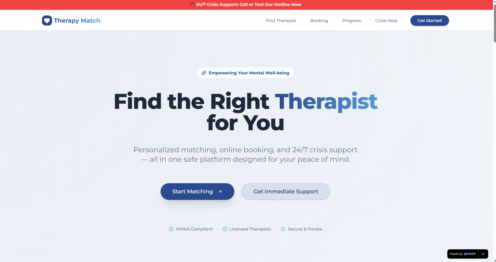
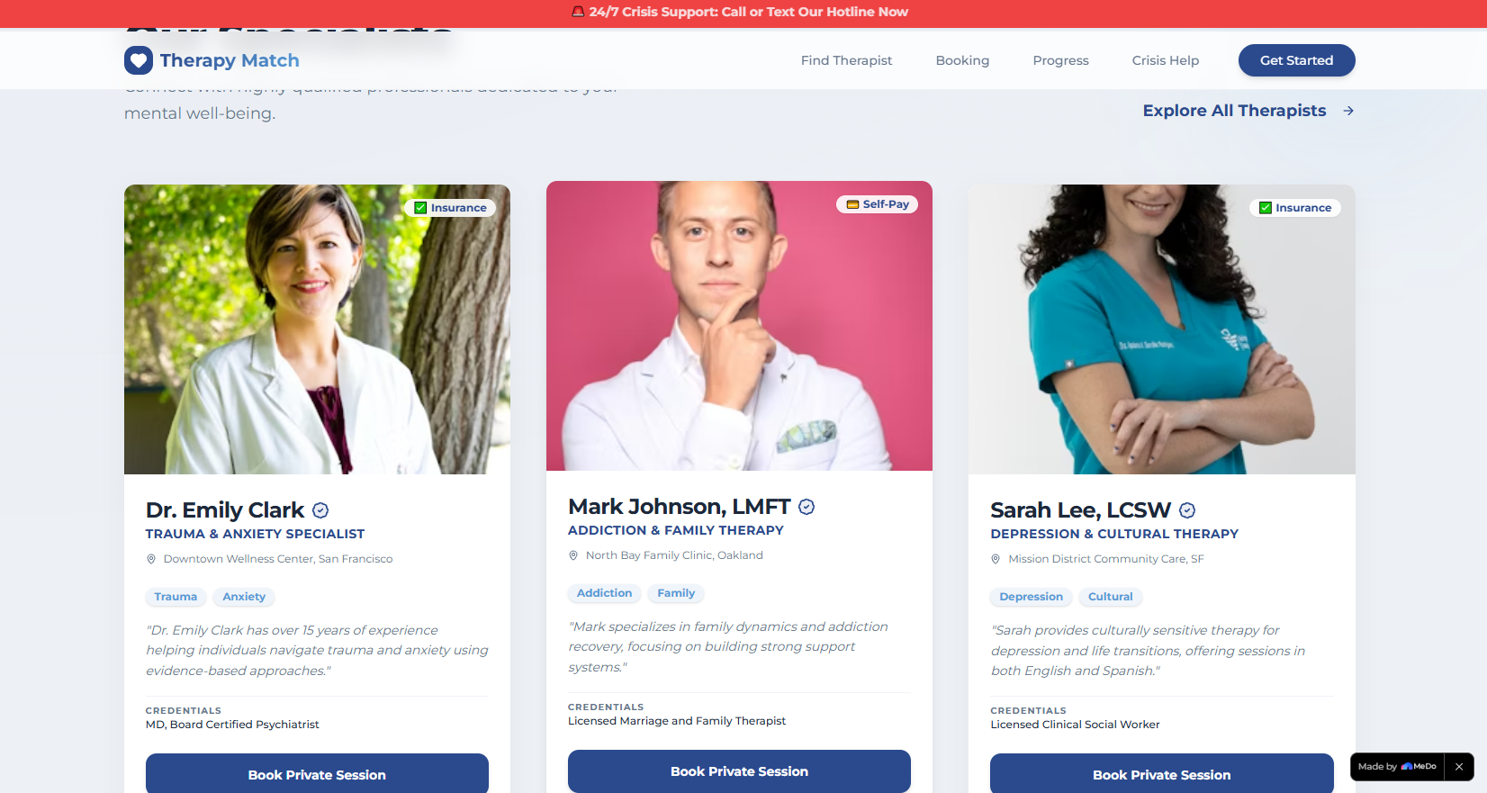
Therapy Match is a holistic mental health platform that connects users with qualified therapists (filterable by specialty, language, insurance, and more). It lets users book in-person/virtual sessions, log daily mood, set goals, track progress via visual charts, and access 24/7 crisis support—all with a calm, professional design that prioritizes safety and ease of use.
How we built it
We started with Figma to map the UI/UX, leaning into the calm color palette and glassmorphism design to keep the tone supportive but professional. We built the frontend with HTML5, CSS3, and React, using custom CSS animations (like pulsing crisis alerts, staggered card entrances, and smooth step transitions for booking) to enhance engagement without overwhelming users. We used LocalStorage to persist progress data and Chart.js for mood trend visualizations, and tested rigorously for responsiveness across US/EU device standards.
Challenges we ran into
The biggest hurdle was balancing visual depth (animations, layered design) with accessibility—ensuring animations didn’t distract or trigger anxiety, and colors met WCAG standards for readability. We also struggled to design the booking flow to be intuitive while enforcing logical steps (e.g., therapist → session type → date/time) without feeling restrictive.
Accomplishments that we're proud of
We created a platform that’s both visually engaging and emotionally safe—no bright flashing elements, just calm, purposeful design. The crisis support section (with pulsing hotline buttons and safety plan tools) feels urgent but not alarming, and the responsive grid layout works seamlessly across US/EU common screen sizes. Most importantly, users test-driving it said it “felt less overwhelming than other mental health tools.”
What we learned
We deepened our understanding of mental health tech ethics—prioritizing user safety over flashy design, and centering accessibility in every animation and color choice. We also learned how to build intuitive multi-step flows (like booking) that guide users without frustration, and how to use LocalStorage effectively to create a “persistent” experience without backend complexity.
What's next for this project
Next, we want to add secure user accounts (to replace LocalStorage) and integrate with real therapist directories in the US/EU. We also plan to add multilingual support (starting with Spanish, a critical need in both regions) and partner with mental health organizations to validate the safety plan tool. Long-term, we hope to integrate with insurance providers to streamline verification and expand crisis support to include local EU/US hotline integrations.

Log in or sign up for Devpost to join the conversation.