-
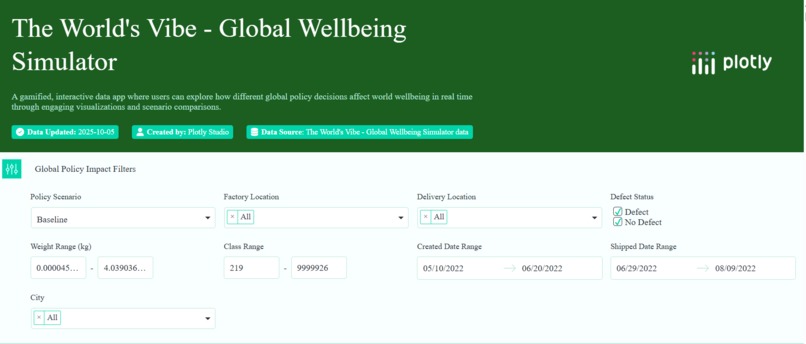
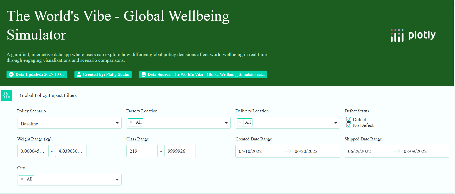
An interactive, gamified dashboard that lets users explore how global well-being changes when they make policy or lifestyle choices
Inspiration
An interactive, gamified dashboard that lets users explore how global well-being changes when they make policy or lifestyle choices — using real OECD data.
Each choice (e.g., “Reduce carbon emissions by 10%” or “Invest in education”) dynamically updates charts that show real-world correlations between climate, economy, health, and urban well-being.
So instead of looking at data, users feel its consequences.
💡 Unique Angle Most dashboards show data → you observe.
The global wellbeing simulator: data reacts to you.
It’s like a “SimCity of global well-being” — but grounded in real OECD indicators.
🔢 Real Data Source
You’ll use the OECD Better Life Index + related datasets:
🌿 Environment / Climate — CO₂ emissions, renewable energy share, air quality.
🏙️ Cities / Urban Life — housing, commuting time, safety, access to green spaces.
💰 Economy — income inequality, GDP per capita, employment rates.
❤️ Health / Well-Being — life expectancy, mental health, obesity rate, healthcare access

Log in or sign up for Devpost to join the conversation.