-
-
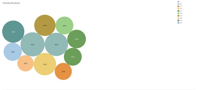
National Unemployment Rates From 2011-2021
-

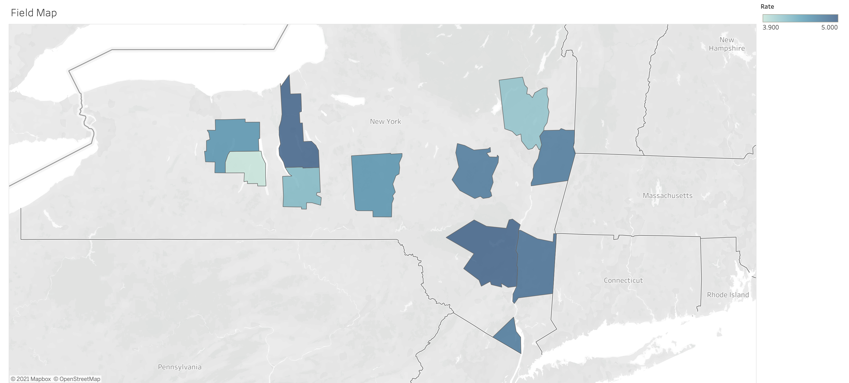
New York Counties Unemployment Rates in June 2021
-

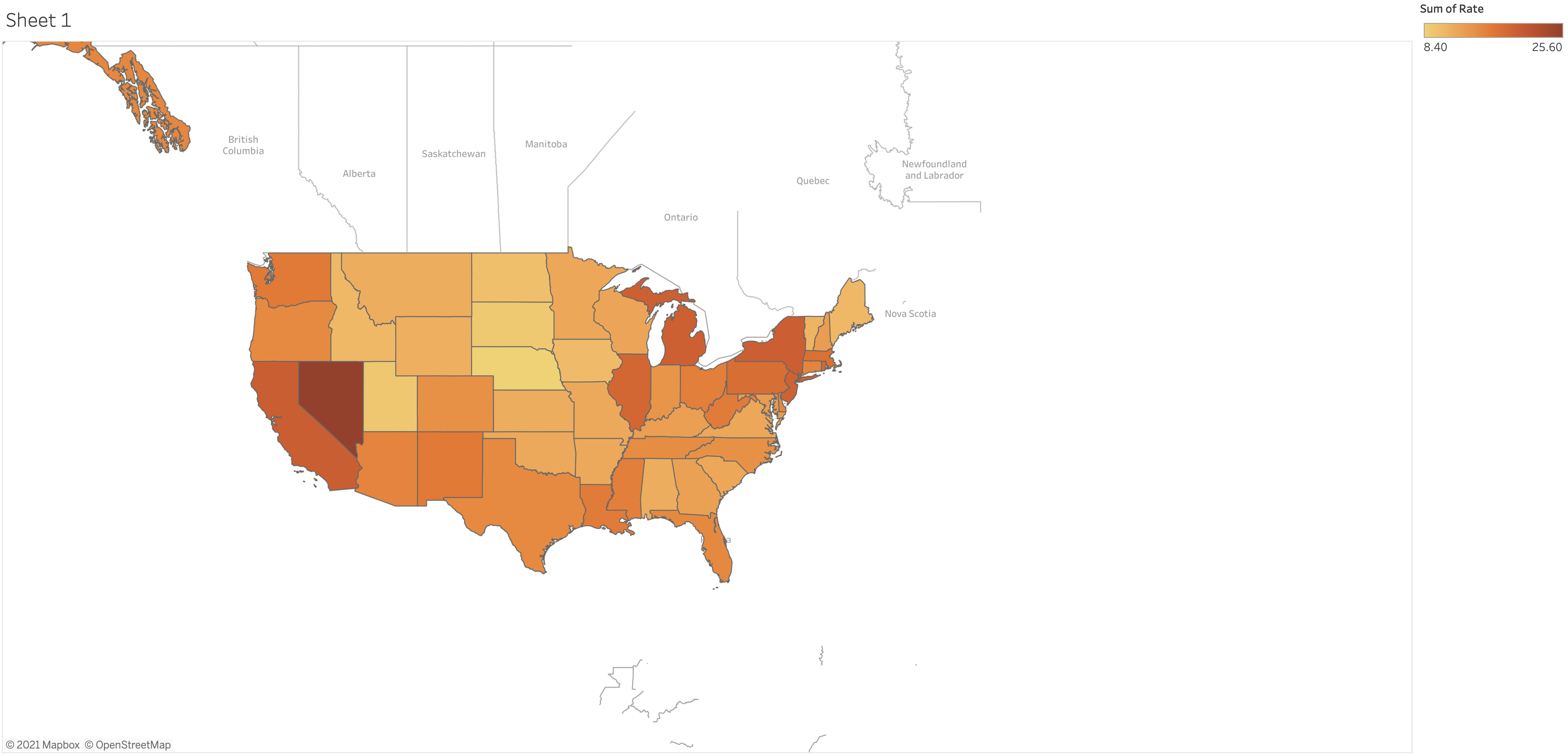
U.S. Unemployment Per State

Inspiration
We took inspiration from the effects of COVID-19.
What it does
Our data visualizations highlight the patterns and trends of the effects of the pandemic.
How we built it
We used Tableau to create our data visualizations.
Challenges we ran into
At first Brandi was going to use Jupyter Python to create a Heatmap of the national unemployment rate from 2011 to 2021, but she ran into several contraints. This mostly included trying to become familiar with complex python code in a short period of time.
Accomplishments that we're proud of
We created 3 data visualizations within 3 days! We are all fairly new to data vizathons so this was a nice chance to learn more about the area.
What we learned
Brandi learned some python (which is a new language for her!) with Tableau, Vivek learned how to create a complex data visualization with the national map, and Brandon got to do secondary research for the patterns and trends of unemployment and datasets.

Log in or sign up for Devpost to join the conversation.