Inspiration
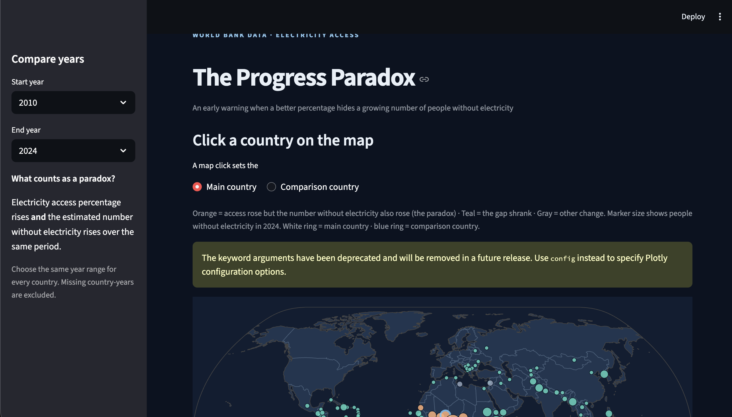
A country can report that electricity access is improving while more people are still living without power. We wanted to make that hidden gap visible. A percentage tells part of the story; the number of people affected tells another.
What it does
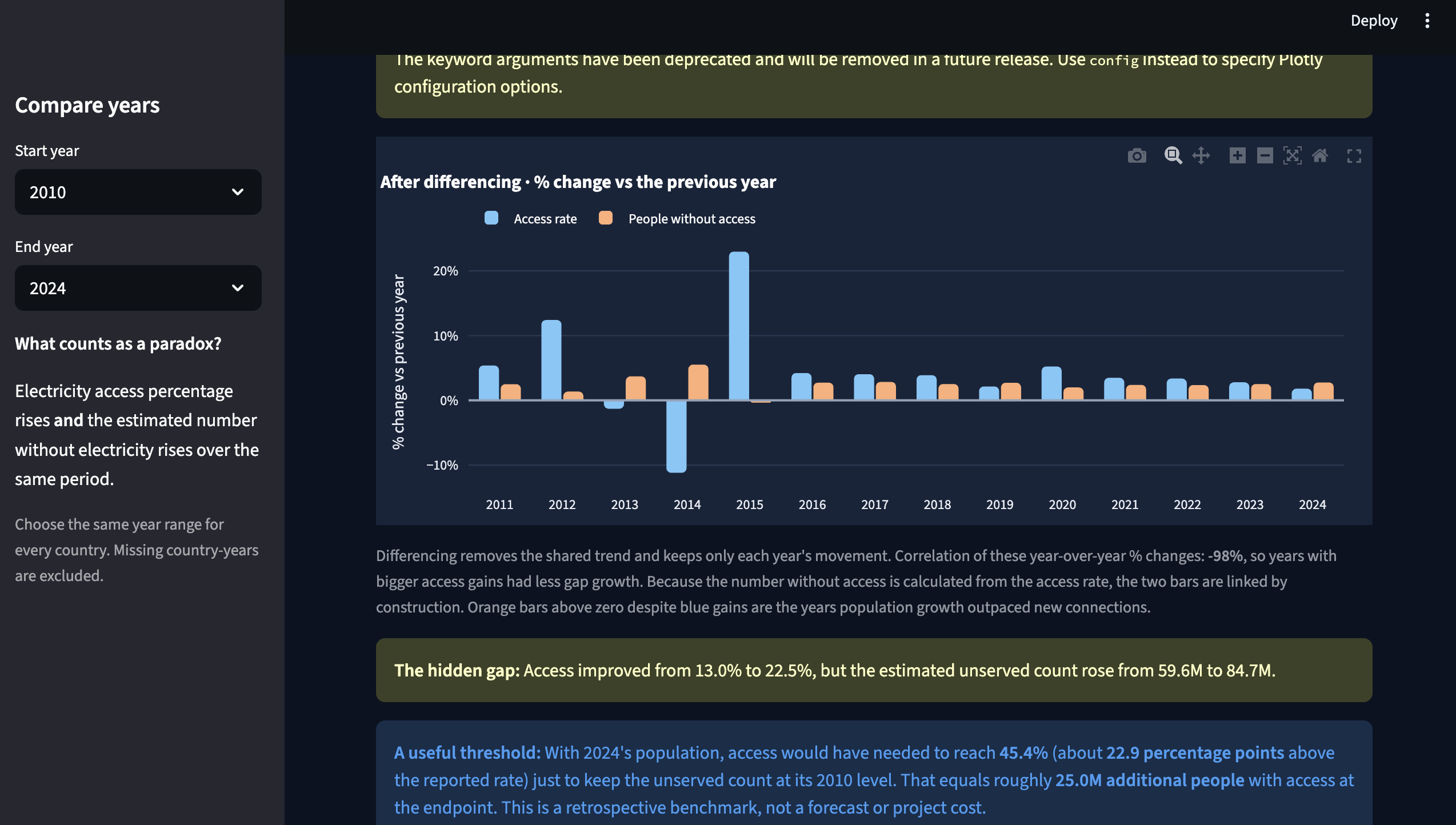
The Progress Paradox retrieves electricity access and population data from the World Bank Indicators API. For each country and year, it estimates the number of people without electricity as population × (1 − access rate / 100). It flags countries where the access rate rose but the estimated number of people without power also rose.
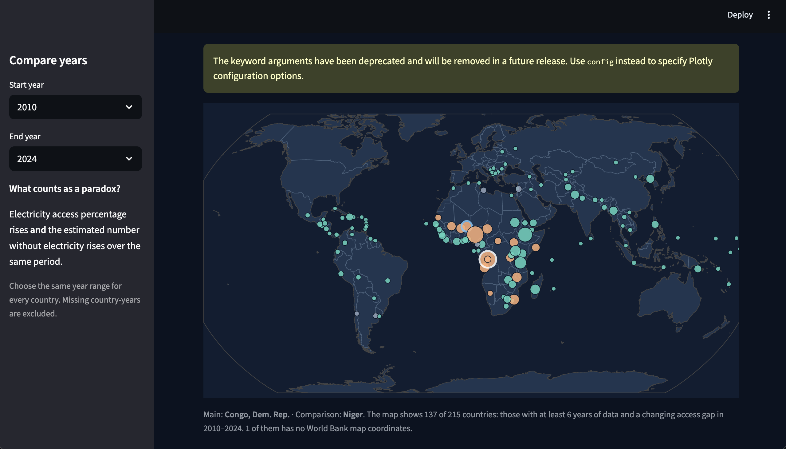
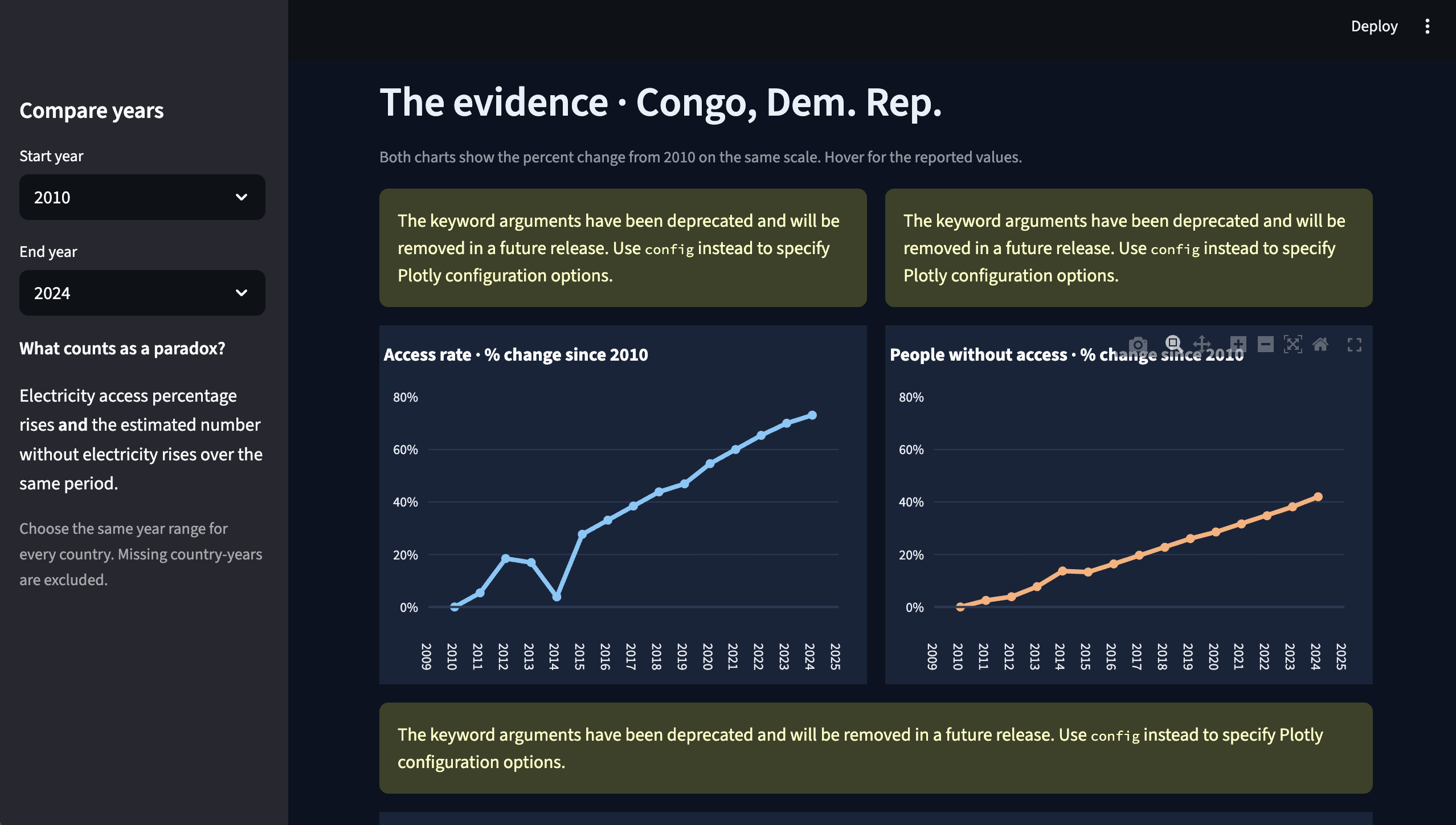
Users can explore a clickable world map, compare two countries, inspect their trends, and rank places where the gap grew most. The dashboard also shows how population growth and access gains contributed to the change, and the access rate that would have kept a country's earlier gap from growing.
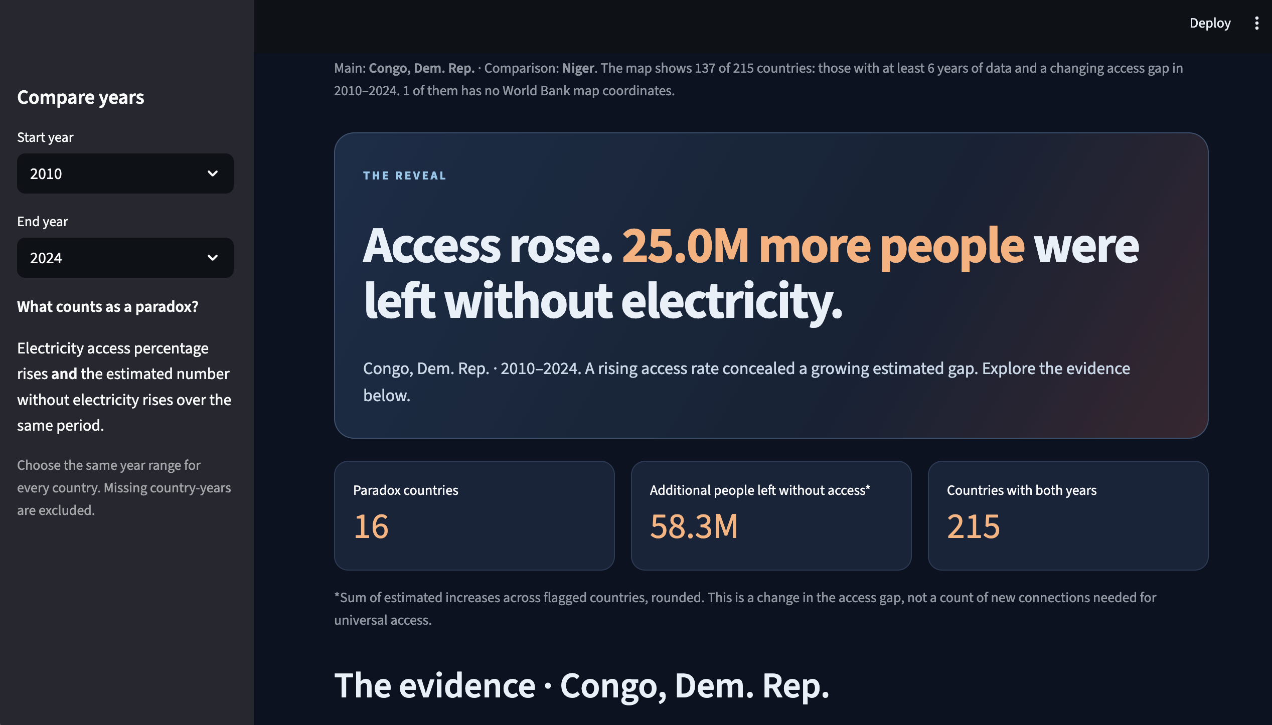
In our default 2010–2024 comparison, 16 countries meet the paradox rule. In the Democratic Republic of the Congo, the access rate rose from 13.0% to 22.5%, yet the estimated number of people without electricity grew by about 25 million.
How we built it
We built the dashboard in Python with Streamlit, Plotly, pandas, and statsmodels. It retrieves World Bank indicators programmatically, joins access and population observations by country and year, excludes regional aggregates and missing endpoints, and calculates the unserved population and changes over time. The map, country comparisons, ranked view, and downloadable results turn those calculations into an investigation tool.
Challenges and what we learned
The hardest part was making two valid measures tell one clear story without misleading people. We had to align the same years across indicators, distinguish countries from aggregates, and show estimates and missing data honestly. We also added time-series checks because two lines moving together do not establish a causal relationship.
We learned that reporting progress only as a percentage can conceal a growing human need. Our dashboard helps identify where to investigate; it does not claim to explain every cause or connect households to electricity.
What's next
We would test the tool with development researchers and energy-access organizations, improve how it communicates uncertainty, and add another essential service only after checking its country-year data coverage.
Built With
- pandas
- plotly
- python
- statmodels
- streamlit
- world-bank


Log in or sign up for Devpost to join the conversation.