-
-
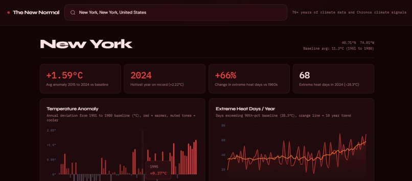
Data / Anomaly + Extreme heat
-
Chronos / Stats
-
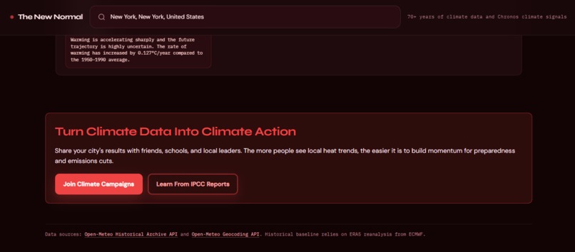
Call to Action links
-
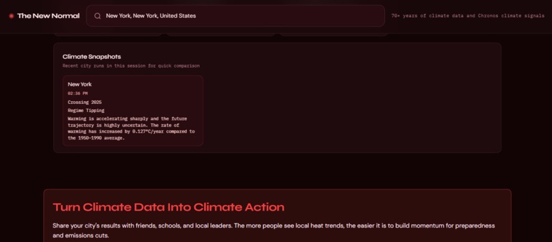
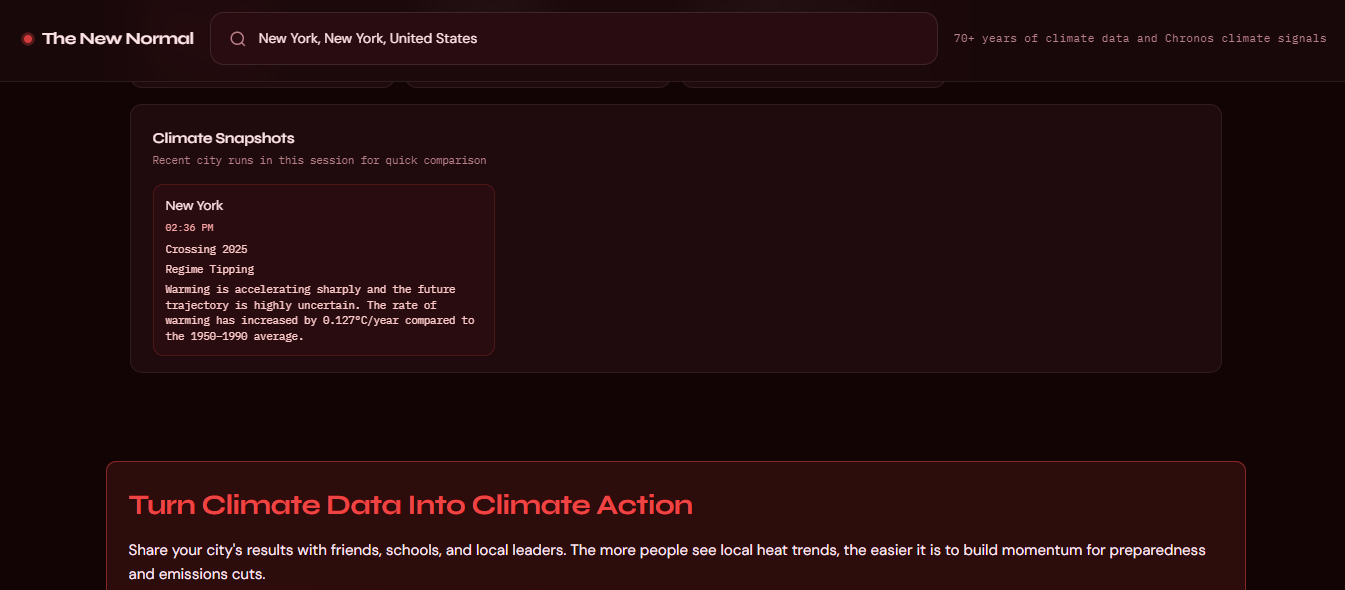
Previously Viewed Cities
-
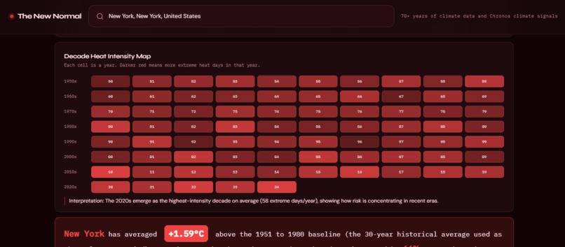
Data / HeatMap
-
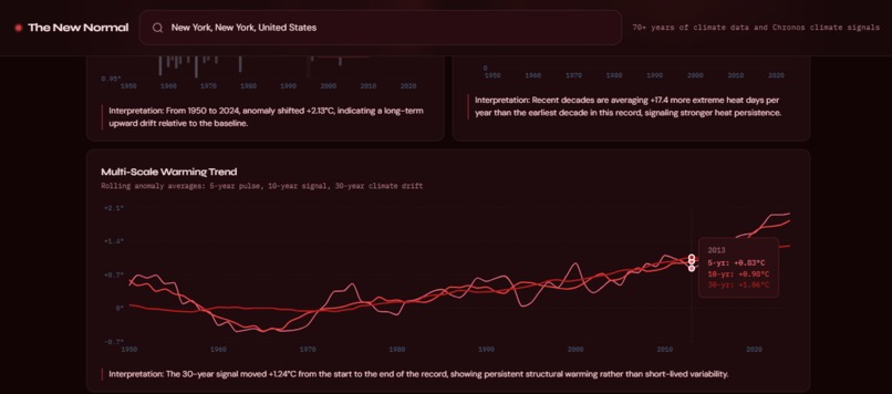
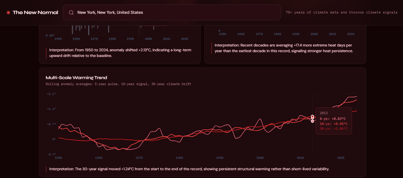
Data / Multi-Scale Warming Trend
-
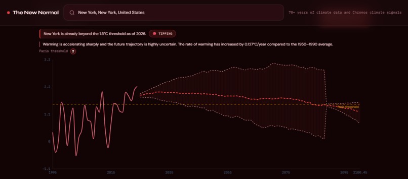
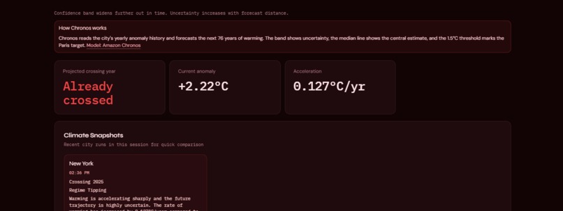
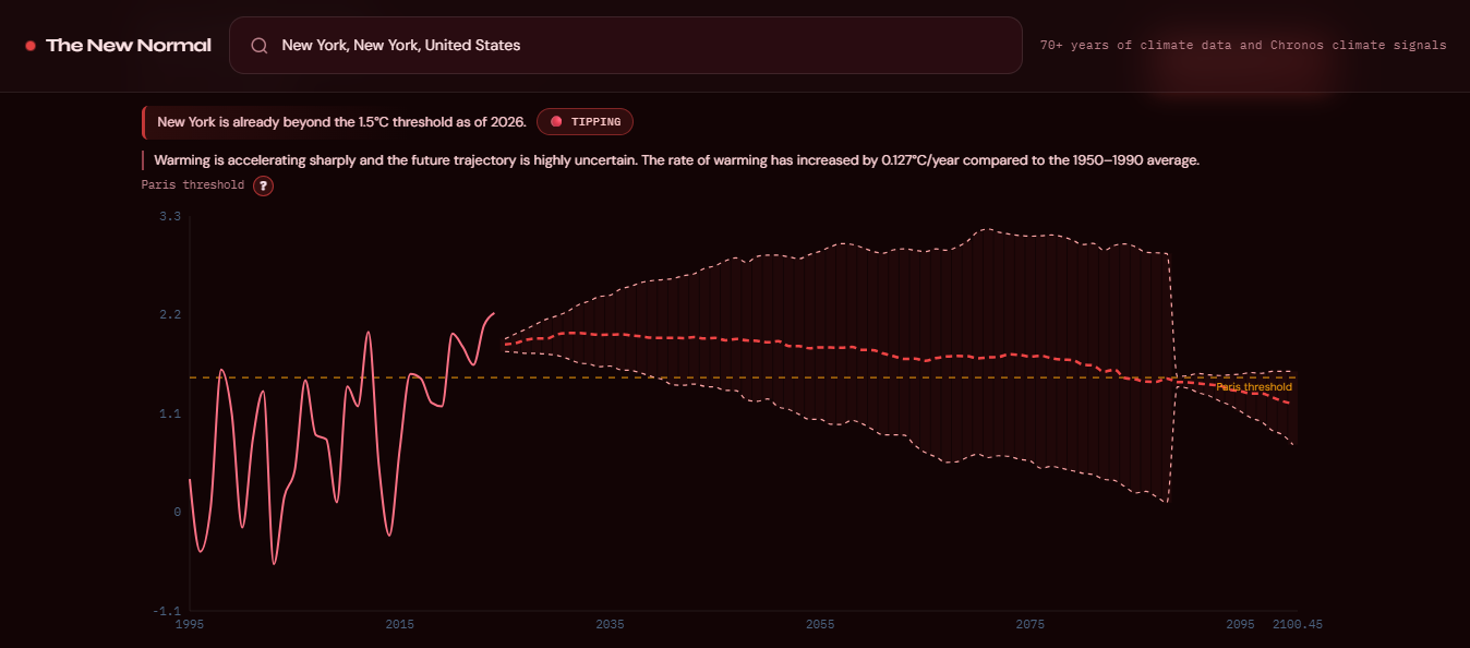
Chronos / AI-Powered Forecasting
-
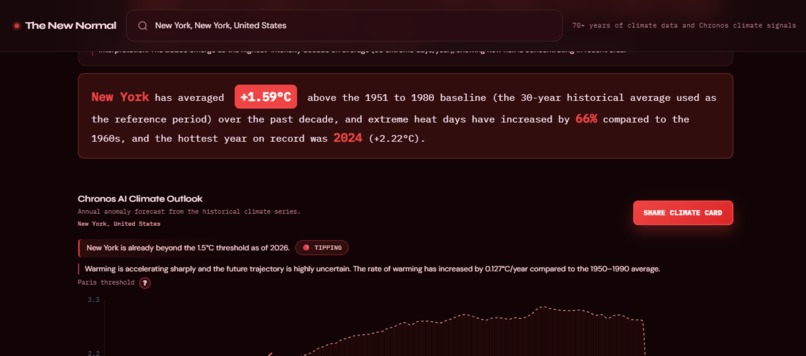
Summary
-
Search / Search
-
Climate Card


Theme
Sustainability & Climate Tech
Inspiration / Problem Statement
Climate change can feel impossibly abstract. There are global averages, distant ice caps, projections decades away. However, everyone has felt a summer that seemed wrong. We wanted to answer one brutally simple question: "Is my city actually getting hotter?" That question became The New Normal! A tool that makes 75 years of scientific data feel personal, local, and impossible to dismiss.
What It Does / Solution
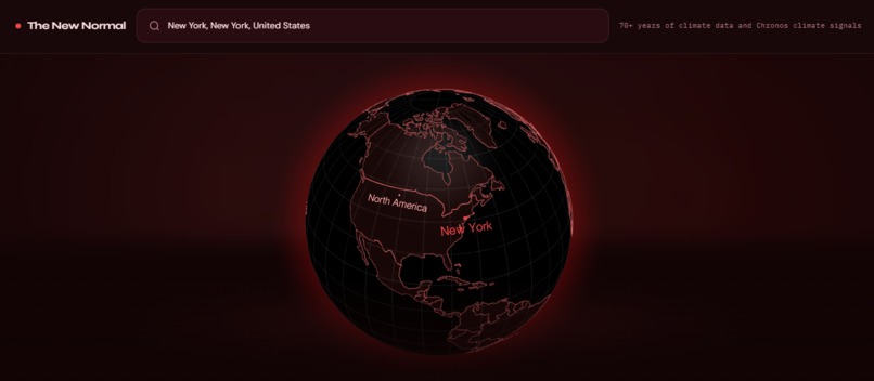
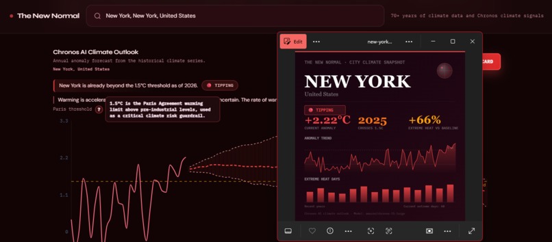
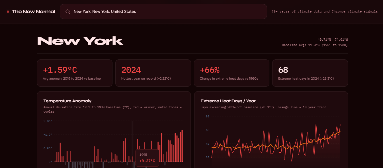
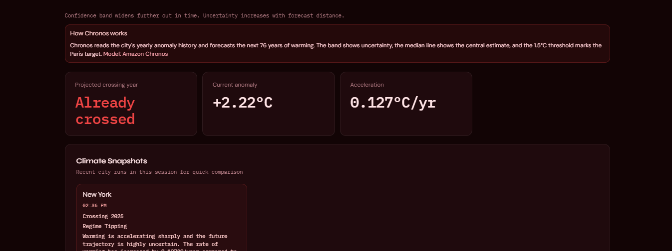
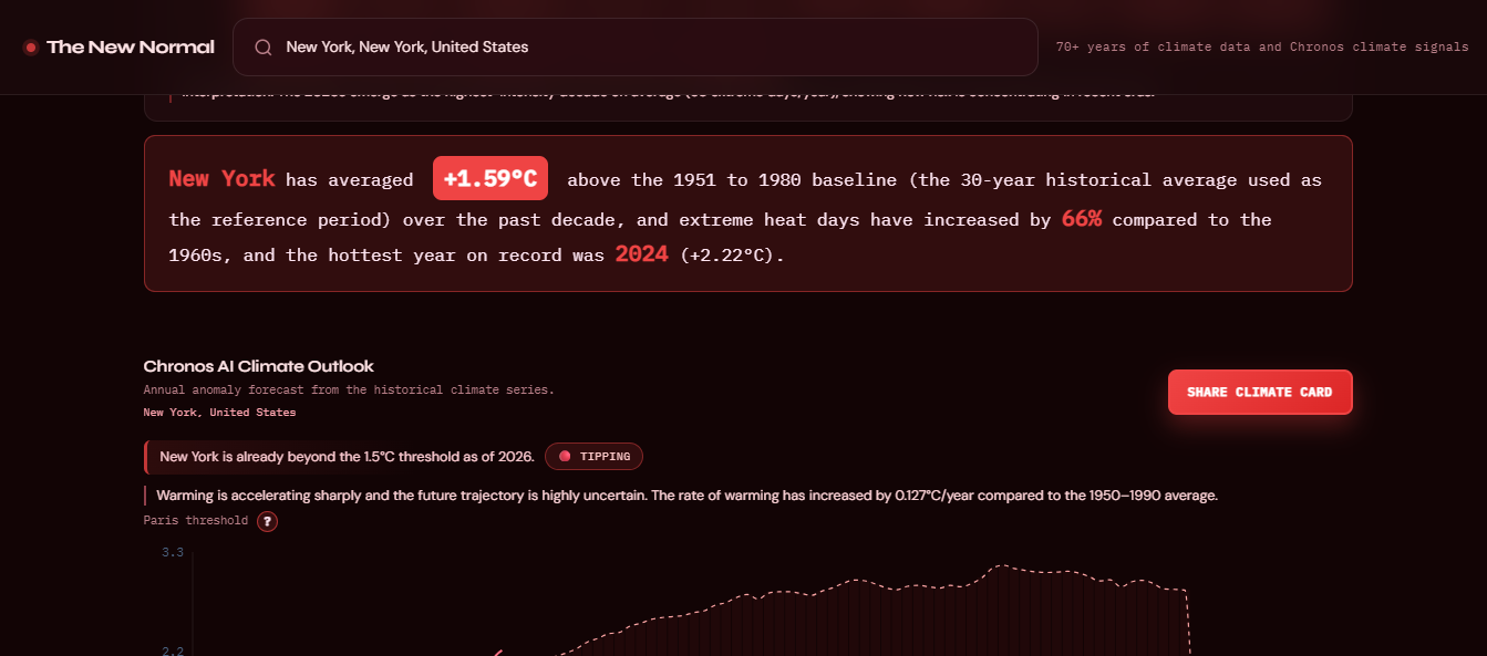
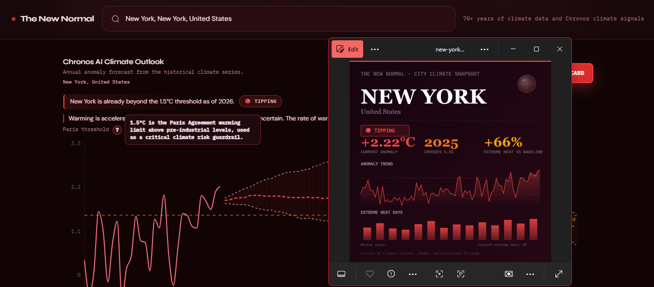
Search any city in the world and instantly get the full picture. Temperature anomalies from 1950 to 2024 are measured against the 1951 to 1980 baseline used by climate scientists worldwide. Extreme heat days per year are shown with a 10-year moving average to cut through year-to-year noise, alongside a decadal heat map for seasonal and long-term pattern recognition. A plain-English city insight breaks it all down without the jargon. A Chronos (Hugging Face Model) AI-powered climate outlook tells you whether your city's median trajectory is approaching, crossing, or already past the 1.5°C threshold, complete with uncertainty bands and a warming regime classification. There's a downloadable city share card so your local climate story can travel. And an interactive 3D globe flies to your city the moment you search.
How We Built It
The data pipeline geocodes every city to lat/lon via Open-Meteo, pulls daily max/min temperatures for 1950 to 2024 from the ERA5 reanalysis archive, computes yearly anomalies against the 1951 to 1980 baseline, and calculates a city-specific 90th-percentile extreme-day threshold. The frontend is React and Vite with Recharts for visualizations and react-globe.gl for the 3D globe. A FastAPI backend warms Amazon's Chronos T5 model on startup and serves the climate outlook endpoints. The entire stack runs on free public APIs with no proprietary data and no paywalls.
Challenges We Ran Into
ERA5 reanalysis data gets noisier the further back you go, especially for smaller cities, so handling missing records without corrupting anomaly calculations took serious cleaning work. We also built the app to degrade gracefully when the backend isn't running rather than crash outright. Perhaps the trickiest challenge was presenting a climate outlook without misleading users into treating a probabilistic trajectory as a guarantee (every design decision around uncertainty and threshold framing had to be deliberate).
What We Learned
We went deep on how the 1951 to 1980 baseline is actually used in climate science and why that specific reference period matters. Integrating Chronos for city-level time-series forecasting was a steep learning curve, and so was figuring out how to translate a model's uncertainty bands into something a general audience could act on rather than tune out.
What's Next
We want to add precipitation and drought anomaly tracking, let users compare two cities side by side, and get the share card spreading. The data is there, we just need more time to surface it.


Log in or sign up for Devpost to join the conversation.