-

Initial view at demo. Wasn't working
-

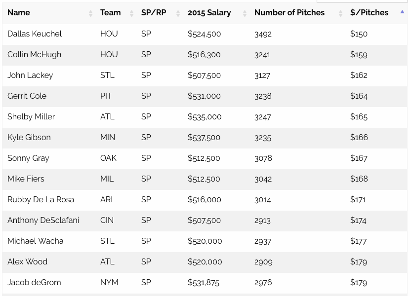
Got it working, most economical
-

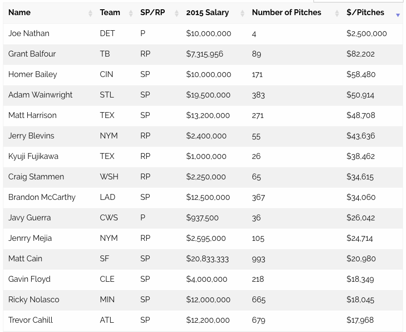
most expensive
-

pitchers who didn't pitch because of injury = $infinity
-

Made a bubble chart, a day after the hack day.


Inspiration
My Boston Red Sox signed David Price to the record contract of average $31million a year this off season. Which got me thinking, with his 3300 pitches last year, that comes out to be roughly $10,000 a pitch, roughly speaking. That got me thinking, who was the most economical and who was the worst? Check it out at http://daigofuji.github.io/expensive-pitch/
What it does
Very simple: $/pitches. USA Today has the salary database. MLB has the number of pitches. I need to come up with how to do the visualization.
How I built it
Scraped data, data cleanup using excel, convert them to json using mr data converter, used my jekyll-foundation web template, used Datatables to do the heavy lifting.
Challenges I ran into
Not enough time! Even though I had this idea in the morning, I was toying with other ideas and couldn't decide on it till about lunch time. Then most the afternoon was spend on excel, didn't get to web part untill about 4.
Accomplishments that I'm proud of
I did excel work!
What I learned
Do not attempt to manual clean up messy excel merge at hackathon! I should have used SQL or something to join those two data sets. There is gotta be a better way!
Also, it was fun to go through number of pitches for 2015 and find things like, Oh yeah, I forgot Ichiro pitched an inning, last year, and Wow, when did Jonny Gomes pitch an inning??
What's next for The most expensive pitch of 2015
Make it work?Make it more attractive looking?
Built With
- d3.js
- datatables
- excel
- jekyll
- jquery
- zurb-foundation

Log in or sign up for Devpost to join the conversation.