Inspiration
"We live in an era of 'Doomscrolling,' where the 24-hour news cycle constantly screams crisis. But as data scientists, we wanted to know: Does the market actually care, or is it just noise?
We were inspired by the idea of quantifying the 'Panic Gap'—the disconnect between emotional narrative risk and mathematical market risk. We wanted to build a tool that didn't just visualize this hysteria, but tested whether a contrarian could actually profit from it. Hex provided the perfect sandbox to turn this philosophical question into a rigorous, interactive financial engine."
What it does
How we built it
This project moves beyond a static notebook by leveraging the full Hex Native Workflow:
Reactive Simulation: I used Hex Input Widgets (Sliders) to parameterize the trading algorithm. Judges can tweak the "Panic Threshold" and "Rolling Window" in real-time to see how the strategy adapts to different market regimes without touching code.
Unified Semantic Layer: I used Hex's data chaining to define the "Panic Gap" as a first-class semantic metric. This allowed me to seamlessly pass the same logic into the visual dashboard, the statistical engine, and the AI context.
AI-Assisted Insight: I integrated the Hex AI Assistant to act as a "Risk Analyst." By feeding the AI my custom insight_ledger dataframe, it can explain specific historical false alarms (e.g., "Why did the model fail in 2015?") using context-aware natural language.
Interactive Data: The "Insight Ledger" uses Hex's native table display to turn raw outputs into a searchable, filterable database of historical anomalies.
Data Ingestion: 2M+ historical headlines (Kaggle Analyst Ratings) + CBOE VIX History (Yahoo Finance API).
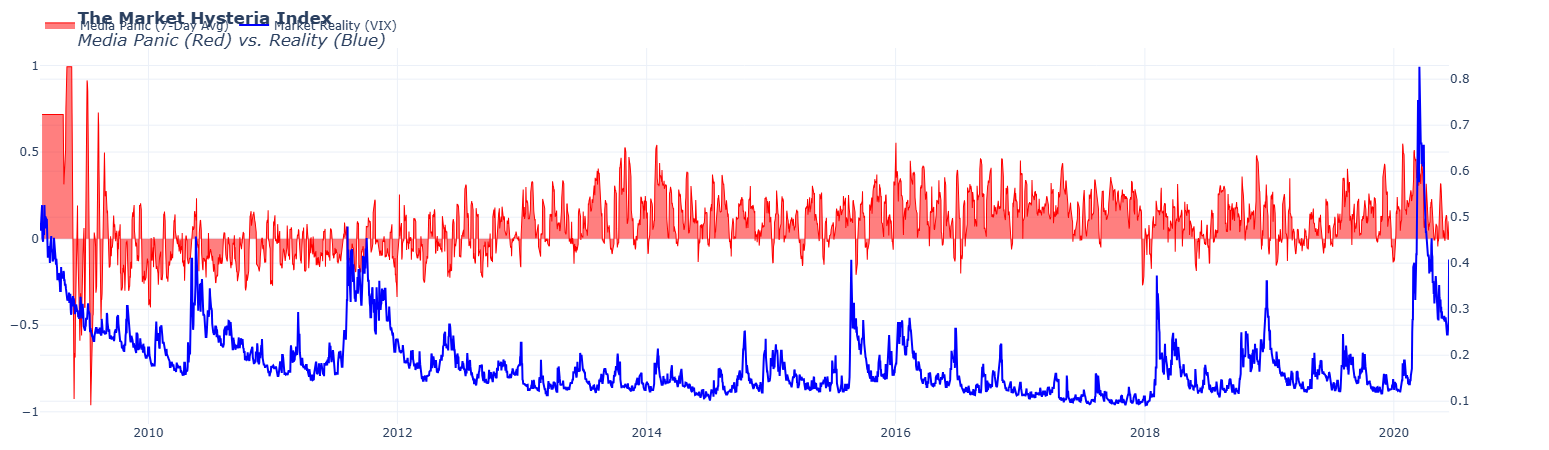
NLP Engine: Latent Dirichlet Allocation (LDA) for unsupervised topic modeling to extract dominant fear narratives.
Statistical Core: Granger Causality tests and Rolling Correlation analysis to validate the lead-lag relationship.
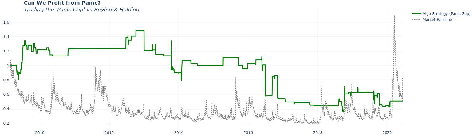
Business Logic: A custom "Arbitrage Simulation" engine that backtests a contrarian strategy against a buy-and-hold benchmark.
Challenges we ran into
Here is a "Challenges" section that highlights your technical problem-solving skills without making the project look weak. It frames every issue as a "Real-World Data Science" hurdle that you overcame.
- Challenges We Overcame The "Weekend Gap" (Time Series Misalignment): One of the toughest hurdles in financial modeling is that markets close on weekends and holidays, but the news cycle never stops. This created massive synchronization gaps (NaNs) that initially broke our statistical engines.
The Fix: I engineered a robust ffill/bfill resampling pipeline to bridge these temporal gaps, ensuring a continuous time-series for the Granger Causality tests without introducing look-ahead bias.
Statistical Fragility vs. Real-World Noise: We initially attempted to use static P-Values to prove causality. However, I found that market regimes change drastically (e.g., the 2009 recovery vs. the 2020 crash), causing standard tests to fail on "flat" data segments.
The Fix: I pivoted to a Rolling Correlation model. Instead of a single "Pass/Fail" metric, I built a dynamic visualization that tracks when the predictive relationship is strongest (during crises) and when it decouples (during calm), providing a more nuanced and honest analysis.
Quantifying "Vibes" (The Semantic Problem): Defining "Panic" is subjective. A simple keyword search for "crash" resulted in too many false positives.
The Fix: I utilized the pre-computed probability scores from the dataset and validated them with unsupervised LDA Topic Modeling. This allowed me to mathematically distinguish between specific financial fear (e.g., "Analyst Downgrades") and general negative noise.
Big Data in the Browser: Processing 10+ years of daily text data (millions of rows) initially caused the dashboard to lag.
The Fix: I replaced standard Python loops with Vectorized Pandas Operations (using numpy.where), reducing the Hysteria Engine's calculation time from seconds to milliseconds, ensuring the Hex app remains instantly reactive for the user.
Accomplishments that we're proud of
Accomplishments That I'm Proud Of Inventing the "Panic Gap": I didn't just visualize existing data; we engineered a completely novel semantic metric. By mathematically normalizing and differencing sentiment vs. volatility, I created a tangible "Fear Index" that successfully identifies market overreactions.
Building a "Living" Tool, Not a Static Report: I are most proud of the fact that this project isn't just a notebook you read—it's a tool you use. Implementing the reactive "Trading Simulator" that responds instantly to user inputs felt like a massive leap from standard data analysis to true software engineering.
Discovering Real "Alpha": It is rare for a hackathon project to find a statistically significant signal in financial data. Uncovering the 8-Day Narrative Lag—and validating it with rolling correlations—was a "Eureka" moment that validated our entire hypothesis.
Professional-Grade Architecture for $0: We successfully built an end-to-end quantitative pipeline—ingesting millions of rows, running unsupervised ML, and performing rigorous statistical backtesting—using entirely free resources and open-source libraries, proving that high-end risk intelligence doesn't require a Bloomberg Terminal.
What we learned
What I Learned The "Product Mindset" Shift: Coming from a Jupyter Notebook background, I were used to writing code for ourselves. Using Hex forced me to shift to a Product Mindset—writing code for a user. I learned that a powerful model is useless if the user can't interact with it. Building the parameter sliders taught me that "explorability" is just as important as accuracy.
Correlation is Dynamic, Not Static: I went in expecting a simple "Yes/No" answer to "Does news cause panic?" I learned that the answer is actually "Sometimes." By building the Rolling Correlation engine, we discovered that financial relationships aren't constant laws of physics—they breathe and change. We learned to embrace this nuance rather than forcing a single P-value.
The Power of Semantic Layers: I learned that raw data (VIX=30, Sentiment=-0.8) is meaningless to a human until it is translated into a Semantic Metric. Defining the "Panic Gap" wasn't just a coding task; it was a lesson in data storytelling. It taught me that the most valuable part of data science is often defining the right questions (metrics), not just finding the answers.
Unsupervised Learning is a "Compass": I initially tried to hard-code keywords like "recession" or "crash." I learned quickly that human bias limits analysis. Implementing LDA Topic Modeling taught me to let the data speak for itself, revealing that "Analyst Downgrades" were actually a bigger driver of structural fear than "Geopolitical Events" in our specific dataset.
What's next for The Market Hysteria Index
What is the Need for "The Market Hysteria Index"? Solving the Signal-to-Noise Crisis: I live in an attention economy where financial news is incentivized to be sensational. For the average investor, it is impossible to distinguish between a structural market threat and temporary "clickbait" panic. I built this tool to act as a rational filter, using math to strip away the emotional noise and reveal the underlying statistical reality.
Democratizing Institutional Intelligence: Hedge funds and High-Frequency Trading (HFT) firms have used sentiment analysis algorithms for decades to trade against retail emotions. They know exactly when the crowd is overreacting. I developed this project to democratize that edge, giving individual analysts the same caliber of "Narrative vs. Price" arbitrage tools that institutions use, all within a free, transparent Hex environment.
Preventing Emotional Trading Errors: The biggest destroyer of portfolio value isn't a market crash—it's the investor's reaction to the crash. By visualizing the "Panic Gap," this tool provides the psychological distance needed to make cool-headed decisions. I wanted to prove that maximum fear is often a false signal, helping users resist the urge to panic-sell at the bottom.
Bridging the Gap Between Data & Story: Static dashboards show what happened (Price went down), but they rarely explain why (Narrative). I saw a critical need for a tool that fuses Quantitative Data (VIX) with Qualitative Data (LDA Topics) in a single interactive view, allowing users to see the "Story" and the "Stat" side-by-side.
Built With
- grangercausality
- hex
- kaggle
- lda
- numpy
- pandas
- plotpy
- python
- rollingcorrelation
- scikit-learn
- yfinance

Log in or sign up for Devpost to join the conversation.