-
-
our data visualization

Inspiration
We wanted to display data that impacted the society we live in today. After attending the hate twitter workshop, the subject caught our attention and we wanted to make this data plot that would help users visualize this problem.
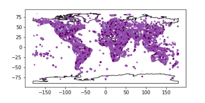
What it does
This map shows a variance of purple which each shade indicates a different level of hate in twitter. If the tweet that comes from that area is classified as a hate speech, then the color will turn out as a dark purple, while if it is a counterhate speech, it will appear as light blue. If the color is a normal purple it means that the tweets that come from there are neutral!
How I built it
We built this using Jupyter notebook! First we had to gather our data and then join the data to make one table. Then we used that data and used geopandas and geoplot to plot the coordinates of the data on top of a basic map. After that, we just had to change the colors to correspond with the classification (hate, neutral, other, or counterhate), and we were done!
Challenges I ran into
Some challenges we ran into include trouble with installing jupyter and other packages such as geopandas and geoplot. We also struggled with gathering all the data onto one table, as we had to use multiple resources.
Accomplishments that I'm proud of
We are proud of the fact that it was our first time using jupyter and despite the many problems that we faced, we were able to finally come out with this graph! We were able to use packages that we never even heard of before to create this visualization!
What I learned
We learned how to use Python for data visualization and how to work with Jupyter to create graphs. As this type of coding is very new to us, we struggled to understand how the platform worked, but in the end we got a hang of it!
What's next for The Hate Society Gives
As we did not have time to add a legend, we hope to do that and implement it onto a website for other users to access easily. We also hope to make it more interactive!
Built With
- geopandas
- geoplot
- jupyter
- python

Log in or sign up for Devpost to join the conversation.