

About The Project
This whole thing started with a simple, stupid question: "What if you took a clean, minimalist teahouse and had it secretly run by a bunch of chaotic, good-for-nothing characters? What would their website look like?"
The main rule for the hackathon this was for was No JavaScript. Yeah, you heard me. So instead of, you know, doing things the easy way, I had to get creative with just CSS. The result is this site: it looks all professional and serene on the surface, but poke around a bit and you'll find the whole thing is held together by duct tape, punchlines, and a whole lot of bugs... I mean, features.
It's a mix of clean magazine layouts, cyberpunk glitchiness, and the kind of fourth-wall-breaking energy you get when you're perpetually behind on rent.
Features
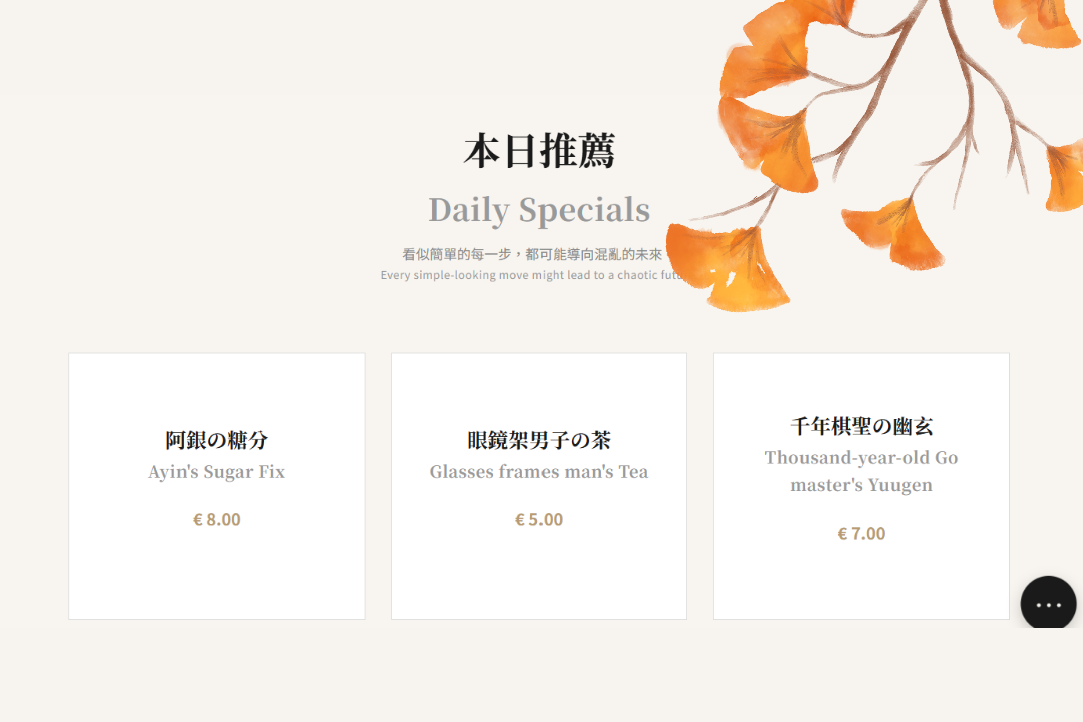
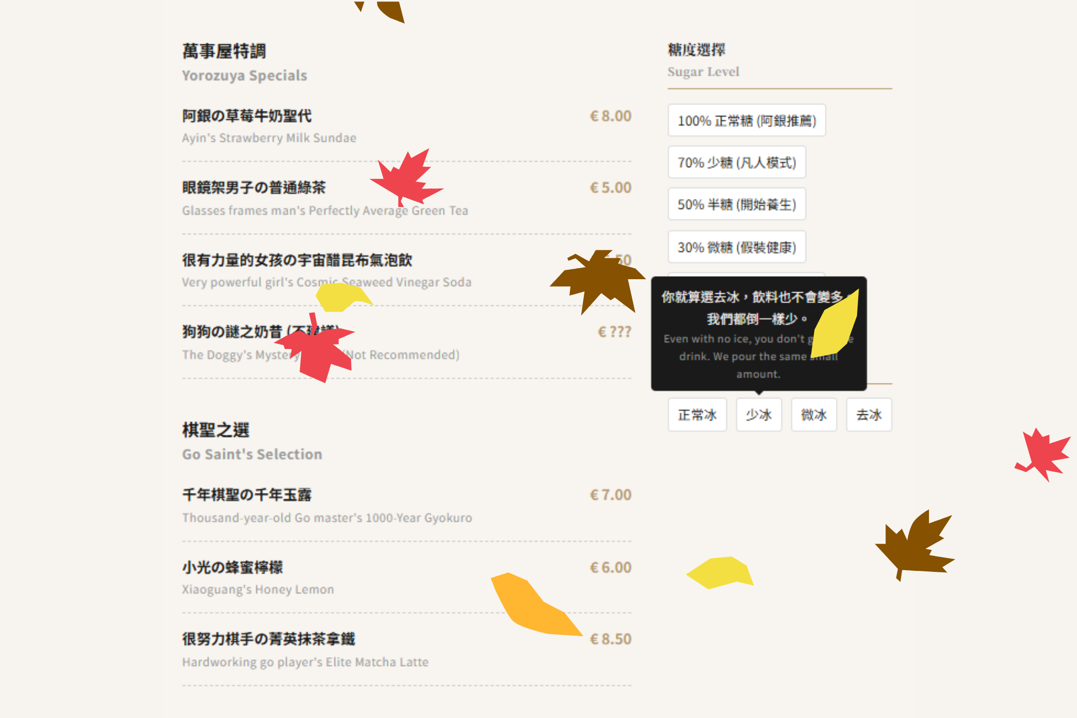
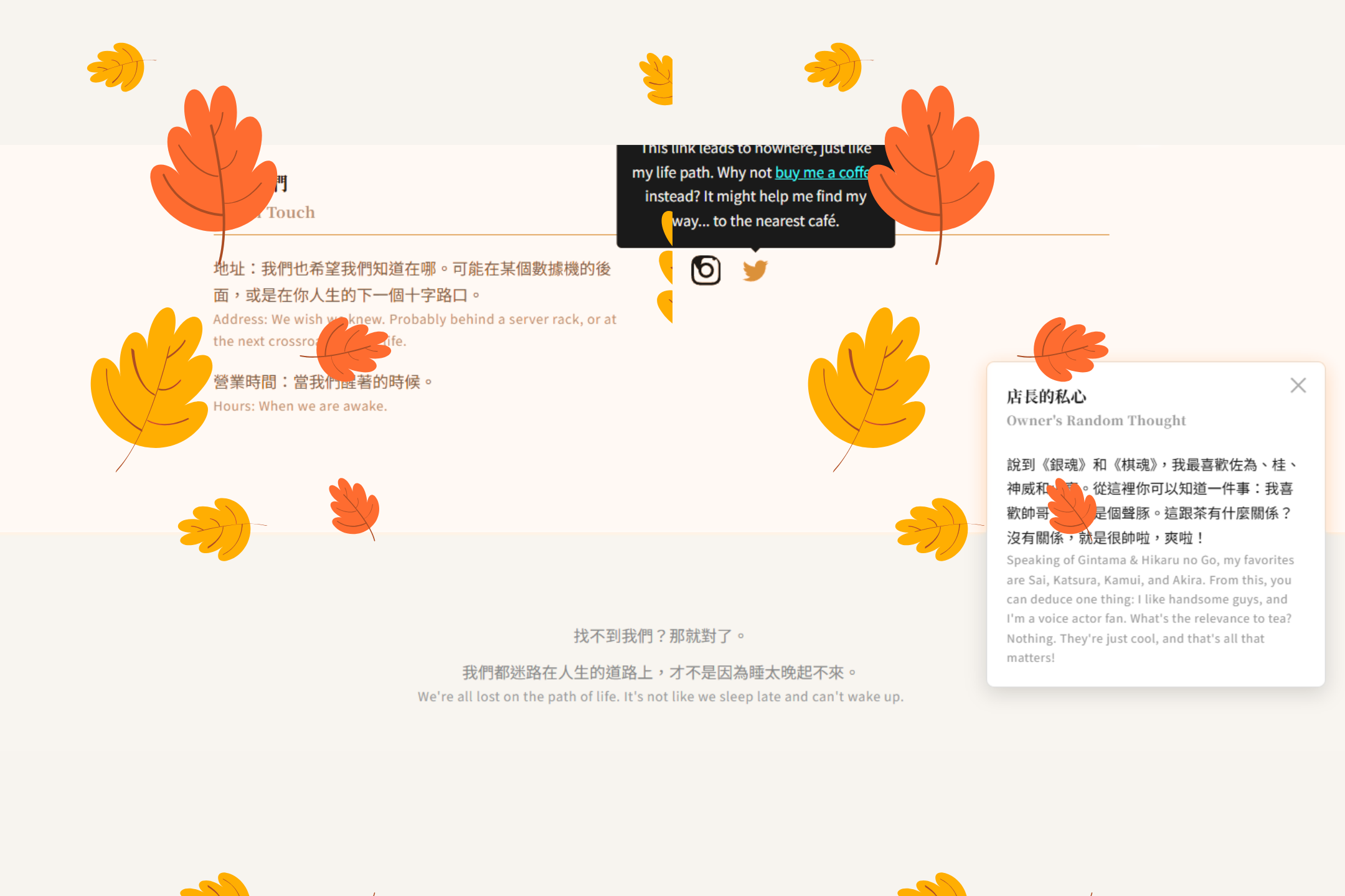
- Dual Personality Design: Looks clean and professional at first glance. But hover over things and you'll find its true, chaotic soul filled with snarky comments and glitch effects.
- 100% Pure CSS Interactivity:
- A full-screen modal menu that appears out of nowhere, powered by a sneaky checkbox.
- A floating button in the corner that reveals the owner's inner thoughts (mostly complaints).
- Hover-triggered tooltips on icons, because why not.
- Glitchy Visuals: Subtle (and not-so-subtle) text and border glitches to make it feel like the whole thing is about to crash at any moment. Which, let's be honest, it is.
- Responsive & Works on Mobile: So you can browse our questionable menu and judge our life choices on the go.
Tech Stack
The tech stack is, uh... impressively short. And cheap.
- HTML5
- CSS3
That's it. Seriously. Don't go looking for a package.json, you won't find one.
How I Pulled This Off
Since I wasn't allowed to use the easy stuff (JS), I had to rely on some old-school CSS sorcery.
The
Checkbox Hack: This is the biggest trick up my sleeve. You hide an actual<input type="checkbox">and use its<label>as a button. When you click the label, the checkbox is toggled. Then you use the:checkedpseudo-class in CSS to magically change the styles of other elements on the page, like making a giant menu appear. It's like a ninja technique for web design. A very, very cheap ninja.- e.g.,
#menu-modal-toggle:checked ~ .menu-modal { display: flex; }
- e.g.,
Pseudo-elements (
::before,::after): The key to all the glitchy text. I basically told CSS to create two ghost copies of the text, layered them on top, and then made them twitch and shake with differentclip-pathandtext-shadowanimations. It gives everything that nice "I haven't slept in three days and I've had way too much coffee" vibe.CSS Transitions & Animations (
@keyframes): Used for everything that moves, fades, or slides smoothly. It's the stuff that makes the site look like I actually put in some effort, creating smooth pop-ups and hover effects instead of things just bluntly appearing and disappearing.


Log in or sign up for Devpost to join the conversation.