Inspiration
My inspiration for this project was because I always had issues with breathing in polluted areas and understood the detrimental environmental effects of air pollution. So I wanted to build an app that would illustrate the monumental problem of growing carbon concentrations in major cities in the U.S. I also wanted to educate people on what they can do to help with the problem by changing their daily habits and being more conscientious about how we treat our planet
What it does
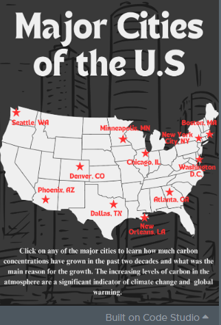
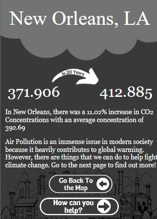
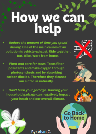
My app allows users to learn how the carbon concentrations in major U.S. cities have grown over the past twenty years. They can click on the spot they would like to learn about and it will show them the average, percent change, and beginning to end in CO2, in that specific city. After they see how much it has grown they can go to my final slide and learn some ways to do their part and help fight climate change.
How we built it
I used JavaScript in AppLab where I first designed the User Interface (UI) and made the interactive objects to change screens and update elements based on inputs from the user through onEvents. Then I accessed an in-built library that gave me the info for 11 cities about the carbon concentrations each month for 20 years. I implemented this data and accessed each column as an array to pull data through indexes. I found the beginning value for each city by accessing the first index in the array and found the end by accessing the last index. Then I found the average by continuously adding all the values for that specified city and then dividing it by the total quantities. Finally, I determined the percent change by using the formula (new-initial)/initial and strung these values together to produced a unique output for each input of a different city.
Challenges we ran into
Since the data was formatted in a way where there was so much for one particular city the initial challenge was how to make the copious amounts of data digestible for the user and I found that simplifying the data into a start-to-finish format made it much more readable and understandable.
Accomplishments that we're proud of
To be able to work with such data and produce this app was an amazing experience. Especially to educate people on why we should be more cognizant of how we treat our planet.
What we learned
I learned how to make complex and copious data readable and understandable to the user, and how to make visually appealing UI to improve the viewers experience with my app.
What's next for The Concern of Rising Carbon Dioxide Concentrations
I would like to expand this beyond just the U.S. and use data from all across the world regarding carbon concentrations to further educate the whole world on why we should care more about our planet and try to become more sustainable.
Built With
- applab
- carbondioxideconcentrationsincities
- javascript

Log in or sign up for Devpost to join the conversation.