-
-
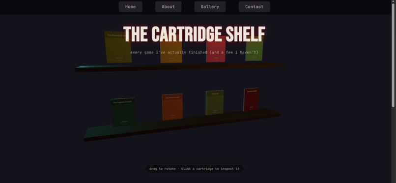
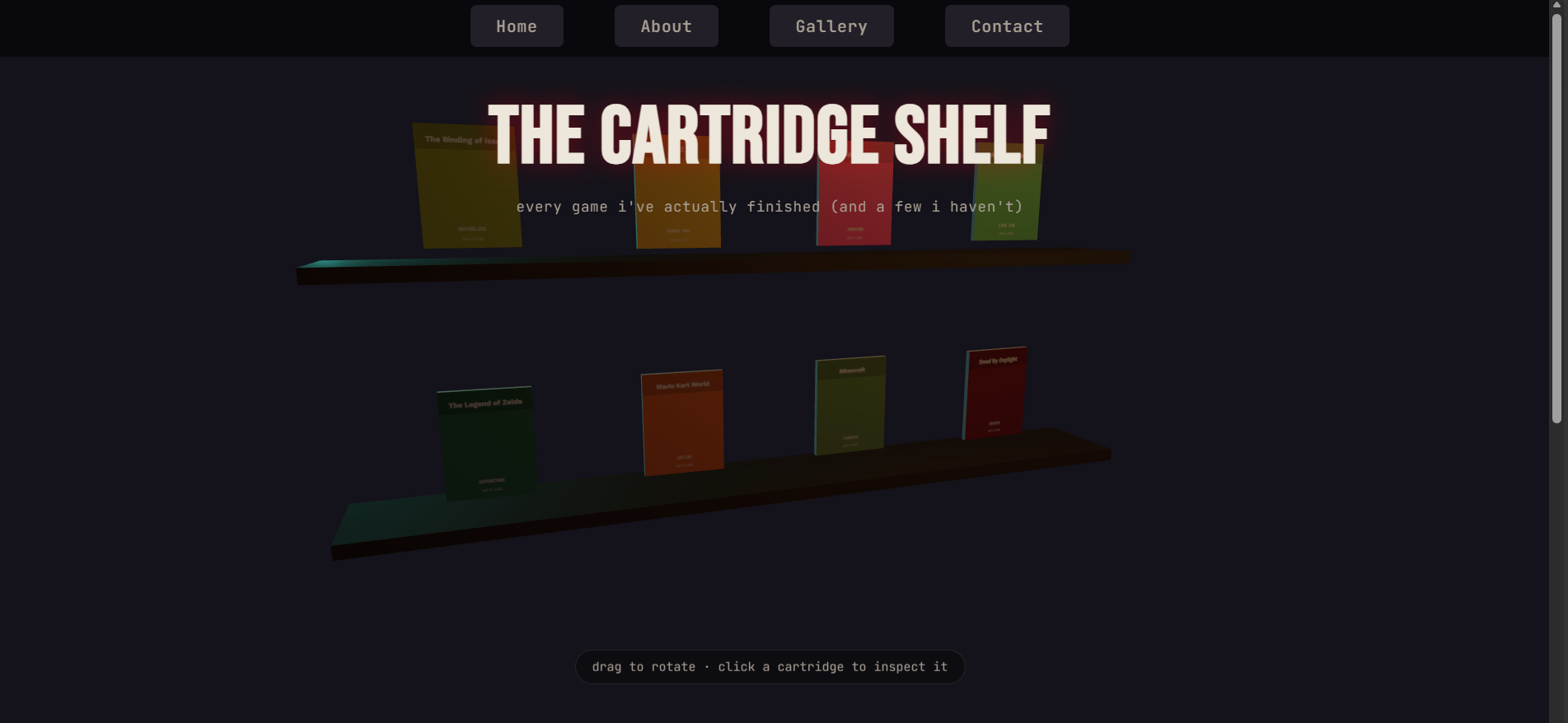
This is the main interface, which displays the bookshelf (showing all game image categories).
-
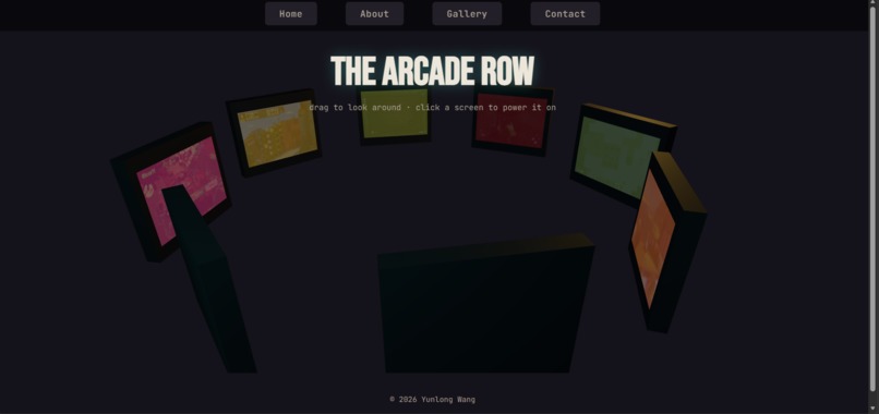
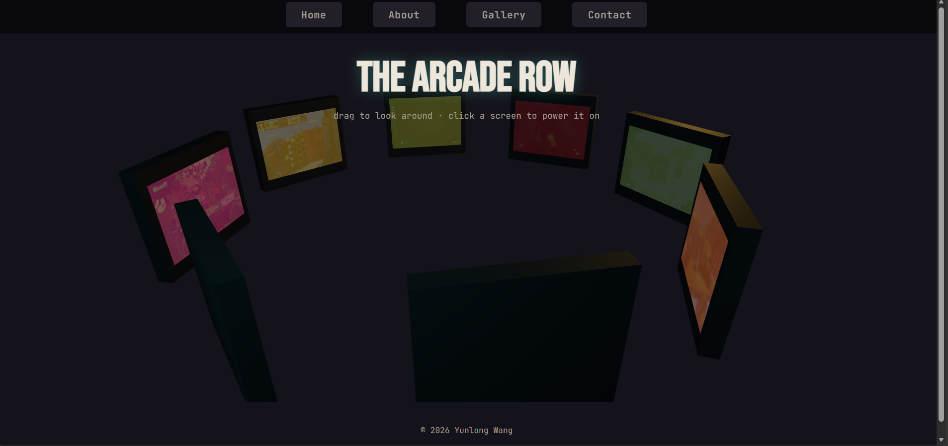
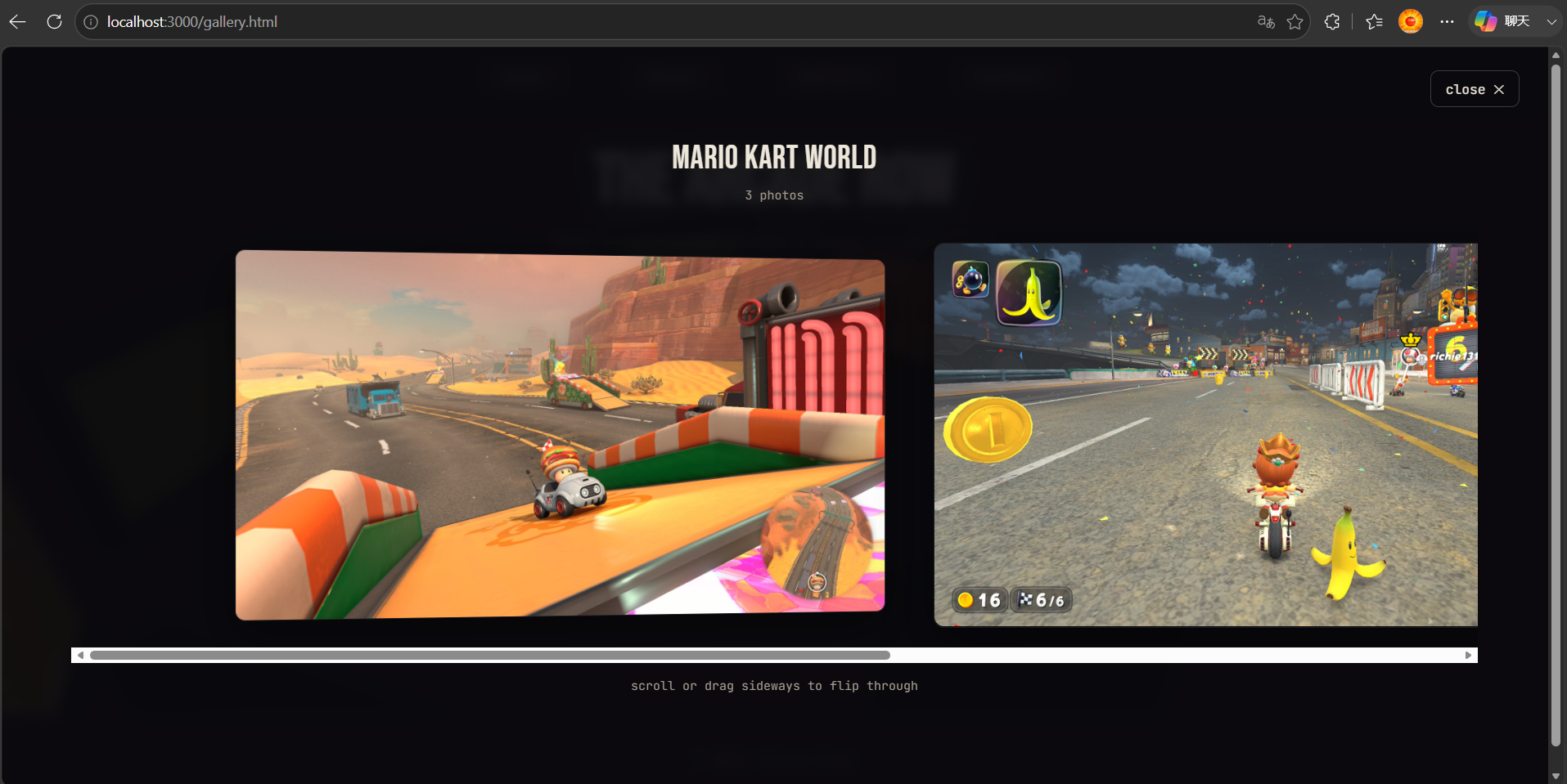
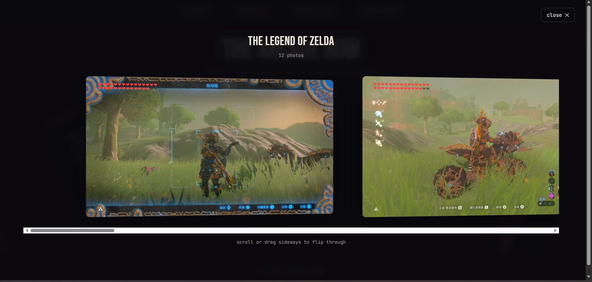
This is the gallery interface, where you can select screenshots of games you want to view.
-
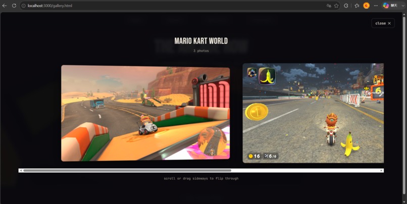
Image Example: Mario Kart World
-
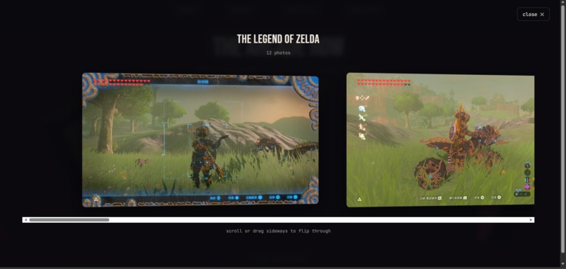
Image Example: The Legend of Zelda
-
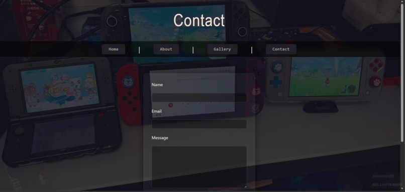
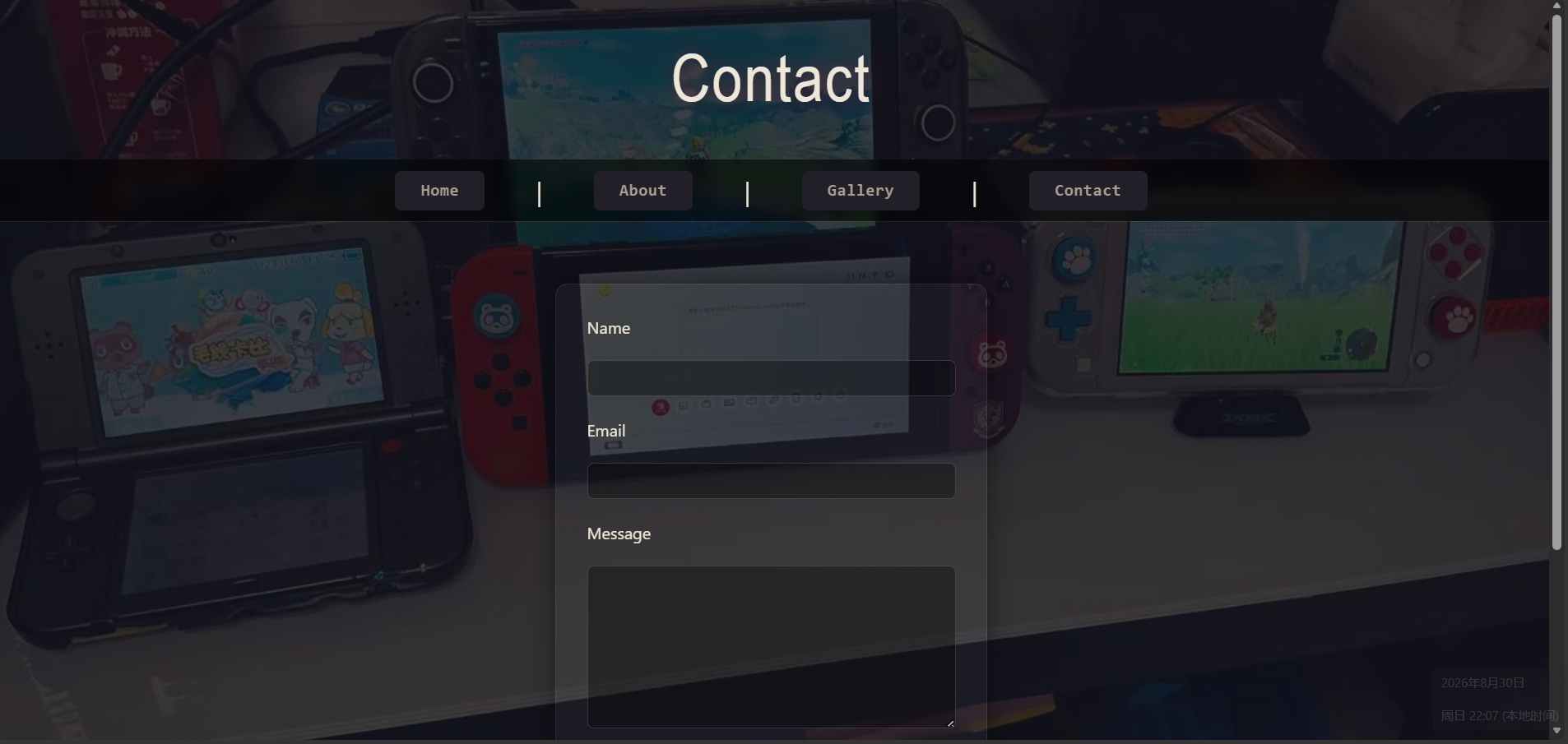
Contact Interface
-
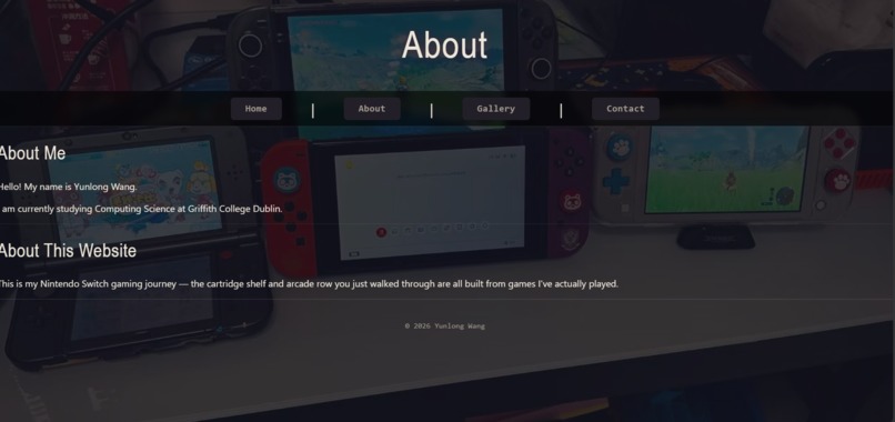
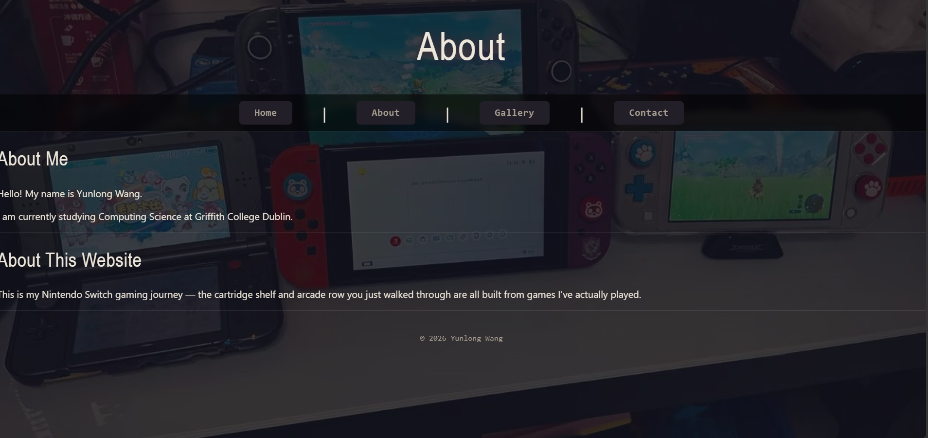
About Interface: Information about me and this website
Inspiration
I already had a personal website where I keep track of my Nintendo Switch games — screenshots, a little gallery, nothing fancy. Separately, I've been doing an undergrad research project measuring HTTP/1.1 vs HTTP/2 vs HTTP/3, and I was actually using that same website as the test target for the experiments.
When I saw this hackathon was basically "3D, no rules, just make something cool,"
I figured why not combine the two instead of leaving my gaming site as a boring
list of <img> tags. Switch games are literally physical cartridges you hold and
insert, so that felt like the obvious thing to turn into 3D instead of doing
another spinning-cube demo.
What it does
It's a personal site with two main pages:
- Home – the cartridge shelf. A shelf of 3D game cartridges (Zelda, Mario Kart, Minecraft, etc.) that you can drag around and look at. Each one has a fake-but-realistic Switch product code on it. Click a cartridge and it pops forward and a little info panel shows up, kind of like selecting a game on the actual Switch home screen.
- Gallery – the arcade row. Eight arcade cabinet screens arranged in a circle, each one shows a thumbnail from my actual screenshots folder. Click one and it "turns on" and opens a scrollable strip of all my photos for that game.
- There's also a small About page where I mention that this whole site doubles as the test website for my HTTP protocol research. It's a bit of an easter egg — you don't expect the gaming diary to also be a research artifact.
How I built it
Nothing fancy on the tooling side, honestly:
- Just Three.js loaded from a CDN with an import map, no build step, no npm/webpack setup. It's still plain HTML/CSS/JS files.
- The text on each cartridge/cabinet (title, code, tag) is drawn onto a
<canvas>at runtime and used as a texture, instead of me making 30 separate image files by hand. - Clicking stuff in 3D uses a raycaster to figure out what you clicked, then I just lerp the position/scale every frame to make it feel like it's "popping out."
- The photo viewer when you click a cabinet is just normal HTML/CSS
(
overflow-x: auto+scroll-snap), not WebGL — didn't need 3D for that part, regular DOM was way easier and still looks fine with a bit ofperspective. - One shared
style.csswith the same colors/fonts across every page so it doesn't look like three different projects stapled together.
Challenges I ran into
- The dumbest one: I opened the file by just double-clicking it (
file://...) and got a completely black screen with no visible error at first. Turns out browsers block ES module scripts from running overfile://, so my Three.js import map just silently failed. Had to actually run a local server (used a tiny Express server I already had lying around from my research project) to get it to load at all. - Making the 3D stuff actually feel like Switch cartridges and not just random floating boxes took more tries than I expected — first version was way too generic looking, like every other "3D card" demo.
- Fitting the research part in without it feeling randomly bolted onto a gaming site. Ended up just writing it in the same casual voice as the rest of the site instead of switching to formal research-paper language halfway through.
What I learned
- You really don't need a whole build pipeline to do WebGL stuff — a CDN + import map is enough for a real interactive scene.
- Generating textures on canvas at runtime is a nice shortcut when you don't have proper art assets for everything.
- The hard part of "make it 3D" was less about the Three.js code and more about not defaulting to generic 3D shapes — figuring out what object from my own world (a cartridge, an arcade screen) actually made sense to build.
Built With
- 3d
- css3
- express.js
- gaming
- html5
- javascript
- node.js
- personal-website
- three.js
- webgl

Log in or sign up for Devpost to join the conversation.