


The Button of Regret
Inspiration
The inspiration for The Button of Regret came from the collective delirium of hour 36 of a hackathon. We noticed that most software is designed to be "user-friendly" and "intuitive." We wondered: What if we built the exact opposite? We wanted to create a digital manifestation of chaos—a button that actively resents being pressed and uses every trick in the book (and some AI-driven ones) to protect its personal space.
What it does
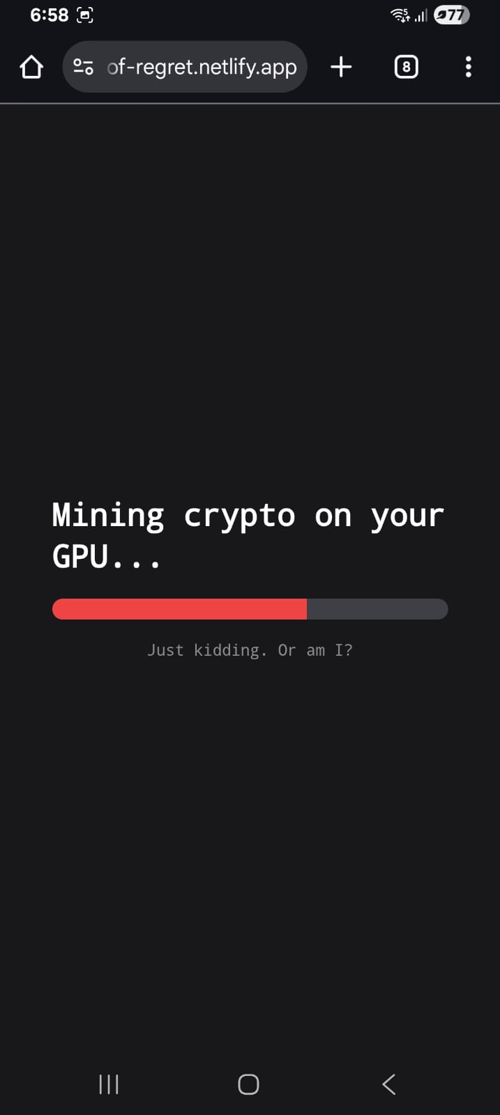
At first glance, it’s a big red button that says "DO NOT PRESS." If you ignore the warning, the application begins a psychological and technical assault on the user:
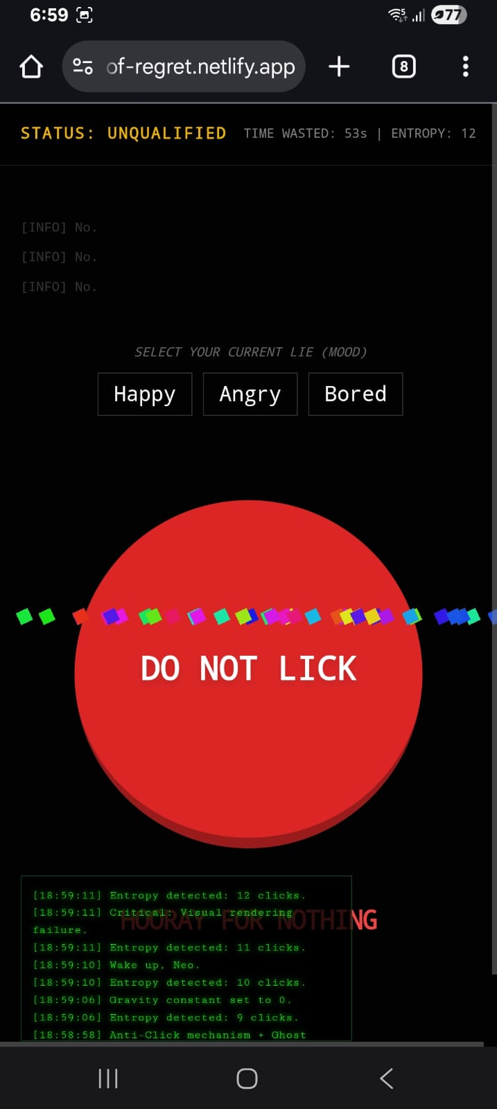
Sentient Avoidance: The button literally runs away from your cursor, leaving behind "echo" ghosts to confuse your depth perception.
AI-Driven Psychological Warfare: Using the Gemini API, the button roasts your life choices, critiques your mouse speed, and generates fake news and absurd advertisements.
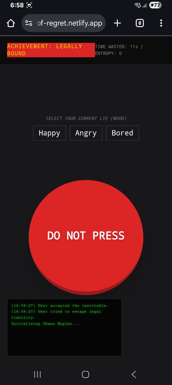
Environmental Sabotage: It can "crash" the physics engine, invert your cursor, trigger fake battery alerts, and force you to accept legally binding (and ridiculous) Terms of Service.
Mood Saboteur: It asks for your mood just so it can generate a custom response specifically designed to ruin your day.
How we built it
The project is a "Single-File Masterpiece" built using:
Frontend: HTML5, Tailwind CSS for rapid (and messy) styling, and Vanilla JavaScript for the heavy lifting of the chaos engine.
Intelligence: We integrated the Gemini 2.5 Flash model to handle all dynamic text generation, ensuring that no two insults or fake ads are ever the same.
Persistence & Chaos: We utilized complex CSS animations for the "glitch" and "dance" modes, and the Web Audio API for those satisfyingly annoying "pop" and "error" sounds.
The Echo System: A custom trail-renderer in JavaScript that tracks the button's transform matrix to leave ghosting artifacts during high-speed chases.
Challenges we ran into
Matrix Math: Calculating the "Echo" positions while the button was mid-transform-transition required some tricky CSS Matrix math to ensure the ghosts didn't just spawn in the center of the screen.
API Latency: Making an AI roast feel "snappy" is hard. We had to implement clever loading states (like "Updating Insult DB") to mask the time it takes for the brain to think of a good burn.
Restraint: The biggest challenge was knowing when to stop. We had ideas for deleting the user's browser history (simulated, of course), but we decided to keep it mostly legal.
Accomplishments that we're proud of
The Feel: We managed to make a UI that feels genuinely "crunchy" and alive. The way the button shakes and teleports feels responsive, even if it's responding by being mean.
AI Integration: Successfully using Gemini to generate not just text, but "character." The button has a consistent, condescending personality.
Zero Dependencies: Aside from Tailwind and the API, the entire engine is raw JS.
What we learned
UX is Subjective: We learned that "User Experience" doesn't always have to be positive to be engaging. People spent more time trying to "beat" the shy button than they do on actual productive apps.
The Power of Feedback: Even "bad" feedback (an error sound or a glitch) makes a digital object feel physical and real to the user.
What's next for The Button of Regret
Multiplayer Regret: A global "Entropy" counter where users from around the world can collectively fail to press the button.
Physical Integration: An IoT version involving a real button that actually moves on a rail system.
Enhanced AI: Using image generation to show the user "pictures of their soul" (which will mostly just be images of wet bread or broken keyboards).

Log in or sign up for Devpost to join the conversation.