About the Project
This project was inspired by the growing dependence on digital infrastructure in everyday life. Services like streaming, cloud storage, artificial intelligence, and online communication all rely on large-scale data centers, yet most people rarely think about where these facilities are physically located or what their environmental footprint might be.
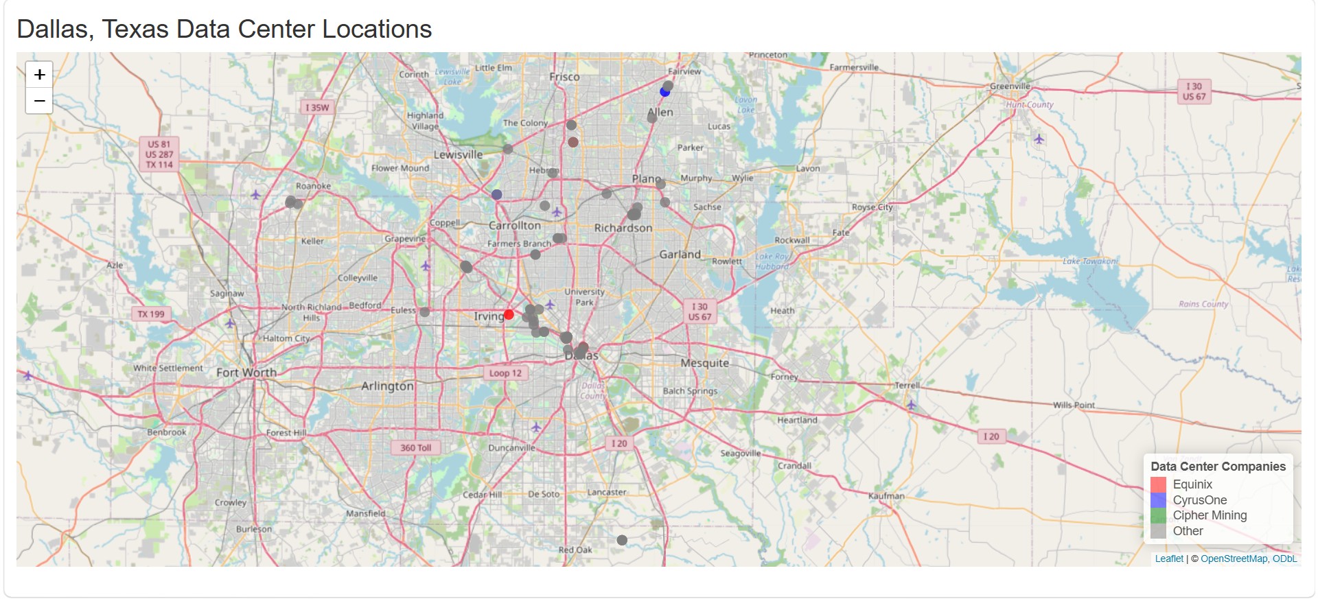
I was particularly interested in the Dallas–Fort Worth region because it has become one of the largest data center hubs in the United States. This raised questions for me about why these facilities cluster in certain areas and what impacts that might have on energy use, land development, and local communities.
What I learned
Through this project, I learned how to:
Work with real-world spatial datasets Clean and structure messy location data in R Build interactive visualizations using leaflet and shiny Represent geographic information in a way that is accessible to non-technical users
I also gained a better understanding of how infrastructure decisions are often invisible to the public, even though they have large-scale environmental consequences.
How I built the project
I built the project using R and Shiny. The workflow included:
Collecting and organizing data on Texas data centers Cleaning and standardizing company and location information Mapping addresses to geographic coordinates Creating an interactive map using the leaflet package Adding visual elements like popups and a legend to improve interpretability
The final application allows users to explore where data centers are located and identify patterns in their distribution.
Challenges faced
One of the main challenges was working with inconsistent location data. Some entries included full addresses, while others were incomplete or formatted differently. This made it difficult to ensure all points could be accurately mapped.
Another challenge was learning how to structure a Shiny application properly, especially how to connect reactive data to interactive map outputs.
Finally, ensuring the visualization was both simple and meaningful required balancing technical detail with clarity for users.
Even without precise numerical modeling, this helps illustrate why regions like Dallas become major infrastructure hubs.
Overall, this project helped me better understand both the technical side of data visualization and the broader societal implications of digital infrastructure growth.


Log in or sign up for Devpost to join the conversation.