-
-
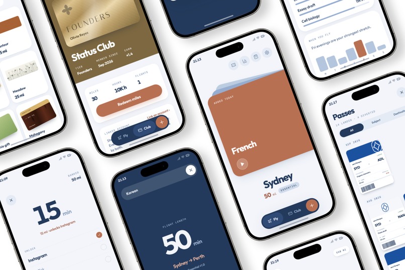
Tempus
-
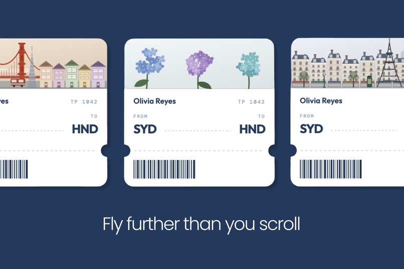
Flight motif
-
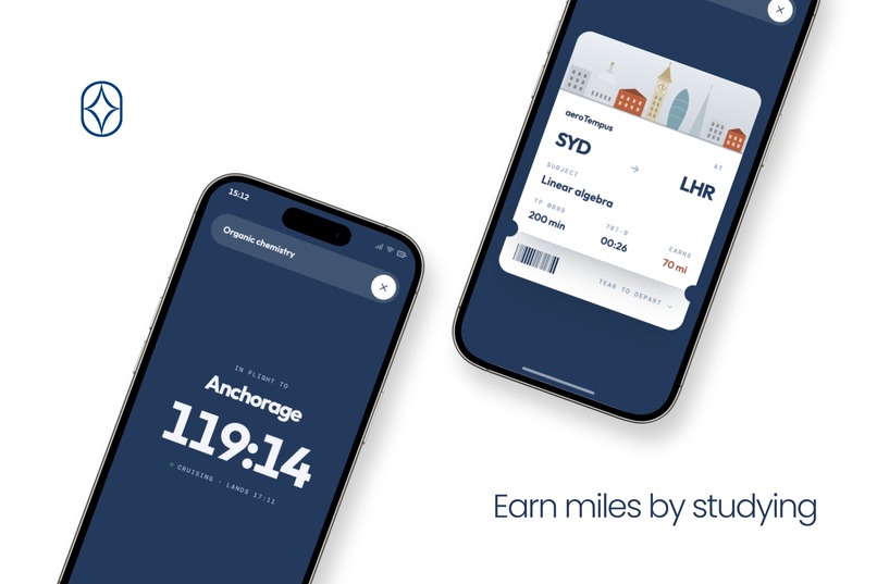
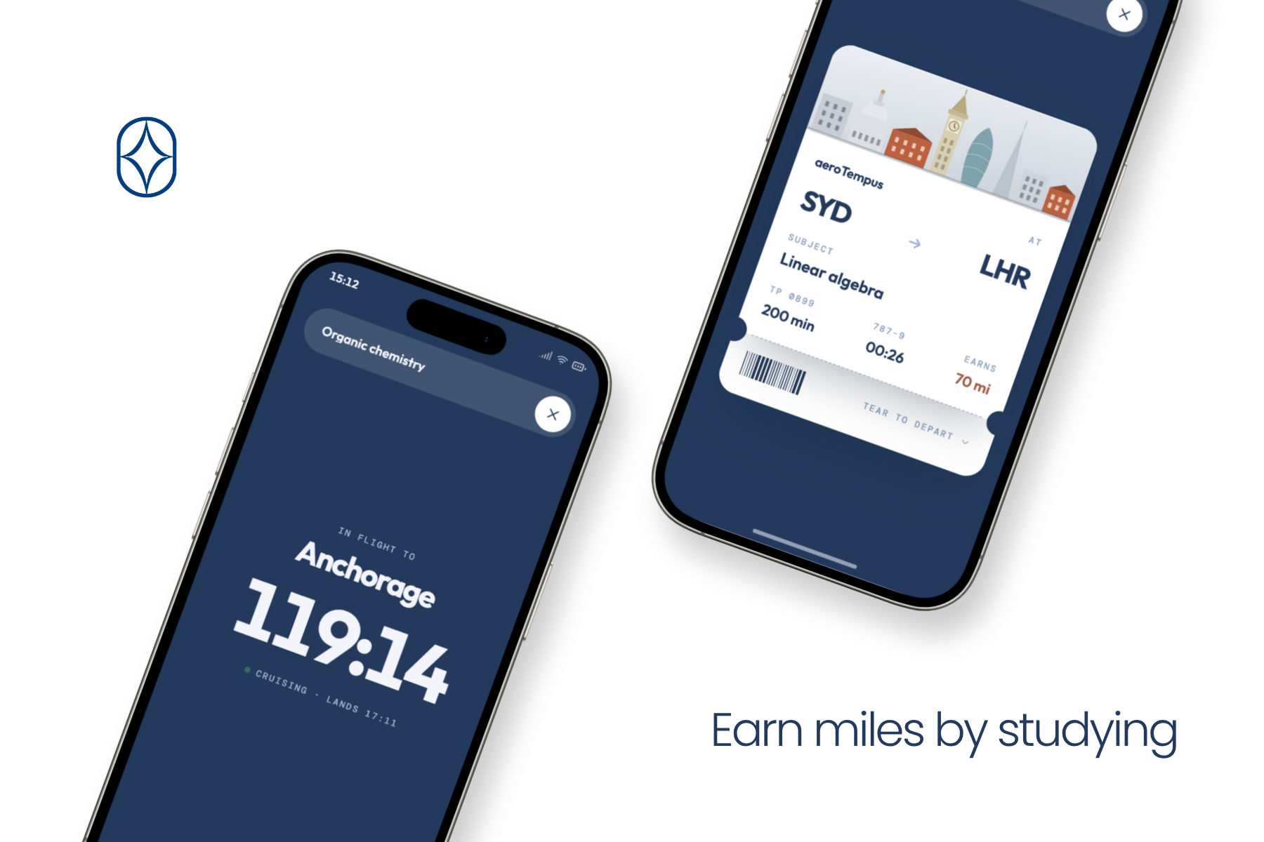
Earn miles by studying
-
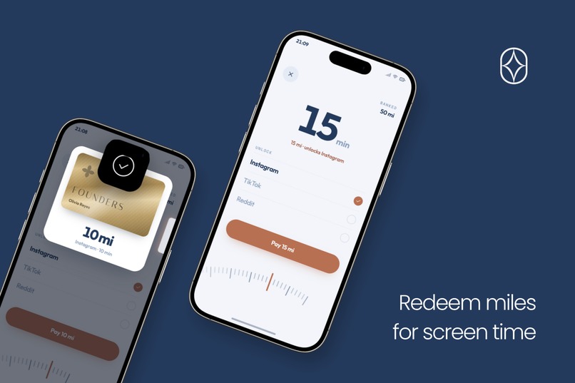
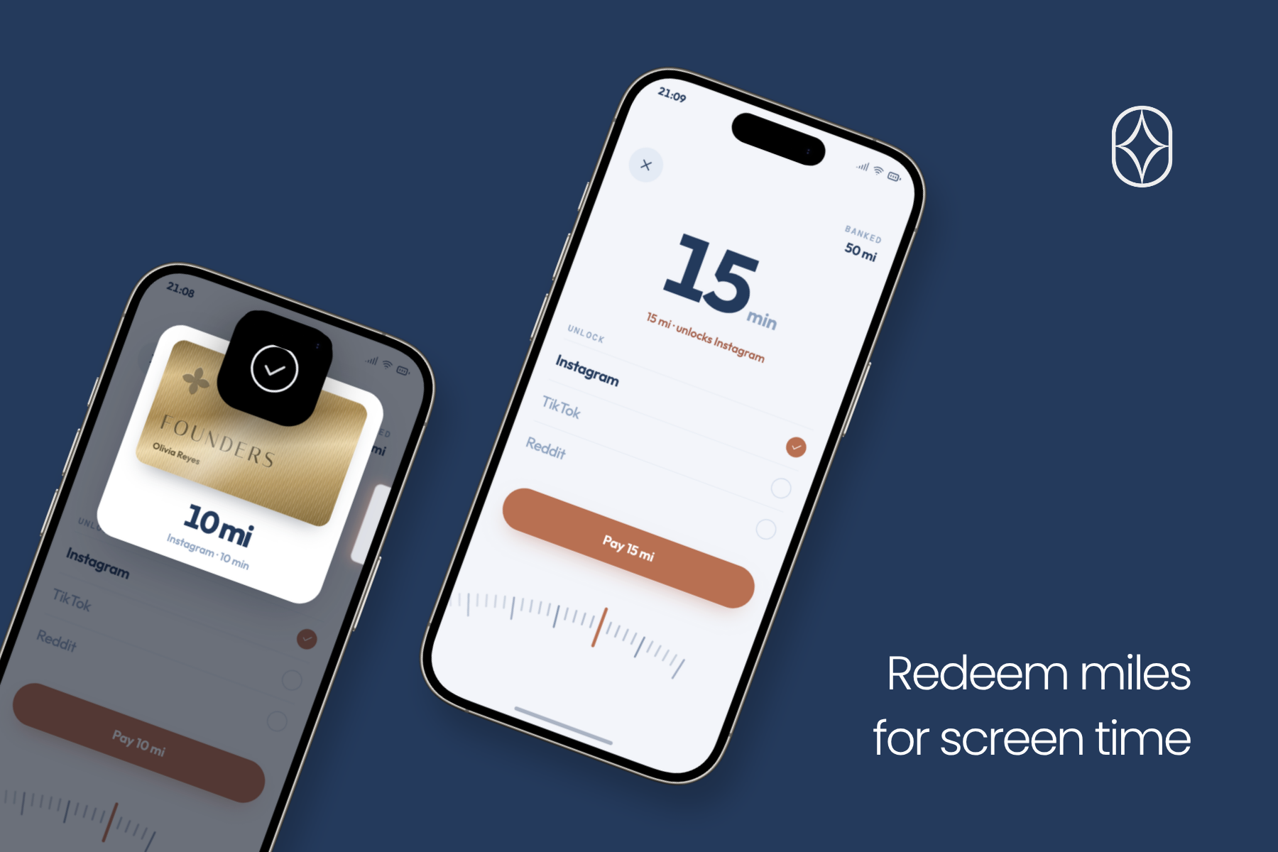
Redeem miles for screen time
-
The Concourse
-
Share with friends
-
App Assets
-
App Assets
-

1024x1024 App Logo

Tempus
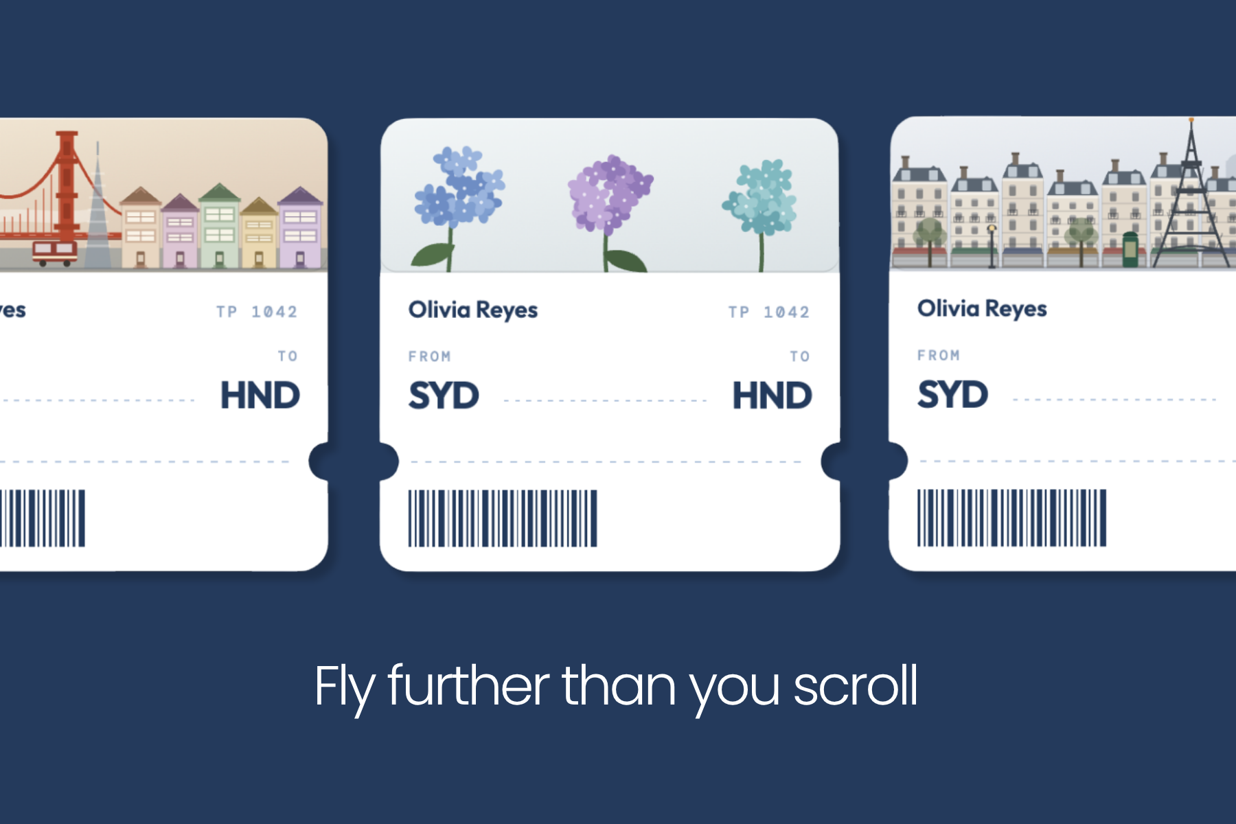
Fly further than you scroll
Tempus is an app that revolves around a problem for both students and adults who need to complete work. It combines a screen time management app and a focus app themed around flying.
Inspiration
We built Tempus to solve a problem we have ourselves. As students with high academic standards, we cannot afford to lose time to the complicated workflows and ‘fluff’ that come with most screen time apps. We needed something that would not only open the doorway to studying but also incentivise us to continue studying.
Before we built anything, we had already tried Opal, ScreenZen, Focus Flight and the native iOS Screen Time, and we had given up on all of them. Reflectively, we wanted to explore the reason behind why all of these focus apps are simply ineffective.
In a survey of 100 students at our school, a recorded 83 percent said that they find it hard to sit down and study for an extended period of time, which proved that we weren’t the only ones who found it struggling. When we looked into why phones are so hard to put down, we discovered a study by Schultz, Dayan and Montague (Science, 1997). This research paper explains how dopamine isn’t simply a pleasure signal but rather something that tracks the gap between what we expected and what actually happens. These findings expose how people are inherently more attracted to reels compared to studying because of its ability to surprise and entertain the brain, contrasted to the mundane and predictable processes of study that leads to diversion.
Overall, the research that we have conducted, supplemented by our own experiences as students studying has led to the breakdown of three primary frustrations, which each of them eventually becoming the foundation of Tempus.
Two apps for one job
The first thing that annoyed us was that we needed two apps to do one singular task. We used a focus timer to keep ourselves at the desk, but it could not prevent us from going off task to the more enticing Instagram, so we added a blocker as well. However, the lack of linkage between these two resulted in a profound issue, where the blocker was inelastic, having set schedules that doesn’t reward studying but rather just limits how much screen time you get.
It was simply too inconvenient to set both of them at the same time because of the inherent lack of flexibility that this provides along with the disruption to the psychological reward system of the human brain. We would believe that the blocker was being extremely unfair, having done hours of work but getting the same amount of screen time compared to a day with no study. This lack of motivation simply resulted in the deletion of the app.
Reflecting on this, the continuous cycle of installing apps and then deleting them formulated an idea. We could simply unify the timer and the blocker to enhance the effects of each other. We believed that screen time shouldn’t be taken away, but rather earnt, and this is exactly the same system in which scrolling triggers dopamine. The unexpected long study session, wherein you immediately get rewarded is such an excitement. In Tempus, this exact flow is replicated, combining the two halves into a loop. Every minute you study earns Miles, and Miles are what you spend to unlock the apps Tempus blocks. Four minutes of study provides one minute in return. Noticeably, this directly morphs the blocking of apps into something that you are in control of, but still have to work for. As the saying “Time is money” goes, we have put a price tag onto money and incentivised you to earn it through the immediate progression of miles.
Why we kept deleting them
Between the two of us, we had downloaded and deleted more of these apps than we could remember. They all followed the same pattern. Throughout the first week, we always had the excitement that this app was going to be the one. However, by the second and third week, the app became almost like an inconvenience, where there was nothing to lose by quitting and nothing to gain by staying.
In order to solve this flaw in Tempus, we started asking what actually keeps people loyal to something for years. Through Kyle’s persistent interest in planes, we were able to adapt a similar system to Qantas’ Frequent Flyer program and Cathay’s Asia Miles, which both don’t rely on the generic streaks or reminders to keep customers. Instead, they rely on something that has deeper ties within their business. Status. It is something that you earn by flying and lose if you stop and we believe that this visual, being integrated directly into your wallet, is one of the best motivators. We saw that people will book a whole extra trip to hold on to a tier and we wanted students to feel the same incentive towards their next study session.
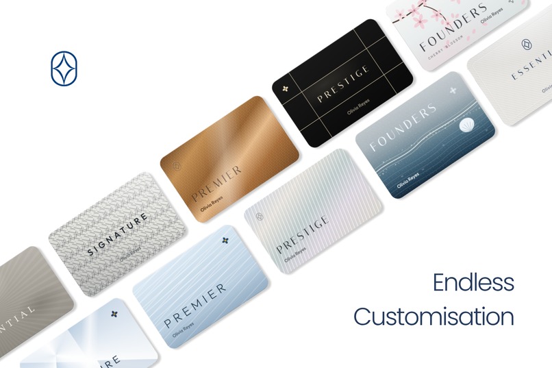
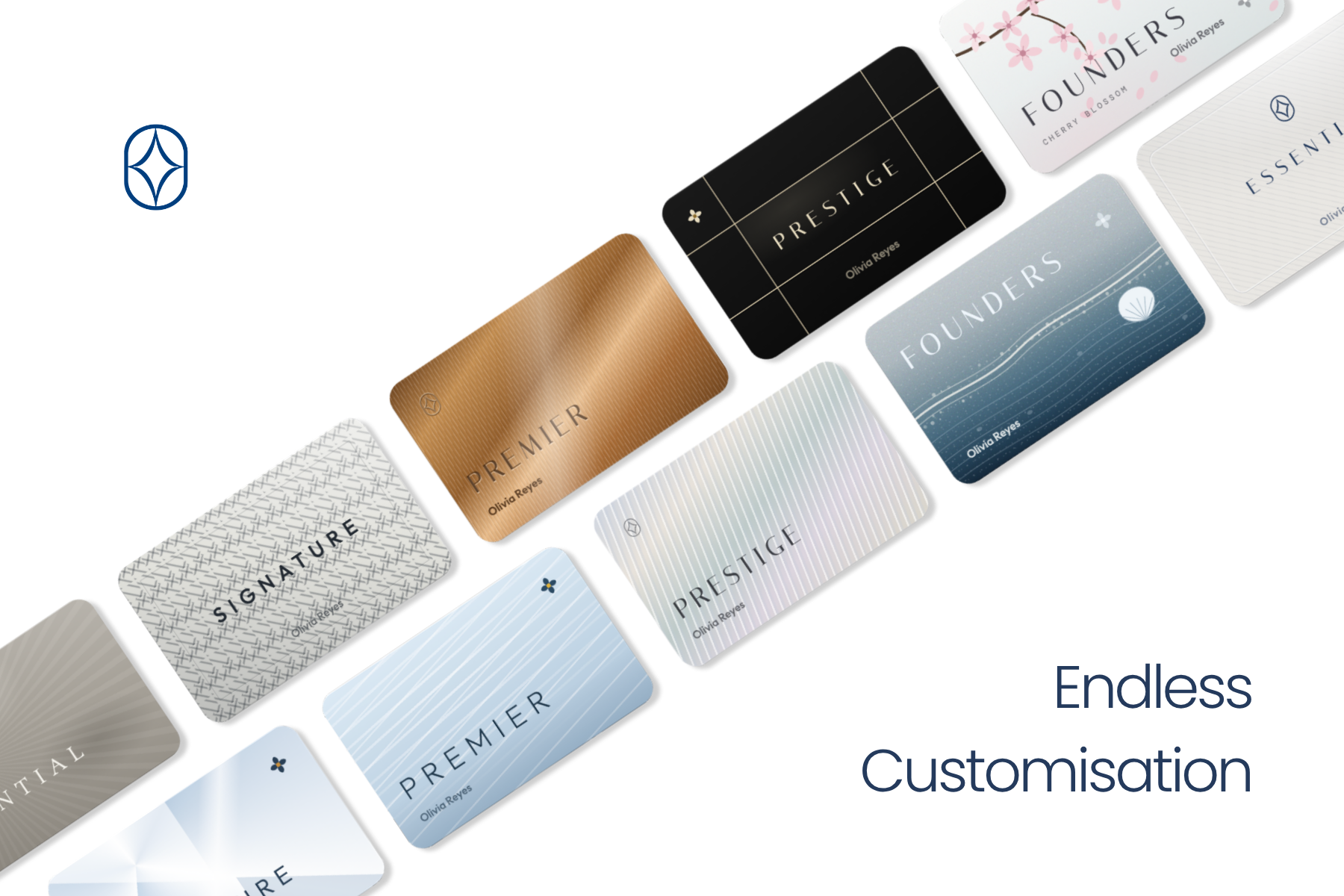
That directly became the Status Club. We have employed the motif of flights as the backbone of Tempus. Hours you study directly represents flight hours and those hours decide your tier for the next 90 days: Essential, Signature, Premier, Prestige or Founders. To prevent the same demotivation after a certain time inside of the app, you have to re-earn the miles every period, with a high tier providing faster earnings, so students who study most get the most back. Furthermore, each tier unlocks a distinct membership card with its own typeface, and the Concourse lets you spend Miles on card faces and boarding pass headers to make that card your own.
Once we had the loyalty program, the rest of the airline was naturally integrated. A study session evolved into a flight at a real airport and the longer session takes you further. Starting a session prints a boarding pass that you tear to depart and quitting early is a diversion, which results in you landing nowhere. When you land, that city becomes your new home, so over a term, your study journey remains recorded as a map throughout the globe.
The theme also solved a problem that we hadn’t expected. Most blockers made us feel a strong pestering sensation that seemed to represent more of a chain than something productive. An airline does the opposite of this. The rules of Tempus allows for users to know exactly why this is happening embody fairer values contrasted to a personal insult, with “Flight diverted, no miles earned” landing much more reasonable than a symbol of failure.
Why it had to be cheaper
The last frustration was the price. Opal’s premium plan costs $99.99 USD per year and several of the other apps we tried charged something similar. As students without a regular income, we could not justify spending such a large amount of money for an app that we might delete in a month. It was also one of the main reasons we gave up on these apps in the first place. It felt so unusual that tools marketed at people trying to build better habits were priced for people who already were working and had a salary.
This consideration has led us to decide that Tempus had to be priced for students. The free version, Economy, contains the whole app: you can fly, earn Miles, block apps and unlock them without paying anything. The paid tier, Business Class, costs far less than the competitors we tried and it also doesn't sell more features. Rather, it sells a stricter rule. In Economy, leaving the app or picking up your phone gets you a warning and a second chance. In Business Class, the cabin is locked and one lapse ends the flight, also restricting users from leaving the app and providing better customisation. We realised that this additional strictness would still get the necessary demand as it is simply something that is worth paying a little for; in order to fill in this wiggle room.
The End Result
Tempus came out of the three complaints that we both have lived with for years, with none of them needing a new kind of app on its own. Together, the timer and blocker provided a cohesive unison that characterised the reward to be something you could lose and the pricing had to be something that made sense for a high schooler. Everything else in Tempus eventually evolved from this backbone.
What it does
Tempus is a simple screen time management app and focus timer in one.
Core Features
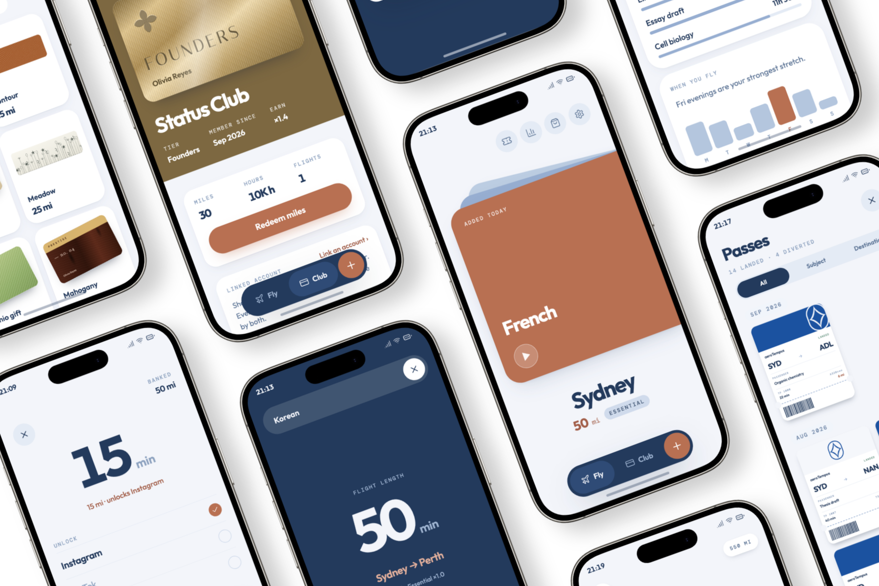
Tempus allows users to lock distracting apps such as Instagram, TikTok and YouTube. Unlike apps such as Opal and ScreenZen, users do not receive a set amount of time each day where their apps are automatically unlocked. Instead, screen time must be redeemed using Miles, our in-app currency inspired by airline miles, which users can earn by studying.
Each study session is a flight where you can choose how long you fly for that converts to a destination you can fly to. Each flight, you get a boarding pass that you can collect. During the flight, you cannot move your phone or exit the app without getting a strike.
A core component of our app is the Status Club which is inspired by real world airline reward programs. The Status Club is our version of a loyalty program. Rather than streaks, you collect hours from studying and after studying for enough hours you move up Club tiers. Each user also gets their own individual Status Card, which they use to withdraw miles.
Analytics
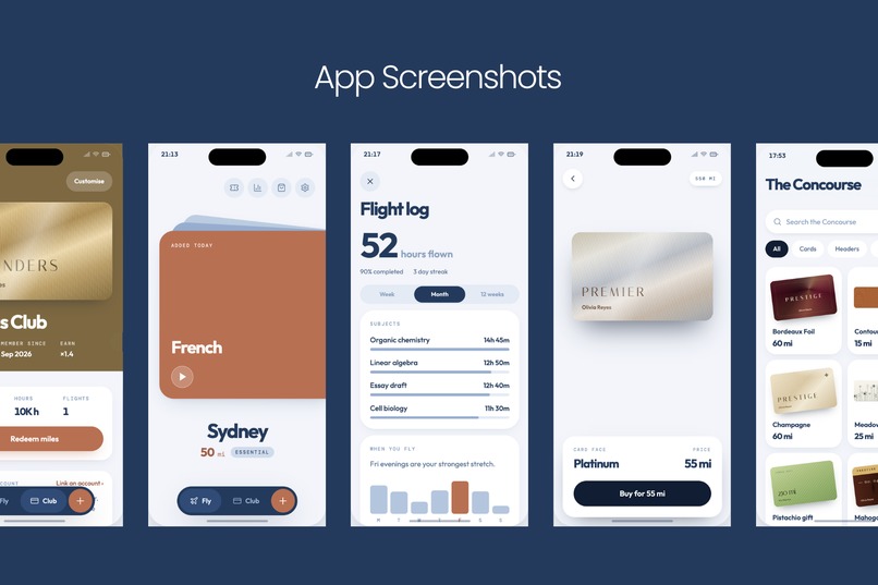
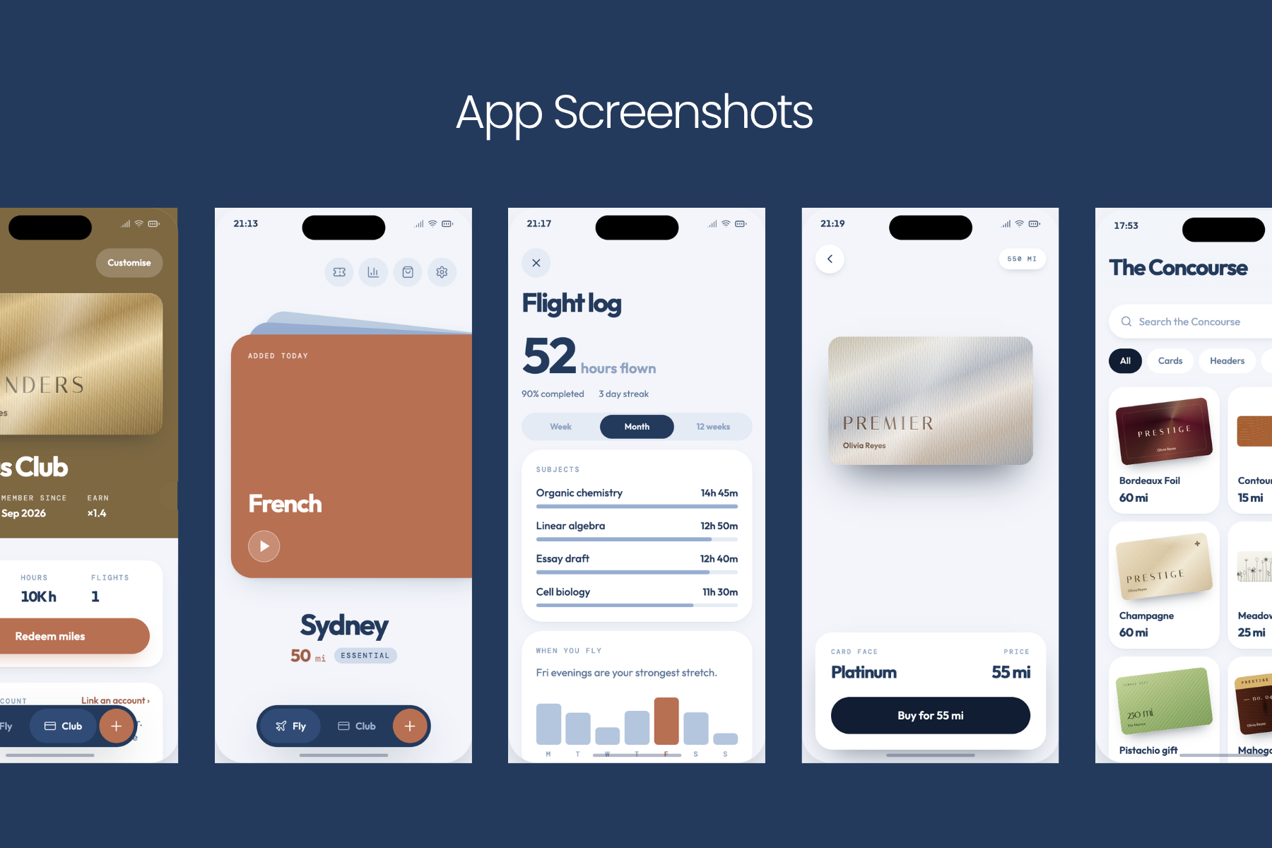
To help users study more effectively and manage their screen time, Tempus includes a Flight Log page containing data about screen time usage, previous flights and other activity. Tempus also includes a Boarding Pass Log, where users can view and collect boarding passes from flights they have completed in the past.
Customisation
There are a few major ways to customise your experience on Tempus. You can customise your Status Card with some preloaded card designs. Additionally, Tempus has a marketplace known as the Concourse which has over 30 card designs for each tier of the Status club as well as boarding pass headers and gift cards. A lot of cards here are free for all users, with some requiring our Business Class subscription.
Companion Support
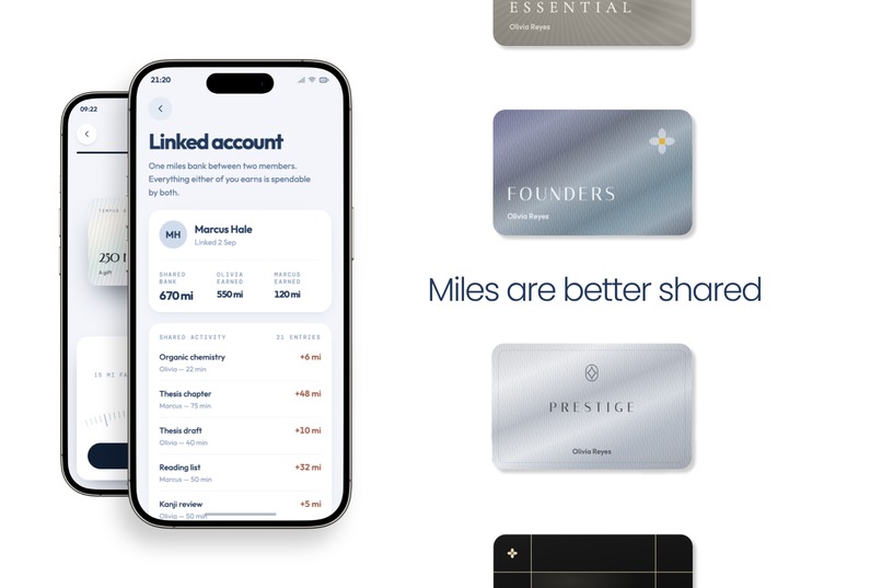
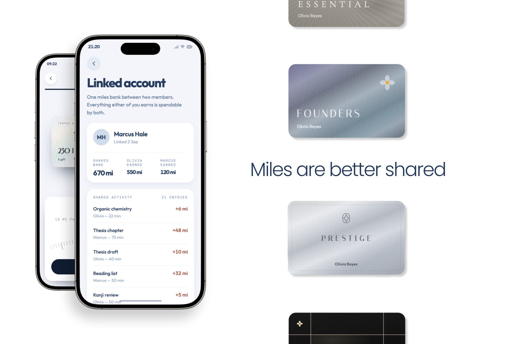
Tempus also allows users to link their Miles with a friend. One challenge we have both experienced with screen time management apps is the difficulty of staying committed to them over time. Linking Miles with a friend creates greater accountability between users while also providing a feature that differentiates Tempus from other screen time management apps.
In Tempus, you can also send gift cards to your friends and this helps create more motivation for each other.
Design
Design Philosophy
Tempus has two main design philosophies - an aviation theme and a minimalist but bold design.
Tempus integrates the aviation theme in a few ways.
The first way we built in the aviation theme is the boarding pass. Instead of a study session being just a timer, every session is a flight with a boarding pass, showing flight-specific details like departure and arrival airports, subject and time. To depart, you tear the pass along its perforated edge, which triggers an animation and transition to the next page. Every pass is then saved to the Boarding Pass Log, so over time your study sessions can turn into a collection. Users can also customise their boarding passes by purchasing boarding pass headers from the Concourse, where there are 60 detailed designs.
The second way is the Status Club. Instead of streaks, which most focus apps use, we modelled our motivation system on airline loyalty programs. There are five tiers (Essential, Signature, Premier, Prestige and the invite-only Founders tier). Each tier has its own membership card with its own colour, as well as a collection of other card faces in the Concourse. It mirrors the core concept of the membership years within airline rewards programs, resetting members' statuses every 90 days. Furthermore, our in-app currency, Miles, is inspired by the miles in many rewards programs.
Our subscription paywall keeps the aviation theme too. The paid tier is Business Class, and the upgrade banner is designed as a boarding pass, so subscribing feels like upgrading your seat.
Finally, our app logo (a star inside an oval) was actually inspired by aviation as well. A part of flying I've found really enjoyable is night flights where you can see the stars, hence the central star, and the oval is meant to represent a plane window (A321XLR for aviation nerds).
The main design philosophy we used when designing the actual pages of our app was minimalism. Specifically, we wanted to keep our app as uncluttered as possible and easy to navigate. For the broad design of the app, we wanted a really consistent theme that would be evident on every page. To achieve this, we used a simple colour palette of navy blue and copper orange. The navy blue is inspired by the sky at night and the copper orange comes from ANA's orange Flying Honu (turtle) A380. For fonts, we chose one simple font across the whole app for text (Outfit) and a separate monospace font for smaller labels (DM Mono), which mimics the printed text on real boarding passes and airport departure boards. For buttons, we always use copper orange for primary buttons.
Apart from having a minimal design system, we also really wanted bold elements. Huts.com was one of our main inspirations, with its minimal page layout but bold button design. We were unsure what unique design element to use for our app, so we browsed Dribbble for inspiration. Ultimately, we really liked this Pomodoro app concept (https://dribbble.com/shots/18955690-Pomodoro-Mobile-App-Design-for-Time-Management), specifically the card design on the home page and the dial. For Tempus, we adapted the dial and the cards to fit our design system more cleanly. The dial is one of the main elements in our app, appearing on the flight length page, the spend cap page and the redeem Miles page. We also added haptic feedback to the dial to make it feel more responsive in the hand.
Notable Design Elements
Please refer to the app walkthrough section in our video. Timestamps are provided.
Status Cards [1:15]: The status card is the main customisable element for each user. Every user gets a default status card based on their tier in the Status Club, but using the Concourse, users can purchase new designs. We used a multistage process to design each card in the Concourse, first sketching them out in Claude Design before refining them and then actually building them into the app. Currently, there are two main themes for the cards in the Concourse: materials (such as Platinum, Carbon, Pearl, Quartz and Opal) and botanical elements (such as cherry blossoms and jasmine flowers).
Redeem Page [3:50]: We wanted redeeming Miles to feel like an intentional action, like making a payment. When you unlock your apps for screen time, your status card slides down from the top of the screen with a smooth easing animation, you confirm with Face ID and then the card slides back up.
Concourse Page [3:25]: The Concourse is designed to feel like a shopping catalogue, similar to browsing duty free at an airport. When you tap an item to see more details, there is a morph animation where the item moves smoothly into its new position on the page. Buying an item uses the same payment animation as the redeem page, so every purchase in the app feels consistent.
Status Club Page [1:05]: The Status Club page is designed to look like a real frequent flyer page, with your status card at the top and widgets below it. When you tap customise to choose a new card design, the card morphs into its new position, then morphs back once you're done.
Onboarding [1:50]: Every page in our onboarding flow has intentional animations and design. The app opens with a boarding pass tearing, then zooming in to reveal another boarding pass behind it, which tears as well. This repeats nine times through an easing animation, so the very first thing users see is the core action of the app. Later in onboarding, there is a teardrop transition, where a huge droplet falls from the top of the screen and covers the page to reveal the next one.
How we built it
Tempus is a fully vibe coded app built using Claude. We built the app fully using SwiftUI and this was our first time using SwiftUI. We used Apple’s inbuilt In App Purchase to power purchases with Revenue Cat SDK integrated into the app as well. Our code is managed on a GitHub repository.
Before we actually built the app inside of Xcode, we first used Claude Design to build a design system for our app. Here, we came up with the navy blue and copper orange colour palette for the app and the font pairings. Using the design system, we sketched out the general app wireframe in Figma to understand what we wanted the app to look like. Here we used Dribbble for inspiration for certain unique design elements we liked, such as the dial. From the wireframe and mockups, we went back to Claude Design and built a working HTML prototype to test animations and page layouts. Only then did we move into Xcode and build the real app with Claude.
Claude Design was one of the most valuable steps in our process. We used it to sketch several versions of each page and prototype before committing to anything in the app itself, and every card and header in the Concourse was designed there.
Challenges we ran into
Making Tempus came with many challenges as well.
One of the first problems we faced was finding out if there was actually demand for a product like Tempus. We conducted market research by looking at problems people faced with existing products. The two major issues we identified were pricing and the complexity of many productivity apps. Additionally, we also surveyed our classmates to understand the potential demand for our app. 83% of people who we surveyed found it difficult to concentrate while studying and also manage their screen time.
As students, time management was also a significant challenge for us as the submission period for Tempus clashed with our school exam block (we live in Australia). Despite planning for the app at the start of August, we only submitted the app to the App Store on the 22nd of September due to many interruptions caused by exams we had to study for. Ultimately, we also spent too much time planning the app and designing the app which left very little time for us to build the app and market it.
One of the reasons planning took so long was due to the amount of time we spent developing the design system. As Tempus was primarily targeting the Design Award, we spent lots of time testing colour palettes using Coolors experimenting with font combinations and unique design elements. Because we wanted a flight themed app, we also had to integrate boarding passes and other flight inspired elements naturally into the app UI. Both my partner and I really like minimal designs which still have some bold elements so we settled on the current design system you see in Tempus.
Tempus was also the first app we made using Swift UI. Previously we had vibe coded apps using React and React native. Even though we did not code ourselves, we found many challenges regarding layout issues when converting our prototypes we made in HTML into Swift UI.
After building the app in Xcode, one of the major challenges we faced was refining the app. We both really enjoy apps with smooth fluid animations and app polish like the broad iOS interface experience. Thus, we spent lots of time fine tuning and refining the different elements of the app. We encountered many small bugs in the app like rendering across different iPhone screen sizes and linking to databases so features like sending gift cards and linked miles work. This refinement process took us over a week due to the sheer number of bugs and problems in the app we had to fix. Ultimately, we did finish refining the bugs in the app after 41 builds.
Another difficult part was subscription security. Purchases had to be tied to the user account and verified server side, so an intercepted response could not unlock anything. This is where AI assistance was least useful. It could produce code that worked, in the sense that a paying user got their features but left many vulnerabilities for people who wanted to hack into and access the system. Ultimately, we spent lots of time reading and breaking down the code to ensure the process was secure.
During the deployment stage, we faced several challenges, particularly around the legal and administrative requirements involved in launching an app. As my partner and I are both minors, we had to use our parents' names and identification documents in order to complete certain parts of the deployment process. Obtaining DSA approval, registering for an ABN, understanding GST requirements, and completing the necessary tax documentation were all completely new processes for us and our parents. As we had never dealt with these requirements before, understanding what was needed and completing the documentation took a significant amount of time and became another challenge we had to manage alongside development.
Ultimately, we tried to publish our app onto the App Store but failed to get the app approved in time. Between the late submission and the time spent on the deployment requirements, there was not enough time left for the app to make it through Apple's review process before the deadline.
What we learned
Building Tempus and participating in Shipaton has taught us many things.
One of the major things we learnt was managing our time effectively, especially with tight deadlines. We found the best way to manage deadlines was to use a proper calendar app to manage tasks left and progress. In the process of developing Tempus, we tested many different app solutions to also help us manage task timelines like Notion, Google Docs and others. Ultimately we found Notion to be incredibly useful for helping us manage workflows.
In the preparation stage of our app, we used Figma and Framer motion to build prototypes. Both of us had used Figma to a small extent before. Using Figma to create full app mockups and pages was a much larger learning curve and we eventually found the app to be much more intuitive.
Furthermore, as Tempus was made by Jimmy and I, we had to collaborate when building Tempus to effectively complete the app. As we both have different schedules, it would sometimes be hard to communicate when building and working on the app so we learned to delegate tasks and to manage pull requests through github.
A challenge of building an app using AI is being able to communicate what you want to the AI so the output is what you want. After building multiple prototypes and refining the app multiple times, we learnt how to use prompt engineering to get AI to know what we want better and the sorts of references to attach to AI to get better and more structured outputs.
What's next for Tempus
We are currently waiting for Tempus to be approved on the app store. Despite requesting an expidited app review, we were unable to get the app reviewed before the Shipaton deadline which is why Tempus is being submitted as a Next Gen project. By the time you are reviewing this, Tempus may be out on the app store so feel free to find it and try it our for yourself. Otherwise, please refer to the app walkthrough in our video :)
Tempus has envisioned three other major changes to the app in the future.
First, we plan on providing more customer incentives for Tempus through the external collaboration with other brands in order to provide discounts for users as a reward for extended study. We have already started this objective through outreach to popular bubble tea companies and other cafes. This would also double as growth for Tempus, providing reach for both parties, whilst also creating a business moat.
Moreover, we wanted to integrate Tempus into Google Play. We wanted to cater for all users who have different devices to promote the efficient learning that we were once unable to have.
We also want to expand marketing for our app to gain more reach and profit. In order to achieve this, we plan to fully utilise the Shipaton ship kit to contact UGC creators on Noise to post videos/shorts on Instagram, Tiktok and Reddit to attract users.
By Jimmy & Kyle


Log in or sign up for Devpost to join the conversation.