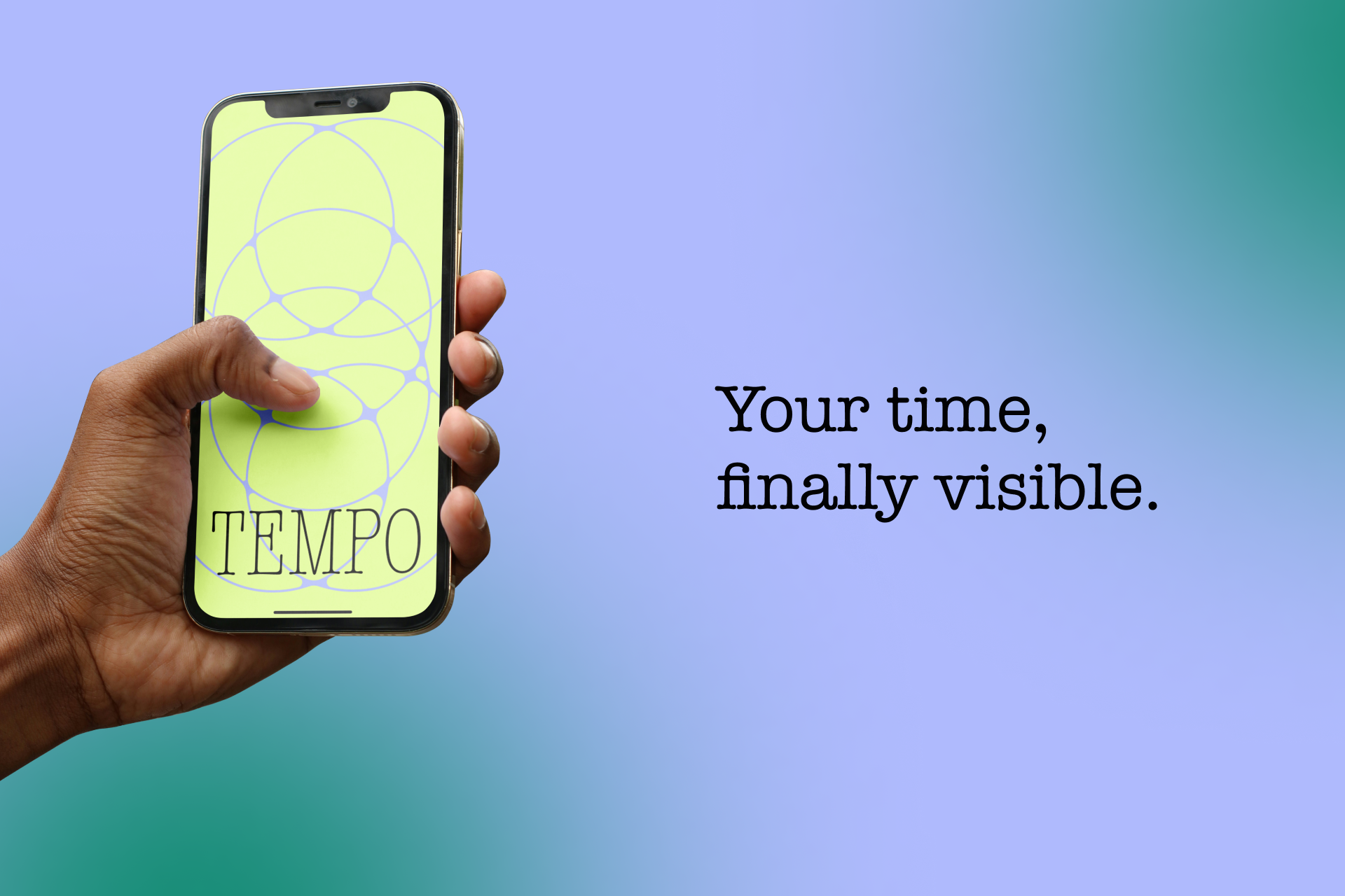

Tempo — Your Time, finally Visible.
What Inspired This
The prompt asked us to design for a sense beyond the classic five. We didn't look outward — we looked inward, to chronoception: the body's perception of time passing.
It's one of the 20–30 senses researchers now recognize, governed by dopaminergic pathways, the insular cortex, and heartbeat integration. Yet every productivity app, calendar, and wellness tool ever built assumes time is the same for everyone — linear, divisible, universal.
This is the Western monochronic model. It's one cultural inheritance. It just happened to build all the infrastructure.
We wanted to design the first tool built on a different truth: time is biological, cultural, and relational.
The specific insight that unlocked everything: two people can be fully present in the same room and be living in genuinely different time realities — neurologically, not metaphorically. Age slows dopaminergic processing. ADHD disrupts it. Cultural background shapes it. Displacement fractures it. And no tool has ever acknowledged that gap exists, let alone given it a name.
Tempo gives it one.
How We Built It
The project is a Figma prototype covering three complete user journeys — Jordan (ADHD/Branching time), Maya and Ravi (generational temporal divergence via Shared Tides), and Leila (polychronic displacement, Still Pool).
The vast majority of the prototype was built natively in Figma — screen flows, transitions, wave states across the four temporal landscapes, the Tide Log terrain, the Shared Tides resonance visualization, and the Sync Ritual sequence. The wave visual language had to carry the entire semantic weight of the interface (no numbers, ever), so we spent significant time getting the shape vocabulary right: fast/choppy for high Rate, long/rolling for low Rate, smooth for coherence, fragmented for ADHD or burnout.
Figma Make was used precisely and intentionally for one moment: Leila's Still Pool intervention. When Leila's temporal state has been flat for too long — frozen in displacement, time not moving in any felt direction — Tempo responds. Make uses camera tracking to detect physical stillness in real time, and triggers a bioluminescent orb that drifts across the screen. To catch it, Leila has to move. When she does, a sound effect fires. The pace of the orbs is calibrated to gently pull her tempo upward — not through instruction, but through felt, embodied engagement.
It's the one moment in the prototype where the interface reaches out and acts on the world rather than just reflecting it. We deliberately scoped Make to this single interaction because it was the moment that most needed to be real — the difference between showing a screen that says "move" and actually making someone move.
This also meant the Make build had to do something native Figma simply can't: read the physical world (camera input), respond to it in real time, and trigger a multimodal output (visual + audio). The constraint of using Make only where Figma couldn't do the job kept the prototype clean and the interaction meaningful when it arrived.
Challenges
The hardest design problem was making "no numbers" feel like a principled decision rather than a missing feature. Every wellness app trains users to expect a score. Replacing that with a motion visual required building enough semantic richness into the visual language that users could read their state without a legend — fast/choppy for compressed time, long/rolling for expansive time, smooth for coherence, fragmented for ADHD or burnout. We tested multiple wave rendering approaches before landing on the layered, semi-translucent style that reads clearly across all four landscape modes.
The speculative technology tension was real throughout. The bioluminescent biomarker is speculative — but the temporal dissonance between Maya and Ravi on a Sunday call is not. Keeping the science grounded while the sensing layer stayed speculative required constant calibration. We used real peer-reviewed sources (Harrington et al. 1998, Meissner & Wittmann 2011, Fuchikawa et al. 2019) as anchors so the speculative parts felt earned rather than arbitrary.
Designing against ourselves was the most uncomfortable part. The "Black Mirror Brainstorm" session — where we systematically imagined every dark version of Tempo before building a single feature — revealed real ethical exposure: coherence data as stigma, privacy mode as readable withdrawal signal, aggregate temporal data as a government surveillance instrument. Each scenario produced a concrete design constraint that shaped the final product. The safeguards aren't additions to Tempo. They are Tempo.
The four landscapes had to feel like equals, not a spectrum with one correct answer. Current (linear time) needed to sit beside Tidal, Branching, and Still Pool without being framed as the default or the goal. The onboarding names monochronic time as a model, not the model — for many of our target users, that single reframing is the first time any tool has acknowledged their relationship with time isn't a deficit.
What We Learned
The most powerful design move was refusing the default. Every existing tool for time assumes one temporal architecture and optimizes within it. The instant we asked what if that assumption is wrong — the entire project opened up.
Speculative design works when it's grounded in real human pain. The biomarker is fiction. The father in a different time reality than his daughter on a Sunday call is not. The fiction becomes believable only because the human truth underneath it is real.
And: design against shame first. Jordan's time blindness. Leila's displacement. Ravi's slowness. Every one of these has been framed as failure by every system they've ever used. Reframing difference as architecture — not deficit — was the project's core stance, and it had to be established before a single screen was drawn.
Built With
- figma


Log in or sign up for Devpost to join the conversation.