Gridlock
A city-scale simulation platform for transit and demand planning.
Inspiration
Cities are designed in conference rooms but lived in by millions of people, and the gap between those two scales is where transit planning quietly fails. Anyone who has watched a brand-new bus route serve nobody, or a packed train pull into a station with no parking, knows the feeling: someone made a decision without a way to see the consequences before it became permanent.
Transit planners today work with spreadsheets, static GIS layers, and twelve-month engagement cycles. By the time a route opens, the demographics have shifted, the jobs have moved, and the public review meetings are arguing about a city that no longer exists. We wanted to build the missing instrument, a city you can poke at in real time, where every "what if" rebuilds itself in seconds. Not a polished slide for a council vote, but a working tool for the people doing the actual planning, on any city, with whatever data they can get their hands on.
Gridlock is named for the thing it tries to prevent.
What it does
Gridlock is a city-scale simulation platform for transit and demand planning. Out of the box it does four things.
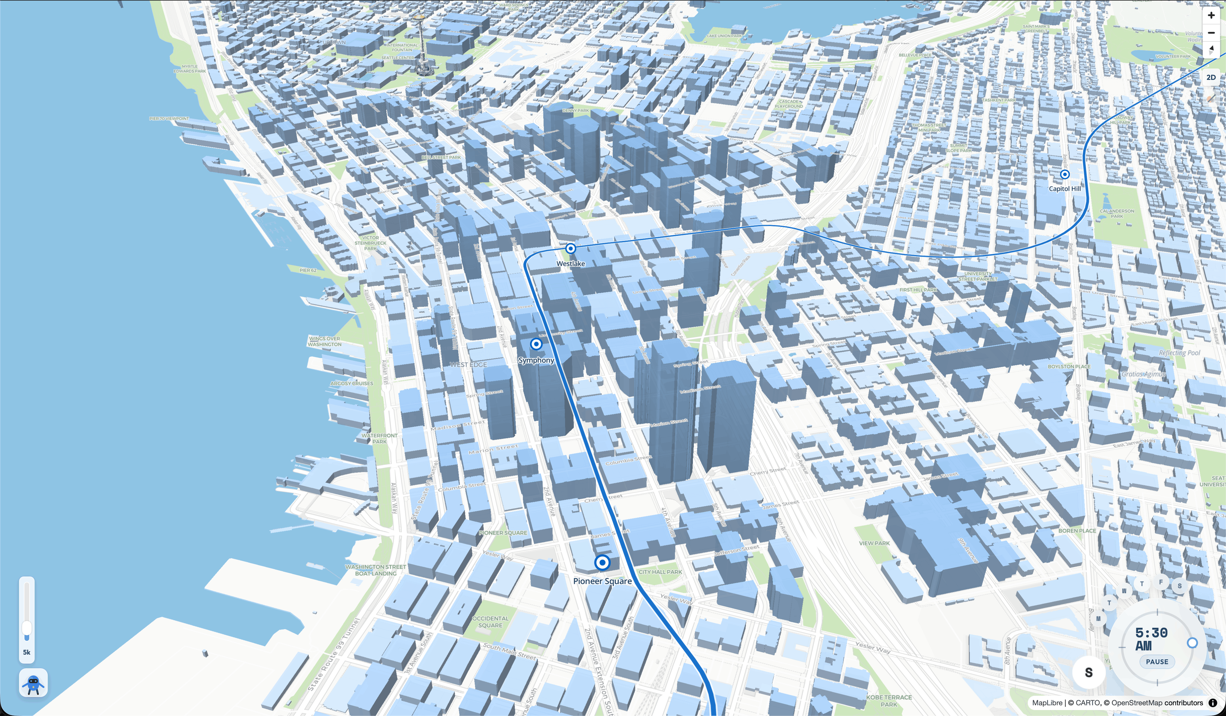
1. Renders any city as an interactive 3D map
Our demo loads Seattle from authoritative Building_Outlines_2023 footprints joined offline to official 3D building shells. The same pipeline runs on any city with public footprint data, buildings stream in by neighborhood with a live status panel so even a cold load feels instant.
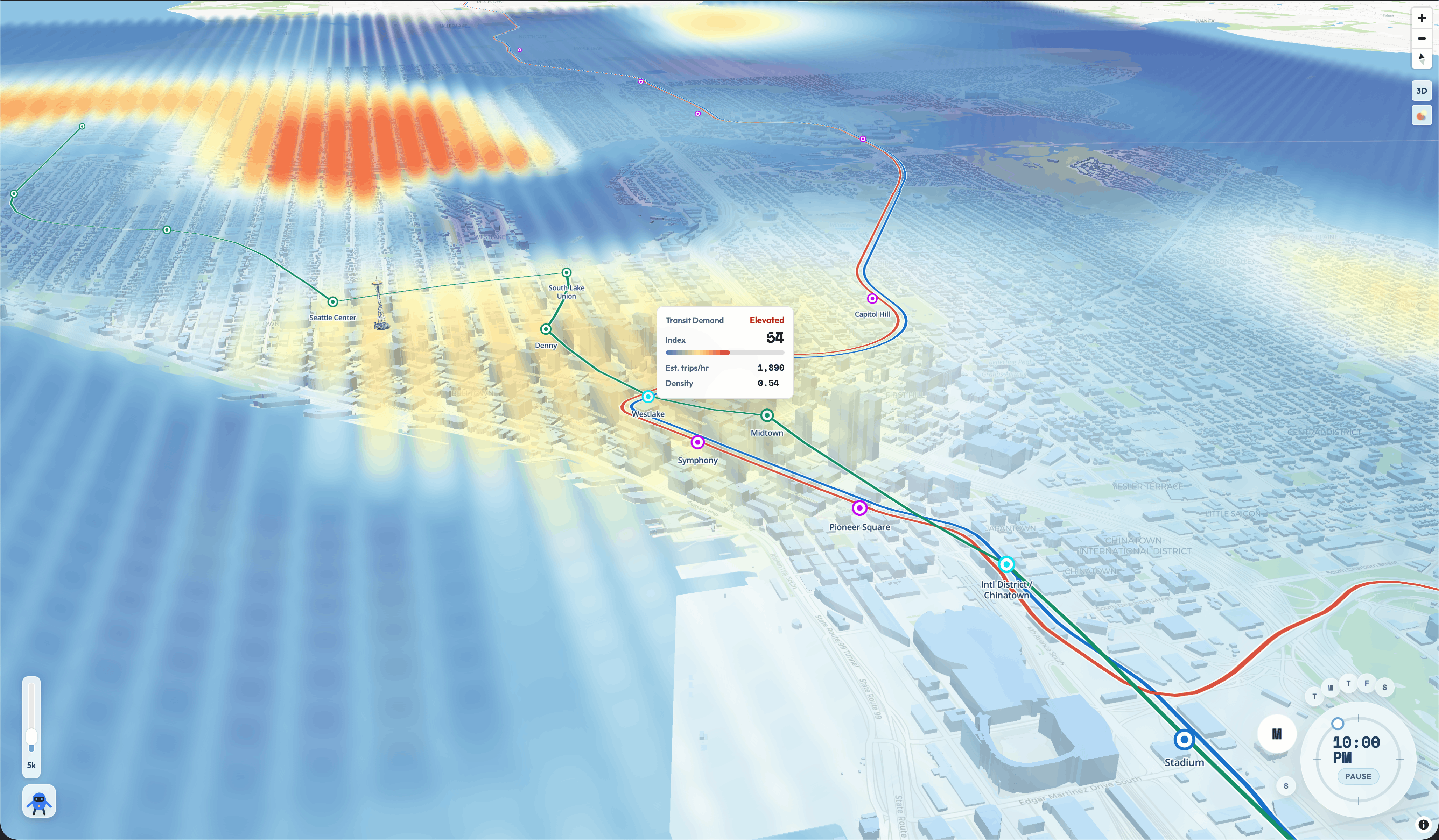
2. Streams a foot-traffic / demand heatmap
A live Server-Sent Events overlay over a $48 \times 7$ grid of half-hour bins by day-of-week. Each cell carries a normalized density score $S_c \in [0, 1]$, blended from a learned demand model, residential density (ACS + TIGER census), GTFS service supply, station connectivity, and (where available) employment density.
3. Runs a transferable demand model
Cities almost never have detailed ridership labels. The model is trained once on historical metropolitan transit data with passenger-level supervision, then applied to any target city through a deliberately portable station-vector schema:
station_id, station_name, lat, lon,
activity_score, connectivity_score, activity_rank_pct,
is_transfer_proxy, connectivity,
population_within_radius, population_density_within_radius,
city_average_population_density, residential_density_ratio
The same recipe that scores Seattle scores Boston, Atlanta, or a campus shuttle network, point it at GTFS plus a population layer and it produces relative demand pressure for the entire city.
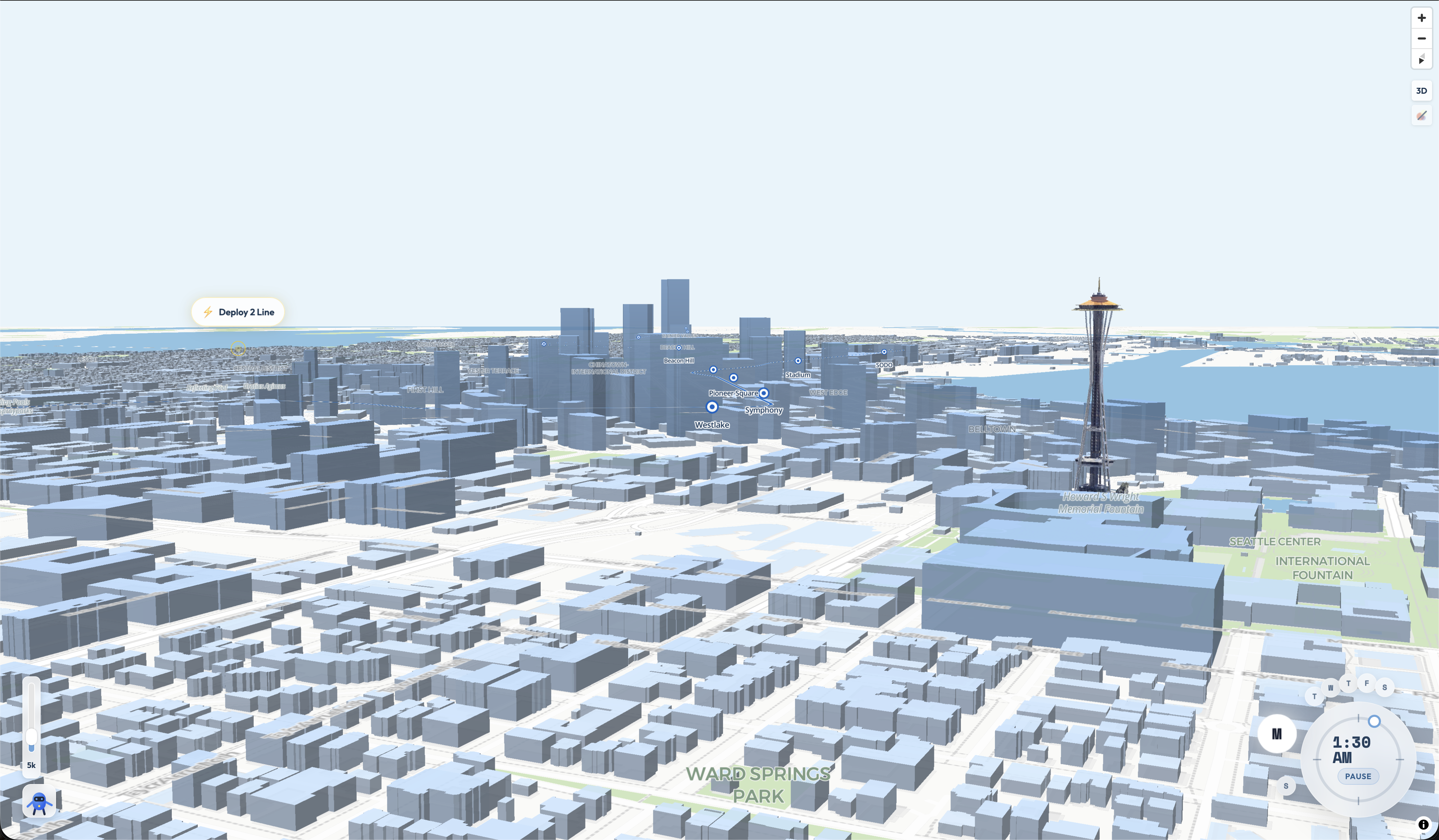
4. Lets planners edit the network and see the consequences
- Add or remove stations.
- Scale frequencies up or down per time-of-day.
- Drop in a special-event surplus that conserves total users while dissipating across trailing half-hour bins.
- Sketch an entirely new line by handing us an ordered station-coordinate CSV.
Gridlock rebuilds the candidate grid, re-scores every cell, and emits both a baseline and scenario heatmap with demand_delta and percent_change per cell:
$$\Delta_c = S_c^{\text{scenario}} - S_c^{\text{baseline}}, \qquad \%\Delta_c = 100 \cdot \frac{\Delta_c}{S_c^{\text{baseline}}}$$
A line through low-demand corridors visibly underperforms a line that connects two existing demand nodes, because line scoring rewards exactly that kind of network effect (math below).
The output is a CSV that keeps every $(\text{cell_id}, \text{day_of_week}, \text{time_bin})$ triple plus a display-ready GeoJSON, both wired into a MapLibre heatmap layer that updates as scenarios edit the network. Seattle is our reference deployment; the architecture is city-agnostic by design.
How we built it
Frontend
React 19 + TypeScript + Vite, MapLibre GL via react-map-gl, a small useHeatmapStream hook backed by EventSource, and a precomputed $(r, c) \mapsto [\text{lon}, \text{lat}]$ centroid lookup so per-frame work is one array index.
Buildings load from cached neighborhood GeoJSON in priority order with a status panel: Downtown Core → East Neighborhoods → Northwest → Beacon Hill → West Seattle. Swap the cached files and it's a different city.
SSE contract
A single /api/heatmap/stream endpoint emits three event types:
| Event | Payload | Purpose |
|---|---|---|
config |
{bounds, rows, cols} |
Sent once on connect |
frame |
{timestamp, cells: [[r, c, density], ...]} |
Sparse, full-frame |
clear |
{} |
Reset all cells to zero |
Reconnects are idempotent. We ship a FastAPI mock server with drifting Gaussian hotspots so the frontend can ship even when the model is mid-rewrite.
Data pipeline
Python modules under data_processing/src/, organized so any city slots in:
- A shared station-vector builder turns any city's GTFS plus a population layer into a normalized table of stations with the same columns.
- A candidate grid builder turns a city bbox into 500 m cells expanded across $48 \times 7$ time bins, attaches Gaussian-decay station exposure, GTFS hourly frequency exposure, optional employment-jobs exposure, and temporal land-use shaping.
- A demand model trains on historical transit data and scores any target city's candidate grid as relative demand pressure.
The math behind the heatmap
Every spatial signal uses the same exponential decay kernel, with decay constant $\lambda = 800$ m and cutoff radius $R = 2500$ m:
$$w(d) = \begin{cases} e^{-d/\lambda} & d \le R \ 0 & d > R \end{cases}$$
Each grid cell $c$ aggregates a per-cell composite from its surrounding stations and the underlying census/jobs layers. The catchment-demand composite is
$$S_c \;=\; 0.60 \cdot M_c \;+\; 0.25 \cdot H_c \;+\; 0.15 \cdot D_c$$
where $M_c$ is learned demand, $D_c$ is dispersion, and $H_c$ is the transparent heuristic blend
$$H_c \;=\; 0.35\,R_c + 0.25\,J_c + 0.15\,A_c + 0.15\,C_c + 0.10\,F_c$$
with $R_c$ residential density, $J_c$ employment-jobs density, $A_c$ station activity, $C_c$ connectivity, and $F_c$ scheduled-train frequency, each min-max normalized.
A shared dispersion weight is reused across event allocation, line catchments, and land-use shaping, so all three scenario surfaces speak the same language.
Proposed-line scoring
This is the piece we're proudest of. Hand it ordered station coordinates and it does the following.
For each proposed station $s$, the catchment is a Gaussian-weighted average of the surrounding cell composite:
$$\text{catchment}(s) \;=\; \frac{\sum_c w(d_{s,c}) \, S_c}{\sum_c w(d_{s,c})}$$
For the line as a whole, we reward connecting strong nodes via the geometric mean of the top two station catchments $D_{(1)}, D_{(2)}$:
$$\text{line_connected_demand} \;=\; 0.45 \cdot \overline{D} \;+\; 0.55 \cdot \sqrt{D_{(1)} \cdot D_{(2)}}$$
A junction boost rewards lines that pass through transfer-rich areas, where $J_{\max}$ is the strongest station's junction potential:
$$\text{line_network_value} \;=\; \text{line_connected_demand} \cdot \bigl(1 + 0.5 \cdot J_{\max}\bigr)$$
For each grid cell $c$, the corridor reach is the larger of segment-distance and stop-distance decay:
$$W_c \;=\; \max\bigl(w(d_c^{\text{line}}),\; w(d_c^{\text{stop}})\bigr)$$
And the cell's final supply-scaled score is
$$\text{line_service_weight}c \;=\; W_c \cdot \text{line_network_value} \cdot f{\text{trains}}$$
Then build_line_weights.py rebuilds the entire candidate grid with the proposed stations baked in, so station-distance, station-count, activity exposure, and scheduled-train weights all reflect the new line, not just bolted-on extra columns.
Event dispersion
Special-event surplus is conserved across an active window plus four trailing half-hour bins with geometric decay $\rho = 0.5$:
$$\sum_{k=0}^{4} \rho^k \, u_{\text{event}} \cdot \text{spatial}(c, k) \;=\; u_{\text{event}}$$
Normalization keeps total surplus equal to the event's $u_{\text{event}}$ while spreading it through space and time.
Orchestration
Three idempotent wrappers, build_features.py, train_models.py, test_scenarios.py, turn the whole pipeline into one-command rebuilds. Throw away curr_data/processed/ and have a working demo in minutes.
Challenges we ran into
- Multimodal GTFS pollution. Most city GTFS feeds mix everything together, light rail, commuter rail, buses, ferries, streetcars, even Amtrak in our case. Every "station" we computed before filtering was actually a bus stop. We wrote a GTFS filter step that keeps only the route types and agencies a planner actually wants and treats raw feeds as immutable source caches. Mundane plumbing that turned out to be the thing keeping the rest of the model honest.
- Cross-city feature drift. Our reference cities have different data shapes, one with detailed origin-destination trip records, one with only GTFS departures. Getting the station-vector schema to mean roughly the same thing on both sides, without ever leaking city identity into the model as a feature, took several rewrites and a hard rule that no city-specific identifier ever becomes an input.
- Missing data is the default. A real city pipeline can't assume jobs data, can't assume ridership history, can't even assume a public GTFS feed for every mode. Every step was designed with graceful fallbacks: zero-frequency rows when supply data is missing, transparent heuristics when learned signals can't be computed, and outputs that always declare themselves relative demand pressure rather than calibrated ridership.
- Scenario rebuilds had to be transparent. Adding a station has to ripple through station distance, station counts, activity exposure, and scheduled-train weights. Our first version just appended new line columns to baseline rows, wrong. We rebuilt scenario candidate features from scratch through a subprocess so every exposure field is recomputed around the change.
- Frontend performance vs. correctness. Live 3D scene services rendered building shells beautifully but melted laptops. Live feature-server queries were accurate but inconsistent on load. We landed on cached neighborhood GeoJSON regions joined offline to authoritative scene heights, slower to update, instant at runtime, accurate where it matters.
- Communicating uncertainty. Demand pressure isn't ridership, and a hackathon UI is one careless label away from making a council member believe a number that doesn't exist. We picked relative scoring, normalized $[0, 1]$ outputs, and
percent_changeover absolute counts in the scenario UI. Boring, but defensible.
Accomplishments that we're proud of
- A transferable demand model: trained once on historical transit data, applied to any city with GTFS plus a census population layer. Seattle is our demo; the architecture is portable on day one.
- A shared dispersion weight that ties land-use shaping, event allocation, and proposed-line catchments together. Three different scenario surfaces speaking the same composite signal kept the math coherent and the UI explainable.
- The proposed-line tool. A planner hands us a CSV of station coordinates and we tell them, in one command, how the new line affects every $500\text{ m} \times 30\text{ min} \times 7\text{-day}$ cell in the city, including the geometric-mean reward for connecting two real demand nodes. That's analysis that takes weeks today.
- A clean SSE contract and a mock server that lets the frontend ship even when the model is mid-rewrite. The contract has survived three pipeline rewrites unchanged.
- A reproducible one-command rebuild of the entire feature stack, training, and scenario suite. Throw away every processed artifact and have a working demo in minutes.
What we learned
- Schemas are the actual product. The shared station-vector schema is what makes everything else composable. The model is replaceable; the schema isn't.
- Sparse SSE beats WebSockets for our shape. Each frame is a full snapshot, but it's sparse, only nonzero cells. Browser auto-reconnect handles flakiness for free.
- Keep the data paths separate. A baseline heatmap on sparse local observations and a transferable demand model fail differently. Keeping them in different modules let us debug each in isolation instead of hunting bugs in a fused codepath.
- Scenario realism comes from rebuilding, not appending. Slapping line weights on top of stale baseline features looks fine but lies. Rebuilding exposure with the new overlay is slower and worth every second.
- Big-picture tools need small-picture honesty. A platform for systemic decisions has to be aggressively transparent about what it knows, what it's guessing, and what it's only relatively right about. We baked that into the UI and the field names instead of leaving it in a footnote.
What's next for Gridlock
- Multimodal: buses join the model. Right now we filter buses out at the GTFS step because rail forms the unambiguous transit graph in our demo. The next pass keeps bus routes and stops in scope, adds a bus-station-vector schema (stop spacing, headway distribution, route overlap as new features), and trains a unified dispersion model that can answer "what happens if this RapidRide route runs every 6 minutes" alongside "what happens if light rail extends to this neighborhood". Buses are where the highest-leverage planning decisions actually live.
- More cities, more data. Add several more cities to the training set, both ones with rich passenger-level history and ones with calibrated boardings/alightings. More cities means a richer station-vector manifold and a model that generalizes more cleanly; calibrated labels means we can stop reporting relative demand and start reporting expected ridership in absolute units.
- More datasets per city. Traffic counts, demographic overlays (age, income, vehicle access), parcel-level zoning, business-license density as a jobs complement, and a city-laws layer (parking minimums, transit overlay districts, height limits) so scenarios reflect what's actually buildable.
- Route-shape exposure. Cells between stops should get demand contribution from the line itself, not only from its endpoints. This matters for routes with widely spaced stops.
- Origin-destination flows as a second layer. Render predicted flows as arcs over the heatmap so planners see where people go, not just where it gets crowded. The same station-vector schema supports it natively.
- Scenario history. Save, diff, and compare scenarios in the UI, version control for transit plans. Flip between baseline, expansion plan A, expansion plan B, and a special-event overlay, and see deltas as map tiles instead of CSV joins.
- Calibration loops. As soon as a city gives us any local label, boardings, APC, fare-card taps, home-work flows, pedestrian counters, event attendance, a one-line calibrator scales predicted totals to match. The transferable model is a starting point. Gridlock should get more accurate the longer a city uses it.
Built With
- csv-pipelines
- deck.gl
- fastapi
- geopandas
- gtfs
- javascript
- maplibre
- markdown
- node.js
- numpy
- pandas
- pyogrio
- python
- react
- scikit-learn
- seattleopendata
- shapely
- typescript
- us-census-bureau
- uvicorn
- vite


Log in or sign up for Devpost to join the conversation.